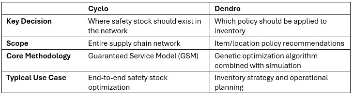
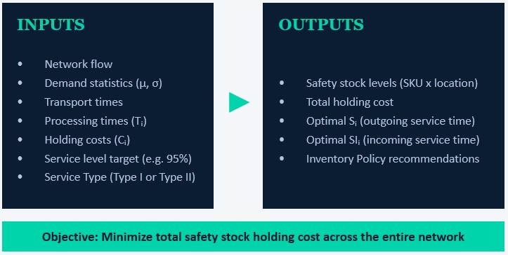
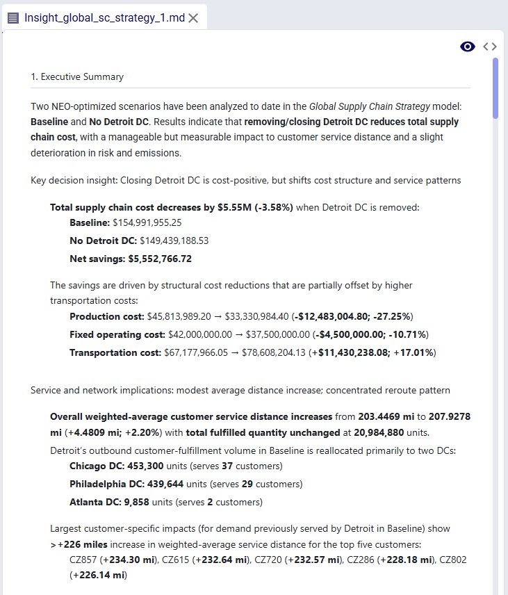
Cyclo is Optilogic’s new Multi Echelon Inventory Optimization (MEIO) engine within Cosmic Frog. It helps supply chain teams determine where safety stock should be held across a network, how much is needed at each stage, and how service levels impact total safety stock cost and responsiveness.
This video gives a quick overview of how to use Cyclo; it uses the Demo Model described further down in this documentation:
If you just want to get going with Cyclo as quick as possible, follow these steps:
Multi Echelon Inventory Optimization (MEIO) is a planning approach used to optimize safety stock across an entire supply chain network.
Cyclo, the MEIO engine, is designed to optimize safety stock placement across multi-stage supply chains that may include suppliers, manufacturing plants, distribution centers, and customer-facing locations. Instead of optimizing each node independently, Cyclo evaluates the entire network simultaneously so organizations can reduce total safety stock while maintaining desired service levels.
Cyclo uses a Guaranteed Service Model (GSM) approach to optimize service-time relationships between facilities and derive recommended safety stock levels.
Cyclo helps organizations answer key supply chain questions such as:
By optimizing safety stock placement across the entire network, Cyclo can help organizations:
Cyclo is especially valuable for:
Both Cyclo and Dendro support inventory optimization workflows in Cosmic Frog, but they are designed for different planning problems.
In practice both can be used together:
Cyclo uses a Guaranteed Service Model (GSM) approach. Rather than directly optimizing safety stock quantities, Cyclo optimizes service-time commitments between facilities. Those service-time decisions are then translated into safety stock requirements.
Represents your risk tolerance – balancing the cost of holding extra buffer inventory against the risk and cost of lost sales. This is a user input. Two risk measures are available:
Service Type 1 is a stricter measure than Type 2 and will in most cases lead to more safety stock.
Time a facility expects upstream suppliers to deliver material. This is a decision variable in the optimization
Time a facility needs to replenish – typically transport time from the upstream location to the facility and/or production/processing time at the facility. These are model inputs.
Time a facility promises to deliver to downstream customers. This is a decision variable in the optimization.
The effective time window over which demand uncertainty accumulates.
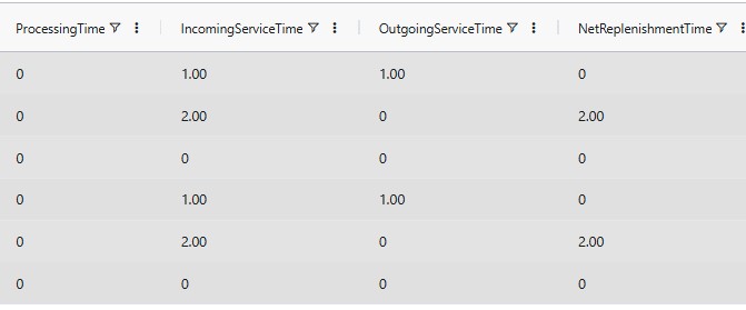
In a Guaranteed Service Model (GSM), each facility commits to serving downstream nodes within a defined service time. The effective exposure to uncertainty is the Net Replenishment Time (NRT):
NRT = Incoming Service Time + Fixed Lead Times − Outgoing Service Time
As NRT increases, more uncertainty accumulates and more safety stock is typically required.
Cyclo evaluates many combinations of incoming and outgoing service times across the network to find the lowest total safety stock holding cost, while reaching the target service level. The optimization is not changing any fixed lead times. Instead, it is strategically deciding where responsiveness should exist in the network.
Consider a product with the following flow path:
Manufacturer → Distribution Center → Customer
Assume the following fixed lead times:
The total physical replenishment lead time across the network is therefore 5 days.
These lead times are inputs to the model and are not optimized. What Cyclo optimizes are the service-time commitments between stages. Specifically:
These service times are optimized with the goal to minimize total safety stock holding cost across the network.
In the next example scenarios:
Manufacturer ----> DC (5 days safety stock) ----> Customer
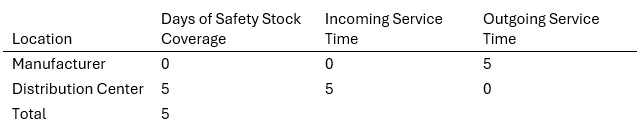
Interpretation:
This approach is common in highly responsive distribution networks.
Manufacturer (2 days safety stock) --> DC (3 days safety stock) --> Customer
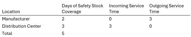
Interpretation:
Manufacturer (4 days safety stock) --> DC (1 day safety stock) --> Customer
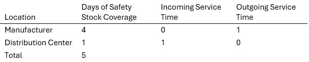
Interpretation:
The total physical replenishment exposure is driven by the same 5-day total network lead time in all 3 scenarios.
What changes is:
Cyclo evaluates many combinations of:
to determine the optimal inventory strategy across the network.
Without MEIO, organizations often duplicate safety stock across multiple locations and optimize inventory independently at each node. Cyclo instead evaluates the network holistically and strategically concentrates inventory where it is most cost-effective, while achieving the required service level.
The following diagram summarizes the inputs and outputs of the Cyclo engine; they will be covered in more detail in the Cyclo in Cosmic Frog section that follows.
The following workflow provides a step-by-step approach for configuring and running Cyclo.
The following table provides an overview of the input tables used by Cyclo, whether they are required, and their purpose. Further below, several screenshots show examples of some of the main inputs in Cosmic Frog.
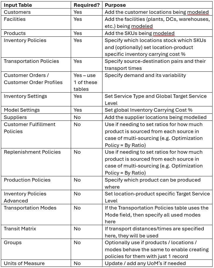
The following screenshots show several input tables with key Cyclo fields.
Demand can be specified in either of the Customer Orders and Customer Order Profiles tables. If the Customer Orders table is populated it will be used and the Customer Order Profiles table will be skipped in that case. If the Customer Orders table is blank, the Customer Order Profiles table will be used.
Before running Cyclo, verify that the supply chain network is fully configured. Recommended validation checks:
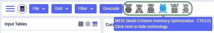
You can also use Cosmic Frog’s Integrity Checker and filter the results where the Relevant Technology field contains Cyclo.
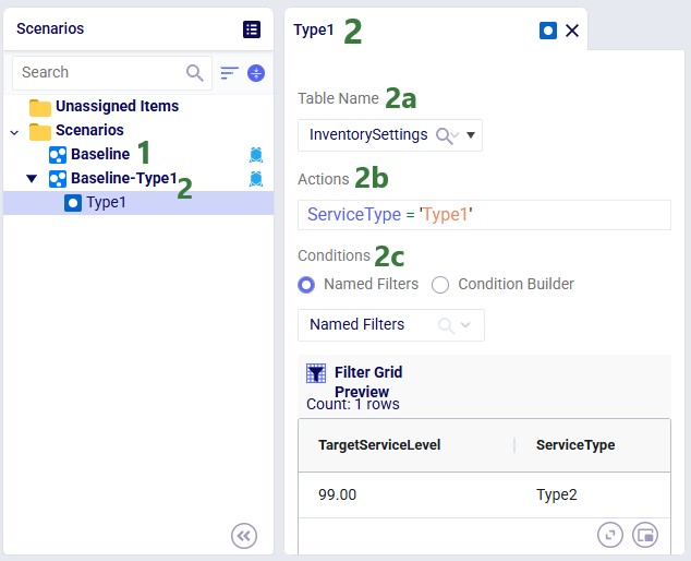
Once the model has been built, you can optionally configure additional scenarios to run. Here 1 additional scenario is added besides the Baseline:
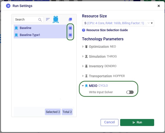
After inputs are validated and scenarios set up, users can kick off their Cyclo optimization run by clicking on the green Run button at the top right in Cosmic Frog, which brings up the Run Settings modal:
During execution, Cyclo processes:
The optimization engine evaluates inventory decisions holistically across the network rather than independently by node.
After the optimization is completed, review the generated outputs.
The Cyclo outputs are in 2 tables, Inventory Network Summary and Inventory Safety Stock Summary, and include:
Cyclo outputs help users understand recommended inventory placement, service-time commitments, and total network inventory cost tradeoffs.
The Inventory Network Summary summarizes results by scenario:
This helps users:
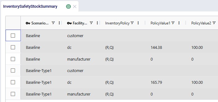
The Inventory Safety Stock Summary shows detailed results at the product x location level, by scenario:
The 4 screenshots in the next sub-sections are of additional fields on the same table and do not always show the fields of the screenshot above again.
The recommended safety stock reflects:
Note that another field not shown in the screenshot, Holding Cost, is available in this table too. Its value is the holding cost for 1 unit of product at that location for the length of the model run. The Holding Cost Contribution is calculated as this Holding Cost value multiplied with the Safety Stock value.
These values represent:
Cyclo can recommend inventory policies and their parameters:
These policies help operationalize inventory decisions.
When reviewing Cyclo outputs, focus on patterns across the network rather than individual locations.
Questions to ask include:
Safety stock optimization quality depends heavily on the quality of the data.
Recommended practices:
Cyclo is especially valuable for scenario analysis.
Examples include:
Scenario comparisons help quantify operational tradeoffs.
MEIO is fundamentally a system-wide optimization problem; avoid evaluating locations independently. The best global solution may intentionally increase inventory at one node in order to reduce much larger inventory requirements elsewhere.
Cyclo outputs are most valuable when reviewed collaboratively by:
Why does Cyclo place more inventory at upstream locations?
In many networks, upstream buffering can reduce downstream safety stock due to variability evening out when aggregating demand from multiple downstream locations (pooling effect). This lowers the total inventory holding cost. Cyclo evaluates these trade-offs automatically.
Does higher service always mean more inventory?
Generally, yes. Higher service-level targets reduce allowable stockout risk, which usually increases safety stock requirements.
Why are service times optimized instead of inventory directly?
The Guaranteed Service Model simplifies the optimization problem and provides a scalable framework for network-wide inventory positioning. Safety stock is derived from optimized service-time relationships.
We will now walk through a Western Europe based life-size template Cyclo model. This model, Cyclo – MEIO, can also be copied to your own account from the Resource Library: Cyclo - MEIO model on the Resource Library.
In this model, we will examine the impact of varying the target service level, reduced demand variability, reduced transport lead-time, and only allowing safety stock to be held at customer facing DCs.
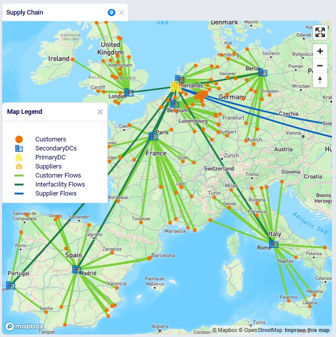
The following map shows most locations and the flow of product in this network:
In this model, the following tables are populated, most of which we will see a screenshot of further below. A reminder that it is helpful to only show Cyclo tables and fields using the Technology Filter at the top.

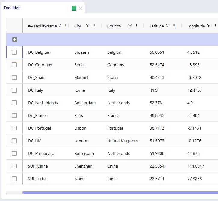
Facilities
This table contains the 2 suppliers, primary DC in Rotterdam, and 8 country-level secondary DCs. They are geocoded based on city and country data.
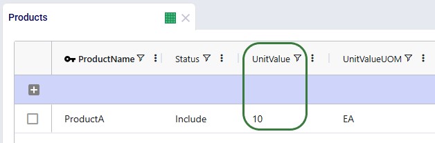
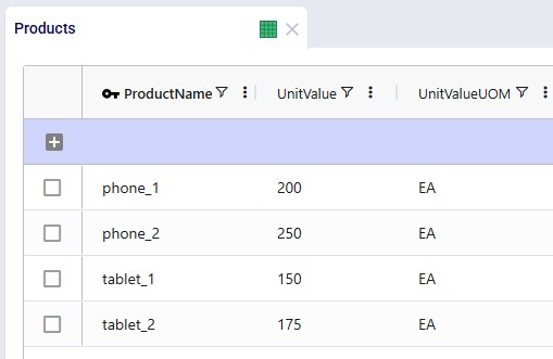
Products
The Products table contains the 4 products which are being modeled. To minimize safety stock, it is important to set a unit value for the products so that safety stock costs can be calculated and minimized.
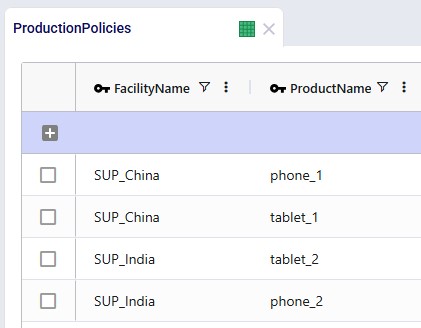
Production Policies
These are not strictly required in this model, as the source of the products can also be deduced from the Transportation Policies table, but the table can be populated if desired. We see that the “_1” products are coming from the supplier in China and the “_2” products are supplied by the India supplier.
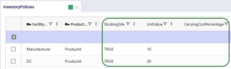
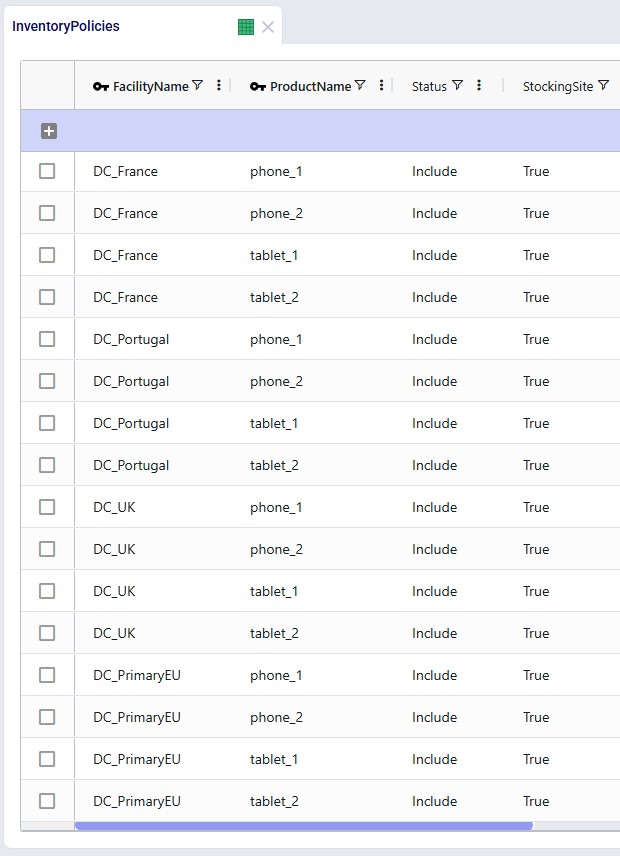
Inventory Policies
For each of the DC-product combinations, a record is specified in this table. Initially, the Stocking Site field is set to True for all, meaning the Primary DC and 8 secondary DCs can all hold safety stock for all 4 products. Note that they are not used in this model, but the Unit Value and Inventory Carrying Cost Percentage fields on this table can be used to override the global values set in the Products and Model Settings tables.
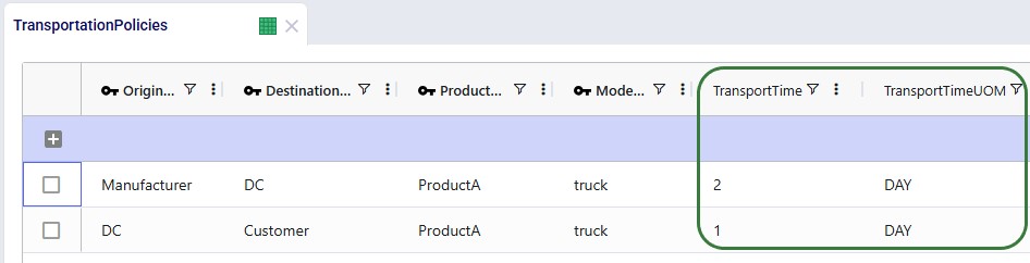
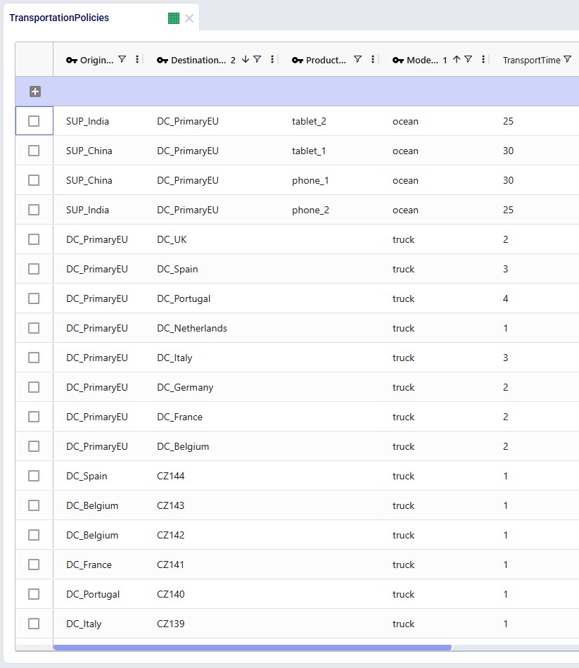
Transportation Policies
The following sets of transportation policies have been added:
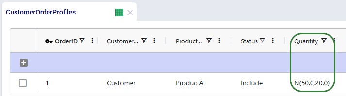
Customer Order Profiles
There are 2 sets of demand specified in the Customer Order Profiles table:
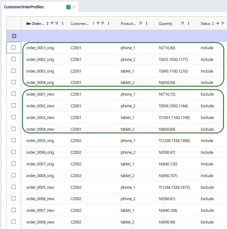
Not shown in the above screenshot: but the Time Between Orders for all these records is set to 7 days, so we are modeling weekly demand.
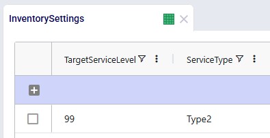
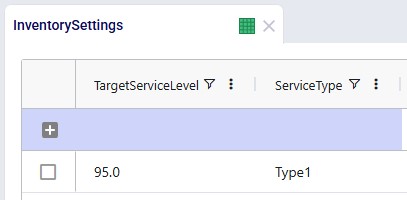
Inventory Settings
In this model, we have left the target service level and service type at their defaults of 95% and Type 1. The target service level will be varied in several scenarios. Note that it is not used in this model, but you can use the Inventory Policies Advanced table to specify product-location specific target service levels, which will override this global value.
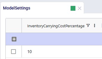
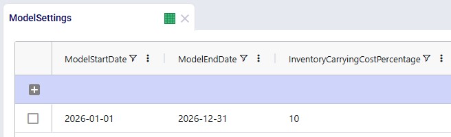
Model Settings
It is important to set an Inventory Carrying Cost Percentage in the Model Settings table to calculate safety stock holding costs. Here it is set to 10%. This global value can be overridden by specifying product-location specific values in the Inventory Policies table.
The following scenarios are included in the template model, from top to bottom:
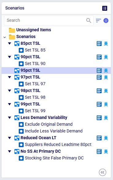
Target Service Level Scenarios
First, we will have a look at the 6 target service level scenarios, for which the outputs in the Inventory Network Summary output table are shown in ascending order of service level:
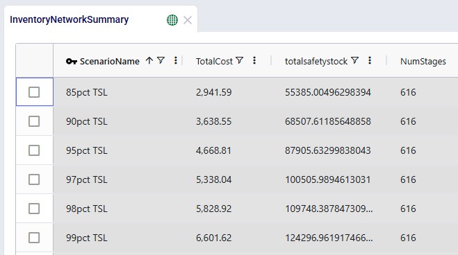
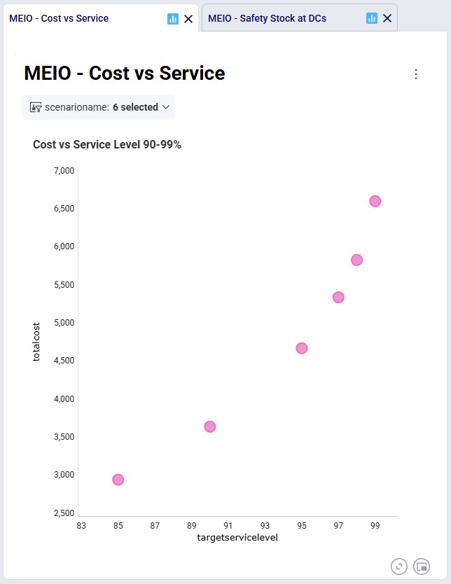
As we expect, the higher the required service level, the more safety stock the network needs to hold, which also leads to increased safety stock holding costs. In the “MEIO – Cost vs Service” dashboard in the Analytics module, we can clearly see that as the service level is being pushed closer to 99%, the cost curve becomes steeper:
Other Scenarios
Now, we will compare the 95% target service level with the other scenarios that were run, which each also require a 95% service level. Starting with the Inventory Network Summary output table again:
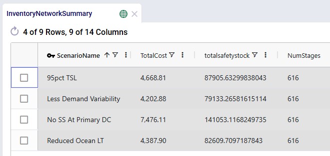
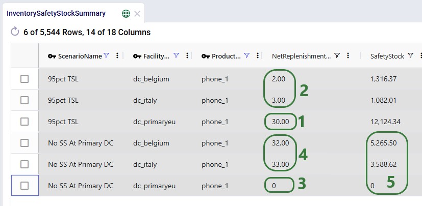
Comparing each scenario with the 95pct TSL baseline scenario, from top to bottom:
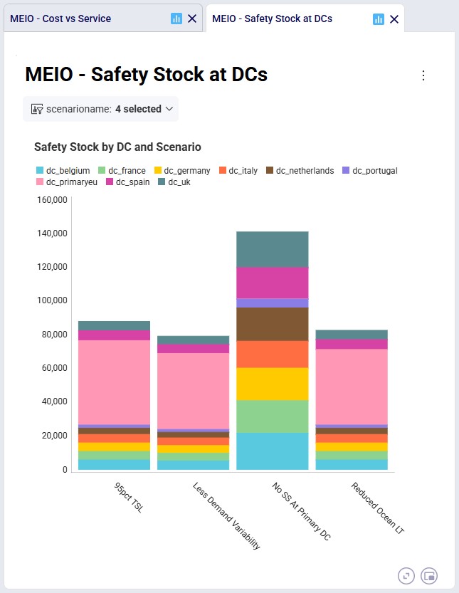
The “MEIO – Safety Stock at DCs” dashboard also shows the safety stock as a stacked column for these 4 scenarios, where the colors indicate the contribution of the total safety stock from each DC. Again, we see that the “Less Demand Variability” and “Reduced Ocean LT” scenarios have overall less safety stock across all DCs as compared to the “95pct TSL” scenario. In the “No SS At Primary DC” scenario, the large pink bucket that represents the safety stock at the primary DC in the other scenarios is not there anymore and instead the other 8 DCs each hold a lot more safety stock than they did in the “95pct TSL” scenario.
Lastly, we use the Inventory Safety Stock Summary output table to compare the safety stock for 2 secondary DCs and the primary DC for the “95pct TSL” and “No SS At Primary DC” scenarios:
Cyclo brings advanced Multi Echelon Inventory Optimization capabilities into Cosmic Frog.
By optimizing service-time commitments and safety stock placement across the entire supply chain network, Cyclo helps organizations:
Cyclo is especially valuable for organizations operating complex, multi-stage supply chains where local safety stock decisions can create unintended network-wide impacts.
Please do not hesitate to contact our support team on Support@optilogic.com in case of any questions of feedback.
Finding problems with any Cosmic Frog model’s data has just become easier with the release of the Integrity Checker. This tool scans all tables or a selected table in a model and flags any records with potential issues. Field level checks to ensure fields contain the right type of data or a valid value from a drop-down list are included, as are referential integrity checks to ensure the consistency and validity of data relationships across the model’s input tables.
In this documentation we will first cover the Integrity Checker tool’s scope, how to run it, and how to review its results. Next, we will compare the Integrity Checker to other Cosmic Frog data validation tools, and we will wrap up with several tips & tricks to help users make optimal use of the tool.
The Integrity Checker extends cell validation and data entry helper capabilities to support users identify a range of issues relating to referential integrity and data types before running a model. The following types of data and referential integrity issues are being checked for when the Integrity Checker is run:
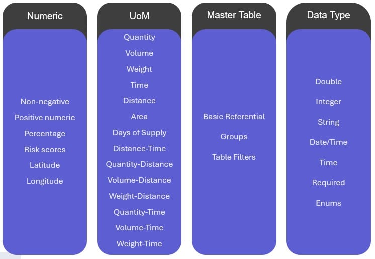
Here, we provide a high-level description for each of these 4 categories; in the appendix at the end of this help center article more details and examples for each type of check are given. From left to right:
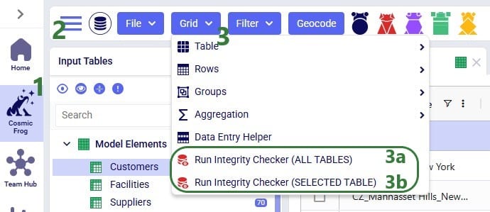
The Integrity Checker can be accessed in two ways while in Cosmic Frog’s Data module: from the pane on the right-hand side that also contains Model Assistant and Scenario Errors or from the Grid drop-down menu. The latter is shown in the next screenshot:
*Please note that in this first version of the Integrity Checker, the Inventory Policies and Inventory Policies Multi-Time Period tables are not included in any checks the Integrity Checker performs. All other tables are.
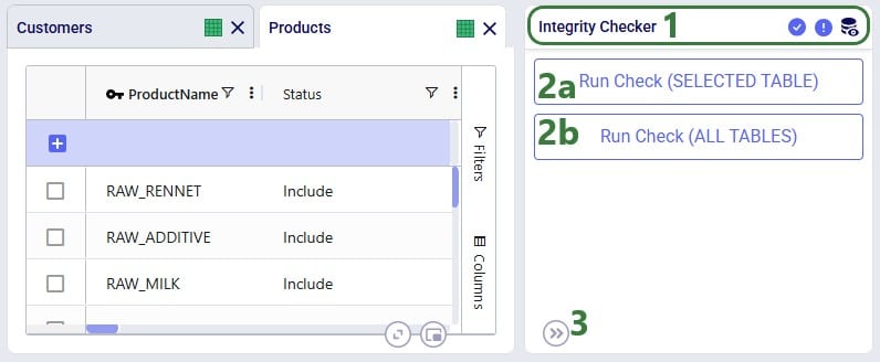
The second way to access the Integrity Checker is, as mentioned above, from the pane on the right-hand side in Cosmic Frog:
If the Integrity Checker has been run previously on a model, opening it again will show the previous results and gives user the option to re-run it by clicking on a “Rerun Check” button which we will see in screenshots further below.
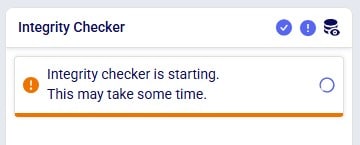
After starting the Integrity Checker in one of the 2 ways described above, a message indicating it is starting will appear in the Integrity Checker pane on the right-hand side:
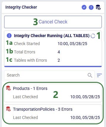
While the Integrity Checker is running, the status of the run will be continuously updated, while results will be added underneath as checks on individual tables complete. Only tables which have errors in them will be listed in the results.
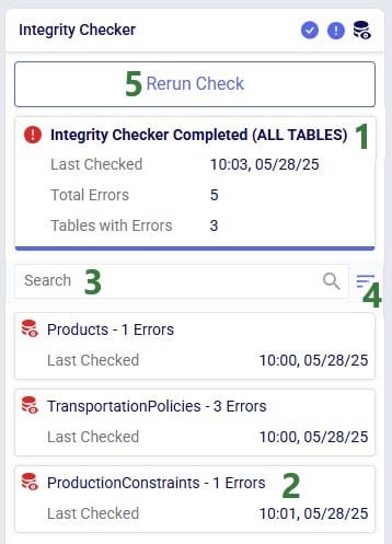
Once the Integrity Checker run is finished, its status changes to Completed:
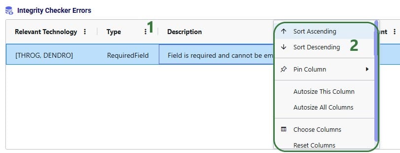
Users can see the errors identified by the Integrity Checker by clicking on one of the table cards which will open the table and the Integrity Checker Errors table beneath it:
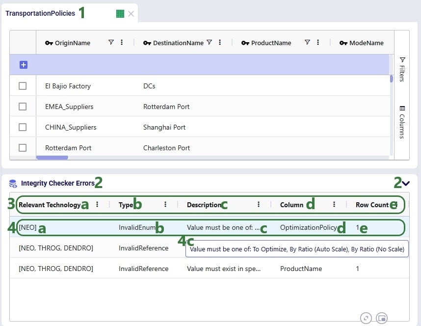
Clicking on a record in the Integrity Checker Errors table will filter the table above (here the Transportation Policies table) down to the record(s) with that error:
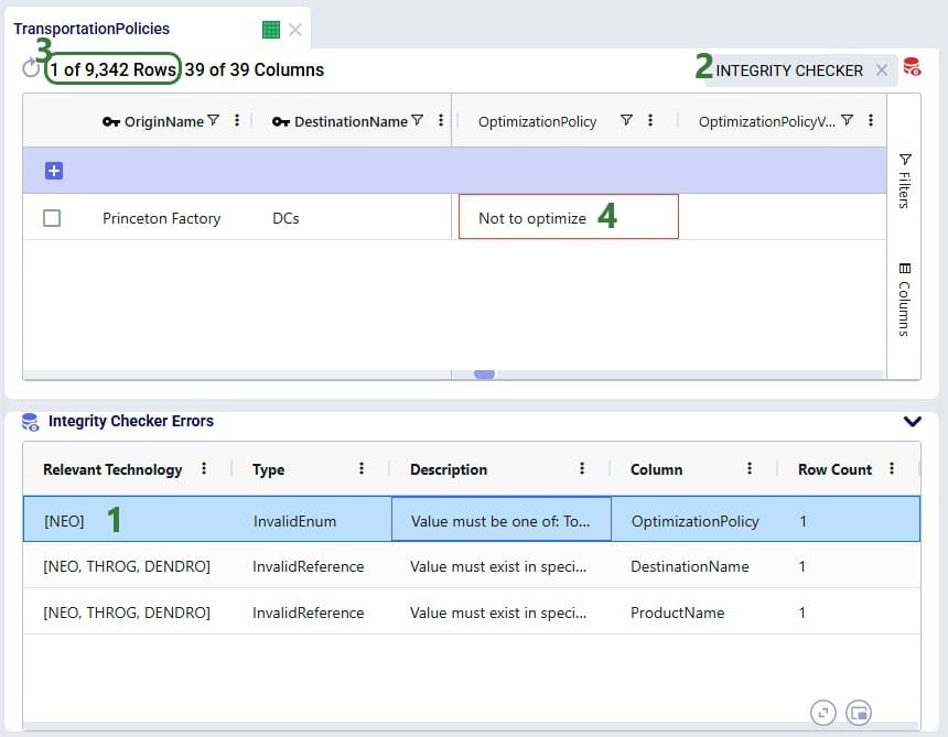
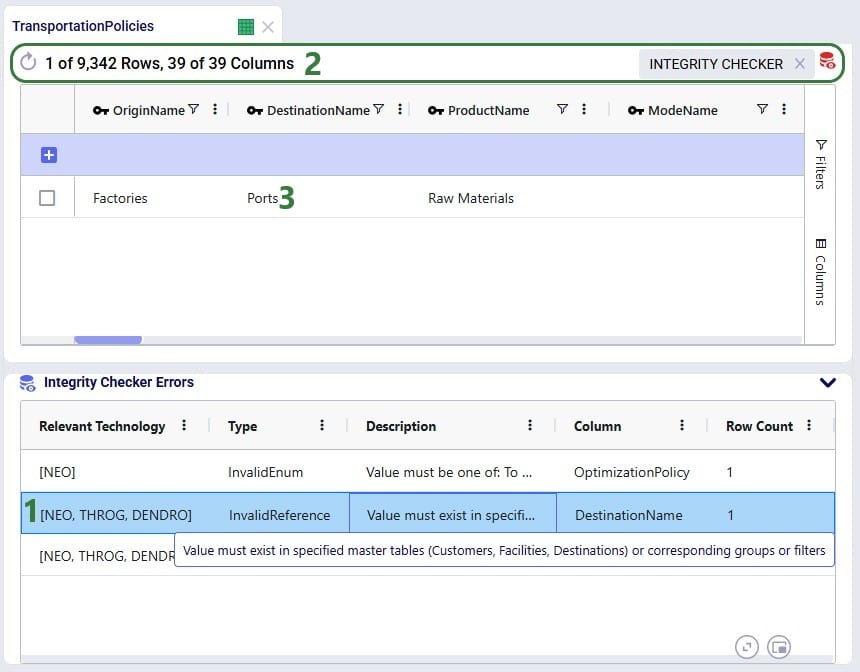
User can go through each record in the Integrity Checker Errors table at the bottom and filter out the associated records with the errors in the table above to review the errors and possibly fix them. In the next screenshot, user has moved onto the second record in the Integrity Checker Errors table:
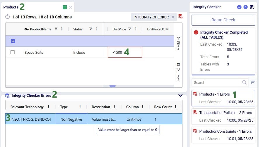
We will look at one more error, the one that was found on the Products table:
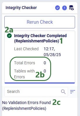
Finally, the following screenshot shows what it looks like when the Integrity Checker was run on an individual table and in the case no errors are found:
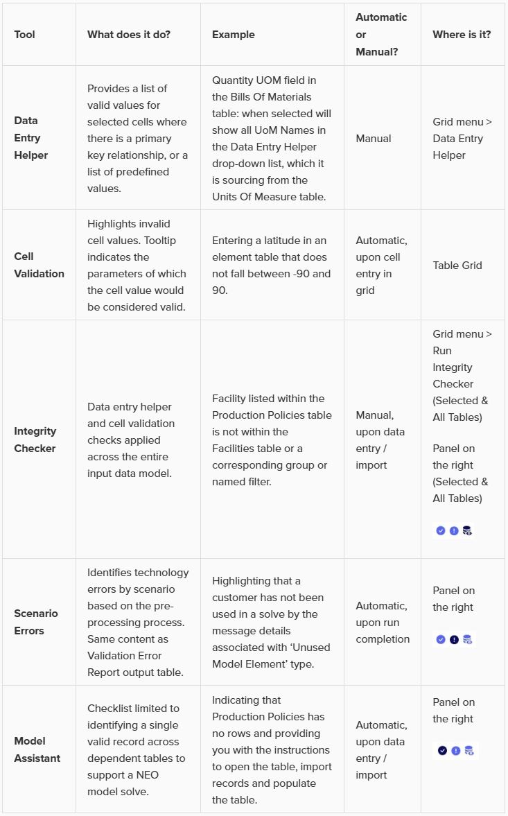
There are additional tools in Cosmic Frog which can help with finding problems in the model’s data and overall construction, the table below gives an overview of how these tools compare to each other to help users choose the most suitable one for their situation:
Please take note of the following so you can make optimal use of the Integrity Checker capabilities:
We saw the next diagram further above in the Integrity Checker Scope section. Here we will expand on each of these categories and provide examples.
From left to right:
Note that the numeric and data type checks sound similar, but they are different: a value in a field can pass the data type check (e.g. a double field contains the value -2000), but not the numeric check (a latitude field can only contain values between -90 and 90, so -2000 would be invalid).
We hope you will find the Integrity Checker to be a helpful additional tool to facilitate your model building in Cosmic Frog! For any questions, please contact Optilogic support on support@optilogic.com.
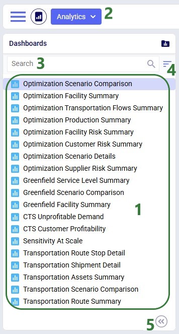
Once you have run a model, you can visualize your results using the Analytics module. A dashboard in the Analytics module is a collection of visualizations. Visualizations can take on many forms, such as charts, tables or maps.
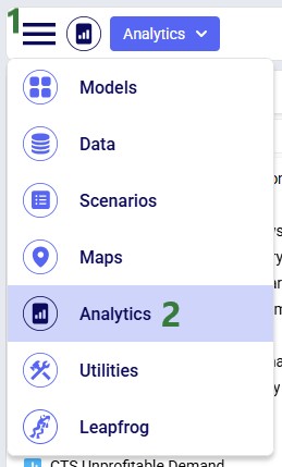
To access the Analytics module:
Once in the Analytics module, the left-hand side panel looks as follows:
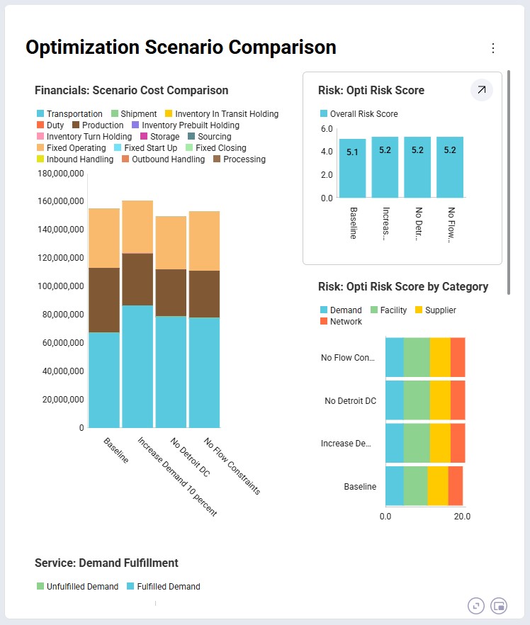
When opening a dashboard it is shown in the central part of Cosmic Frog. This is the default Optimization Scenario Comparison dashboard shown for the Global Supply Chain Strategy model, which highlights some common analytics and metrics:
Many dashboards are designed to be interacted with through a set of filters, like for example the Optimization Transportation Flows one (also shown for the Global Supply Chain Strategy model):
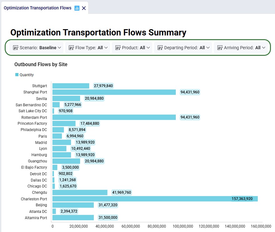
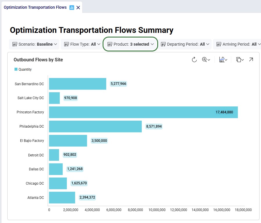
In the screenshot directly above, the dashboard is shown for all products in the model, which includes raw materials and finished goods. Filtering for just the finished goods changes the shown chart on this dashboard as follows:
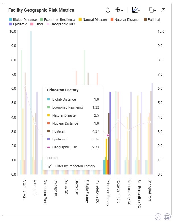
We can hover over visualization elements to get more information, which will be shown in a tooltip. Here, we show the information for one of the facilities, Princeton Factory, in a chart named Facility Geographic Risk Metrics, which is part of the Optimization Facility Risk Summary dashboard. This is again in the Global Supply Chain Strategy model:
The Analytics drop-down menu at the top of the module contains the following options:
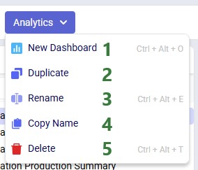
The context menu that comes up when right-clicking on a dashboard in the list has all the same options, except for the New Dashboard one:
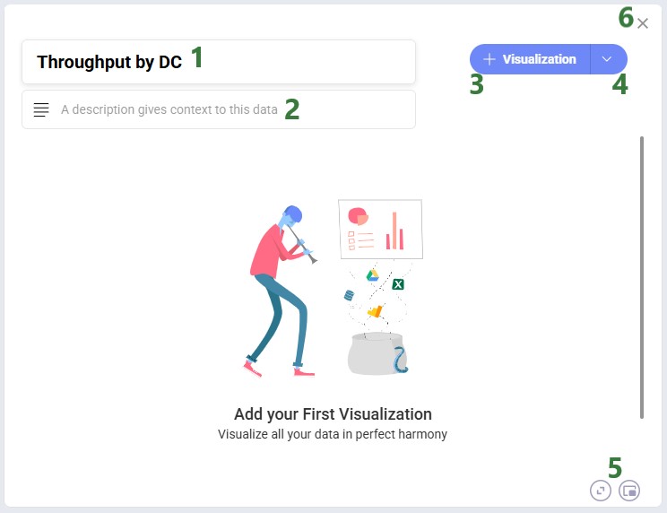
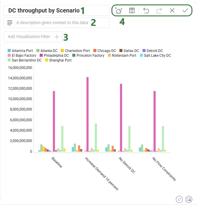
After you click on New Dashboard in the Analytics menu, the central part of Cosmic Frog will look as follows:
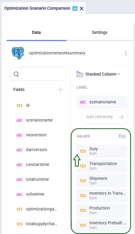
After clicking on the + Visualization button, first we need to choose the source data we will use for the visualization:
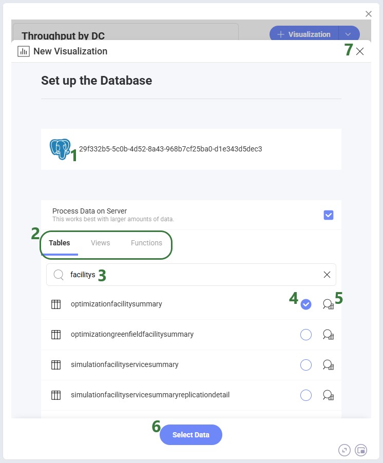
The form now looks similar to the following screenshot, where on the left-hand side the visualization can be configured and on the right-hand side the chart will be shown as it is being built:
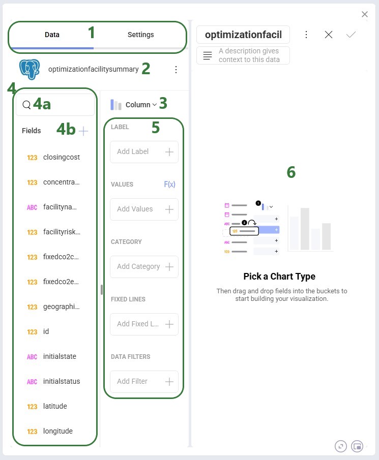
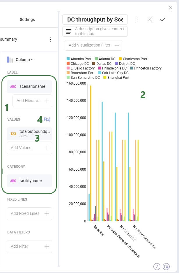
After dragging the fields we want on top of the Label, Values, and Category areas, our visualization configuration area looks as follows:
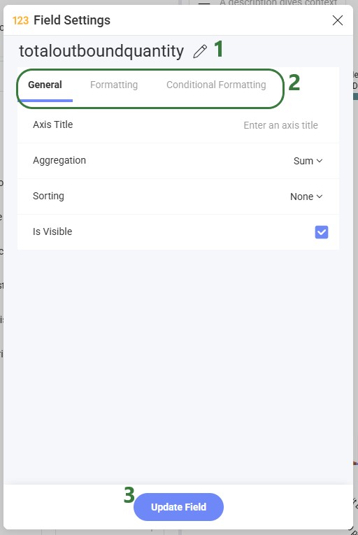
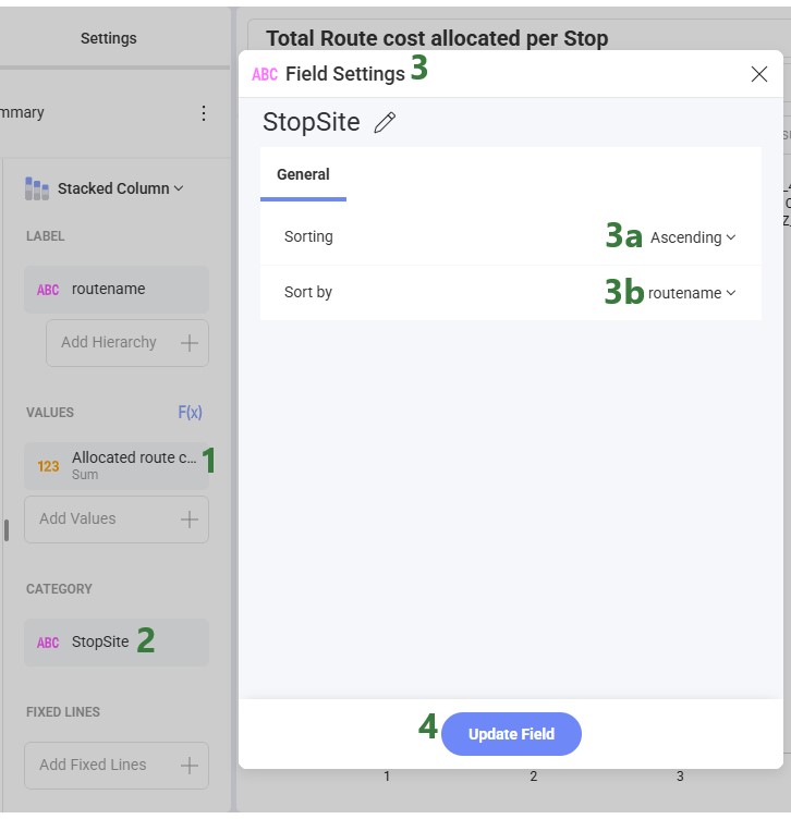
Clicking on a field in any of the configuration areas (bullet 3 above) brings up the Field Settings form:
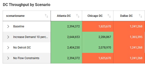
The following screenshot shows an example of using conditional formatting in a grid visualization, where the background color for values less than 2M is orange and over 2M green:
While the chart is being configured, its current state is shown on the right-hand side where several additional settings and options are available to the user:
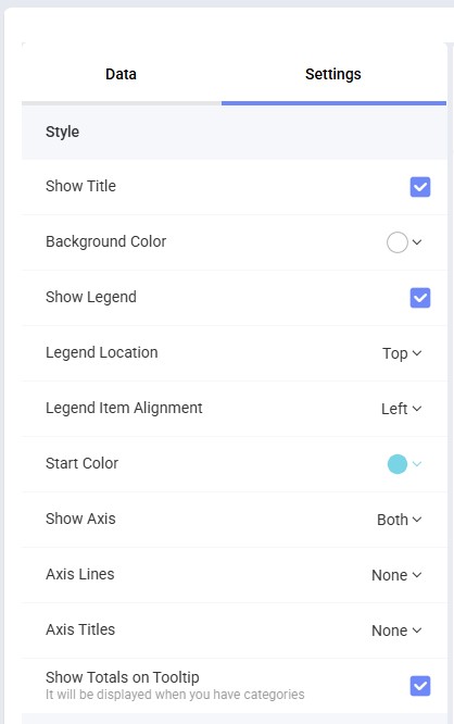
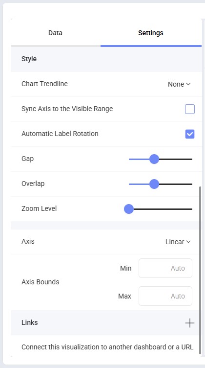
The chart configuration options available to the user under the Settings tab are shown in the next 2 screenshots; these specify what is shown on the chart and the formatting of the different chart items:
Once you are happy with the visualization, click on the Save checkmark icon to save it and close the editor for this visualization. This will bring you back to the dashboard:
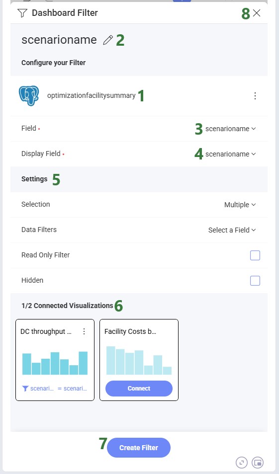
When you choose a Dashboard Filter, you are first prompted to choose your data source (a table, view or function) in the same way as selecting the source data for a visualization. After selecting your source, the Dashboard Filter form is shown:
Creating a Date Filter works as follows:
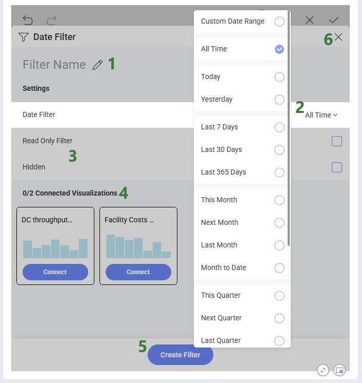
Note that after a Date Filter has been added to the dashboard, users can still switch between different timeframes when using the filter; this is not fixed at the time of Date Filter configuration.
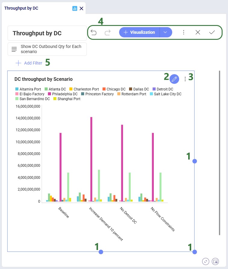
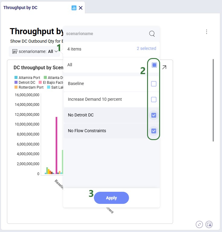
After a filter has been created, it is accessible in the top part of the dashboard, underneath the dashboard's description. Here we have added a filter for scenario name:
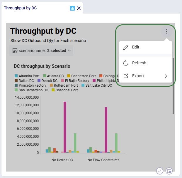
We can customize existing dashboards to fit our needs. Click on the icon with 3 vertical dots to bring up the options to Edit, Refresh, and Export (Image, PowerPoint, PDF, or Excel) the current dashboard. If previously a visualization was copied to the Clipboard, a Paste option will be available here too:
Please see the sections above on adding and configuring visualizations and dashboards which apply here in the same way.
If bars are not showing in a chart this is likely due to the first column having no value or its value being 0. To resolve:
As always, please reach out to our Support team at support@optilogic.com in case of any questions or feedback.
To learn all about dashboards and visualizations within Cosmic Frog, please refer to the Getting Started with Analytics help center article, which contains the latest information.
Watch the video to learn how to build dashboards to analyze scenarios and tell the stories behind your Cosmic Frog models. You can also refer to the Getting Started with Analytics help center article, which contains the latest information as of July 2026 in text + screenshot format.
Cosmic Frog users can now perform additional quick analyses on their supply chain models’ input and output data through Cosmic Frog’s new grid features. This functionality enables users to easily apply different types of grouping and aggregation to their data, while also allowing users to view their data in a pivoted format. Think for example of the following use cases:
In this documentation we will cover how grids can be configured to use these new features, show several additional examples, and conclude with a few pointers for effective use of these features.
These new grid features can be accessed from the “Columns” section on the side bar on the right-hand side of input and output tables while in the Data module of Cosmic Frog:

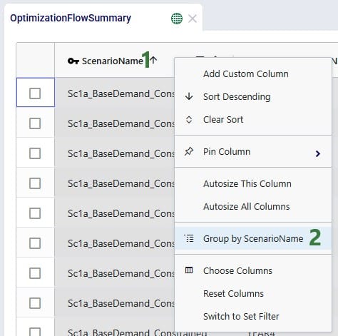
Alternatively, users can also start grouping and subsequently aggregating by right clicking on the column names in the table grid:
We will first cover Row Grouping, then Aggregated Table Mode, and finally Pivot Mode.
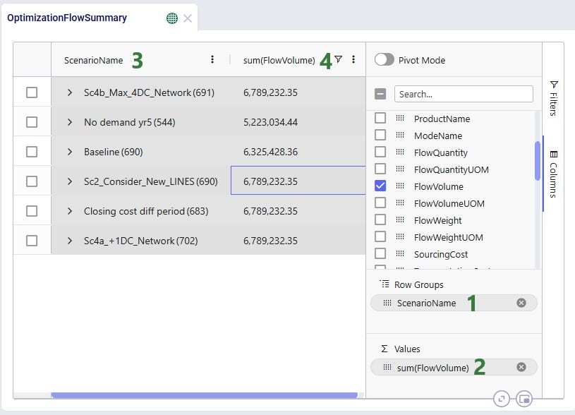
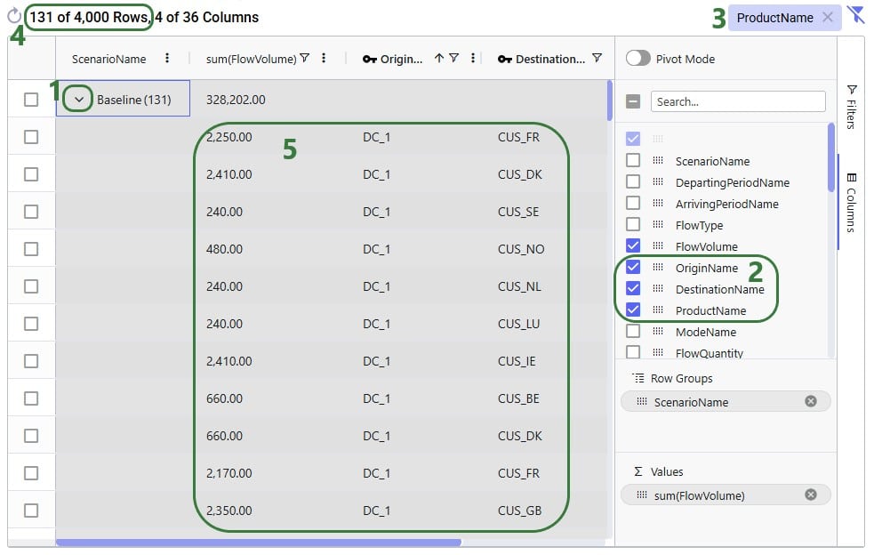
Using the row grouping functionality allows users to select 1 or multiple columns of an input or output table by which all records in the table will be grouped. These groups of records can be collapsed and expanded as desired to review the data. In the following screenshot the row grouping feature is used to compare the sources of a certain finished good in a particular period for 1 scenario:
When clicking on Columns on the right hand-side of the table to open the row grouping / aggregated table / pivot grid configuration pane shows the configuration for this row grouping:

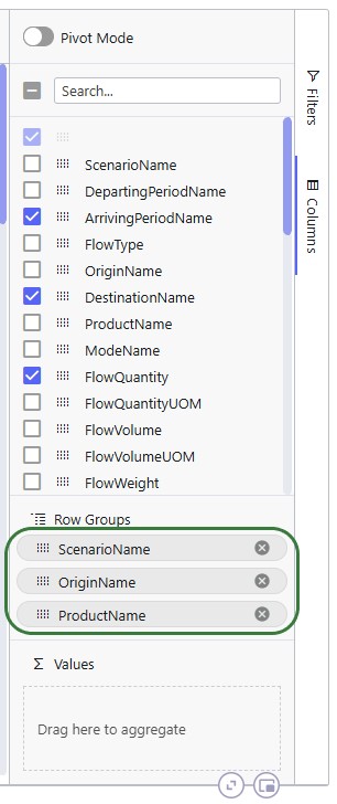
The above example showed grouping the rows by 1 column, this next example shows the same table, but now the rows are grouped by 3 columns. Note that you can change the order of the Row Groups by clicking on a column header and dragging it up or down.
The table then looks as follows:
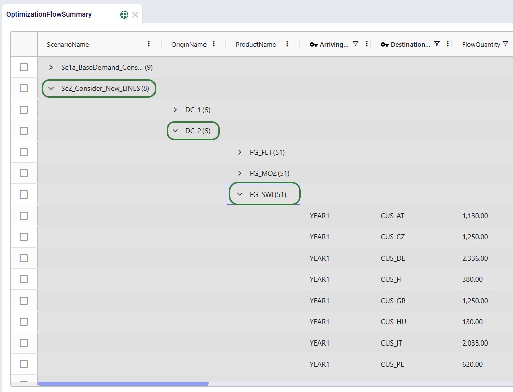
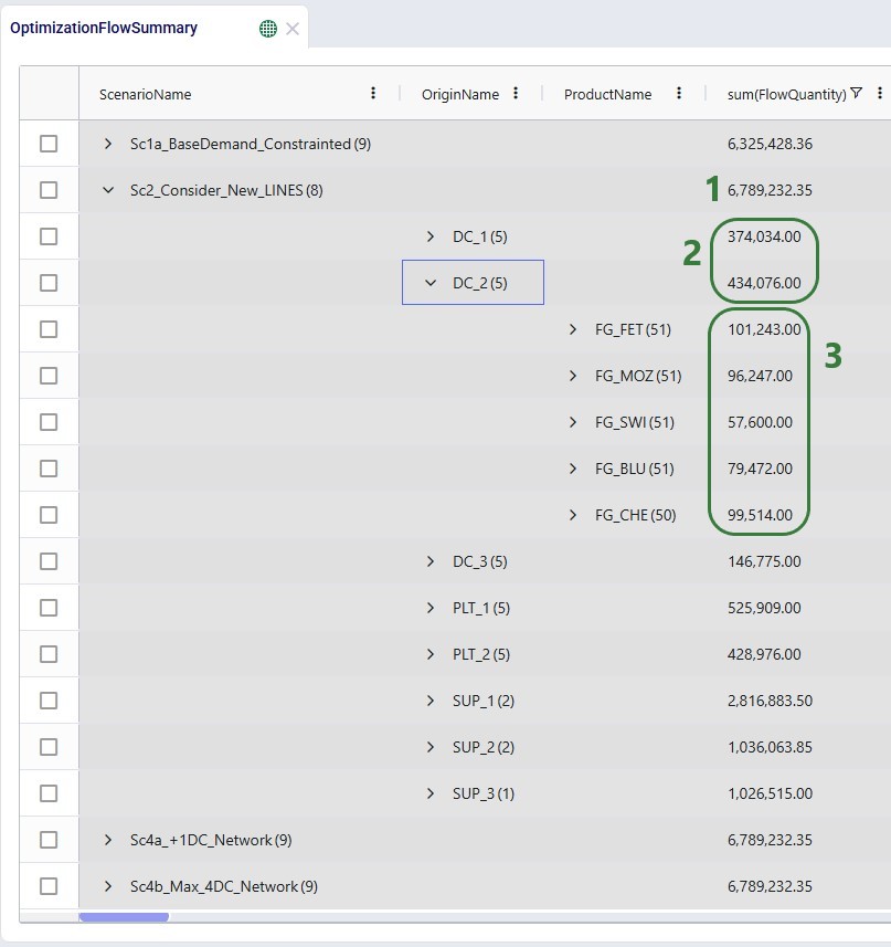
The number in parenthesis indicates how many unique values there are for the next row group:
Once a table is grouped by one or more fields, a next step can be to aggregate one or multiple columns by this/these grouped field(s). When this is done, we call this aggregated table mode. Different types of aggregation are available to the user, which will be discussed in this section.
When configuring the grid through the configuration panel that comes up when clicking on Columns on the right-hand side of input & output tables, several options are available to help users find field names quickly and turn multiple on/off simultaneously:
To configure the grid, fields can be dragged and dropped:

Alternatively, instead of dragging and dropping, users can also right-click on the field(s) of interest to add them to the configuration areas. This can be done both in the list with column names at the top of the configuration window as shown in the following screenshot, but also on the column names in the grid itself (which we have seen an example of in the “How to Access the New Grid Features” section above):

In the screenshot above (taken with Pivot Mode on which is why the Column Labels area is also visible), the user right-clicked on the Flow Volume field and now they can choose to add it to the Row Groups area (“Group by FlowVolume”), to the ∑ Values area (“Add FlowVolume to values”), or to the Column Labels area (“Add FlowVolume to labels”).
The next screenshot shows the result of a configured aggregated table grid:
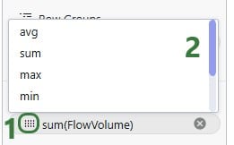
When adding numeric fields to the ∑ Values area, the following aggregation options are available to the user:
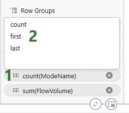
For non-numeric fields, only the last 3 options are available as aggregations:
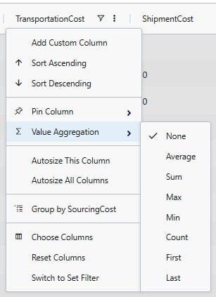
When adding an aggregation field through right-clicking on a field name in the grid, it looks as follows. The user right-clicked on a numerical field, Transportation Cost, here:
When filters are applied to the table, these are still applied when the table is being grouped by rows, aggregated, or pivoted:

It was mentioned above that the number in parentheses after the scenario name represents the number of rows that the aggregation was applied to. We can expand this by clicking on the greater than (>) icon to view the individual rows that make up the aggregation:
Next is an aggregated table mode example where more than 1 Row Group is used. Here, the Flow Quantity on the Optimization Flow Summary table is summed by scenario, origin, and product:
The resulting table:
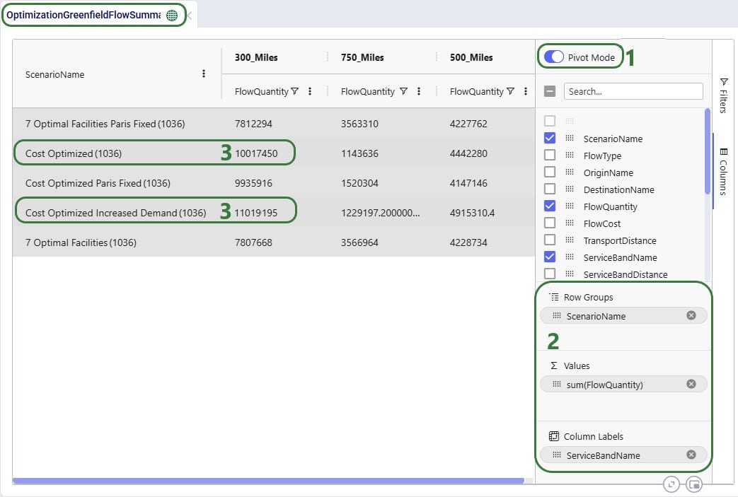
When users turn on pivot mode, an extra configuration area named Column Labels becomes available in addition to the Row Groups and ∑ Values areas:
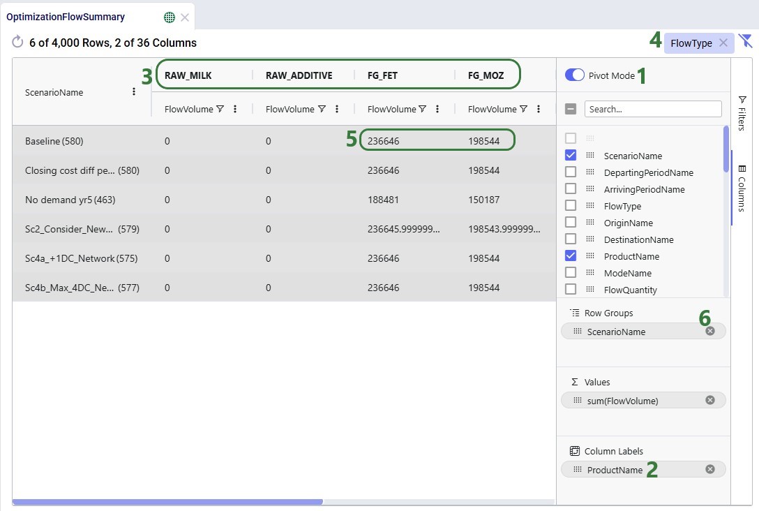
Another example to show the total volumes of different flow types, filtered for finished goods, by scenario is shown in the next screenshot:

So far, we have only looked at using the new grid features on the Optimization Flow Summary output table. Here, we will show some additional examples on different input and output tables.
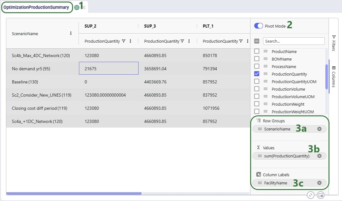
In this first additional example, a pivot grid is configured to show the total production quantity for each facility by scenario:
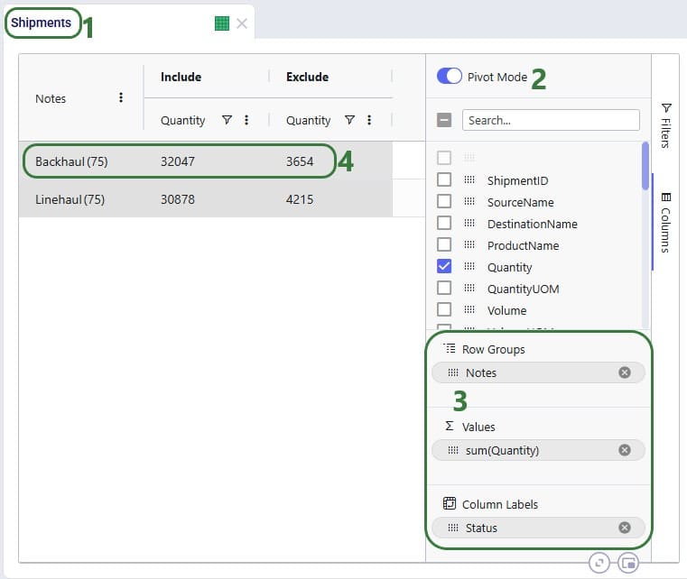
In the next example, we will show how to configure a pivot grid to do a quick check on the shipment quantities: how much the backhaul vs linehaul quantity is and how much of each is set to Include vs Exclude:
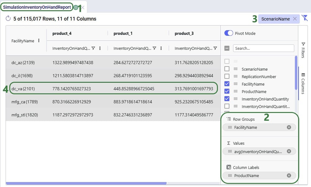
In the following 2 examples, we are doing some quick analysis on the Simulation Inventory On Hand Report, a simulation (Throg) output table containing granular details on the inventory levels by location and product over time. In the first of these 2 examples, we want to see the average inventory by location and product for a specific scenario:
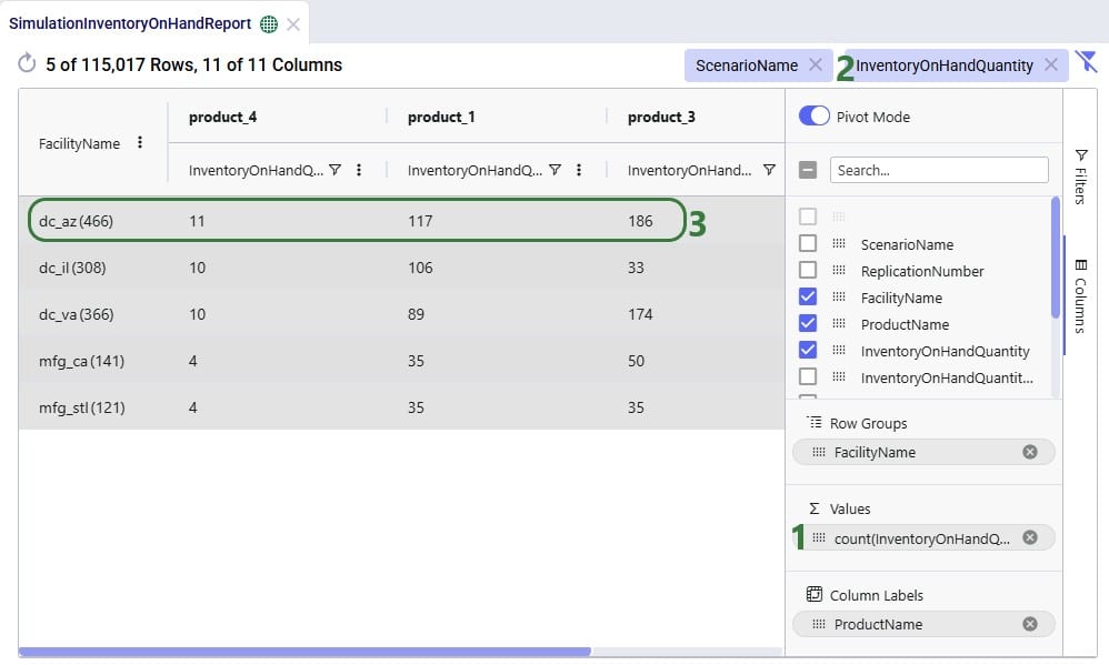
In the next example, we want to see how often products stock out at the different facilities in the Baseline scenario:
The last 2 examples in this section show 2 different views of Greenfield (Triad) outputs. The first example shows the average transport distance and time by scenario:
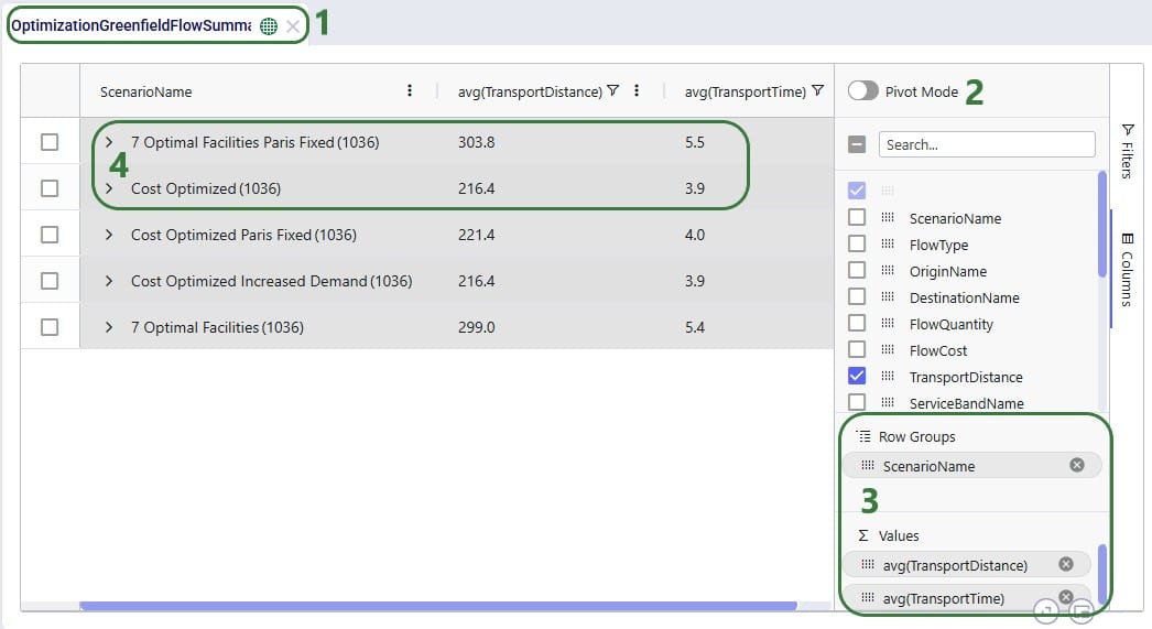
Lastly, we want to look, by scenario, how much of the quantity delivered to customers falls in the 300 miles, 500 miles, and 750 miles service bands:
Please take note of following to make working with Row Grouping, Aggregated Table Grids and Pivot Grids as effective as possible:
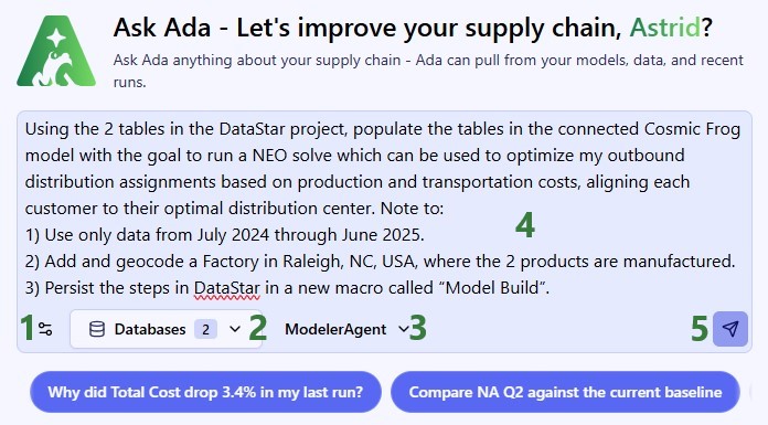
In this quick start guide we will walk through how you can build a DataStar macro for repeatable Cosmic Frog model building, where data needs to be refreshed periodically, through chatting with Ada.
When using Ada to have the Modeler Agent create a model, it is a non-deterministic process where you may not get the same results every time. Once you are happy with the model you have built using Ada, you want to be able to repeat those steps every time in a reliable, performant, deterministic fashion. That is the value of being able to persist the process in DataStar.
It is helpful to be familiar with the contents of the following Help Center articles prior to diving into this quick start:
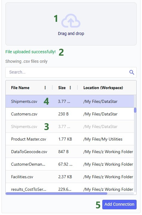
This quick start guide uses a historical shipments file that was also used in the Importing a CSV File quick start guide. In addition, we will create a second data connection for a basic costs file and import that one into the Project Sandbox too. We then use the data in those 2 files to populate tables of an initially empty Cosmic Frog model with the aim to run a Neo solve. Finally, the steps to populate this model are automatically captured in a DataStar macro to create a repeatable model build workflow. In summary the steps are:
We will cover what is contained in the 2 CSV files and steps 1-3 in this section.
The next 2 screenshots show the structure of the data in the 2 CSV files used in this quick start.
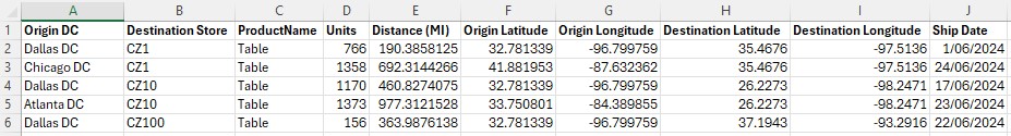
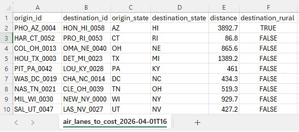
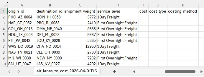
Of the Historical_Shipments.csv file, the first 5 of a total of 42,656 records are shown. The Ship Dates range from May 2024 through August 2025:
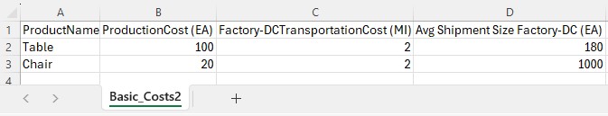
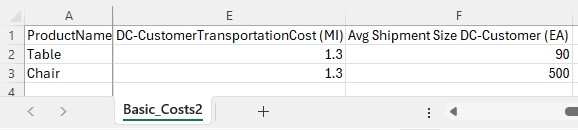
The next 2 screenshots show all data contained in the Basic_Costs.csv file:
Now, we move on to chatting with Ada in the next generation Optilogic platform at https://ai.optilogic.app. Here, we will walk-through an initial prompt and the back and forth that follows. Note that you can get different responses and clarifying questions from Ada, even with the same starting data and initial prompt.
We first connect the DataStar project and empty Cosmic Frog model in the Databases drop-down selector, and then submit our prompt:
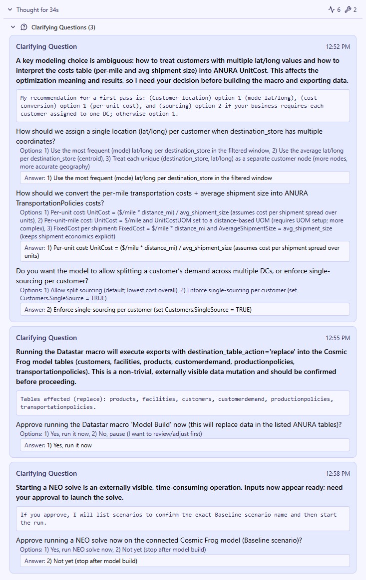
Ada comes back with three consecutive clarifying questions, 1 on model configuration decisions and 2 to approve running the DataStar macro and a Neo solve on the Cosmic Frog model. You can see the questions and the user’s responses in this screenshot:
Ada’s response is then as follows:
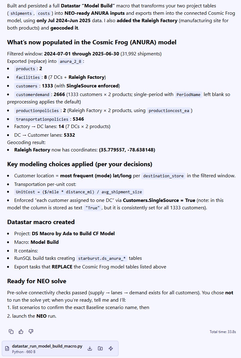
So, this achieved what we set out to do in the prompt. We did not yet run the Neo solve as we first want to examine the Cosmic Frog model and DataStar macro.
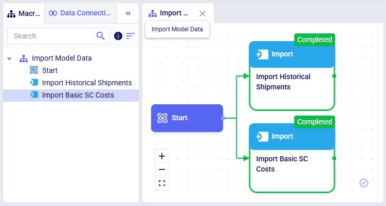
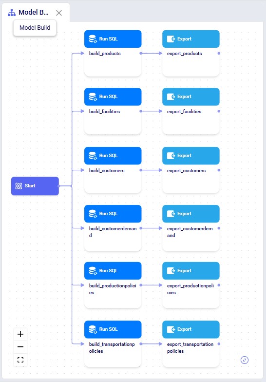
In DataStar, we see that in addition to the macro that imports the data from the 2 CSV files, there is now a Model Build macro present too. Note that you may need to refresh your browser to see the new macro in case the project was still open from before. You can click on any task to select it and inspect its configuration which comes up on the right-hand side.
Opening the model in Cosmic Frog, we see that the expected tables are populated. Here, the Facilities table is shown with the 7 DCs and 1 (geocoded) Factory, as we requested:
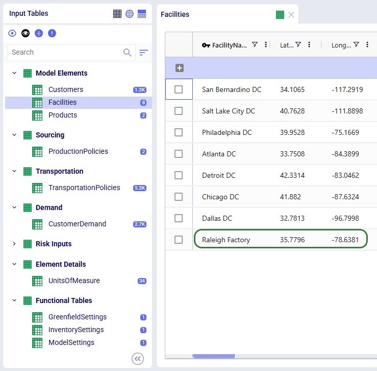
All tables look good, except:
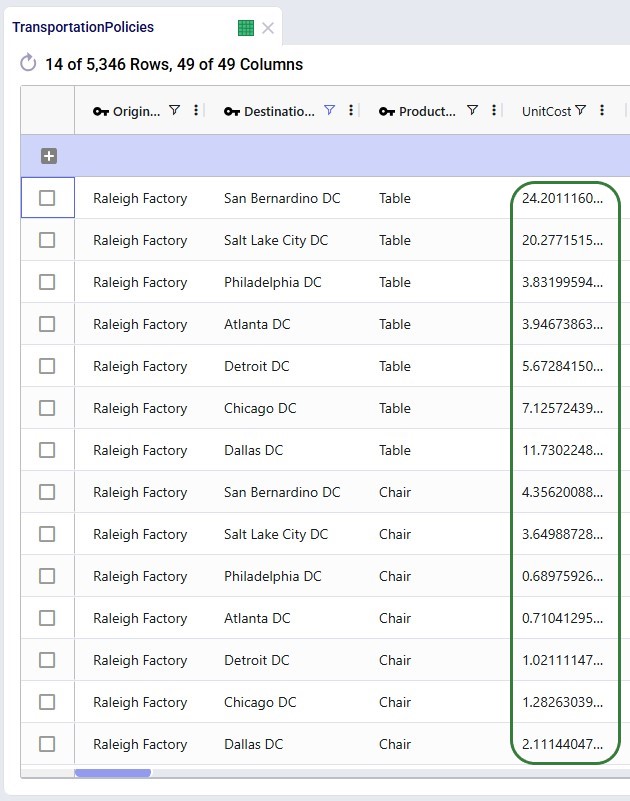
To understand the distance calculation and correct the model horizon, we continue our conversation with Ada:
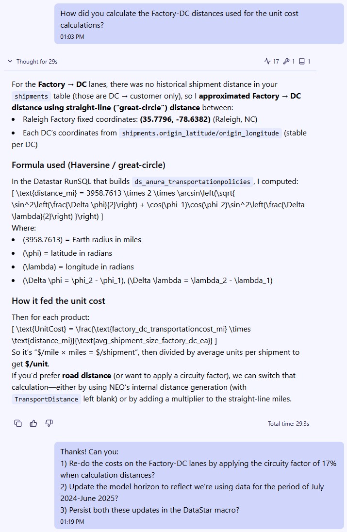
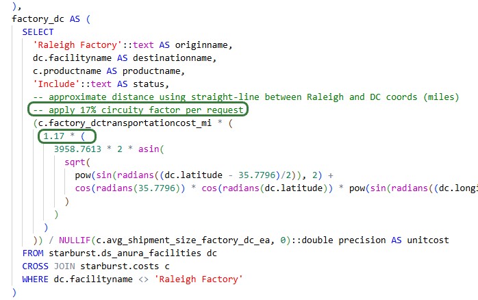
As a result of the last prompt Ada updates the build_transportationpolicies Run SQL task in the Model Build macro, which we can see by opening its SQL Script:
In addition, she adds 2 tasks to the Model Build macro to take care of setting the model start and end date in the Model Settings table:
Double-checking the Cosmic Frog model to ensure the updated macro was run and results in the desired changes, we can see that the Unit Costs on the Factory-DC lanes have increased by 17% and that the Model Settings table now has Model Start Date and Model End Date set correctly.
Now we have created a repeatable, deterministic workflow in DataStar to build a basic Neo model from the 2 input files, which may be refreshed with newer data regularly.
To get an idea of the types of interactions you can have with Ada while working on DataStar projects, here are some example prompts to get you started:
As always, please do not hesitate to reach out to our Support team via support@optilogic.com in case of questions or feedback.
Please feel free to download the Cosmic Frog Python Library PDF file. Please note that this library requires Python 3.11.
You can also reference the video shown below that covers an overview on scripting within Cosmic Frog.
Thank you for using the most powerful supply chain design software in the galaxy (I mean, as far as we know).
To see the highlights of the software please watch the following video.
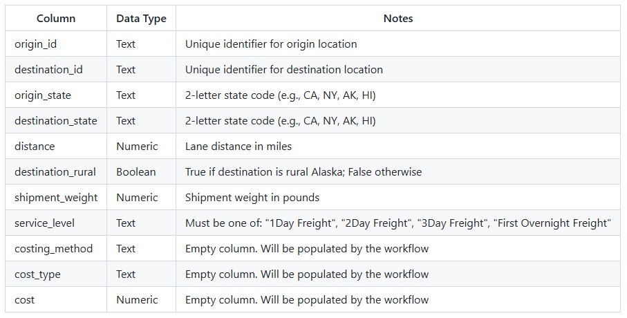
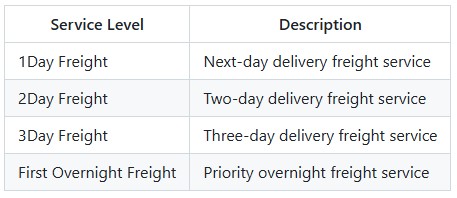
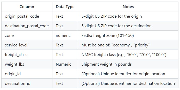
The Air Express Freight Costing utility solves the challenge of pricing air express freight shipments when carrier rate data is complex and varies by service level, distance, and weight. Rather than manually looking up rates in carrier tariff tables, this workflow automates the entire process using FedEx Express Freight standard list rates. The utility expects a lanes-to-cost table containing shipment details including origin, destination, distance, weight, and desired service level. After running the utility, users receive a fully costed table with calculated transportation costs.
The Air Express Freight Costing Utility is available on the Resource Library, from which you can download it or copy it to your Optilogic account. Learn more about the Resource Library in this How to use the Resource Library help center article.
Sample Data
System Utility
The steps to use this utility are as follows. These are illustrated with screenshots below.
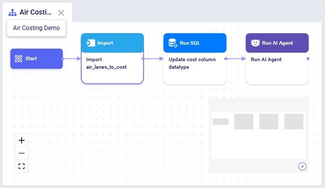
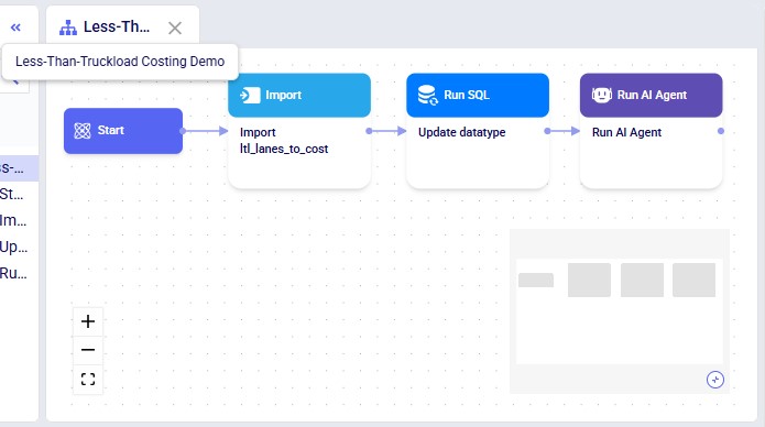
Screenshots of the steps where the project from the Resource Library is used (Copy to Account option), which creates the DataStar project including macro shown below in the user's account:
Key Constraints:
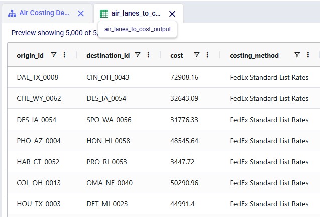
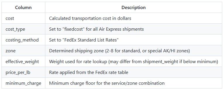
The utility produces an output table containing all lanes from the input with the following columns populated:
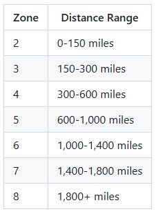
Zones are determined automatically based on the following priority:
Special Zones (for Alaska/Hawaii):
Standard Distance-Based Zones:
Costs are calculated using the following formula:
base_charge = shipment_weight x price_per_lb final_cost = MAX(base_charge, minimum_charge) Effective Weight: If the shipment weight is below the minimum weight for a service/zone combination, the utility uses the minimum weight band's rate but calculates the charge based on the actual shipment weight.
The Model Output Insights Agent helps users investigate and analyze Cosmic Frog model outputs by turning analytical questions into structured, data-backed strategic reports. It breaks down complex questions into a step-by-step exploration plan, executes targeted queries, synthesizes findings, and produces a professional report - complete with visualizations and actionable recommendations.
This documentation describes how this specific agent works and can be configured. Please see the “AI Agents: Architecture and Components” Help Center article if you are interested in understanding how the Optilogic AI Agents work at a detailed level.
Extracting meaningful insights from large databases typically requires exploring and analyzing many output tables which can take a lot of time and effort. The Model Output Insights Agent streamlines the process, helping users get to the insights quicker than ever before.
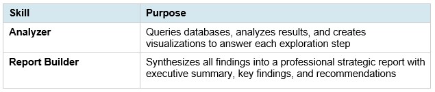
Main skills the Model Output Insights Agent uses:
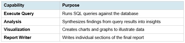
Supporting capabilities:
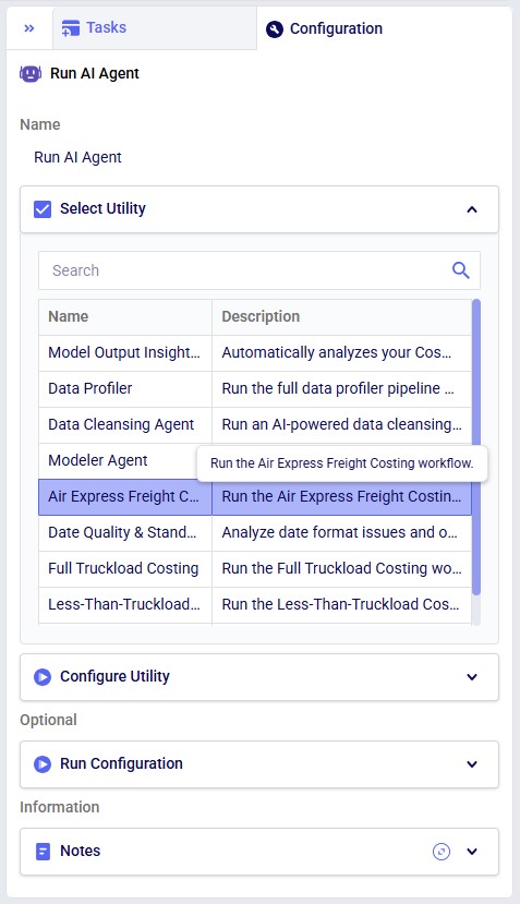
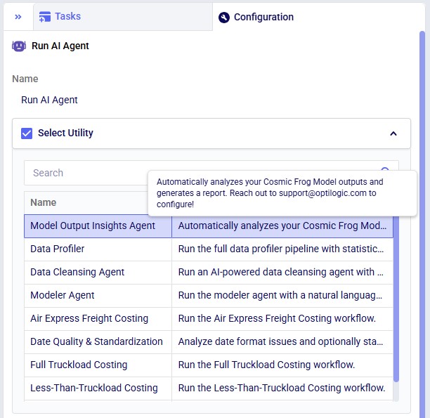
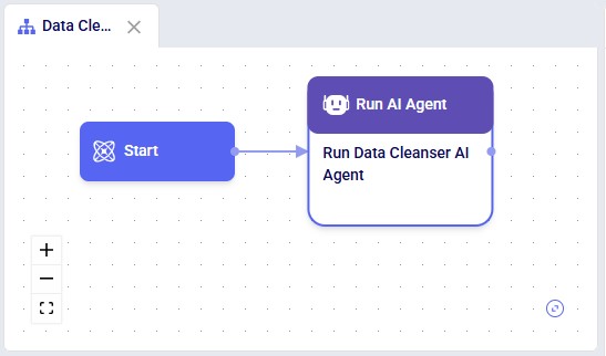
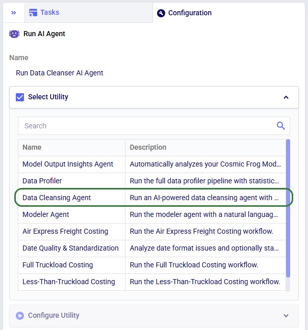
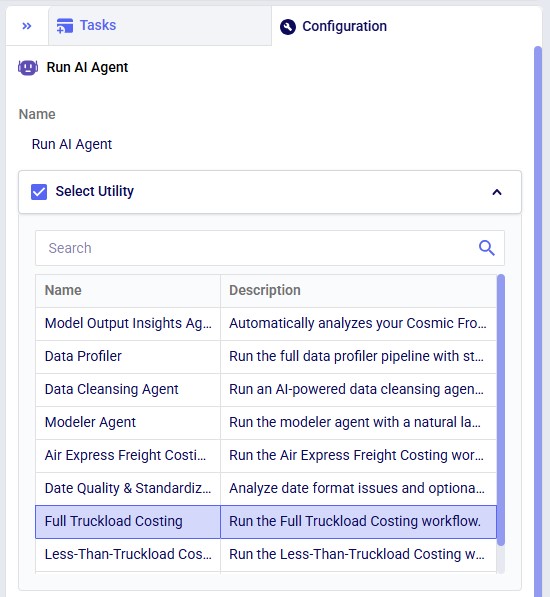
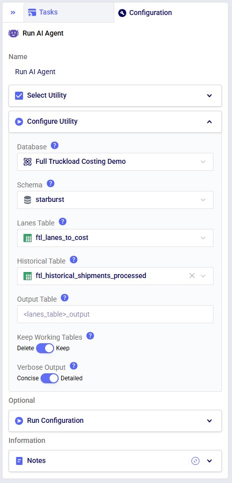
The agent can be accessed through the Run AI Agent task in DataStar. Once a Run AI Agent task is added to the macro, first the Model Output Insights Agent needs to be selected from the list of available agents and utilities in the "Select Utility" section:
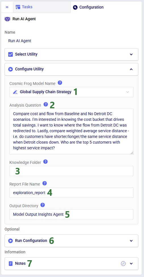
Next, the inputs and settings for the task can be specified in the Configure Utility, Run Configuration, and Notes sections:
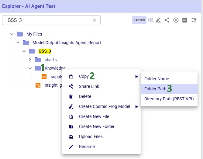
This next screenshot shows how to get a Folder Path while in the Explorer application: 1) right-click on the folder in the Explorer, 2) hover over Copy in the context menu, and 3) click on Folder Path:
After the run, a report in both markdown (.md) and pdf (.pdf) format and charts (if any) are created and can be found in the Explorer with the specified file name and folder. Once clicked, the file is opened in the Lightning Editor application for review.
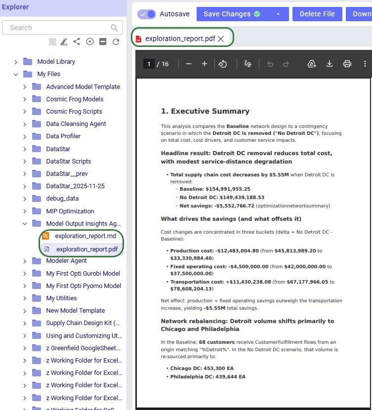
Note that currently the charts are only included in the markdown file as a file name. Users can look for the charts in the Charts folder in the targeted output directory.
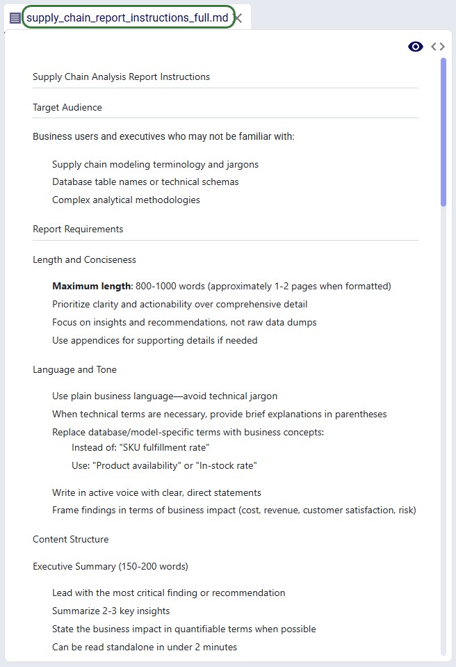
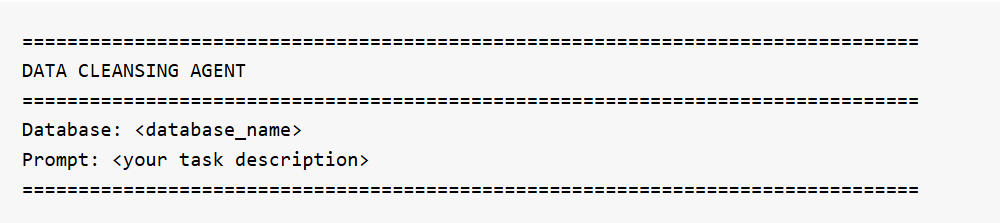
The Data Cleansing Agent is one of Ada’s AI-powered assistants. It helps users profile, clean, and standardize their database data without writing code. Users describe what they want in plain English -- such as "find and fix postal code issues in the customers table" or "standardize date formats in the orders table to ISO" -- and the agent autonomously discovers issues, creates safe working copies of the data, applies the appropriate fixes, and verifies the results. The agent handles common supply chain data problems including mixed date formats, inconsistent country codes, Excel-corrupted postal codes, missing values, outliers, and messy text fields. It expects a connected database with one or more tables as input. The output is a set of cleaned copies of their tables in the database which users can immediately use for Cosmic Frog model building, reporting, or further analysis, while the original data is preserved untouched for comparison or rollback.
This documentation describes how this specific agent works and can be configured, including walking through multiple examples. Please see the “AI Agents: Architecture and Components” Help Center article if you are interested in understanding how the Optilogic AI Agents work at a detailed level.
Cleaning and standardizing data for supply chain modeling typically requires significant manual effort -- writing SQL queries, inspecting column values, fixing formatting issues one at a time, and verifying results. The Data Cleansing Agent streamlines this process by turning a single natural language prompt into a full profiling, cleaning, and verification workflow.
Key Capabilities:
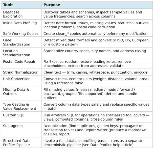
Tools:
The agent can be accessed on the next generation Optilogic platform by chatting with Ada and through the Run AI Agent task in DataStar. Both ways will be explained, via Ada first, then the DataStar workflow, followed by an overview of the main differences between the 2 methods.
It is recommended to be somewhat familiar with Ada before diving into this content. Please see the Getting Started with Ada & Agentic AI article, and in particular its How to Use Ada section.
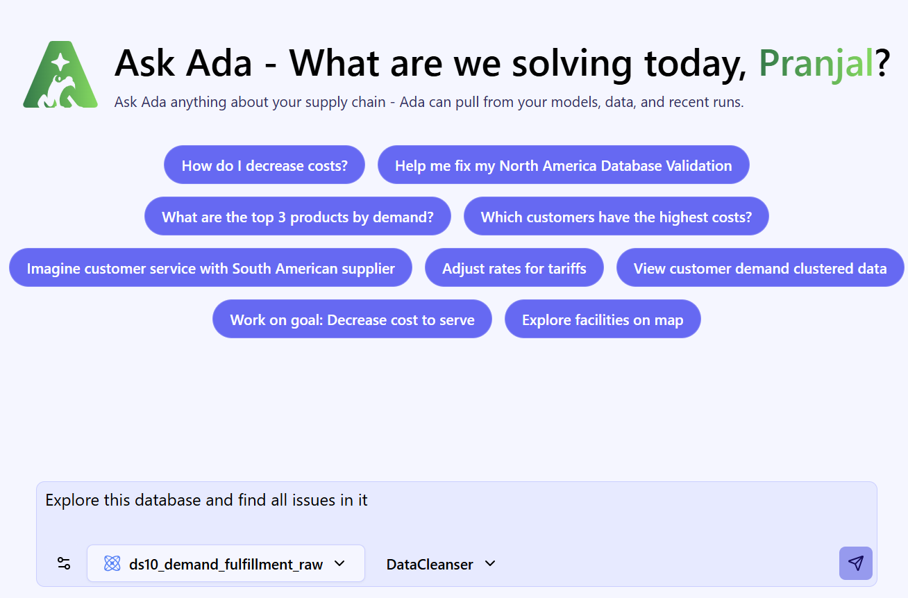
Once logged into the next-generation Optilogic platform at https://ai.optilogic.app, you can start chatting with Ada leveraging the Data Cleansing Agent right away from the central part of the Home page.
Regarding how to write good prompts, please note that the general Best Practices, Tips & Tricks, and Current Limitations and Known Behaviors included in the Getting Started with Ada documentation also apply to the Data Cleansing Agent.
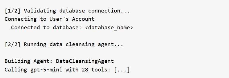
After submitting a prompt, the Data Cleansing Agent will start processing and formulating a response:
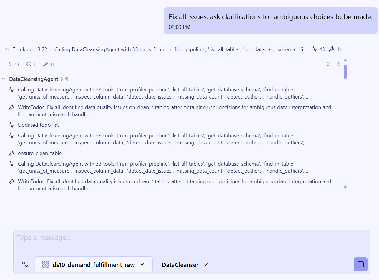
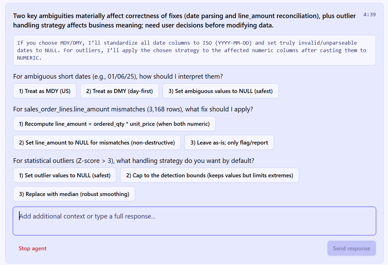
The Data Cleansing Agent may ask for feedback before proceeding — for example, when:
When Ada finishes, the final response is presented:
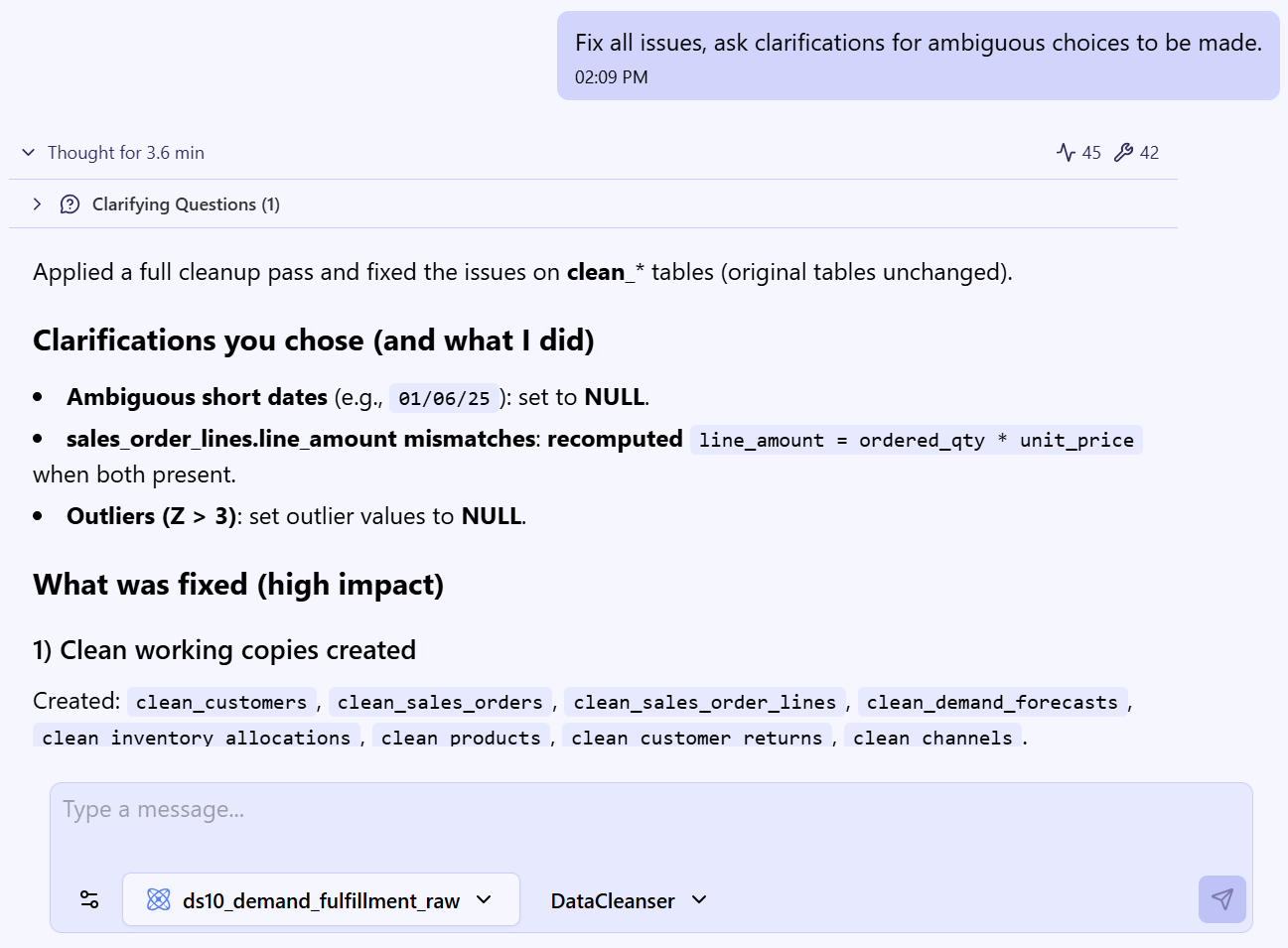
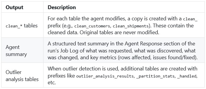
For completeness, the cleaned data shows up in the connected database as clean_* table copies — for example, clean_customers, clean_orders — with the originals preserved untouched for comparison or rollback:
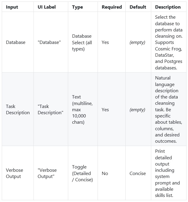
In DataStar, the Data Cleansing Agent is accessed by using a Run AI Agent task, see also the screenshots below. The key inputs are:
The Task Description field includes placeholder examples to help you get started:
Optionally, users can:
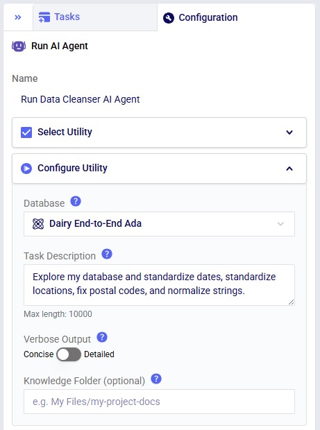
Not shown in the screenshots above, there is also a Run Configuration section, where users can add Tags to facilitate finding job runs, set a Timeout for the task, and set the Resource Size to use. Note that for most Run AI Agent tasks, the Resource Size will need to be set to XS or higher.
Suggested workflow:
After the run, the agent produces a structured summary of everything it did, including metrics on rows affected, issues found, and issues fixed; see the next section where this Job Log is described in more detail. The cleaned data is persisted as clean_* tables in the database (e.g., clean_customers, clean_shipments).
There are a few differences to keep in mind when running the Data Cleansing Agent either through chatting with Ada or from within DataStar:
Recommendation: Use the chat UI to develop and refine a prompt, then transfer the working prompt into a DataStar Run AI Agent task once you want the workflow to become repeatable.
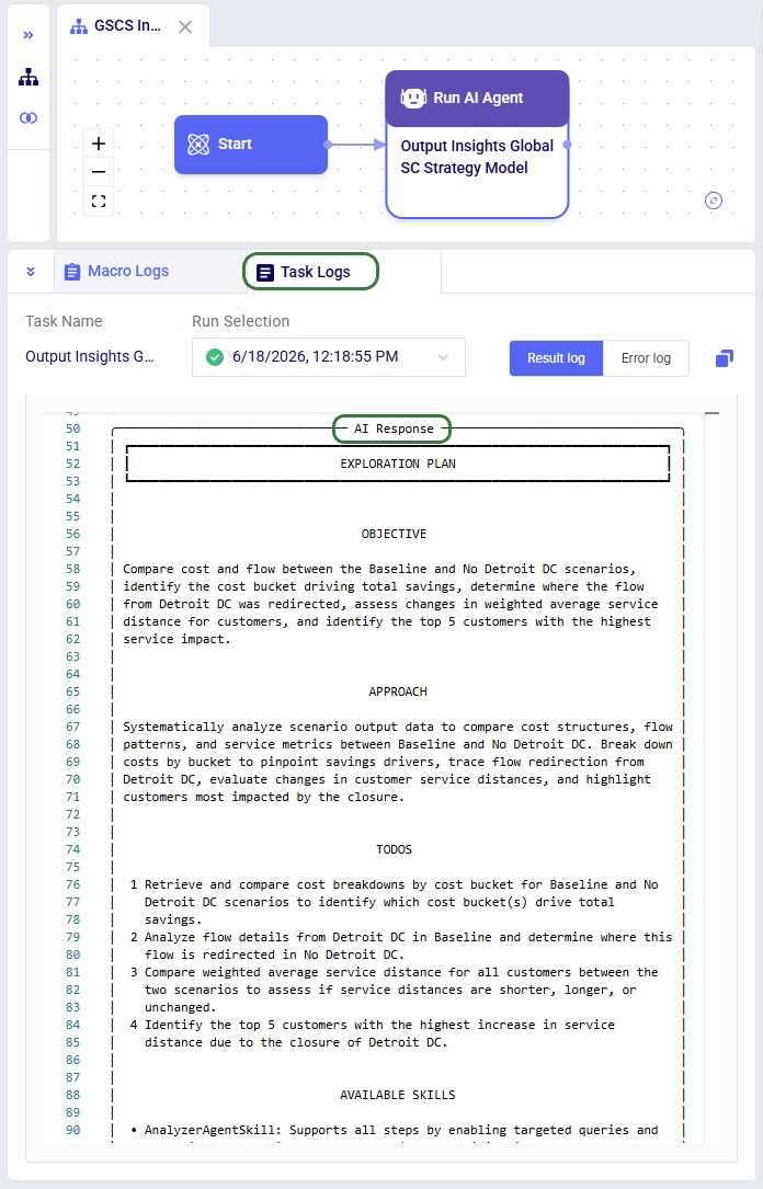
After a run completes, the Task Log provides a detailed trace of every step the agent took. Understanding the log structure helps users verify what happened and troubleshoot if needed. The log follows a consistent structure from start to finish.
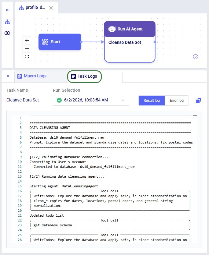
Header
Every log begins with a banner showing the database name and the exact prompt that was submitted.
Connection & Setup
The agent validates the database connection and initializes itself with its full set of tools. If Verbose Output is set to "Detailed", the log also prints the system prompt and tool list at this stage.
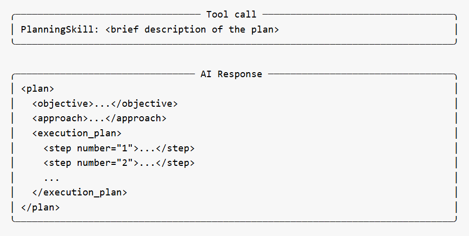
Planning Phase
For non-trivial tasks, the agent creates a strategic execution plan before taking action. This appears as a PlanningSkill tool call, followed by an AI Response box containing a structured plan with numbered steps, an objective, approach, and skill mapping. The plan gives users visibility into the agent's intended approach before it begins working.
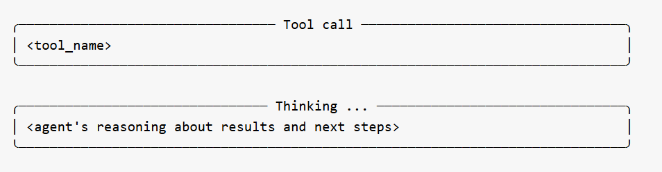
Tool Calls and Thinking
The bulk of the log shows the agent calling its specialized tools one at a time. Each tool call appears in a bordered box showing the tool name. Between tool calls, the agent's reasoning is shown in Thinking boxes -- explaining what it learned from the previous tool, what it plans to do next, and why. These thinking sections are among the most useful parts of the log for understanding the agent's decision-making.
The agent may call many tools in sequence depending on the complexity of the task. Profiling-only prompts typically involve discovery tools (schema, missing data, date issues, location issues, outliers). Cleanup prompts add transformation tools (ensure_clean_table, standardize_country_codes, standardize_date_column, etc.).
Occasionally a Memory Action Applied entry appears between steps -- this is the agent recording context for its own use and can be ignored.
Error Recovery
If the agent encounters a validation error on a tool call (e.g., a column stored as TEXT when a numeric type was expected, or a missing parameter), the log shows the error and the agent's automatic adjustment. The agent reasons about the failure in a Thinking block and retries with corrected parameters. Users do not need to intervene.
Agent Response
At the end of the run, the agent produces a structured summary of everything it discovered or changed. This is the most important section of the log for understanding outcomes:
For profiling prompts, this section reports what was found across all tables -- schema details, missing data percentages, date format inconsistencies, location quality issues, numeric anomalies, and recommendations for next steps. For cleanup prompts, it reports which tables were modified, what transformations were applied, how many rows were affected, and confirmation that originals are preserved.
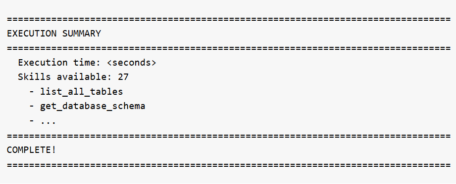
Execution Summary
The log ends with runtime statistics and the full list of skills that were available to the agent:
What the agent expects in your database:
The agent works with any tables in the selected database. There are no fixed column name requirements -- the agent discovers the schema automatically. However, for best results:
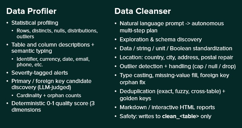
To help you decide if you should use the Data Profiler or Data Cleanser Agent for your task, here is a quick overview of both:
A user wants to understand what data is in their database before deciding what to clean.
Database: Supply Chain Dataset
Task Description: List all tables in the database and show their schemas
What happens: The agent calls get_database_schema for all tables and exits with a structured report.
Output:
Requested: List all tables and show schemas.
Discovered (schema 'starburst'):
...
Total: 12 tables, 405 rows, 112 columns
A user needs to clean up customer location data before using it in a Cosmic Frog network optimization model.
Database: Supply Chain Dataset
Task Description: Clean the customers table completely: standardize dates to ISO, fix postal codes (Excel corruption + placeholders), standardize country codes to alpha-2, clean city names, and normalize emails to lowercase
What the agent does:
Output:
Completed data cleansing of clean_customers table:
All changes applied to clean_customers (original customers table preserved).
The cleaned data is available in the clean_customers table in the database. The original customers table remains untouched.
A user with a 14-table enterprise supply chain database needs to clean and standardize all data before building Cosmic Frog models for network optimization and simulation.
Database: Enterprise Supply Chain
Task Description: Perform a complete data cleanup across all tables: standardize all dates to ISO, standardize all country codes to alpha-2, clean all city names, fix all postal codes, and normalize all email addresses to lowercase. Work systematically through each table.
What the agent does: The agent works systematically through all tables -- standardizing dates across 12+ tables, fixing country codes, cleaning city names, repairing postal codes, normalizing emails and status fields, detecting and handling negative values, converting mixed units to metric, validating calculated fields like order totals, and reporting any remaining referential integrity issues. This is the most comprehensive operation the agent can perform.
Output: A detailed summary covering every table touched, every transformation applied, and a final quality scorecard showing the before/after improvement.
A user has multiple records for the same customer in the customers table and wants golden keys created and propagated to the orders table.
Database: Supply Chain Dataset
Task Description: Find duplicate customer records in the customers table, create golden key mappings, and propagate them to the orders table.
What the agent does: Delegates the task to the Deduplication sub-agent, which detects exact and fuzzy duplicate groups, picks a canonical record for each group, and updates the orders table so every order points to the canonical customer.
Output: A summary listing how many duplicate groups were detected, how many golden keys were created, and how many rows in orders were updated to point to the canonical master record.
Below are example prompts users can try, organized by category.
Questions or feedback? Please contact the Optilogic Support team on support@optilogic.com.
The Data Profiler AI Agent is one of Ada's AI-powered assistants, focused on assessing data. It automatically analyzes the quality, structure, and relationships of data stored in an Optilogic database. By profiling every table and column, the agent creates a comprehensive data-quality catalog that helps users understand their data, identify issues, discover relationships, and prioritize cleansing efforts.
The agent can be accessed by chatting with Ada in the next generation Optilogic platform and via Run AI Agent tasks in DataStar.
Understanding the quality and meaning of data is often one of the most time-consuming steps in any analytics, modeling, or optimization project. The Data Profiler AI Agent automates this process by:
The result is a queryable inventory of your data assets, complete with quality assessments and relationship insights.
The Data Profiler AI Agent performs several layers of analysis.
For every table and column, the agent calculates statistical characteristics such as:
For large datasets, the agent uses deterministic sampling to ensure consistent results across profiling runs.
Using LLM-assisted analysis, the agent generates:
These descriptions help users quickly understand the purpose and meaning of data assets.
Based on semantic classifications, the agent recommends appropriate database data types. Examples include:
These recommendations help improve data consistency and prevent issues such as loss of leading zeros in identifiers.
After semantic types are identified, the agent performs specialized validation checks against actual data values. Examples include:
The agent performs dozens of validation checks tailored to the detected semantic type.
Each detected issue is stored as a single row structured alert. Each alert contains:
Notable specialized checks include:
The agent can identify relationships even when keys are not formally defined in the schema.
The discovery process includes
The Data Profiler AI Agent assigns scores ranging from 0.0 to 1.0 across three dimensions:
The overall score is a weighted average, which is capped if data integrity drops too low. Tables without data receive a baseline minimum score, while tables that generate errors display an error stub so users are always aware of the issue.
Measures whether values are:
When the same column name appears in multiple tables with different semantic tags, a majority vote picks one and corrects the outliers.
The only required input is to point the agent to a database. There are several optional inputs which we will cover in the Using the Data Profiler Agent section below.
The output consists of tables written to the database that was profiled:
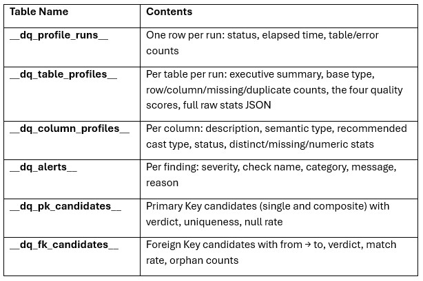
In addition to database outputs, the agent generates a timestamped execution log, which includes table processing times, alerts, and primary key/foreign key findings. Reviewing the log can help diagnose profiling issues and understand execution performance.
There are two ways to access the Data Profiler Agent:
Both ways will be explained, through DataStar first, then using the chat UI.
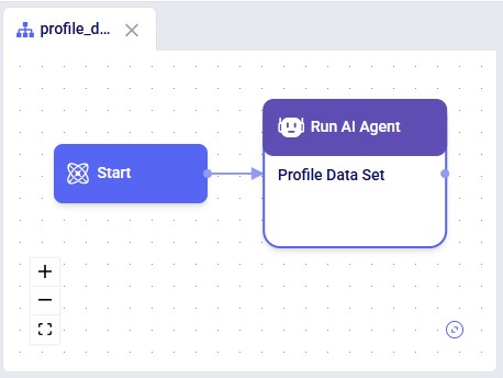
Accessing the Data Profiler Agent through DataStar is done via a Run AI Agent task:
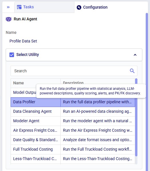
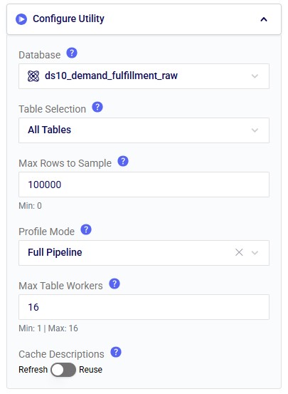
In the Configure Utility section of the Configuration tab (from top to bottom):
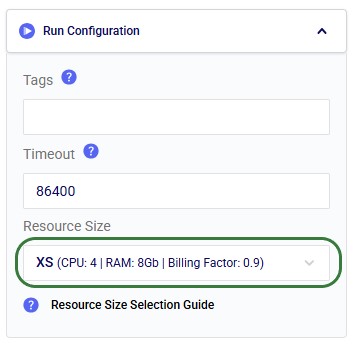
Note that it is recommended to change the Resource Size from 3XS to XS in the Run Configuration section, since 3XS is usually not sufficient to run the Data Profiler Agent:
While the task is running and after it has completed, the Task Logs tab contains the log file where the user can monitor progress and review key alerts and high-level output summaries:
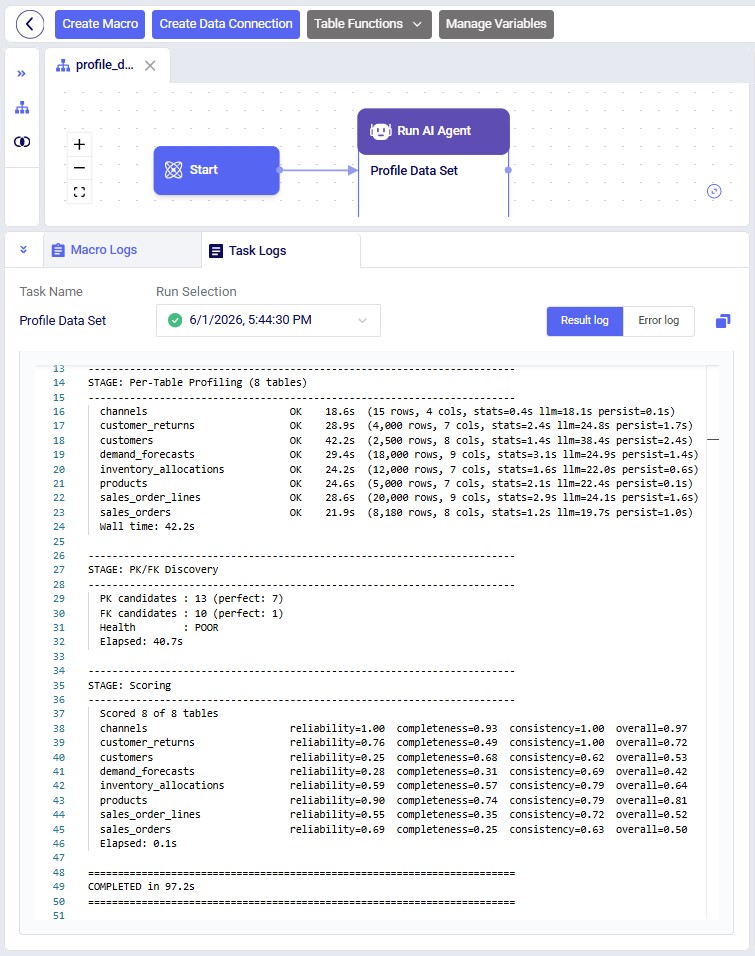
As an example output, let us have a look at the _dq_table_profiles table:
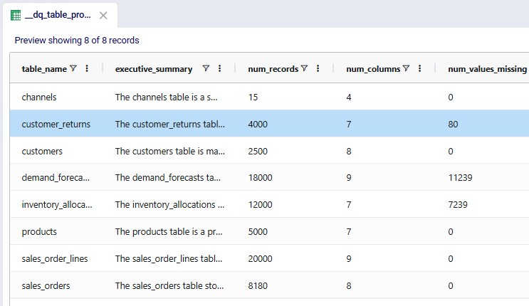
In this table, the entire executive summary for the customer_returns table is as follows: "The customer_returns table records return events tied to individual sales order lines, supporting analysis of return volumes, reasons, and financial impact. Each record links a return reference return_id to an order_line_id, with return_date providing the time dimension for trend reporting. Operational metrics include return_qty and restock_flag, while refund_amount captures the customer reimbursement value but is stored as text and includes invalid entries. Return reasons are mostly standardized but include missing values and placeholder or corrupted categories, suggesting a need for data cleansing and validation."
It is recommended to be somewhat familiar with Ada and how to talk to her in the chat UI before diving into this content. Please see the Getting Started with Ada & Agentic AI article, and in particular its How to Use Ada section.
Once logged into the next generation Optilogic platform at https://ai.optilogic.app, you can start chatting with Ada and leveraging the Data Profiler Agent right away from the central part of the Home page. You can access it by using the Data Cleanser Agent, as this agent can call the Data Profiler Agent as a tool.
After selecting the database to profile (here a DataStar project named Dairy End-to-End Ada), set the agent to Data Cleanser, write your prompt indicating you want to profile the data (or a subset of it) contained in the connected database. It is recommended to mention the Data Profiler pipeline and wanting to write the results into the database itself:
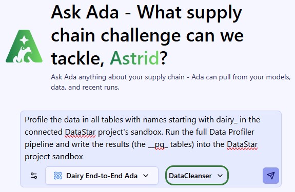
This prompt results in running the full Data Profiler Agent's pipeline and the __pq_ tables can be found in the sandbox of the connected DataStar project.
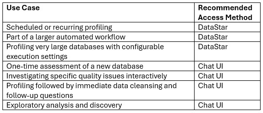
The following table summarizes the most common use cases for the 2 ways of accessing the Data Profiler Agent:
To help you decide if you should use the Data Profiler or Data Cleanser Agent for your task, here is a quick overview of both:
You point the Data Profiler AI Agent at a database, walk away, and come back a few minutes later to a queryable catalogue of every table — what each column means, what type it should be, where the data is broken, how the tables relate, and a single quality score per table to triage what needs cleaning first.
Questions or feedback? Please contact the Optilogic Support team on support@optilogic.com.
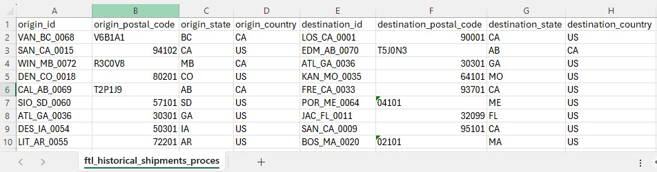
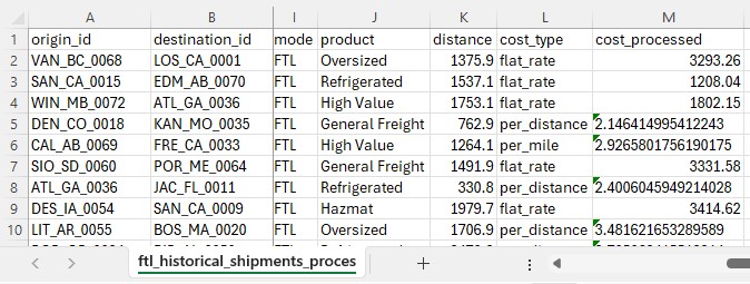
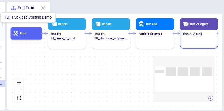
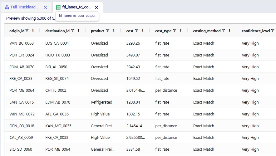
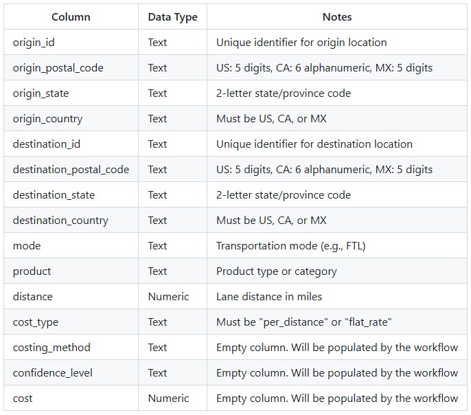
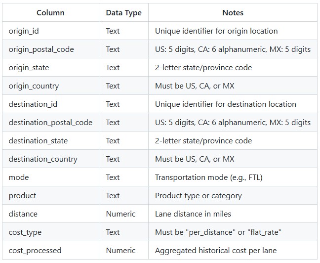
The Full Truckload Costing utility solves the common problem of missing transportation cost data when building supply chain models. Rather than requiring users to manually research rates for every lane, this workflow automatically derives costs from a company's existing shipment history. The utility expects two input tables: a lanes-to-cost table containing the origin-destination pairs that need pricing, and an optional historical shipments table containing preprocessed cost data. After running the utility, users receive a fully costed lanes table with confidence levels for each estimate.
The Full Truckload Costing Utility is available on the Resource Library, from which you can download it or copy it to your Optilogic account. Learn more about the Resource Library in this How to use the Resource Library help center article.
Sample Data
System Utility
The steps to use this utility are as follows. These are illustrated with screenshots below.
Screenshots of the steps:
Key Constraints:
Key Constraints:
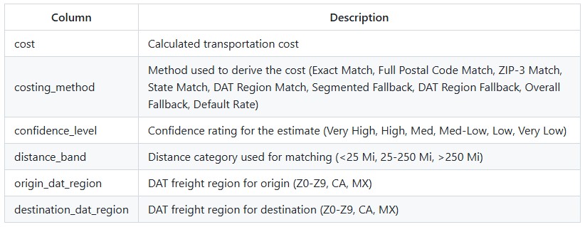
The utility produces an output table containing all lanes from the input with the following additional columns populated:
The utility processes lanes through a sequential pipeline, with each step only processing lanes that still have NULL costs:
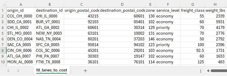
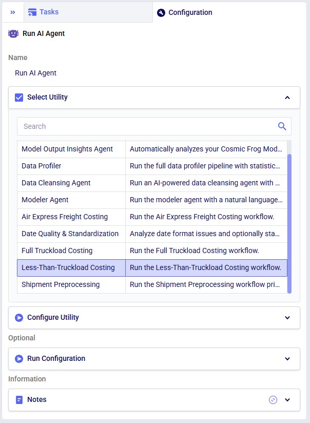
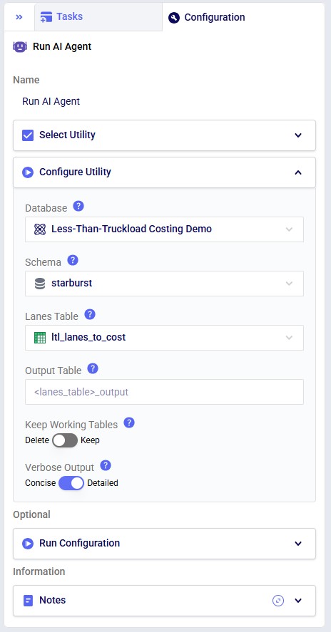
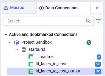
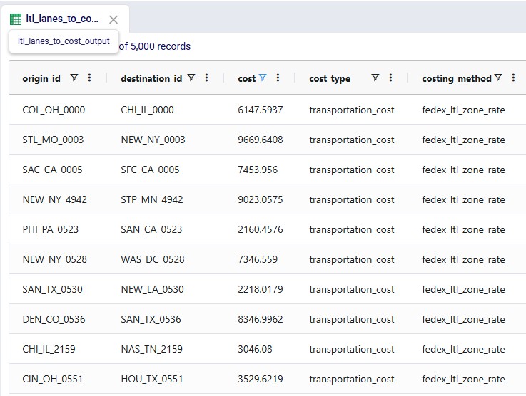
The Less Than Truckload Costing utility solves the challenge of pricing less-than-truckload (LTL) shipments when carrier rate data is complex and varies by service level, distance, and weight. Rather than manually looking up rates in carrier tariff tables, this workflow automates the entire process using FedEx Express Freight standard list rates. The utility expects a lanes-to-cost table containing shipment details including origin, destination, distance, weight, and desired service level. After running the utility, users receive a fully costed table with calculated transportation costs.
The Less Than Truckload Costing Utility is available on the Resource Library, from which you can download it or copy it to your Optilogic account. Learn more about the Resource Library in this How to use the Resource Library help center article.
Sample Data
System Utility
The steps to use this utility are as follows. These are illustrated with screenshots below.
Screenshots of the steps:
Key Constraints:
The utility produces an output table containing all lanes from the input with the following additional columns populated:
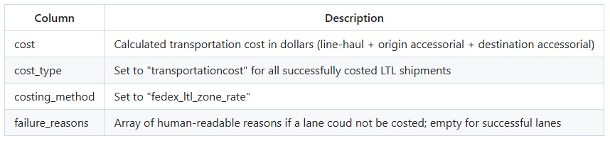
LTL costs are calculated as a three-component sum:
Each component is calculated independently using the formula:
Where:
FedEx Freight zones (101–150) represent the transit distance and pricing tier between an origin and destination. Zones are assigned by FedEx based on origin and destination ZIP codes. You can determine the correct zone for a lane using the FedEx Freight zone chart or a zone lookup tool.
Higher zone numbers generally correspond to longer distances and higher rates.
The utility supports the following standard NMFC freight classes:
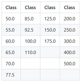
Freight class values are case-insensitive and will be normalized automatically. Common formats such as "60", "60.0", and "60.00" are all accepted and treated as equivalent.
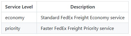
Service level values are normalized to lowercase automatically, so "Economy", "ECONOMY", and "economy" are all accepted.
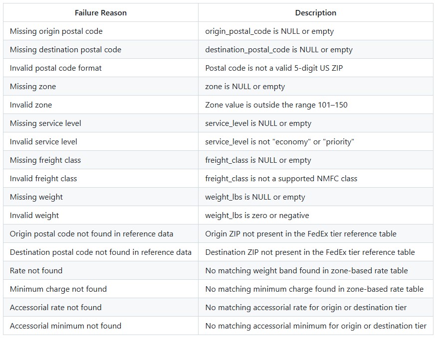
If a lane cannot be costed, the failure_reasons column will contain one or more of the following:
DataStar is Optilogic’s new AI-powered data product designed to help supply chain teams build and update models & scenarios and power apps faster & easier than ever before. It enables users to create flexible, accessible, and repeatable workflows with zero learning curve—combining drag-and-drop simplicity, natural language AI, and deep supply chain context.
Today, up to an estimated 80% of a modeler's time is spent on data—connecting, cleaning, transforming, validating, and integrating it to build or refresh models. DataStar drastically shrinks that time, enabling teams to:
The 2 main goals of DataStar are 1) ease of use, and 2) effortless collaboration, these are achieved by:
In this documentation, we will start with a high-level overview of the DataStar building blocks. Next, creating projects and data connections will be covered before diving into the details of adding tasks and chaining them together into macros, which can then be run to accomplish the data goals of your project.
Please see this "Getting Started with DataStar: Application Overview" video for a quick 5-minute overview of DataStar.
Before diving into more details in later sections, this section will describe the main building blocks of DataStar, which include Data Connections, Projects, Macros, and Tasks.
Since DataStar is all about working with data, Data Connections are an important part of DataStar. These enable users to quickly connect to and pull in data from a range of data sources. Data Connections in DataStar:
Connections to other common data resources such as MySQL, OneDrive, SAP, and Snowflake will become available as built-in connection types over time. Currently, these data sources can be connected to by using scripts that pull them in from the Optilogic side or using ETL tools or automation platforms that push data onto the Optilogic platform. Please see the "DataStar: Data Integration" article for more details on working with both local and external data sources.
Users can check the Resource Library for the currently available template scripts and utilities. These can be copied to your account or downloaded and after a few updates around credentials, etc. you will be able to start pulling data in from external sources:

Projects are the main container of work within DataStar. Typically, a Project will aim to achieve a certain goal by performing all or a subset of importing specific data, then cleansing, transforming & blending it, and finally publishing the results to another file/database. The scope of DataStar Projects can vary greatly, think for example of following 2 examples:
Projects consist of one or multiple macros which in turn consist of 1 or multiple tasks. Tasks are the individual actions or steps which can be chained together within a macro to accomplish a specific goal.
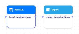
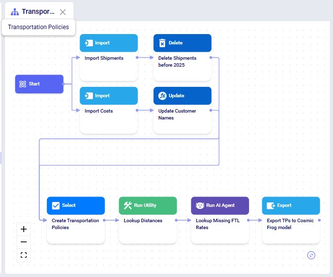
The next screenshot shows an example Macro called "Transportation Policies" which consists of 8 individual tasks that are chained together to create transportation policies for a Cosmic Frog model from imported Shipments and Costs data:
Every project by default contains a Data Connection named Project Sandbox. This data connection is not global to all DataStar projects; it is specific to the project it is part of. The Project Sandbox is a Postgres database where users generally import the raw data from the other data connections into, perform transformations in, save intermediate states of data in, and then publish the results out to a Cosmic Frog model (which is a data connection different than the Project Sandbox connection). It is also possible that some of the data in the Project Sandbox is the final result/deliverable of the DataStar Project or that the results are published into a different type of file or system that is set up as a data connection rather than into a Cosmic Frog model.
The next diagram shows how Data Connections, Projects, and Macros relate to each other in DataStar:

As referenced above too, to learn more about working with both local and external data, please see this "DataStar: Data Integration" article.
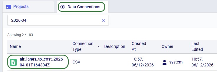
On the start page of DataStar, the user will be shown their existing projects and data connections. They can be opened, or deleted here, and users also have the ability to create new projects and data connections from this start page.
The next screenshot shows the existing projects in card format:

New projects can be created by clicking on the Create Project button in the toolbar at the top of the DataStar application:

If on the Create Project form a user decides they want to use a Template Project rather than a new Empty Project, it works as follows:

These template projects are also available on Optilogic's Resource Library:

After the copy process completes, we can see the project appear in the Explorer and in the Project list in DataStar:

Note that any files needed for data connections in template projects copied from the Resource Library can be found under the "Sent to Me" folder in the Explorer. They will be in a subfolder named @datastartemplateprojects#optilogic (the sender of the files).
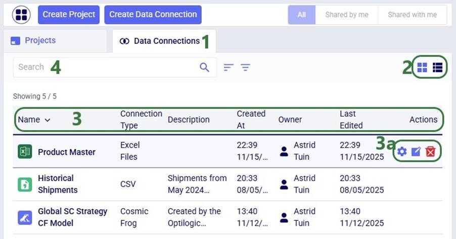
The next screenshot shows the Data Connections that have already been set up in DataStar in list view:
New data connections can be created by clicking on the Create Data Connection button in the toolbar at the top of the DataStar application:
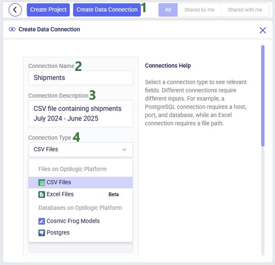
The remainder of the Create Data Connection form will change depending on the type of connection that was chosen as different types of connections require different inputs (e.g. host, port, server, schema, etc.). In our example, the user chooses CSV Files as the connection type:

In our walk-through here, the user drags and drops a Shipments.csv file from their local computer on top of the Drag and drop area:
Now let us look at a project when it is open in DataStar. We will first get a lay of the land with a high-level overview screenshot and then go into more detail for the different parts of the DataStar user interface:
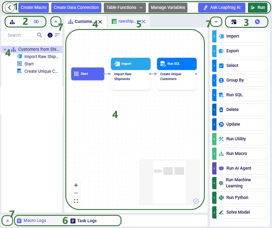
Next, we will dive a bit deeper into a macro:

The Macro Canvas for the Transportation Policies macro is shown in the following screenshot:
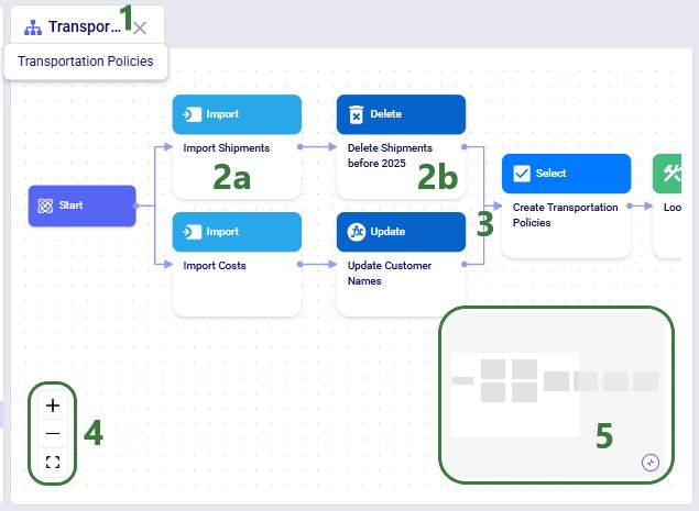
In addition to the above, please note following regarding the Macro Canvas:
We will move on to covering the 2 tabs on the right-hand side pane, starting with the Tasks tab. Keep in mind that in the descriptions of the tasks below, the Project Sandbox is a Postgres database connection. The following tasks are currently available:
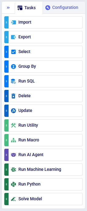
From top to bottom:
Users can click on a task in the tasks list and then drag and drop it onto the macro canvas to incorporate it into a macro. Once added to a macro, a task needs to be configured; this will be covered in the next section.
When adding a new task, it needs to be configured, which can be done on the Configuration tab. When a task is newly dropped onto the Macro Canvas its Configuration tab is automatically opened on the right-hand side pane. To make the configuration tab of an already existing task active, click on the task in the Macros tab on the left-hand side pane or click on the task in the Macro Canvas. The configuration options will differ by type of task, here the Configuration tab of an Import task is shown as an example:


Please note that:
The following table provides an overview of what connection type(s) can be used as the source / destination / target connection by which task(s), where PG is short for a PostgreSQL database connection and CF for a Cosmic Frog model connection:

Leapfrog in DataStar (aka D* AI) is an AI-powered feature that transforms natural language requests into executable DataStar Update and Run SQL tasks. Users can describe what they want to accomplish in plain language, and Leapfrog automatically generates the corresponding task query without requiring technical coding skills or manual inputs for task details. This capability enables both technical and non-technical users to efficiently manipulate data, build Cosmic Frog models, and extract insights through conversational interactions with Leapfrog within DataStar.
Note that there are 2 appendices at the end of this documentation where 1) details around Leapfrog in DataStar's current features & limitations are covered and 2) Leapfrog's data usage and security policies are summarized.


Leapfrog’s response to this prompt is as follows:
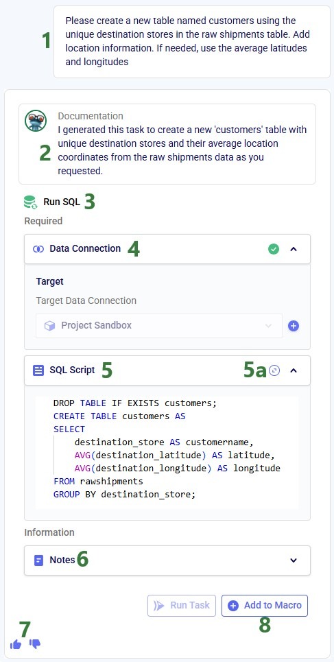
DROP TABLE IF Exists customers;
CREATE TABLE customers AS
SELECT
  destination_store AS customer,
  AVG(destination_latitude) AS latitude,
  AVG(destination_longitude) AS longitude
FROM rawshipments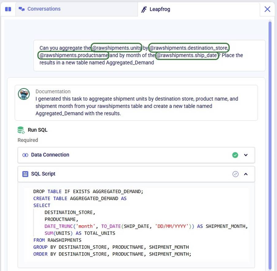
GROUP BY destination_storeTo help users write prompts, the tables present in the Project Sandbox and their columns can be accessed from the prompt writing box by typing an @:


This user used the @ functionality repeatedly to write their prompt as follows, which helped to generate their required Run SQL task:
Now, we will also have a look at the Conversations tab while showing the 2 tabs in Split view:

Within a Leapfrog conversation, Leapfrog remembers the prompts and responses thus far. Users can therefore build upon previous questions, for example by following up with a prompt along the lines of “Like that, but instead of using a cutoff date of August 10, 2025, use September 24, 2025”.
Additional helpful DataStar Leapfrog links:
Users can run a Macro by selecting it and then clicking on the green Run button at the right top of the DataStar application:

Please note that:

When a macro/task is running, the tasks on the macro canvas have visual indicators of the status of the run, while the Macro Logs and Task Logs tabs at the bottom also contain information on the runs, see the next section.

Next, we will cover the Logs tabs at the bottom of the Macro Canvas where logs of macros/tasks that are running/have been run can be found:

When a macro has not yet been run, the Macro Logs tab will contain a message with a Run button, which can also be used to kick off a macro run. When a macro is running or has been run, the macro log will look similar to the following:

The next screenshot shows the log of a run of the same macro where the third task ended in an error:

Please note that:
For the following supported tasks a task log is generated when the task is run: Import, Export, Run Utility, Run AI Agent, Run Machine Learning, Run Python, and Solve Model. An example is shown in the next screenshot for a Run AI Agent task using the Data Cleansing AI Agent:
In the Data Connections tab on the left-hand side pane the available data connections are listed:
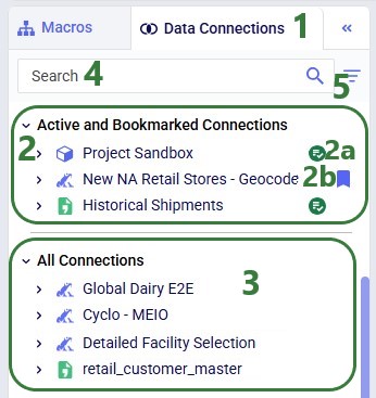
Next, we will have a look at what the connections list looks like when some of the connections have been expanded:
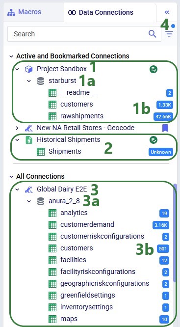
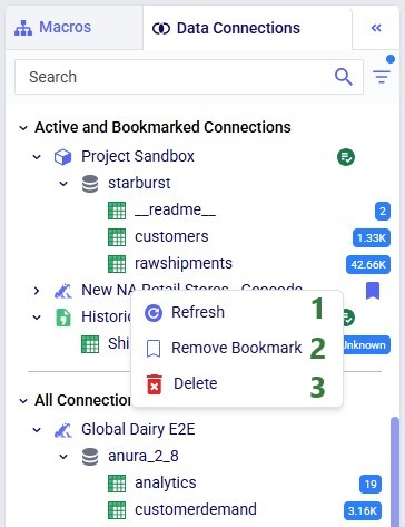
Right-clicking on a connection brings up the following context menu:
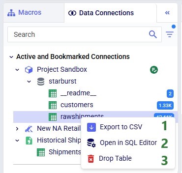
Right-clicking on a table in a connection also brings up a context menu:
The tables within a connection can be opened within DataStar. They are then displayed in the central part of DataStar where the Macro Canvas is showing when a macro is the active tab.
Please note:

A table can be filtered based on values in one or multiple columns:
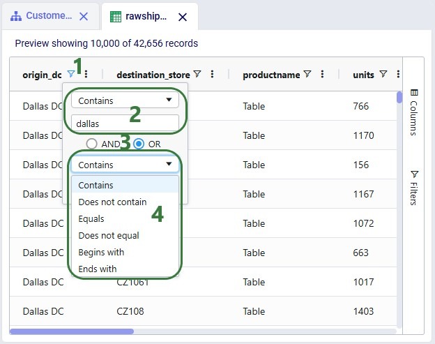

Columns can be re-ordered and hidden/shown as described in the Appendix; this can be done using the Columns fold-out pane too:

Finally, filters can also be configured from a fold-out pane:
Users can explore the complete dataset of connections with tables larger than 10k records in other applications on the Optilogic platform, depending on the type of connection:
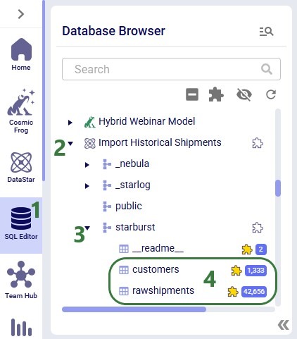
Here is how to find the database and table(s) of interest in SQL Editor:
Here are a few additional links that may be helpful:
We hope you are as excited about starting to work with DataStar as we are! Please stay tuned for regular updates to both DataStar and all the accompanying documentation. As always, for any questions or feedback, feel free to contact our support team at support@optilogic.com.
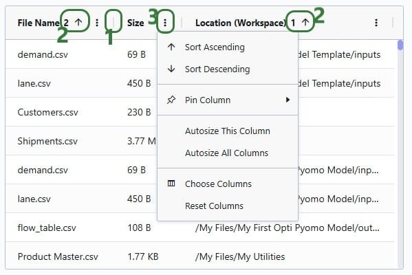
The grids used in DataStar can be customized and we will cover the options available through the screenshot below. This screenshot is of the list of CSV files in user's Optilogic account when creating a new CSV File connection. The same grid options are available on the grid in the Logs tab and when viewing tables that are part of any Data Connections in the central part of DataStar.
Leapfrog's brainpower comes from:
All training processes are owned and managed by Optilogic — no outside data is used.
When you ask Leapfrog a question:
Your conversations (prompts, answers, feedback) are stored securely at the user level.
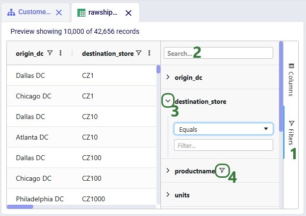
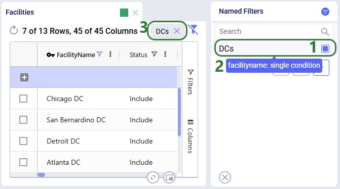
Named Filters are an exciting new feature which allows users to create and save specific filters directly on grid views, to then be utilized seamlessly across all policies tables, scenario items and map layers. For example, if you create a filter named “DCs” in the Facilities table to capture all entries with “DC” in their designation, this Named Filter can then be applied in a policy table, providing a dynamic alternative to the traditional Group function.
Unlike Groups, named filters automatically update: adding or removing a DC record in the Facilities table will instantly reflect in the Named Filter, streamlining the workflow and eliminating the need for manual updates. Additionally, when creating Scenario Items or defining Map Layers, users can easily select Named Filters to represent specific conditions, easily previewing the data, making the process much quicker and simpler.
In this help article, how Named Filters are created will be covered first. In the sections after, we will discuss how Named Filters can be used on input tables, in scenario items, and on map layers, while the final section contains a few notes on deleting Named Filters.
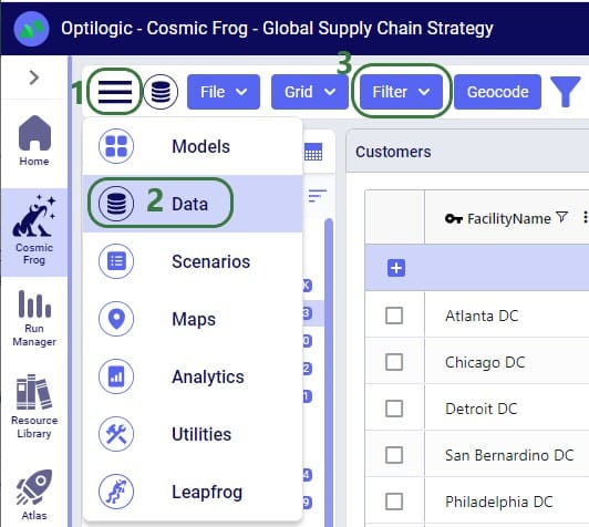
Named Filters can be set up and saved on any Cosmic Frog table: input tables, output tables, and custom tables. These tables are found in the Data module of a Cosmic Frog model:
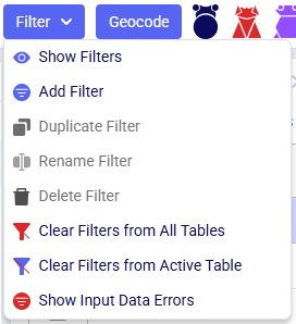
A quick description of each of the options available in the Filter drop-down menu follows here, we will cover most of these in more detail in the remainder of this Help Article:
Note that an additional Save Filter option becomes available in this menu in case a filter has been created (added) and next changes have been made to the table's filter conditions. The Save Filter option can then be used to update the existing named filter to reflect these changes.
Let’s walk through setting up a filter on the Facilities table that filters out records where the Facility Name ends in “DC” and save it as a named filter called “DCs”:
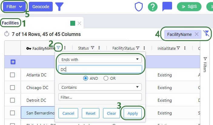

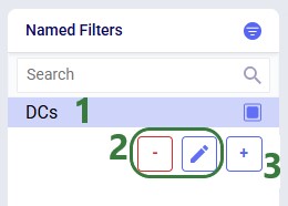
There are 3 buttons below the list of filters as follows (these were obscured by the hover text in the previous screenshot):
There is a right-click context menu available for filters listed in the Named Filters pane, which allows the user to perform some of the same actions as those in the main Filter menu shown above:

Named Filters can use filtering conditions that are applied to multiple fields in a table. The next example shows a Named Filter called “CZ2* Space Suit demand >6k” on the Customer Demand input table which uses filtering conditions on three fields:
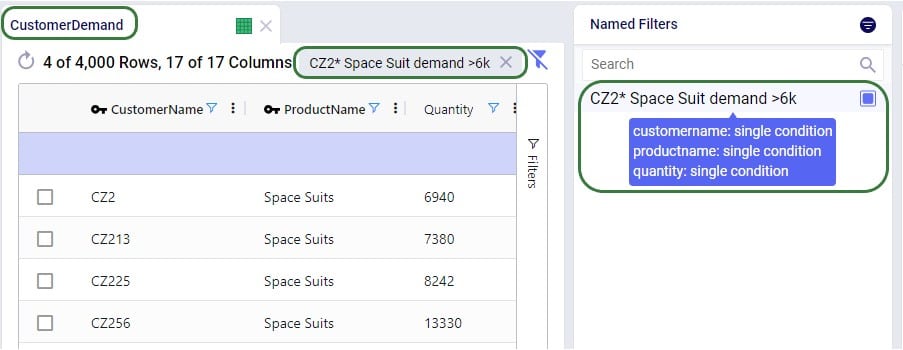
Conditions were applied to 3 fields in the Customer Demand table, as follows: 1) Customer Name Begins With “CZ2”, 2) Product Name Contains “Space”, and 3) Quantity Greater Than “6000”. The resulting filter was saved as a Named Filter with the name “CZ2* Space Suit demand >6k” which is applied in the screenshot above. When hovering over this Named Filter, we indeed see the 3 fields and that they each have a single condition on them.
Besides being able to create Named Filters on input tables, they can also be created on output and custom tables. On output tables this can for example expedite the review of results after running additional scenarios where one can apply a pre-saved set of Named Filters one after the other once the runs are done instead of having to re-type each filter that shows the outputs of interest each time. This example shows a Named Filter on the Optimization Facility Summary output table to show records where the Throughput Utilization is greater than 0.8:

Next, we will see how multiple Named Filters can be applied to a table. In the example we will use, there are 4 Named Filters set up on the Facilities table:
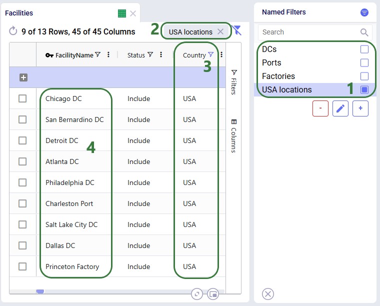
Next, we will apply another Named Filter in addition to this first one ("USA locations"). How the Named Filters work together depends on if they are filtering on the same field or on different fields:
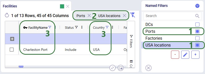
Now, if we want to filter out only Ports located in the USA, we can apply 2 of the Named Filters simultaneously:
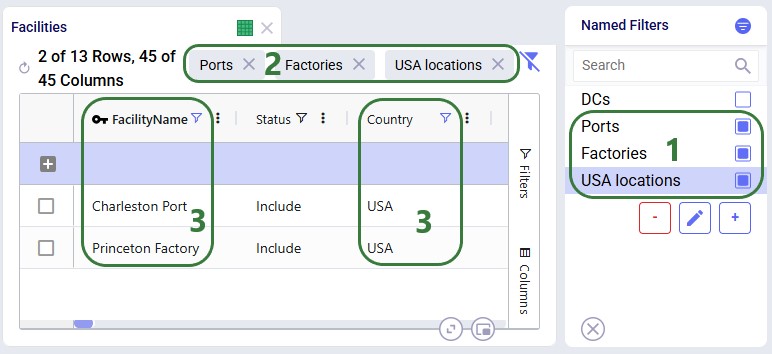
To show an example of how multiple named filters that filter on the same field work, we will add a third Named Filter:
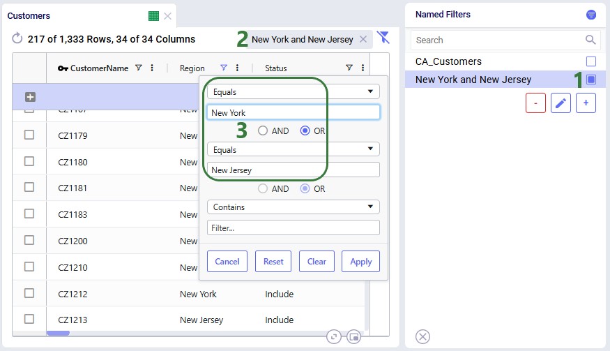
To alter an existing filter, we can change the criteria of this existing filter, and then save the resulting filter, replacing the original Named Filter. Let’s illustrate this through an example: in a model with about 1.3k customers in the US, we have created a Named Filter “New York and New Jersey”, but later on realize that this filter also includes customers in New Hampshire and New Mexico:
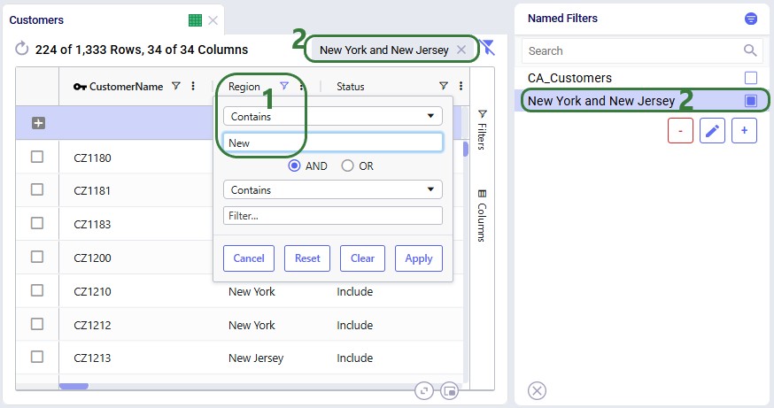
In reality, this filter also filters out customers located in the regions (states) of New Hampshire and New Mexico in addition to those in New York and New Jersey. So, the next step is to update the filter to only filter out the New York and New Jersey customers:
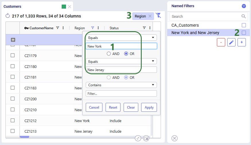
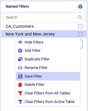
Next, we can use the Save Filter option from either the Filter menu drop-down list or the context menu after right-clicking on the filter in the Named Filters pane to update the existing "New York and New Jersey" named filter to use the updated condition. The following screenshot shows the latter method:
After choosing Save Filter from the context menu, the following message is shown for the user to confirm they want to overwrite the original named filter using the current filter conditions:
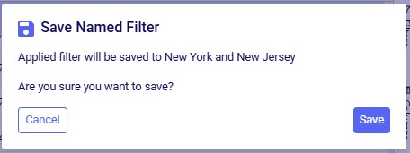
After clicking Save, the existing named filter has been updated:
So far, the only examples were of filters applied to one field in an input table. The next example shows a Named Filter called “CZ2* Space Suit demand >6k” on the Customer Demand input table which uses filtering conditions on multiple fields:
Conditions were applied to 3 fields in the Customer Demand table, as follows: 1) Customer Name Begins With “CZ2”, 2) Product Name Contains “Space”, and 3) Quantity Greater Than “6000”. The resulting filter was saved as a Named Filter with the name “CZ2* Space Suit demand >6k” which is applied in the screenshot above. When hovering over this Named Filter, we indeed see the 3 fields and that they each have a single condition on them.
Besides being able to create Named Filters on input tables, they can also be created on output and custom tables. On output tables this can for example expedite the review of results after running additional scenarios where one can apply a pre-saved set of Named Filters one after the other once the runs are done instead of having to re-type each filter that shows the outputs of interest each time. This example shows a Named Filter on the Optimization Facility Summary output table to show records where the Throughput Utilization is greater than 0.8:
The last option of Show Input Data Errors in the Filter menu creates a special filter named ERRORS and filters out records in the input table it is used on that have errors in the input data. This can be very helpful as records with input errors may have these in different fields and the types of errors may be different, so a user is not able to create 1 single filter that would capture multiple different types of errors. When this filter is applied, any record that has 1 or multiple fields with a red outline will be filtered out and shown. Hovering over the field gives a short description of the problem with the value in the field.

Named Filters for certain model elements (i.e. Customers, Facilities, Suppliers, Products, Periods, Modes, Shipments, Transportation Assets, Processes, Bills Of Materials, Work Centers, and Work Resources) can be used in other input tables, very similar to how Groups work in Cosmic Frog: instead of setting up multiple records for individual elements, for example a transportation policy from A to B for each finished good, a Named Filter that filters out all finished goods on the Products table can be used to set up 1 transportation policy for these finished goods from A to B (which at run-time will be expanded into a policy for each finished good). The advantage of using Named Filters instead of Groups is that Named Filters are dynamic. If records are added to tables containing model elements and they match the conditions of any Named Filters, they are automatically added to those Named Filters. Think for example of Products with the pre-fix FG_ to indicate they are finished goods and a Named Filter “Finished Goods” that filters the Product Name on Begins With “FG_”. If a new product is added where the Product Name starts with FG_, it is automatically added to the Finished Goods Named Filter and anywhere this filter is used this new finished good is now included too. We will look at 2 examples in the next few screenshots.
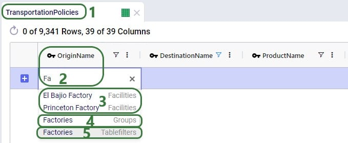
The completed transportation policy record uses Named Filters for the Origin Name, Destination Name, and Product Name, making this record flexible as long as the naming conventions of the factories, ports, and raw materials keep following the same rules.
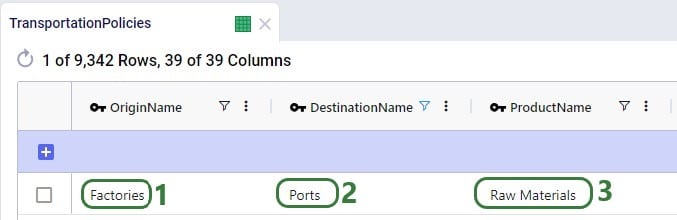
The next example is on one of the Constraints tables, Production Constraints. On the Constraints tables, the Group Behavior fields dictate how an element name that is a Group or a Named Filter should be used. When set to Enumerate, the constraint is applied to each individual member of the group or named filter. If it is set to Aggregate, the constraint applies to all members of the group or named filter together. This Production Constraint states that at each factory a maximum amount of 150,000 units over all finished goods together can be produced:
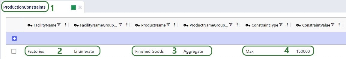
When setting up a scenario item, previously, the records that the scenario item’s change needed to be applied to could be set by using the Condition Builder. Now users have the added option to use a saved Named Filter instead, which makes it easier as the user does not need to know the syntax for building a condition, and it also makes it more flexible as Named Filters are dynamic as was discussed in the previous section. In addition, users can preview the records that the change will be made to so the chance of mistakes is reduced.
Please note that a maximum of 1 Named Filter can be used on a scenario item.
The following example changes the Suppliers table of a model which has around 70 suppliers, about half of these are in Europe and the other half in China:
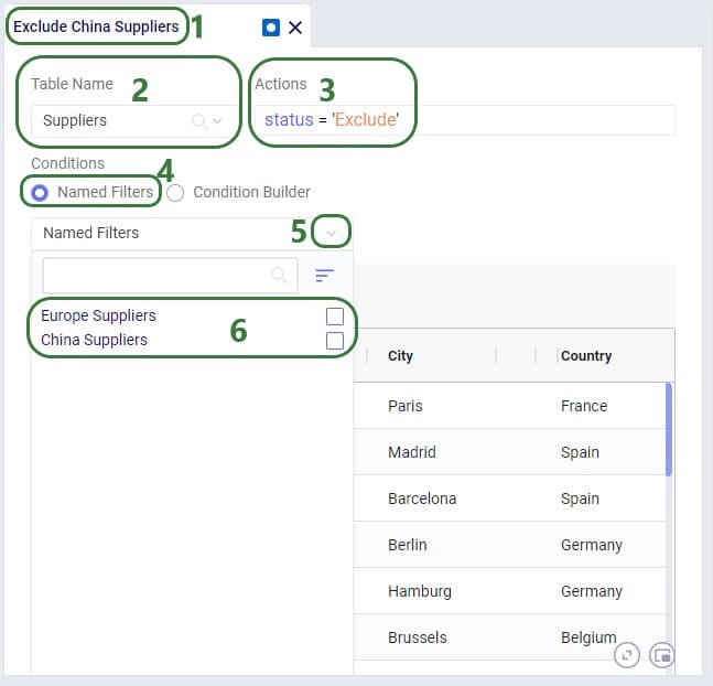
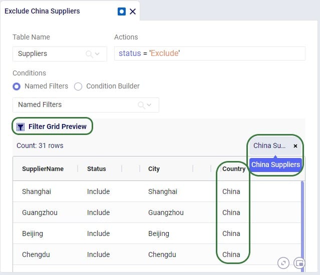
The Named Filters drop-down collapses after choosing the China Suppliers Named Filter as the condition, and now we see the Preview of the filtered grid. This is the Suppliers table with the Named Filter China Suppliers applied. At the right top of the grid the name of the applied Named Filter(s) is shown, and we can see that in the preview we indeed only see Suppliers for which the Country is China. So these are the records the change (setting Status = Exclude) will be made to in scenarios that use this scenario item.
A few notes on the Filter Grid Preview:
Besides using Named Filters on other input tables and for setting up conditions for scenario items, they can also be used as conditions for Map Layers, which will be covered in this final section of this Help Article. Like for scenario items, there is also a Filter Grid Preview for Map Layers to double-check which records will be filtered out when applying the condition(s) of 1 or multiple Named Filters.
In this first example, a Named Filter on the Facilities table filters out only the Facilities that are located in the USA:
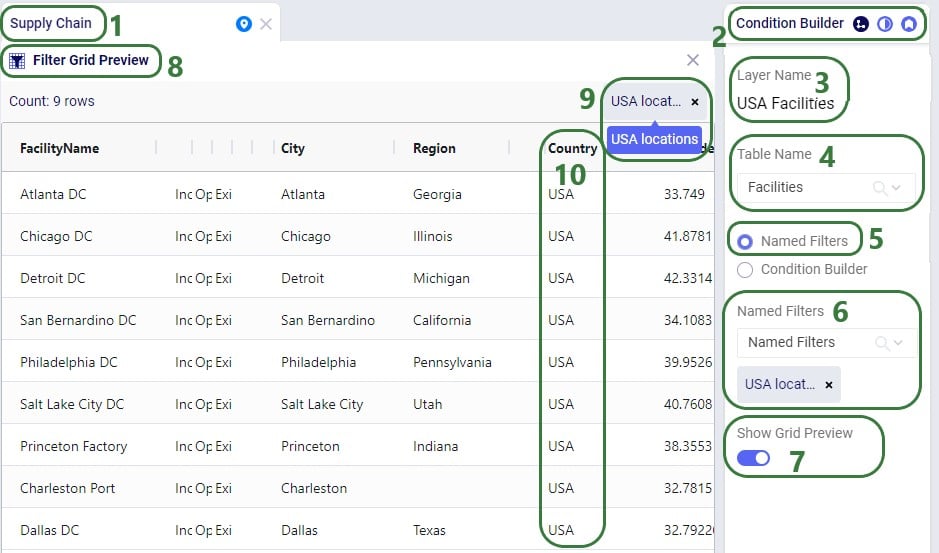
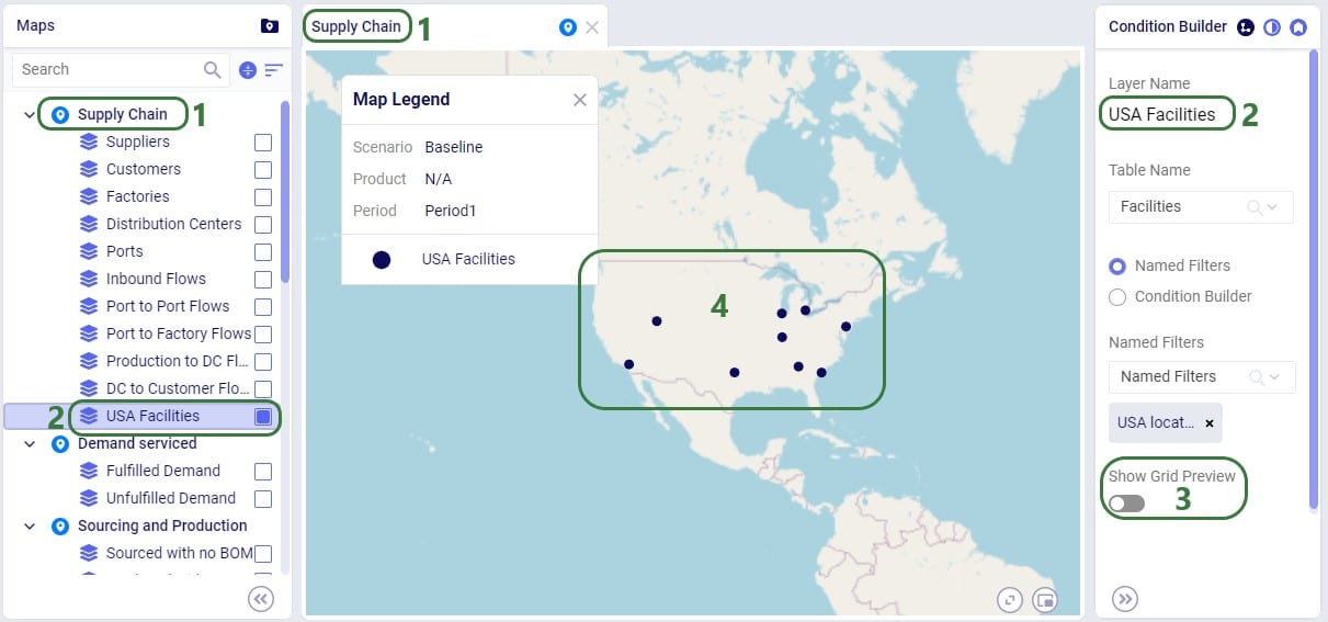
Another example of the same model is to use a different Named Filter from the Facilities table to show only Factories on the map:
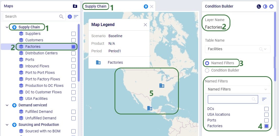
Applying multiple Named Filters on maps works the same way as for tables:
For example, applying the Ports and Factories filters will show all Ports (4 in total, 2 not shown in the screenshot as they are in Europe and China) and all Factories (2) - these are 2 filters on the same field (facility name) and are therefore OR-ed:
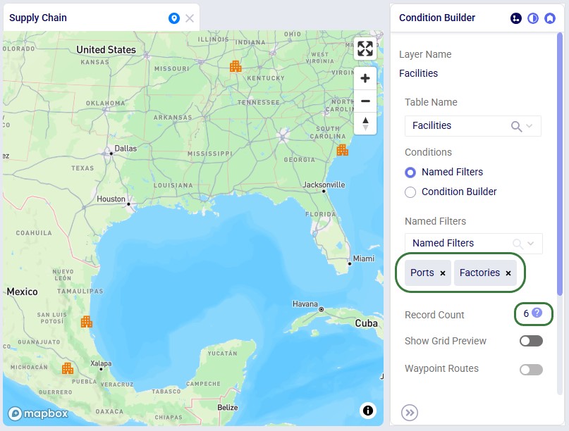
Now, when we also enable the US Locations filter in addition, only the Port and Factory in the US are shown on the map - the US Locations filter applies to a different field (country) and is therefore AND-ed with the other 2:
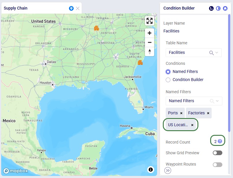
The same notes that were listed for the Filter Grid Preview for scenario items apply to the Filter Grid Preview for Map Layers too: columns with conditions have the filter icon on them, users can resize and (multi-)sort the columns, however, re-ordering the columns is not possible.
Named Filters can be deleted, and this affects other input tables, scenario items, and map layers that used the now deleted Named Filter(s). This will be explained further in this final section of the Help Article on Named Filters.
A Named Filter can be deleted by using one of three methods:
After choosing to delete a named filter, the following message comes up to ask the user for confirmation. In this example we are deleting the filter named "New York and New Jersey" which is a filter on the Customers input table:
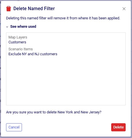
The message will let the user know if the named filter that is about to be deleted was used in any Map Layers and/or Scenario Items. If so, it lists the names of these layers/items in the "See where used" section which can be expanded and collapsed by clicking on the caret symbol. Note that currently this message does not indicate if the named filter is used in any input tables.
The results of deleting a Named Filter that was used are as follows:
Ada is Optilogic’s next-generation agentic AI, enabling supply chain teams to work faster and with greater confidence across the full modeling lifecycle — from raw data preparation to optimization runs to executive reporting — all through natural language interactions.
Unlike traditional UI chat assistants, it deploys purpose-built agents that can pursue multi-step goals, use specialized skills, maintain conversational context, and coordinate with each other to complete workflows that previously required significant manual effort. This dramatically reduces the time required to move from raw data to recommendations.
As a core part of Optilogic’s Next Generation User InterfacePlatform, Ada provides a more intelligent and conversational approach to supply chain design work.
Ada is named after Ada Lovelace, widely regarded as the world’s first computer programmer and one of the earliest visionaries to recognize the potential of computational systems beyond pure calculation. The name reflects Optilogic’s goal of building intelligent systems that help people solve complex problems through collaboration between human expertise and advanced computing.
Ada is your AI-first supply chain modeling partner, designed specifically for the Optilogic platform. Through a conversational interface, Ada helps users build, validate, analyze, and improve supply chain models.
You can think of Ada as a chat agent like for example Claude and ChatGPT. But, unlike general-purpose AI chat tools, Ada is trained around supply chain modelling workflows and has access to Optilogic-specific tools, applications, databases, schemas, and platform capabilities.
Today, Ada includes three specialized AI Agents:
The Select the AI Agent part of the Create Your First Prompt section further below includes guidance on which agent to use for what type of question/task.
For a deeper technical explanation of how AI agents, tools, and skills work together, see the AI Agents: Architecture and Components help center article.
Teams commonly use Ada for:
Ada works best for:
Ada is less suited for:
Ada is best thought of as:
Ada does not automatically understand:
The clearer the context you provide, the better the results typically become.
Ada can connect to:
Ada operates entirely within the Optilogic platform and your connected databases. It does not access the internet or any data or systems outside of the Optilogic environment. It does not send your data to third parties beyond what is required by the underlying GPT family model API (see AI Data Security & Privacy).
Ada may:
To start using Ada, log into the next generation Optilogic platform at https://ai.optilogic.app or navigate there by clicking on the Ada icon in the navigation sidebar while on the current Optilogic platform (https://optilogic.app):
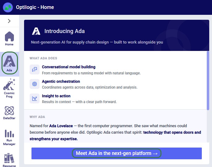
Besides this documentation, you can also get a guided tour on how to use Ada from within the platform itself. In the sidebar on the left, click on the Apps Launcher icon:

Then search for “Start Ada chat” and click on the Start Ada Chat Walkthrough item in the Actions list to start the tour:
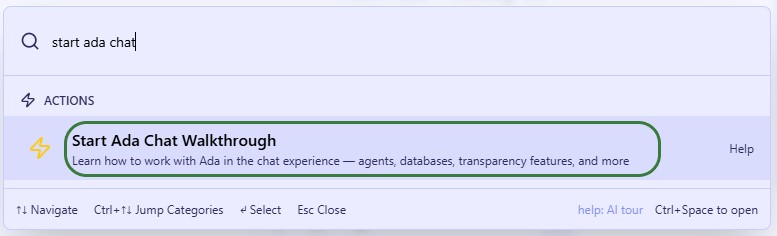
When logged into the next-gen platform at https://ai.optilogic.app, there are 2 main ways to start using Ada:
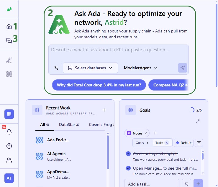
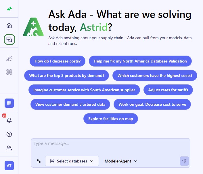
In a new conversation, you first need to configure chat style (optional), select your database(s), choose your agent, and then enter your question/task for Ada.
Note that for any further questions within the same conversation, the chat style, database(s), and agent do not need to be configured again – they will remain as they were set for the first prompt.
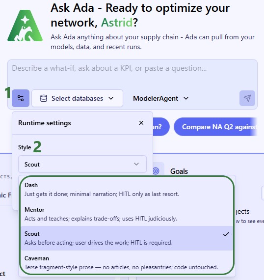
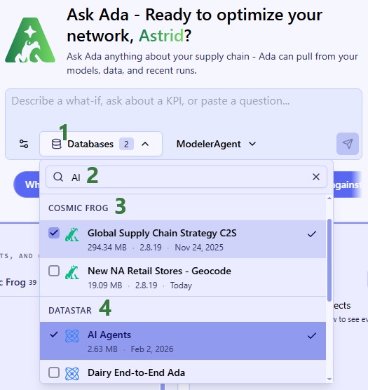
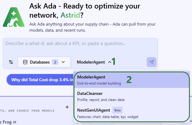
To guide you on choosing the best agent for the task, here is an overview of what each is good at.
Modeler Agent:
Data Cleanser:
Next Gen UI Agent:
Once a prompt has been submitted, Ada will process it and formulate a response. Responses can have different formats, here we will see a text only result, while other response types are covered in the next section.
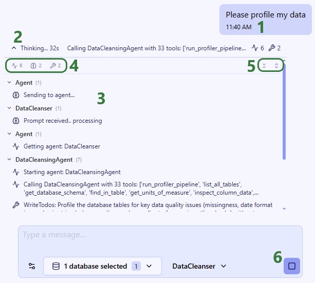
Once Ada is done processing the prompt, the response will be displayed:
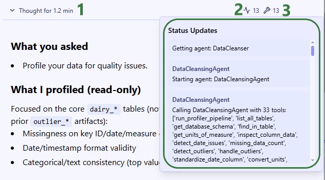
The full response for this prompt is shown in the next 2 screenshots:
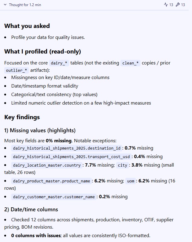
Besides responses that are purely text-based, you will come across other types too. For example, when your input is needed, Ada will pause the response and ask you for feedback:
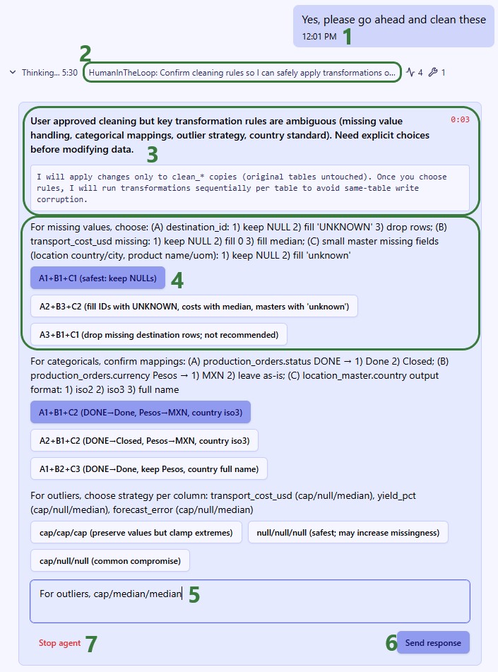
When Ada modifies a Cosmic Frog model or a DataStar project sandbox, users can verify these in the respective applications on the current platform (https://optilogic.app). Here, we are checking if the data cleaning step indeed created the clean_ tables in the sandbox of the connected DataStar project:
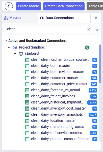
Responses can also contain files:
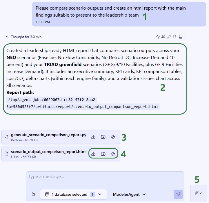
When saving an artifact to your workspace, the following modal will come up where you can choose the location to save it and indicate if any pre-existing files with the same name at the chosen location should be overwritten or not:
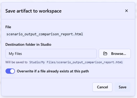
When choosing to open the report in Lightning Editor, it does so in the new platform, to the right of the conversation with Ada so users do not need to change context:
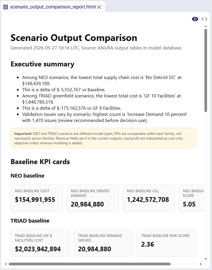
The Next Gen UI Agent can help you for example with changing the look and feel of the platform’s UI. In this example it created a tour on how to customize the UI where the user can click on the buttons in the response to be taken directly to that part of the UI. Note that only part of Ada's response is shown in the screenshot:
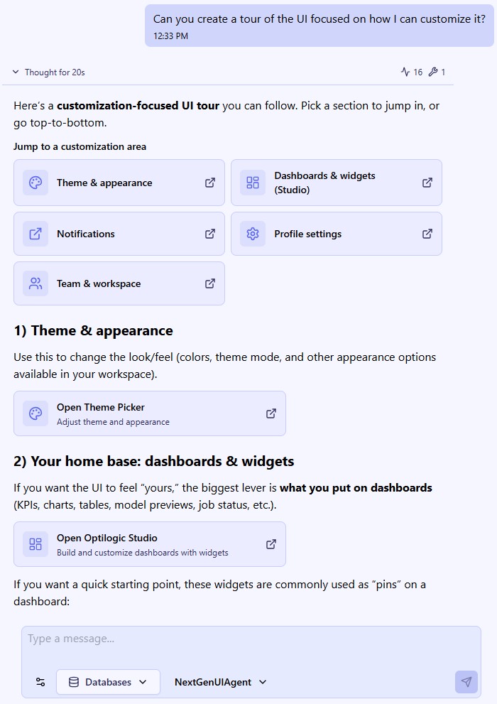
Conversations with Ada are by default saved and users can return to them to review, audit, or continue the conversation.
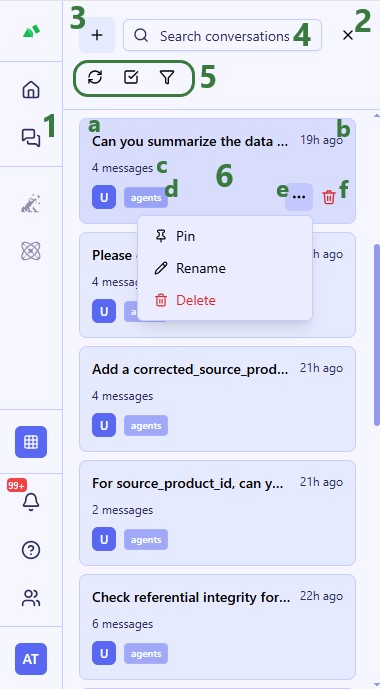
Keep Conversations Focused
Ada performs best when conversations stay centered on a single task or workflow. Avoid mixing unrelated activities — such as model building, reporting, and data cleansing — in the same chat.
Focused conversations improve response quality, reduce confusion, and make it easier for Ada to maintain context.
Give Context Before the Task
Provide business context, objectives, constraints, and relevant background before asking Ada to perform work.
Better prompts typically include:
Example: Instead of: “Build scenarios for this model.”
Try: “This model evaluates manufacturing diversification risk across LATAM and EMEA. The goal is to reduce China dependency while minimizing transportation cost increases. Create several realistic diversification scenarios.”
Ask Ada to Explore Before Acting
For complex workflows, first ask Ada to explore, profile, summarize, or analyze the environment before making changes.
Examples:
This gives both you and Ada better shared context before execution and reduces downstream errors.
Plan First for Multi-Step Workflows
For larger workflows, ask Ada to propose a plan before executing actions.
Example: “Before making changes, provide a step-by-step plan for how you would approach this workflow.”
This allows you to:
Be Explicit About Constraints
Clearly state any important rules or limitations.
Examples:
Explicit constraints improve consistency and reduce unintended actions.
Ask Ada Clarifying Questions
If a workflow is complex or ambiguous, invite Ada to ask clarifying questions before proceeding.
Example: “Before executing, ask any clarifying questions needed to complete this task correctly.”
This often improves first-pass accuracy significantly.
Start a New Conversation When Switching Contexts
Create a new conversation when:
Long conversations can dilute context and reduce response quality over time.
Ask for Multiple Options
Instead of requesting a single recommendation, ask Ada for multiple approaches and trade-offs.
Example: “Provide three approaches for supplier diversification and explain the trade-offs of each.”
This helps surface alternatives and improves decision-making.
Re-State Important Constraints During Long Workflows
In long conversations, periodically remind Ada about key requirements.
Examples:
This helps reduce context drift.
Generate a Summary Before Starting a New Chat
If a conversation becomes long or complex, ask Ada to summarize:
You can paste this summary into a new conversation to preserve context without carrying forward unnecessary noise.
Helpful prompt: “Summarize this conversation into a clean handoff document including goals, technical decisions, constraints, and next steps.”
Avoid Overloading Prompts
More information is not always better.
Instead:
Focused prompts generally produce better results than overly large or unstructured requests.
Ask Ada What It Can Do
If you are unsure how to approach a task, ask Ada directly.
Examples:
Ada can often suggest workflows, prompts, and capabilities you may not know are available.
Ada is evolving rapidly, and some platform capabilities are still in active development.
File Attachments in Chat
Files cannot currently be uploaded directly into Ada conversations.
File Explorer Data Access
Data stored in your account (accessible through the Explorer application) is not directly accessible in chat workflows. Data first needs to be imported into a DataStar project or connected database.
DataStar and Cosmic Frog Integration
The Next Gen platform does not yet provide fully seamless integration of the DataStar and Cosmic Frog applications. For some processes, users will need to open these in the current platform (https://optilogic.app).
UI Rendering Requires the Next Gen UI Agent
Advanced inline visualizations and UI rendering features currently require selecting the Next Gen UI Agent explicitly.
Long Conversations Can Degrade Performance
As conversations grow longer, Ada may lose context, become repetitive, or produce less reliable responses.
Starting a fresh conversation for new workflows or projects generally improves results.
AI Responses Should Always Be Reviewed
Like all AI systems, Ada can occasionally produce incorrect or misleading outputs.
Always validate:
before using outputs in production or customer-facing work.
Session Stability
Leaving the platform idle for extended periods can interrupt workflows or produce unexpected behavior.
If the platform becomes unstable:
We hope you are going to have many productive conversations with Ada! Please do not hesitate to contact our Support team via support@optilogic.com if you have any questions or concerns.
Applies to all Optilogic AI systems.
No confidential client information will be used as inputs or part of model training and validation datasets. In addition:
Data Minimization: The amount of data shared with the AI provider depends on the task being performed. Optilogic's agents are engineered to query and pass only the minimum data required for each specific operation — ranging from structural metadata (table and column names, data types, statistical summaries) for schema-level tasks, to slices of actual data values for operations that require it, such as data cleansing, outlier detection, or name matching.
Optilogic does not transmit your entire dataset to the AI provider in a single operation. However, over the course of a session, the AI provider may process portions of your data as needed to complete the tasks you request.
No Model Training: Optilogic does not use your data to train AI models. Optilogic’s current AI provider (OpenAI) does not use API-submitted data for model training under their enterprise API terms. Refer to OpenAI policies here: https://openai.com/policies/.
Built-in Agent Safety Instructions: Optilogic agents include standing safety instructions in their core configuration to guard against prompt injection — attempts to manipulate agent behavior through user messages or data the agent processes. These instructions:
Best Practices: Users should avoid including sensitive information (PII, credentials, etc.) in table/column names or prompts, as these are shared with the AI provider.
The Modeler Agent is one of Ada’s AI-powered supply chain modeling specialists. It helps users build, validate, troubleshoot, run, analyze, and automate Cosmic Frog network optimization (Neo) and transportation optimization (Hopper) models. The Modeler Agent accelerates the entire modeling lifecycle – from raw operational data to optimization-ready model construction and scenario analysis – while improving model quality, traceability, and reproducibility. By combining supply chain domain knowledge with direct platform capabilities, it helps teams move from messy source data to solver-ready models faster and with fewer manual hand-offs.
The agent can be accessed by chatting with Ada in the next generation Optilogic platform and via Run AI Agent tasks in DataStar.
Users get leverage in these main areas:
Data → Model mapping
Validation & feasibility checks
Scenario & policy authoring (conceptual + implementation guidance)
Engine execution support
Workflow automation (DataStar)
Reporting and documentation
There are two ways to access the Modeler Agent:
Both ways will be explained: via chat first, then the DataStar workflow, followed by an overview of the main differences between the 2 methods.
It is recommended to be somewhat familiar with Ada and how to talk to her in the chat UI before diving into this content. Please see the Getting Started with Ada & Agentic AI article, and in particular its How to Use Ada section.
Once logged into the next generation Optilogic platform at https://ai.optilogic.app, you can start chatting with Ada leveraging the Modeler Agent right away from the central part of the Home page.
Here, our example is of a new modeler who inherited a work in progress model to evaluate and optimize their company's manufacturing footprint. They have the Cosmic Frog model which is partially built and a DataStar project with both raw historical and master data, and a set of previously cleaned tables.
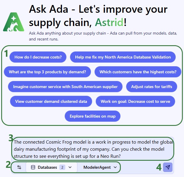
Our 2 connected databases are shown in this screenshot:
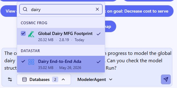
After submitting a prompt, the Modeler Agent will start processing and formulating a response; the following 3 screenshots show the full response:
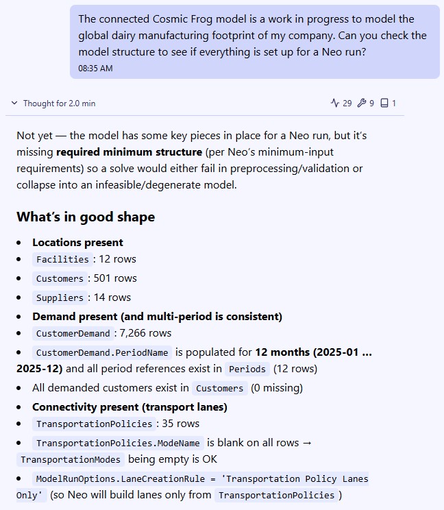
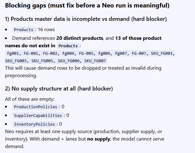
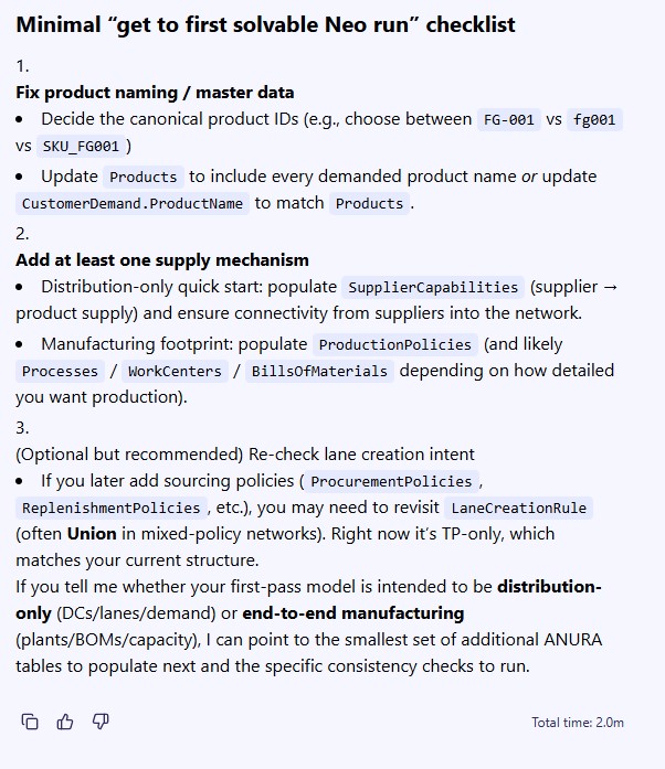
We now understand there are several issues that need to be addressed before we can attempt a first model run. First, the user decides to focus on the product name problem identified in the Customer Demand table. To understand the problem, we first have a look at the Customer Demand table in the Cosmic Frog model and notice that whereas all finished goods should follow the naming convention of FGXXX, many do not:
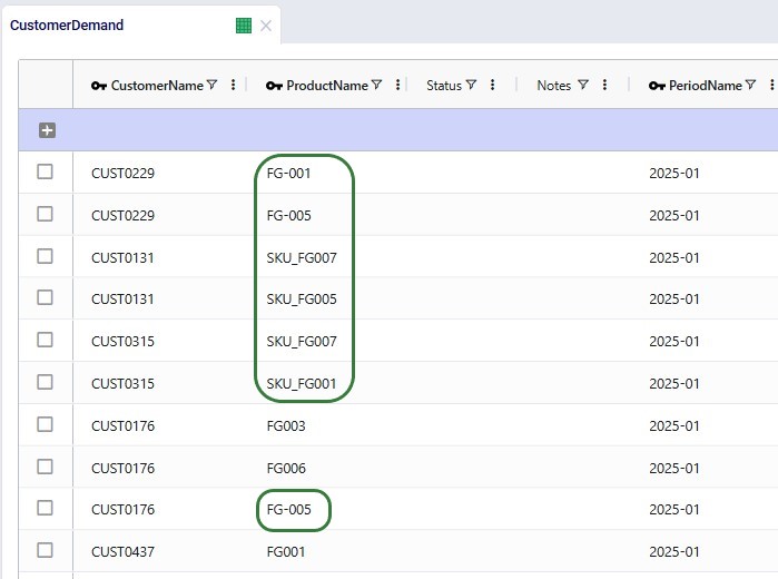
Since we are not familiar with the data in the DataStar project, we ask the Modeler Agent if there are tables that can help resolve the product naming problem:
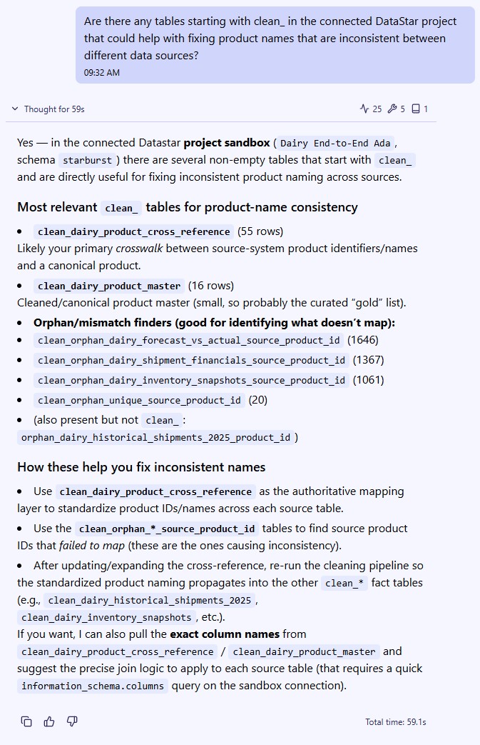
We then have a look at the mentioned tables in the DataStar project and identify the 2 we think can be used as lookups to fix the incorrect product names:
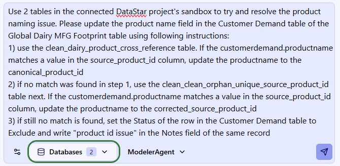
The response does not yet make any changes, but summarizes what they will be and asks us to confirm before making the changes:
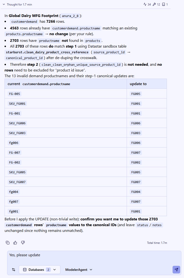
After submitting the confirmation, the changes are made:
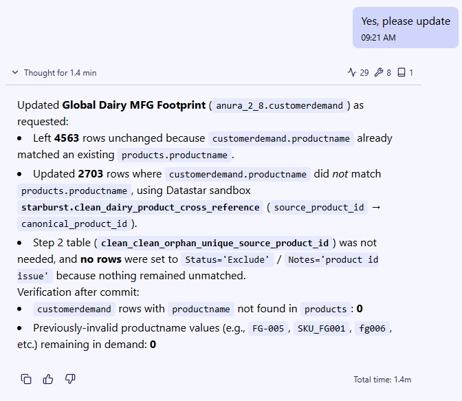
And checking the Customer Demand table in Cosmic Frog, we see the product naming is now consistent. The names outlined in green were incorrect previously (see screenshot above):
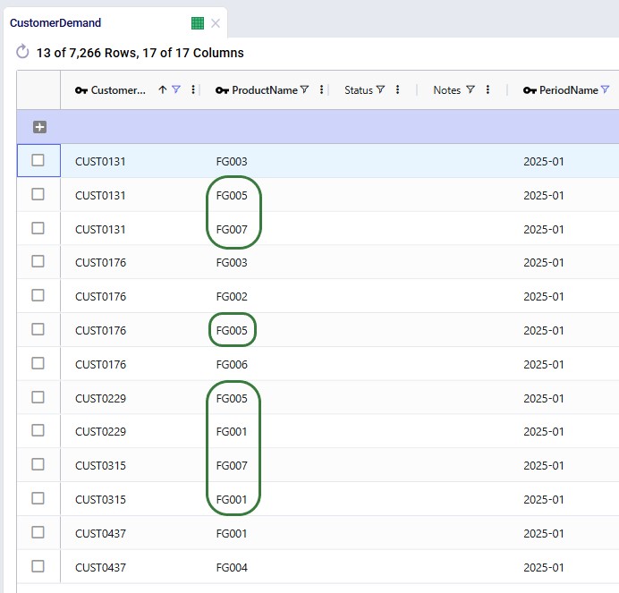
Accessing the Modeler Agent through DataStar is done via a Run AI Agent task:
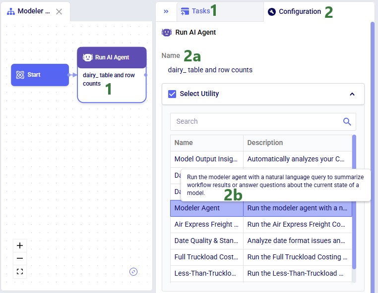
Next, configure the other parts of the task:
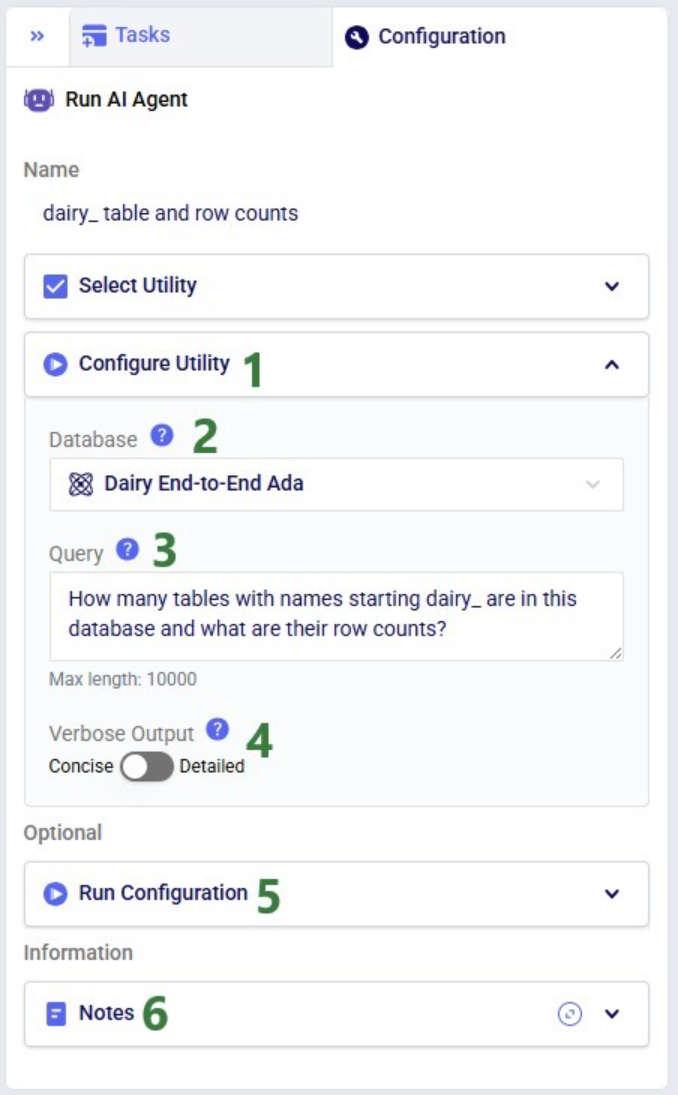
After running a Run AI Agent task, the Task Logs tab located underneath the Macro canvas will show the log that contains the Modeler Agent’s response:
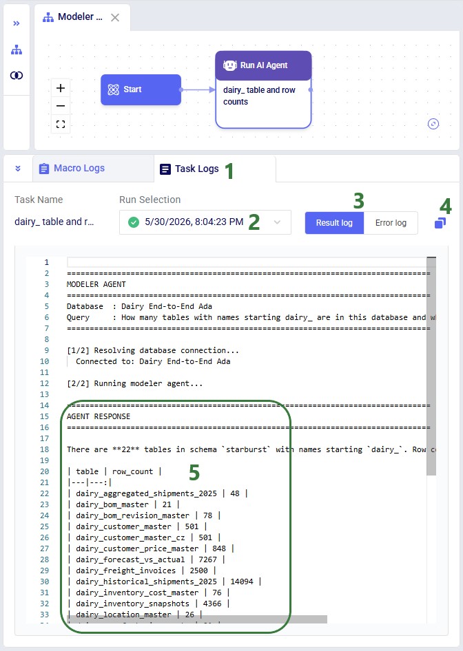
There are a few differences to keep in mind when running the Modeler Agent either via the chat with Ada UI or from within DataStar:
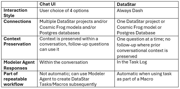
Recommendation: Use the chat UI to develop and refine a prompt, then transfer the working prompt into a DataStar Run AI Agent task once you want the workflow to become repeatable.
The general Best Practices, Tips & Tricks, and Current Limitations and Known Behaviors included in the Getting Started with Ada documentation also apply to the Modeler Agent. In addition, we recommend providing the Modeler Agent with structured context. The more structured context provided, the faster and more accurately it can help.
Specify the engine and objective
Better:
“Using Neo, minimize total landed cost while meeting all customer demand.”
Worse:
“Optimize my supply chain.”
Specify grain and keys
Better:
“Demand is customer-product-month keyed by (customer_id, sku, month).”
Worse:
“Here’s demand data.”
Clarify constraints and assumptions
Examples:
Separate staging from ANURA model tables
Transform and cleanse data in staging layers whenever possible and export finalized structures into ANURA.
Ask for evidence
Request:
rather than only asking:
“Is it valid?”
Prefer incremental changes
Better:
“Fix these 3 fields.”
Worse:
“Rebuild the whole model.”
Inspect an existing model
“Inspect my model {database name}: what ANURA tables are populated, and what are row counts by table?”
Identify minimum required inputs
“I want to run {Neo|Hopper} for {problem statement}. What are the minimum ANURA input tables and critical required fields?”
Map raw source data into ANURA
“Here are my source tables {table list} with keys {keys}. Propose a mapping into ANURA tables for {engine} and list assumptions and gaps.”
Validate referential integrity
“Check that all {demand table} references exist in {Customers, Products} and show missing keys.”
Diagnose empty outputs
“My run completed but outputs are (partially) empty. Walk me through the most likely causes and the checks to confirm each.”
Troubleshoot Infeasibility (Neo) / Unrouted Shipments (Hopper)
“My model is infeasible. Help me troubleshoot.”
“About 60% of shipments in scenarios 2 and 3 are unrouted. Diagnose why.”
Create scenarios
“Create a set of scenarios where the 5 currently excluded DCs are set to Consider and demand is increased by 10%, 30%, and 50%.”
Configure Hopper inputs
“I have shipments at the weekly level and 5 different types of assets. What ANURA tables do I need for Hopper?”
Build a DataStar workflow
“Design a DataStar macro that builds Cosmic Frog model-ready Facilities and Products tables from the clean_DC_Master, clean_MFG_Master and clean_SKU_Master tables in this DataStar project’s sandbox and exports them into the EMEA Neo Cosmic Frog model.”
Output analysis and reporting
“Analyze the outputs of the Neo scenarios in the Global Supply Chain Strategy model. Generate a report for the leadership team which compares the scenarios and focuses on the biggest shifts and main KPIs.”
The Modeler Agent helps supply chain modeleres avoid common modeling mistakes such as:
Many optimization issues originate during preprocessing rather than inside the solver itself. Preprocessing typically:
Common preprocessing-related symptoms include:
The Modeler Agent is designed to diagnose these issues before expensive solves are executed whenever possible.
Questions or feedback? Please contact the Optilogic Support team on support@optilogic.com.
Ada, Optilogic's Agentic AI, is a suite of specialized AI agents designed to help supply chain teams work faster and with greater confidence across the full modeling lifecycle. Each agent is tailored to a specific part of the supply chain workflow.
In this documentation we will cover what AI agents and their components are.
AI agents are software systems that use a large language model (LLM) as a reasoning engine but go beyond chat by taking actions in an environment. Instead of only generating text, an agent can interpret a goal, decide what to do next, call external capabilities (tools), observe the results, and iterate until the objective is achieved.
In practice, an "agent" is not a single model call - it is a control system wrapped around an LLM:
This architecture matters because it turns the LLM from a passive text generator into an adaptive problem-solver that can:
An agent is not just a chat model. A chat model produces responses; an agent operates - it can run commands, fetch data, write artifacts, and iterate autonomously within defined constraints. Think of an AI agent as a smart assistant that can:
Agents are most useful when tasks are multi-step, partially specified, and feedback-driven, for example:
If a task is single-shot and fully specified (e.g., "summarize this paragraph"), a non-agent LLM call is often simpler and cheaper.
Most agents follow a ReAct-style loop (Reason + Act), sometimes with explicit planning:
A useful way to think about the loop is that each iteration should:
Well-behaved agents stop for explicit reasons, such as:
An agent is the intelligent layer that decides what to do. It's like a project manager who understands the goal, plans the approach, and uses available skills and tools to get the job done.
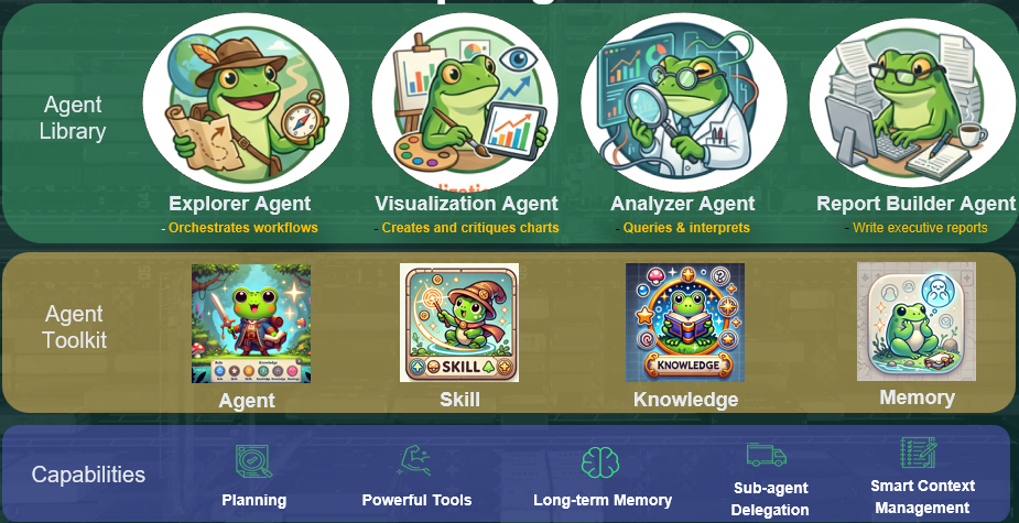
Note that not all these agents are exposed to users, in which case they are available as skills for other agents to use under the hood.
The Ada ecosystem includes many specialized agents (some of which are shown in the image above), each designed for specific analytical and reporting tasks.
Why specialization helps:
The agent toolkit is built on four foundational concepts that enable flexible and powerful agent development:
The core reasoning component - a large language model equipped with specialized skills and capabilities.
In addition to the model itself, an agent definition typically includes:
A versatile building block that packages how to do something. This modularity allows agents to be composed and extended dynamically.
A skill may:
A mechanism for injecting domain-specific expertise into agents at runtime, enabling them to operate effectively in specialized fields without requiring model retraining.
An intelligent storage system that helps agents overcome context-management challenges by preserving important information for future use, enabling continuity across interactions.
Current implementation supports several advanced capabilities enabled by the agent toolkit:
Agents can build structured plans that improve the accuracy and quality of final outputs through systematic decomposition of complex tasks.
The system supports custom tools provided by users, allowing agents to integrate with existing workflows and data infrastructure.
Persistent memory enables agents to maintain context and track important information across extended work sessions.
Complex tasks can be delegated to specialized sub-agents, allowing for efficient division of labor and expertise application.
The system intelligently manages context to ensure agents have access to relevant information while avoiding context window limitations.
Below is a simple workflow showing how different components work together. For simplicity, not all components are included here.
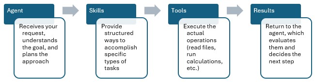
An agent is the intelligent layer that decides what to do. It's like a project manager who understands the goal, plans the approach, and uses available skills and tools to get the job done.
Skills are packaged capabilities that combine one or more tools with guidance on when and how to use them. Think of a skill as a trained procedure or technique.
Tools are the specific actions an AI agent can perform. They are specialized and do one specific thing reliably. They don't make decisions - they just execute when called.
As an AI Agent works, it produces the logs which include steps that the agent takes, tools it calls, as well as a work summary. The AI Response sections are typically the most useful as they explain the exploration plan, the work it has done, and the results after exploration. This is generally a response to the user. While all others are more for internal processes.

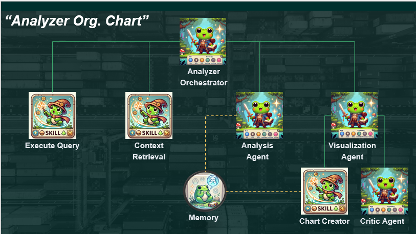
Exciting tools that drastically shorten the time spent wrangling data, building supply chain models for Cosmic Frog, and analyzing outputs of these models are now available on the Optilogic platform.
Collectively, the Optilogic agentic AI tools are called Ada. This is after Ada Lovelace, widely regarded as the world’s first computer programmer and one of the earliest visionaries to recognize the potential of computational systems beyond pure calculation.
This documentation briefly explains how to access these AI Agents and Utilities, lists the available tools with a short description of each, and provides links to detailed documentation for several of these tools.
Before we dive into how to access the AI Agents & Utilities, here are a few links you may find helpful:
Four of the available agents can be accessed by chatting with Ada and all of them can be accessed by using Run AI Agent tasks in DataStar.
When chatting with Ada on the next generation Optilogic platform, users can select the agent they want to use for their prompt:
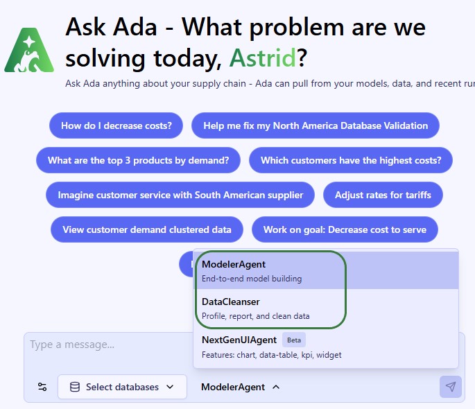
Please note that:
Please refer to the detailed documentation on the individual agents and the getting started with Ada & Agentic AI article to learn more about using these when chatting with Ada.
At a high level, the steps in DatsStar are as follows (screenshots follow beneath):
Your macro canvas will look similar to the following screenshot after step #4:
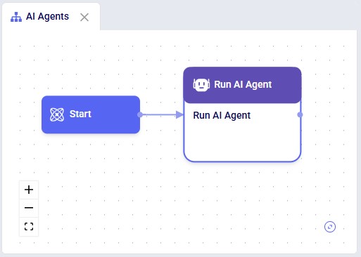
After adding a task, its configuration tab is automatically shown on the right-hand side. Give the task a name, and then select the Agent you want to use from the list of available Agents in the Select Utility section. You can also use the Search box to quickly find any Agent that contains certain text in its name or description. Hover over the description of an Agent to see the full description in case it is not entirely visible:
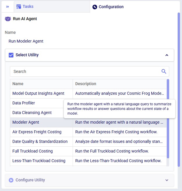
Once an Agent has been selected by clicking on it, the Configure Utility section becomes available. The inputs here will differ based on the Agent/Utility that has been selected. In the next screenshot the Configure Utility section of the Modeler Agent is shown:
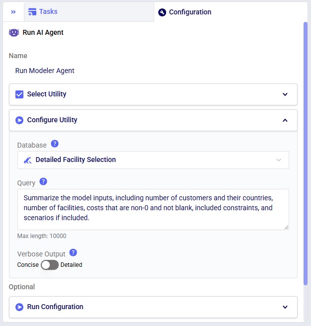
Provide the inputs for at least the required parameters, and if desired for any optional ones. Note that hovering over a blue question mark icon will bring up a hover box with a description of the parameter.
Using Utilities works in the same way as using AI Agents, just through the Run Utility task instead of the Run AI Agent task. The following 3 screenshots show 1) a Run Utility task added to a Macro, 2) its Select Utility section, and 3) the Configure Utility section of the Duplicate Macro utility:
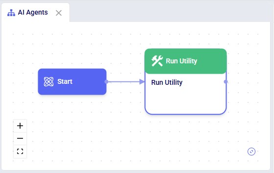
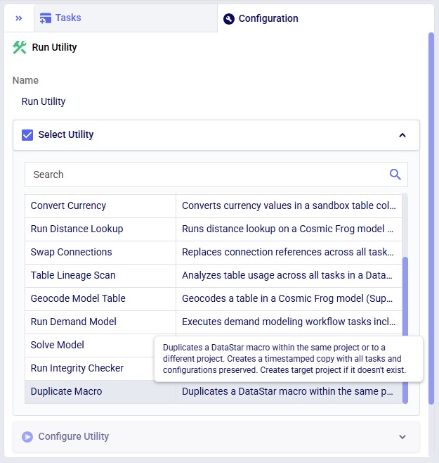
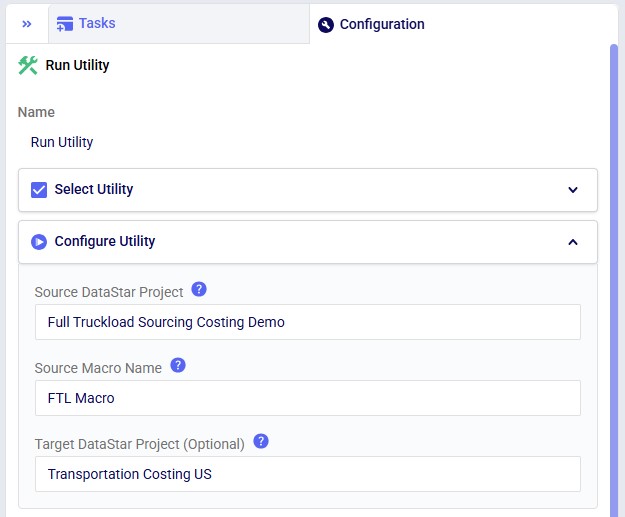
Resource Size for both Run AI Agent and Run Utility tasks can be set in the Run Configuration section, which is indicated as optional. However, for most agents and utilities, the default 3XS Resource Size is not sufficient. It is recommended to update this to XS:
The folloing AI Agents and Utilities are currently available. More are being added as they come available. For each a short description is given and for those that have more detailed documentation to go with them, a link to this documentation is included.
At Optilogic, we have built the next generation (next-gen) platform to complement our AI. It is a modern, unified workspace where users:
While the next-gen platform is still in development, there is plenty available already for users to start working with it. Especially the AI-first approach will be a gamechanger for many. This documentation gives a high-level overview of the new platform. Please see the separate Getting Started with Ada & Agentic AI documentation for in-depth documentation on Ada, your supply chain modeling partner.
Optilogic users can log into the next-gen platform at https://ai.optilogic.app, using the same credentials as those used to log into the current platform (on https://optilogic.app).
Once logged in, you are walked through 3 setup windows, shown in the following screenshots.

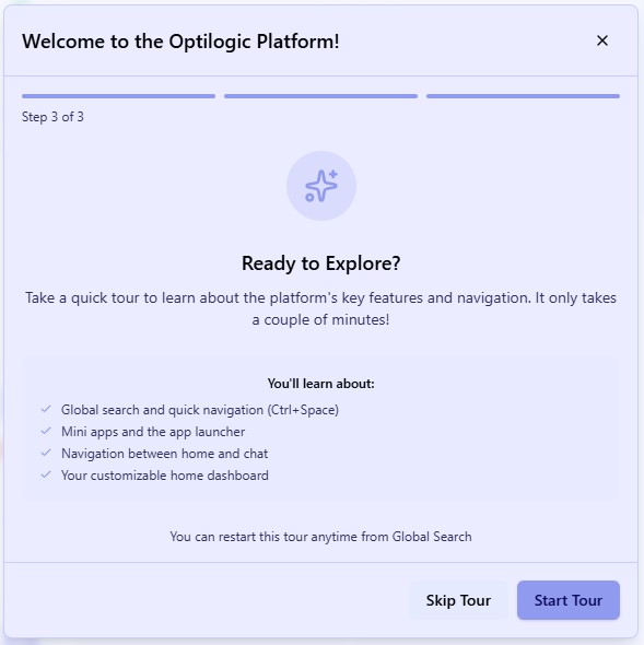
It is recommended to take the quick tour to learn about the platform. After it completes, you can follow another walkthrough, this one centered around using Ada through the chat UI. If you want to return to either of these tours later, you can find these in the Actions results part of Global Search (Ctrl + Space) after typing “introduction tour” or “Ada tour” in the search textbox.
Your Home page will look similar to this:
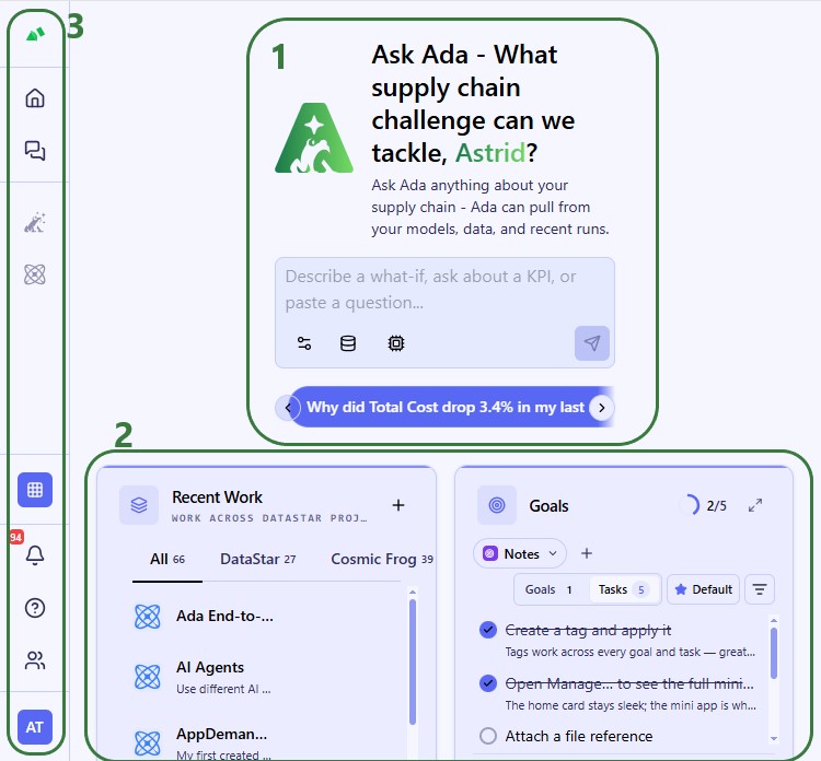
Clicking anywhere in the sidebar will expand it:
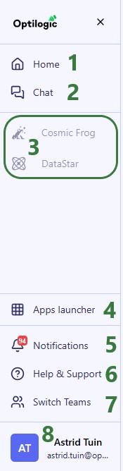
When an application has been opened, it is added to the taskbar. If multiple instances of it are active, we can see that too:
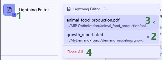
A context-menu is also available when right-clicking on applications added to the taskbar:
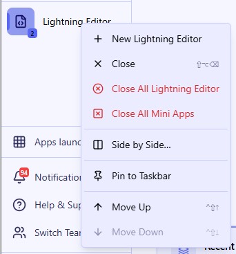
From top to bottom:
The following modal comes up when clicking on the Apps Launcher in the sidebar:
When clicking on Notifications in the sidebar, the notifications list will open up on the right-hand side of the platform, next to the Home page or active chat with Ada:
It is not shown in the screenshot, but hovering over a Notification card will bring up a checkmark icon and an x icon which can be used to mark the notification as read and to close it.
Clicking on Help & Support in the sidebar brings up the following modal:
If your organization uses the Teams set of features, you can easily switch teams by clicking on the Switch Teams button:
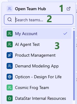
Configure your account by using the options found when clicking on your profile picture:
As mentioned under bullet 3d just above, by default, applications will be opened on the right-hand side of the screen next to either the homepage or chat with Ada page:
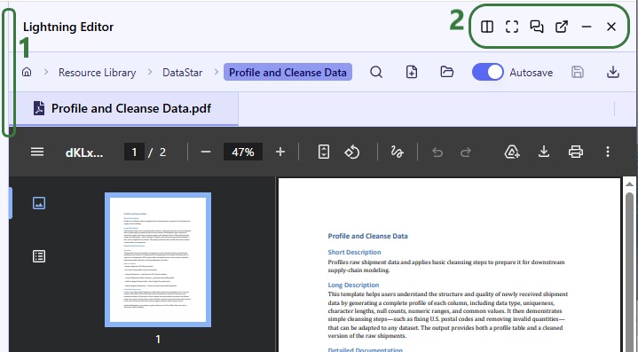
When you enter side by side mode, the second application will be shown to the left of the first, taking the place of home/chat. Here, first DataStar was opened and then Lightning Editor by using the Side by Side option:
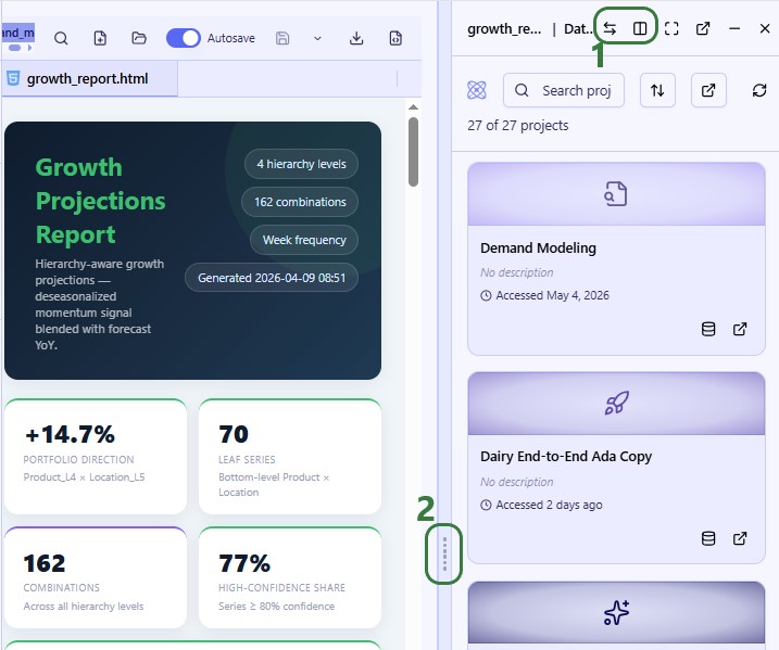
Whilst Cosmic Frog is not yet entirely integrated into the next-gen platform, users can open it, see their model list, and run scenarios from here:
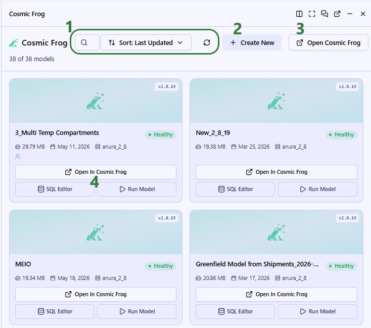
When clicking on Run Model for one of the available models, the following modal comes up:
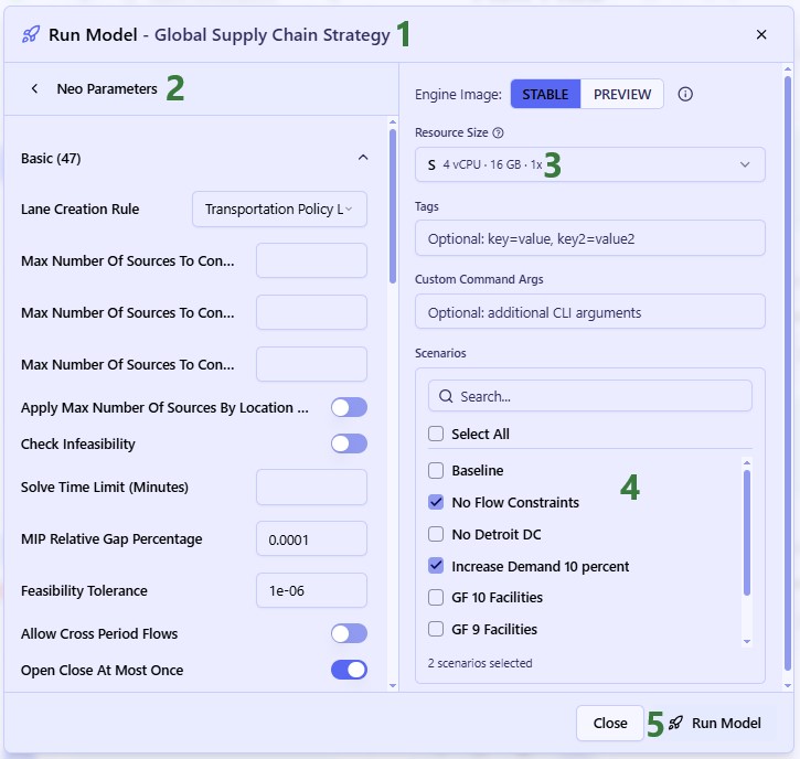
DataStar is also not yet entirely integrated, but projects, macros, and connections can be viewed and macros can be run:
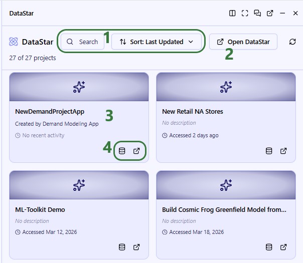
The user clicks on the New Retail NA Stores project card to open it:
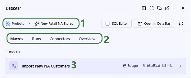
We have clicked on the Import New NA Customers to open it:
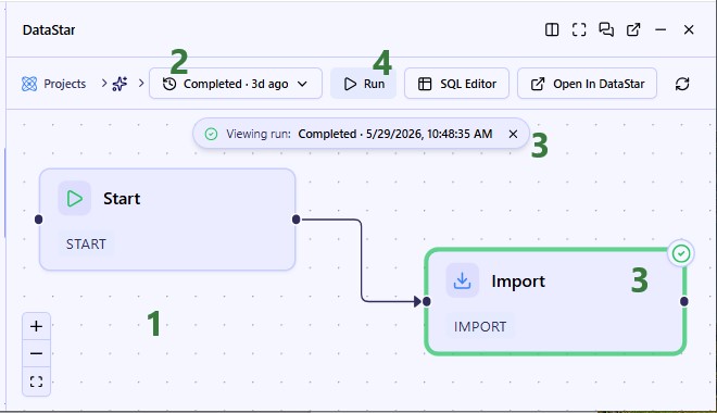
The Next Gen UI Agent is one of Ada’s agents and can be accessed through the chat UI. It can help you with anything UI/platform related, like finding things within the platform, creating charts/tables, reporting on KPIs, and guidance on widget creation/removal.
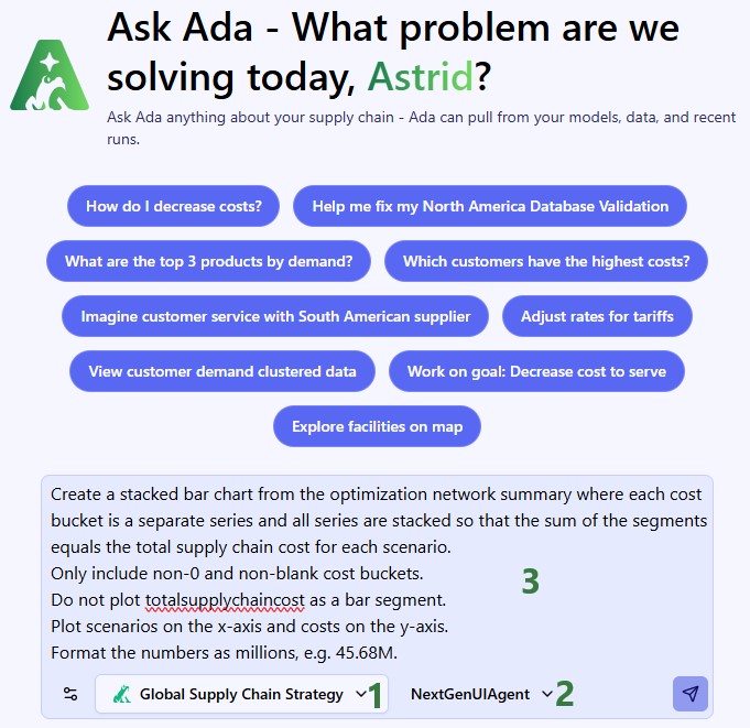
The response to the prompt is as follows, where at the top the asked for bar chart is shown and the agent proactively added the data used for the chart in a table underneath the chart:
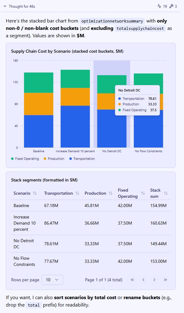
Here are a few example prompts you can try using the Next Gen UI Agent:
As always, please reach out to Optilogic Support (support@optilogic.com) in case of questions or feedback.
In just a few clicks, you can create a free account on the Optilogic platform, which includes Cosmic Frog and DataStar among other applications. This document walks you through the steps.
If you just want the fastest way to get started:
You will go through 3 main stages:
To start, go to the Create a Free Account page on Optilogic's website. You will see the following form on the right-hand side:
After clicking on the Next Step button, the form changes to the following message. In addition, a new browser tab has been opened and has automatically become the active tab (see screenshot below this one):

The new active tab shows the following Create An Account form:
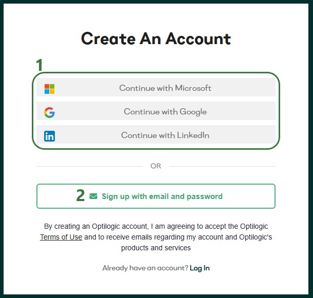
We will first go through the Single Sign-On steps using Google as the example in the next section. In the section after, Email and Password Steps, we will cover the email and password sign-up option.
We will illustrate the single sign-on process by going through the steps using a Google account. These steps are similar when using a Microsoft or LinkedIn account.
First, you will be prompted which Google account you want to use. The one you are currently logged into will be listed and you can click on it to select it. If you want to use another Google account, click on the "Use another account" option.
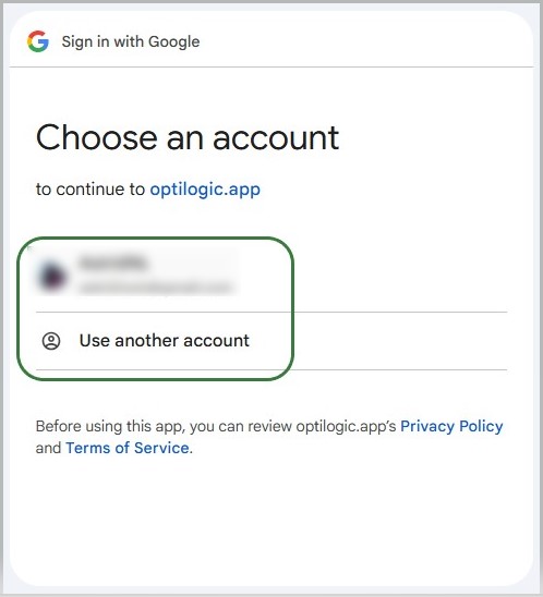
After selecting the Google account to use, the following form will appear:
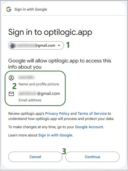
If you have clicked on the Continue button, the following form with user account information will come up. If any details are missing, please fill them out and then click on the Submit button.
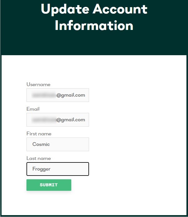
You have now signed up for an Optilogic account. The next step is to verify your email address, see the Verify Email and Configure Account section further below (link).
If you have chosen the option to sign-up using your email address and a password, the bottom part of the sign-up form will now look as follows:
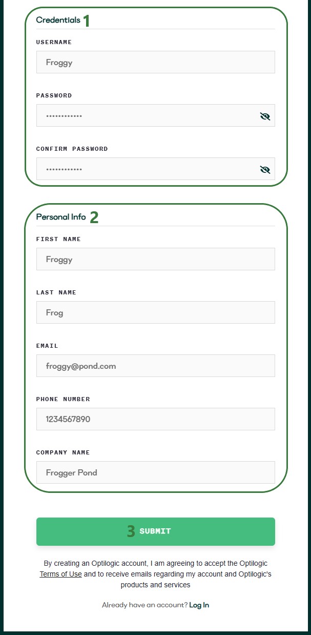
Regardless of if you used an SSO method or the username & password option to sign-up for an Optilogic account, the next steps are the same. After clicking on the Submit button, the following message will appear:
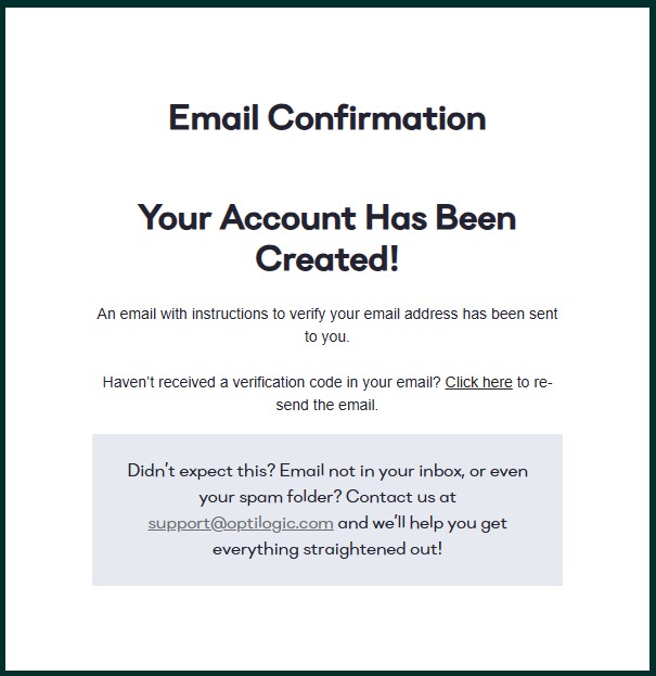
Go into your email account and find the email from Optilogic Support with the subject Verify Your Optilogic Email. In there, click on the Verify Email button:
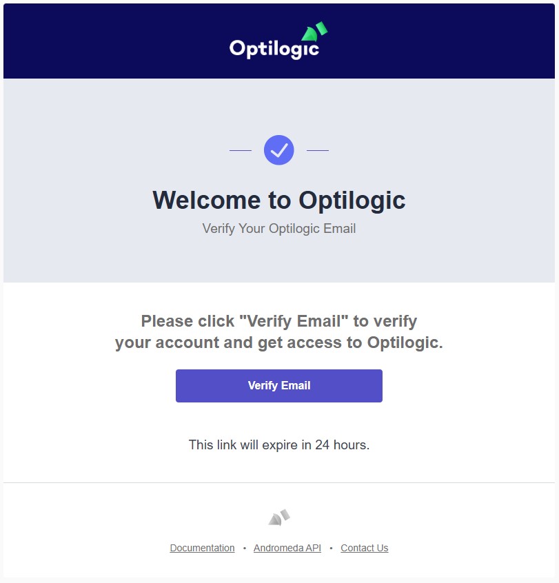
This will take you into the Optilogic platform, where you will be walked through a few quick questions to finalize your details and set up your account. Step 1 is pre-populated from your previous entries; if any are missing, please add them and then click on the Next button:
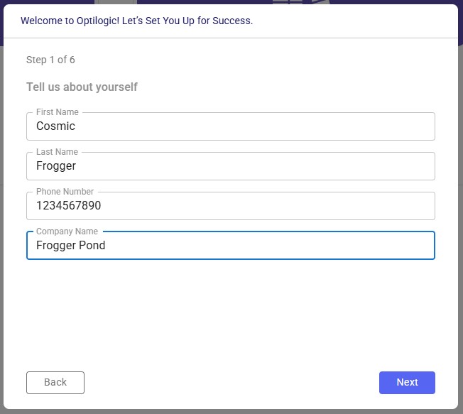
The next steps gather a bit more information:
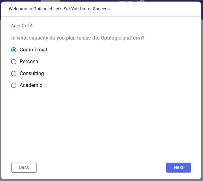
When completed, the Cosmic Frog application will be opened, and you can start exploring any of the 3 example models shown on the start page:
🎉 You're ready to start using Optilogic!
Note that you can also sign up for an Optilogic account from the platform's login page (https://optilogic.app) by clicking on the Sign-Up link at the bottom. The options and steps are the same as documented above.
Did not receive verification email?
Wrong SSO account selected?
The Multiple Compartments (MC) feature allows a single transportation asset (e.g., truck, trailer) to be divided into independent compartments, each with its own capacity and compatibility constraints. This enables Hopper to produce more accurate, feasible, and operationally realistic transportation plans.
Get up and running in 4 steps:
Use this feature when one or more of your transportation assets have physically separate sections that must be loaded independently. Common examples:
Without Multiple Compartments, Hopper checks only that the total shipment fits the total asset capacity. This can produce plans that look valid in the optimizer but cannot be executed operationally because individual compartments are overloaded or contain incompatible products.
Three changes have been made to Hopper's data model: one new input table, one new field on an existing input table, and one new field on an existing output table.
This table defines the structure and rules of the compartments that make up each configuration. Add one row per compartment; rows with the same Compartment Configuration Name form a single configuration.
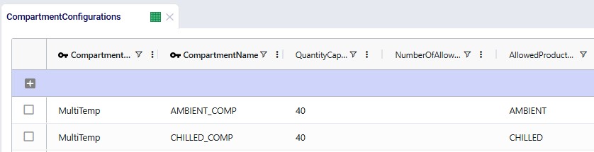
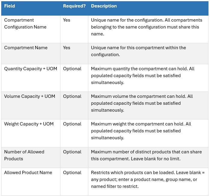
A new Compartment Configuration Name field has been added to the Transportation Assets table. Populate it with the name of a configuration defined in the Compartment Configurations table to enable compartment-level modeling for that asset.
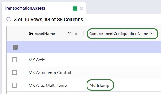
Effect on Hopper's solver:
The Transportation Optimization Shipment Summary output table now includes a Compartment Name column. For any shipment transported on a multi-compartment asset, this column shows which compartment it was assigned to.
This field enables:
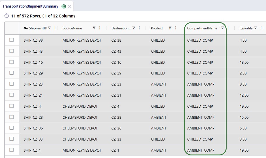
The following example runs two scenarios with the same "MK Artic Multi Temp" asset to illustrate the difference:
Both scenarios have other single-compartment assets available. In each scenario, the MK Artic Multi Temp asset is used for one route. The charts below show how much of each product is on board at each stop along that route (stops are ordered by route sequence on the x-axis; the asset is loaded at Milton Keynes and Chelmsford depots and delivers to the CZ locations).
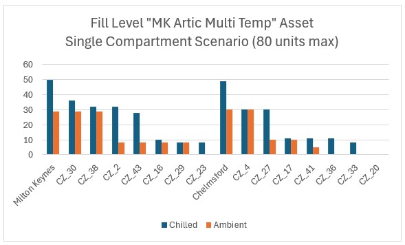
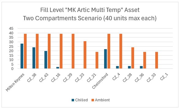
Key observations:
Multiple Compartments moves Hopper from aggregate capacity modeling to granular compartment-level modeling. This means:
Questions? Contact the Optilogic support team at support@optilogic.com.
Showing supply chains on maps is a great way to visualize them, to understand differences between scenarios, and to show how they evolve over time. Cosmic Frog offers users many configuration options to customize maps to their exact needs and compare them side-by-side. In this documentation we will cover how to create and configure maps in Cosmic Frog.
In Cosmic Frog, a map represents a single geographic visualization composed of different layers. A layer is an individual supply chain element such as a customer, product flow, or facility. To show locations on a map, these need to exist in the master tables (e.g. Customers, Facilities, and Suppliers) and they need to have been geocoded (see also the How to Geocode Locations section in this help center article). Flow based layers are based on output tables, such as the OptimizationFlowSummary or SimulationFlowSummary and to draw these, the model needs to have been run so outputs are present in these output tables.
Maps can be accessed through the Maps module in Cosmic Frog:
The Maps module opens and shows the first map in the Maps list; this will be the default pre-configured “Supply Chain” map for maps the user created and most models copied from the Resource Library:
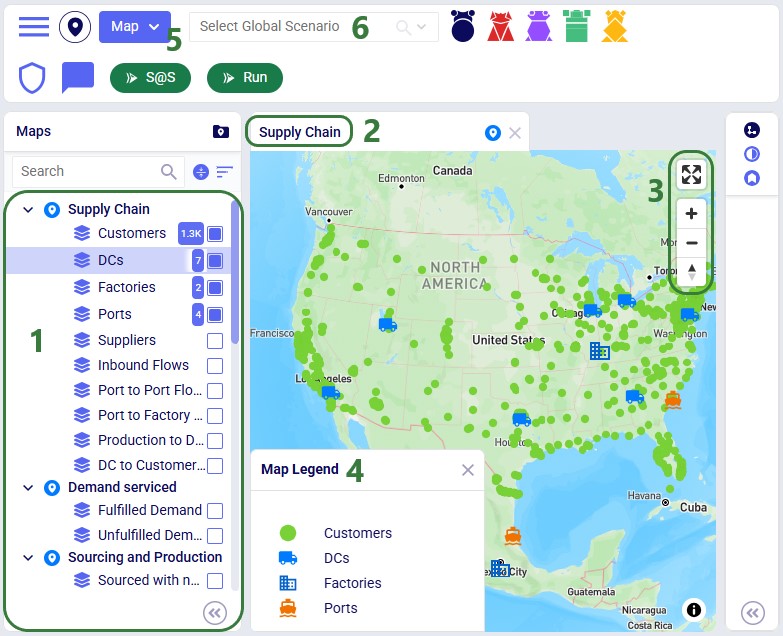
In addition to what is mentioned under bullet 4 of the screenshot just above, users can also perform following actions on maps:

As we have seen in the screenshot above, the Maps module opens with a list of pre-configured maps and layers on the left-hand side:
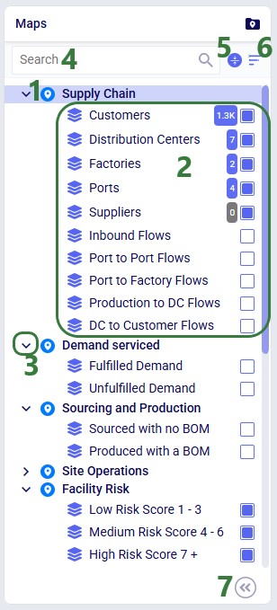
The Map menu in the toolbar at the top of the Maps module allows users to perform basic map and layer operations:
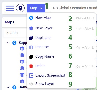
These options from the Map menu are also available in the context menu that comes up when right-clicking on a map or layer in the Maps list.
The Map Filters panel can be used to set scenarios for each map individually. If users want to use the same scenario for all maps present in the model, they can use the Global Scenario Filter located in the toolbar at the top of the Maps module:

Now all maps in the model will use the selected scenario, and the option to set the scenario at the map-level is disabled.
When a global scenario has been set, it can be removed using the Global Scenario Filter again:
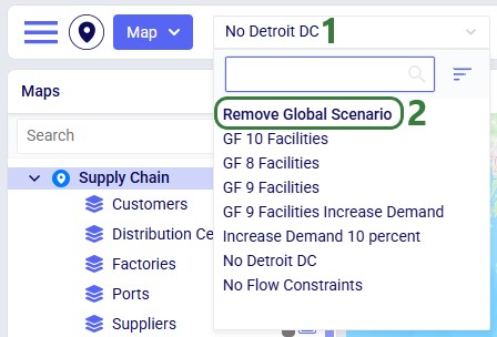
The zoom level, how the map is centered, and the configuration of maps and their layers persist. After moving between other modules within Cosmic Frog or switching between models, when user comes back to the map(s) in a specific model, the map settings are the same as when last configured.
Now let us look at how users can add new maps, and the map configuration options available to them.

Once done typing the name of the new map, the panel on the right-hand side of the map changes to the Map Filters panel which can be used to select the scenario and products the map will be showing. If the user wants to see a side-by-side map comparison of 2 scenarios in the model, this can be configured here too:
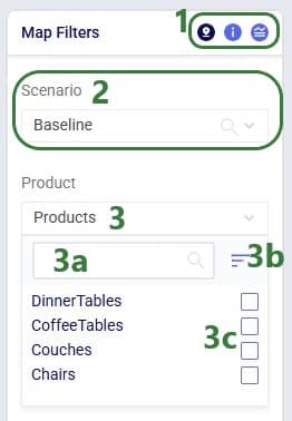
In the screenshot above, the Comparison toggle is hidden by the Product drop-down. In the next screenshot it is shown. By default, this toggle is off; when sliding it right to be on, we can configure which scenario we want to compare the previously selected scenario to:
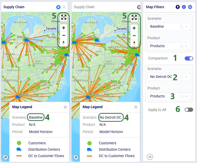
Please note:
Instead of setting which scenario to use for each map individually on the Map Filters panel, users can instead choose to set a global scenario for all maps to use, as discussed above in the Global Scenario Filter section. If a global scenario is set, the Scenario drop-down on the Map Filters panel will be disabled and the user cannot open it:
On the Map Information panel, users have a lot of options to configure what the map looks like and what entities (outside of the supply chain ones configured in the layers) are shown on it:
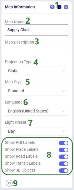
Users can choose to show a legend on the map and configure it on the Map Legend pane:
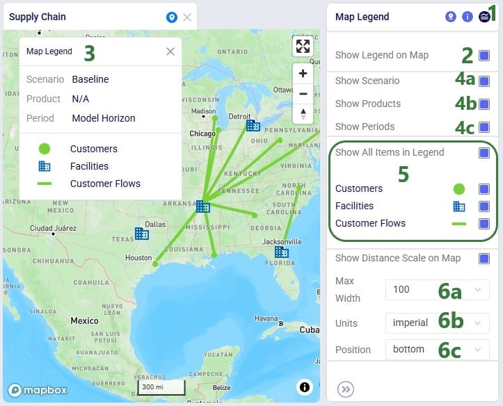
To start visualizing the supply chain that is being modelled on a map, user needs to add at least 1 layer to a map, which can be done by choosing “New Layer” from the Map-menu:

Once a layer has been added or is selected in the Maps list, the panel on the right-hand side of the map changes to the Condition Builder panel which can be used to select the input or output table and any filters on it to be used to draw the layer:

When looking at the DC to Customer Flows layer in the Maps list, we see that the Number of lines displayed in it is 1,333:
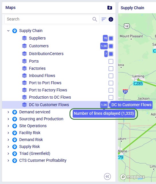
The condition used in the Condition Builder (flowtype = 'CustomerFulfillment') filters out 3,999 records in the OptimizationFlowSummary output table for the Baseline scenario. However, since each customer receives 3 different products (all from the same DC), the number of source destination pairs, and therefore the number of lines on the map, is 1,333.
We will now also look at using the Named Filters option to filter the table used to draw the map layer:
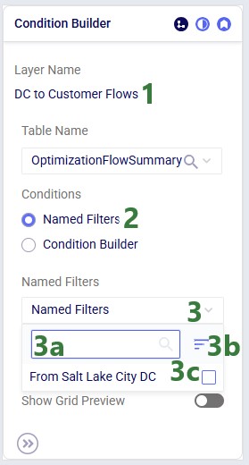
In this walk-through example, user chooses to enable the “From Salt Lake City DC” named filter:
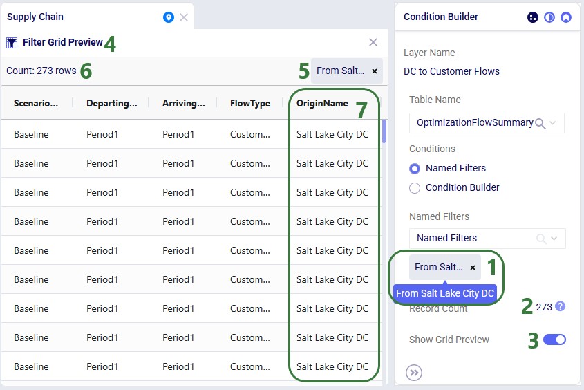
Similar to above, these 273 filtered records result in fewer lines (91) drawn on the map, since each customer served by the Salt Lake City DC receives 3 products from it. Therefore, the number of unique origin-destination pairs is 273 / 3 = 91.
In the next layer configuration panel, Layer Style, users can choose what the supply chain entities that the layer shows will look like on the map. This panel looks somewhat different for layers that show locations (Type = Point) than for those that show flows (Type = Line). First, we will look at a point type layer (Customers):

Next, we will look at a line type layer, Customer Flows:
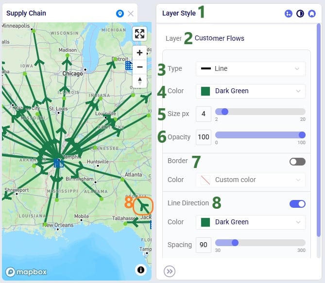
At the bottom of the Layer Style pane a Breakpoints toggle is available too (not shown in the screenshots above). To learn more about how these can be used and configured, please see the "Maps - Styling Points & Flows based on Breakpoints" Help Center article.
Labels and tooltips can be added to each layer, so users can more easily see properties of the entities shown in the layer. The Layer Labels configuration panel allows users to choose what to show as labels and tooltips, and configure the style of the labels:

This next screenshot shows the tooltip of a flow line on the DC to Customer Flows layer. The tooltip is configured to show the following fields from the OptimizationFlowSummary table: OriginName, DesintationName, ProductName, FlowQuantity, TransportationCost, and TransportationTime. Display Aggregates is turned on:
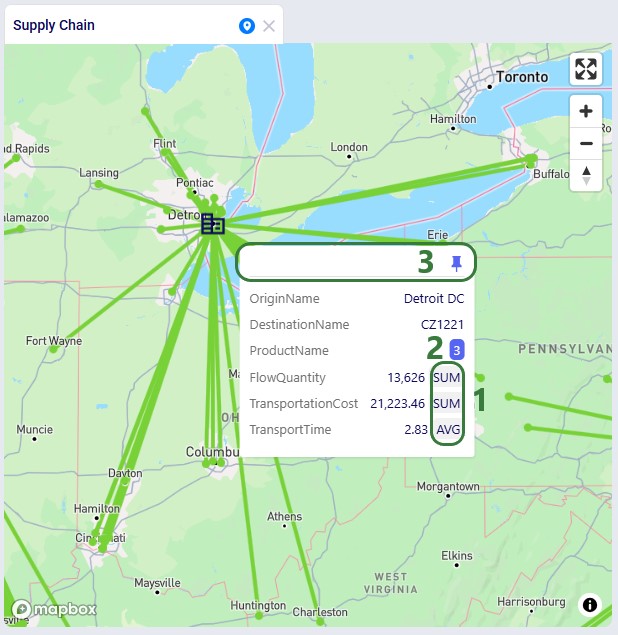
When pinning a tooltip, the Details View is shown on the right-hand side of the map:
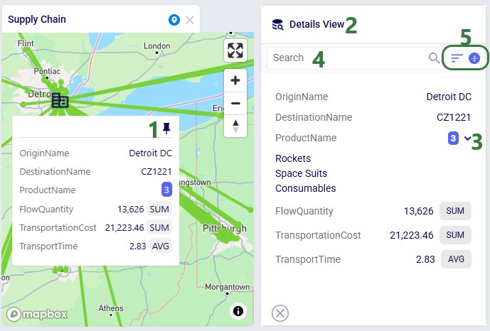
Finally, this example shows a map where the labels for a customer locations layer are showing. They have been configured to use blue black as the font color, 14 as the font size, to use a background color which is set to cyan, and they are positioned below (position = bottom) the customer's map icon:
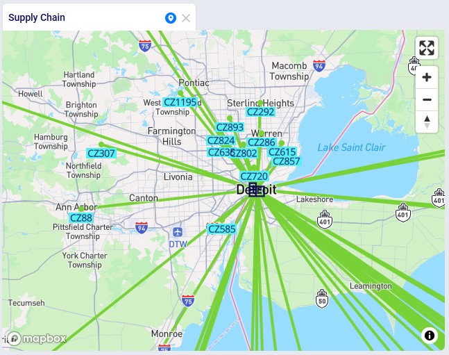
When modelling multiple periods in network optimization (Neo) models, users can see how these evolve over time using the map:
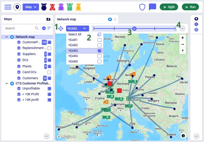
Users can now add Customers, Facilities and Suppliers via the map:
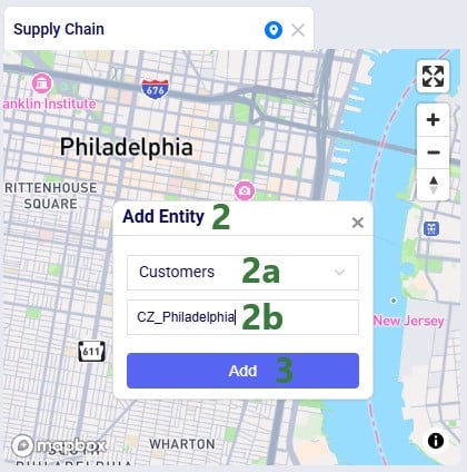
After adding the entity, we see it showing on the map, here as a dark blue circle, which is how the Customers layer is configured on this map:
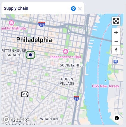
Looking in the Customers table, we notice that CZ_Philadelphia has been added. Note that while its latitude and longitude fields are set, other fields such as City, Country and Region are not automatically filled out for entities added via the map:
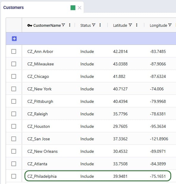
In this final section, we will show a few example maps to give users some ideas of what maps can look like. In this first screenshot, a map for a Transportation Optimization (Hopper engine) model, Transportation Optimization UserDefinedVariables available from Optilogic’s Resource Library (here), is shown:
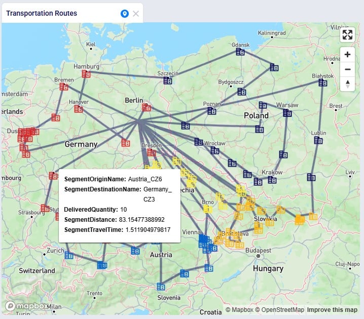
Some notable features of this map are:
The next screenshot shows a map of a Greenfield (Triad engine) model:
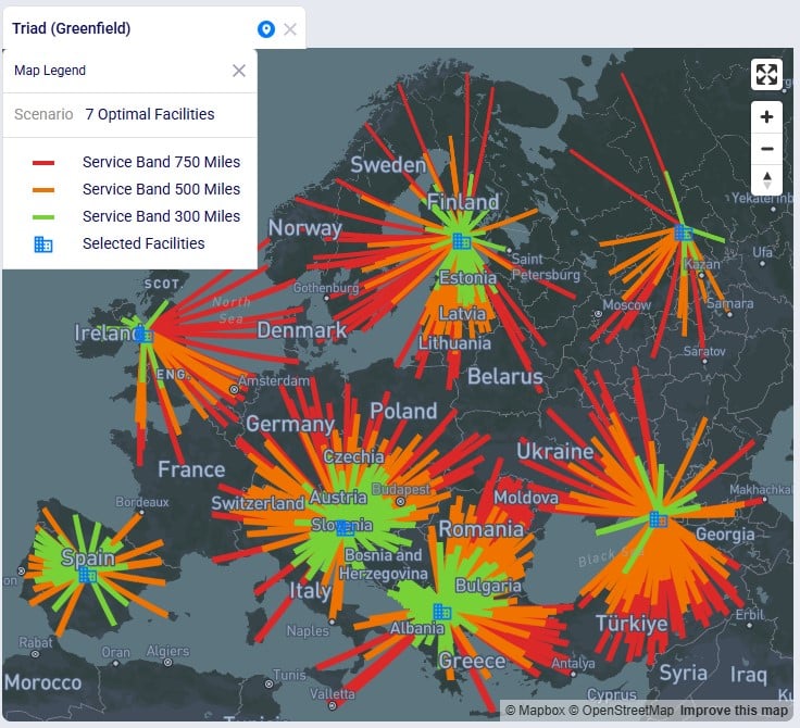
Some notable features of this map are:
This following screenshot shows a subset of the customers in a Network Optimization (Neo engine) model, the Global Sourcing – Cost to Serve model available from Optilogic’s Resource Library (here). These customers are color-coded based on how profitable they are:
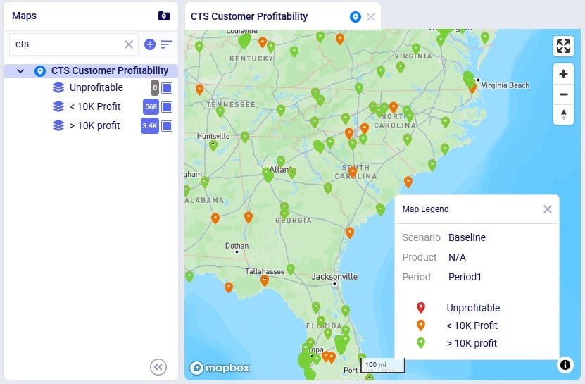
Some notable features of this map are:
Lastly, the following screenshot shows a map of the Tariffs example model, a network optimization (Neo engine) model available from Optilogic’s Resource Library (here), where suppliers located in Europe and China supply raw materials to the US and Mexico:
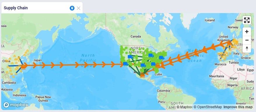
Some notable features of this map are:
We hope users feel empowered to create their own insightful maps. For any questions, please do not hesitate to contact Optilogic support at support@optilogic.com.