In this quick start guide we will show how users can seamlessly go from using the Resource Library, Cosmic Frog and DataStar applications on the Optilogic platform to creating visualizations in Power BI. The example covers cost to serve analysis using a global sourcing model. We will run 2 scenarios in this Cosmic Frog model with the goal to visualize the total cost difference between the scenarios by customer on a map. We do this by coloring the customers based on the cost difference.
The steps we will walk through are:
We will first copy the model named “Global Sourcing – Cost to Serve” from the Resource Library to our Optilogic account (learn more about the Resource Library in this help center article):
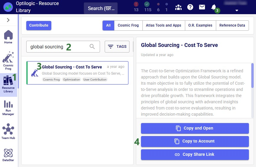
On the Optilogic platform, go to the Resource Library application by clicking on its icon in the list of applications on the left-hand side; note that you may need to scroll down. Should you not see the Resource Library icon here, then click on the icon with 3 horizontal dots which will then show all applications that were previously hidden too.
Now that the model is in the user’s account, it can be opened in the Cosmic Frog application:


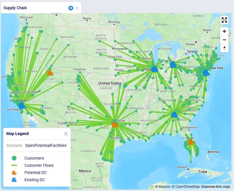
We will only have a brief look at some high-level outputs in Cosmic Frog in this quick start guide, but feel free to explore additional outputs. You can learn more about Cosmic Frog through these help center articles. Let us have a quick look at the Optimization Network Summary output table and the map:

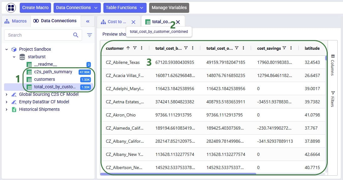
Our next step is to import the needed input table and output table of the Global Sourcing – Cost to Serve model into DataStar. Open the DataStar application on the Optilogic platform by clicking on its icon in the applications list on the left-hand side. In DataStar, we first create a new project named “Cost to Serve Analysis” and set up a data connection to the Global Sourcing – Cost to Serve model, which we will call “Global Sourcing C2S CF Model”. See the Creating Projects & Data Connections section in the Getting Started with DataStar help center article on how to create projects and data connections. Then, we want to create a macro which will calculate the increase/decrease in total cost by customer between the 2 scenarios. We build this macro as follows:

The configuration of the first import task, C2S Path Summary, is shown in this screenshot:

The configuration of the other import task, Customers, uses the same Source Data Connection, but instead of the optimizationcosttoservepathsummary table, we choose the customers table as the table to import. Again, the Project Sandbox is the Destination Data Connection, and the new table is simply called customers.
Instead of writing SQL queries ourselves to pivot the data in the cost to serve path summary table to create a new table where for each customer there is a row which has the customer name and the total cost for each scenario, we can use Leapfrog to do it for us. See the Leapfrog section in the Getting Started with DataStar help center article and this quick start guide on using natural language to create DataStar tasks to learn more about using Leapfrog in DataStar effectively. For the Pivot Total Cost by Scenario by Customer task, the 2 Leapfrog prompts that were used to create the task are shown in the following screenshot:

The SQL Script reads:
DROP TABLE IF EXISTS total_cost_by_customer_combined;
CREATE TABLE total_cost_by_customer_combined AS
SELECT
  pathdestination AS customer,
  SUM(CASE WHEN scenarioname = 'Baseline' THEN pathcost ELSE 0 END)
    AS total_cost_baseline,
  SUM(CASE WHEN scenarioname = 'OpenPotentialFacilities' THEN pathcost ELSE 0 END)
    AS total_cost_openpotentialfacilities
FROM c2s_path_summary
WHERE scenarioname IN ('Baseline', 'OpenPotentialFacilities')
GROUP BY pathdestination
ORDER BY pathdestination;
To create the Calculate Cost Savings by Customer task, we gave Leapfrog the following prompt: “Use the total cost by customer table and add a column to calculate cost savings as the baseline cost minus the openpotentalfacilities cost”. The resulting SQL Script reads as follows:
ALTER TABLE total_cost_by_customer_combined
ADD COLUMN cost_savings DOUBLE PRECISION;
UPDATE total_cost_by_customer_combined
SET
cost_savings = total_cost_baseline - total_cost_openpotentialfacilities;
This task is also added to the macro; its name is "Calculate Cost Savings by Customer".
Lastly, we give Leapfrog the following prompt to join the table with cost savings (total_cost_by_customer_combined) and the customers table to add the coordinates from the customers table to the cost savings table: “Join the customers and total_cost_by_customer_combined tables on customer and add the latitude and longitude columns from the customers table to the total_cost_by_customer_combined table. Use an inner join and do not create a new table, add the columns to the existing total_cost_by_customer_combined table”. This is the resulting SQL Script, which was added to the macro as the "Add Coordinates to Cost Savings" task:
ALTER TABLE total_cost_by_customer_combined ADD COLUMN latitude VARCHAR;
ALTER TABLE total_cost_by_customer_combined ADD COLUMN longitude VARCHAR;
UPDATE total_cost_by_customer_combined SET latitude = c.latitude
FROM customers AS c
WHERE total_cost_by_customer_combined.customer = c.customername;
UPDATE total_cost_by_customer_combined SET longitude = c.longitude
FROM customers AS c
WHERE total_cost_by_customer_combined.customer = c.customername;
We can now run the macro, and once it is completed, we take a look at the tables present in the Project Sandbox:
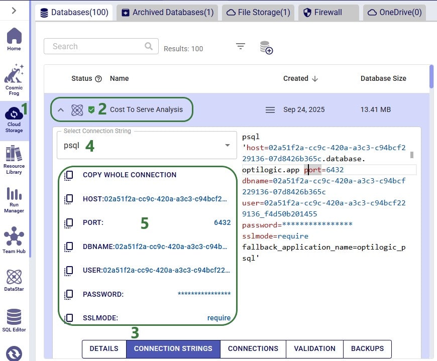
We will use Microsoft Power BI to visualize the change in total cost between the 2 scenarios by customer on a map. To do so, we first need to set up a connection to the DataStar project sandbox from within Power BI. Please follow the steps in the “Connecting to Optilogic with Microsoft Power BI” help center article to create this connection. Here we will just show the step to get the connection information for the DataStar Project Sandbox, which underneath is a PostgreSQL database (next screenshot) and selecting the table(s) to use in Power BI on the Navigator screen (screenshot after this one):
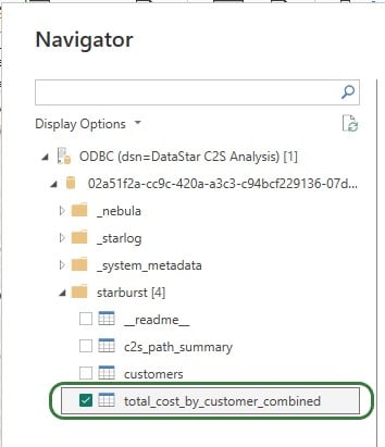
After selecting the connection within Power BI and providing the credentials again, on the Navigator screen, choose to use just the total_cost_by_customer_combined table as this one has all the information needed for the visualization:
We will set up the visualization on a map using the total_cost_by_customer_combined table that we have just selected for use in Power BI using the following steps:
With the above configuration, the map will look as follows:
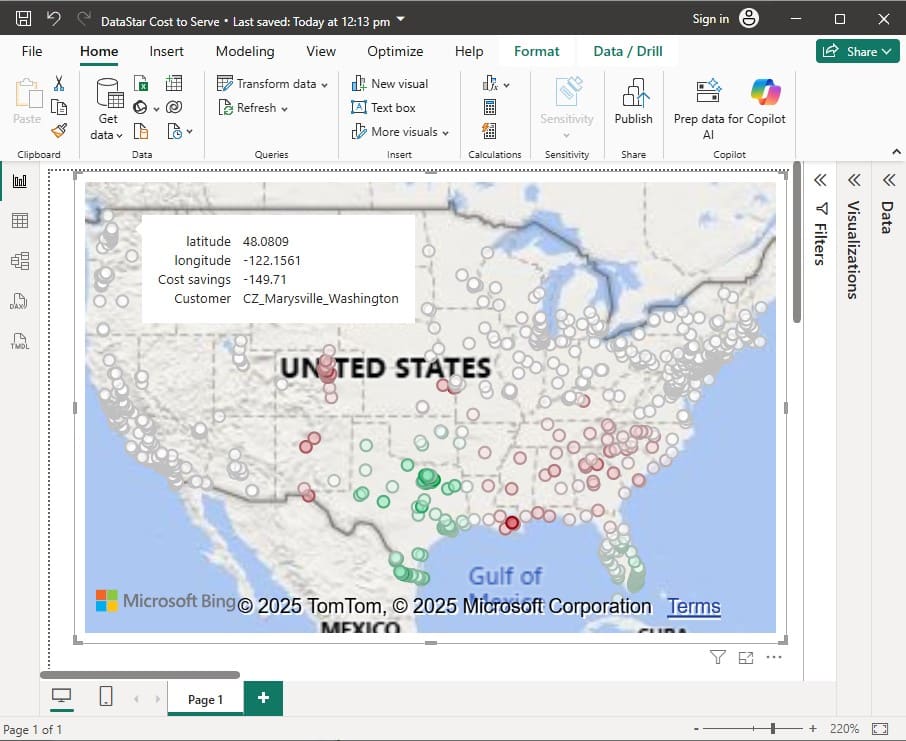
Green customers are those where the total cost went down in the OpenPotentialFacilities scenario, i.e. there are savings for this customer. The darker the green, the higher the savings. White customers did not see a lot of difference in their total costs between the 2 scenarios. The one that is hovered over, in Marysville in Washington state, has a small increase of $149.71 in total costs in the OpenPotentialFacilities scenario as compared to the Baseline scenario. Red customers are those where the total cost went up in the OpenPotentialFacilities scenario (i.e. the cost savings are a negative number); the darker the red, the higher the increase in total costs. As expected, the customers with the highest cost savings (darkest green) are those located in Texas and Florida, as they are now being served from DCs closer to them.
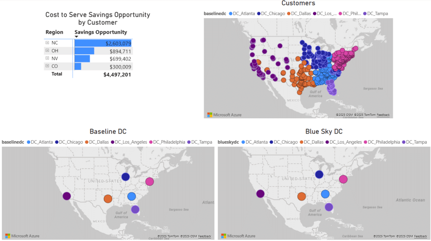
To give users an idea of what type of visualization and interactivity is possible within Power BI, we will briefly cover the 2 following screenshots. These are of a different Cosmic Frog model for which a cost to serve analysis is performed too. Two scenarios were run in this model: Baseline DC and Blue Sky DC. In the Baseline scenario, customers are assigned to their current DCs and in the Blue Sky scenario, they can be re-assigned to other DCs. The chart on the top left shows the cost savings by region (= US state) that are identified in the Blue Sky DC scenario. The other visualizations on the dashboard are all on maps: the top right map shows the customers which are colored based on which DC serves them in the Baseline scenario, the bottom 2 maps shows the DCs used in the Baseline (left) and the DCs used in the Blue Sky scenario.
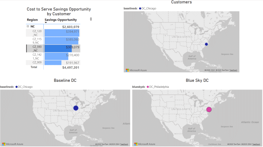
To drill into the differences between the 2 scenarios, users can expand the regions in the top left chart and select 1 or multiple individual customers. This is an interactive chart, and the 3 maps are then automatically filtered for the selected location(s). In the below screenshot, the user has expanded the NC region and then selected customer CZ_593_NC in the top left chart. In this chart, we see that the cost savings for this customer in the Blue Sky DC scenario as compared to the Baseline scenario amount to $309k. From the Customers map (top right) and Baseline DC map (bottom left) we see that this customer was served from the Chicago DC in the Baseline. We can tell from the Blue Sky DC map (bottom right) that this customer is re-assigned to be served from the Philadelphia DC in the Blue Sky DC scenario.

In this quick start guide we will show how users can seamlessly go from using the Resource Library, Cosmic Frog and DataStar applications on the Optilogic platform to creating visualizations in Power BI. The example covers cost to serve analysis using a global sourcing model. We will run 2 scenarios in this Cosmic Frog model with the goal to visualize the total cost difference between the scenarios by customer on a map. We do this by coloring the customers based on the cost difference.
The steps we will walk through are:
We will first copy the model named “Global Sourcing – Cost to Serve” from the Resource Library to our Optilogic account (learn more about the Resource Library in this help center article):
On the Optilogic platform, go to the Resource Library application by clicking on its icon in the list of applications on the left-hand side; note that you may need to scroll down. Should you not see the Resource Library icon here, then click on the icon with 3 horizontal dots which will then show all applications that were previously hidden too.
Now that the model is in the user’s account, it can be opened in the Cosmic Frog application:
We will only have a brief look at some high-level outputs in Cosmic Frog in this quick start guide, but feel free to explore additional outputs. You can learn more about Cosmic Frog through these help center articles. Let us have a quick look at the Optimization Network Summary output table and the map:
Our next step is to import the needed input table and output table of the Global Sourcing – Cost to Serve model into DataStar. Open the DataStar application on the Optilogic platform by clicking on its icon in the applications list on the left-hand side. In DataStar, we first create a new project named “Cost to Serve Analysis” and set up a data connection to the Global Sourcing – Cost to Serve model, which we will call “Global Sourcing C2S CF Model”. See the Creating Projects & Data Connections section in the Getting Started with DataStar help center article on how to create projects and data connections. Then, we want to create a macro which will calculate the increase/decrease in total cost by customer between the 2 scenarios. We build this macro as follows:
The configuration of the first import task, C2S Path Summary, is shown in this screenshot:
The configuration of the other import task, Customers, uses the same Source Data Connection, but instead of the optimizationcosttoservepathsummary table, we choose the customers table as the table to import. Again, the Project Sandbox is the Destination Data Connection, and the new table is simply called customers.
Instead of writing SQL queries ourselves to pivot the data in the cost to serve path summary table to create a new table where for each customer there is a row which has the customer name and the total cost for each scenario, we can use Leapfrog to do it for us. See the Leapfrog section in the Getting Started with DataStar help center article and this quick start guide on using natural language to create DataStar tasks to learn more about using Leapfrog in DataStar effectively. For the Pivot Total Cost by Scenario by Customer task, the 2 Leapfrog prompts that were used to create the task are shown in the following screenshot:
The SQL Script reads:
DROP TABLE IF EXISTS total_cost_by_customer_combined;
CREATE TABLE total_cost_by_customer_combined AS
SELECT
  pathdestination AS customer,
  SUM(CASE WHEN scenarioname = 'Baseline' THEN pathcost ELSE 0 END)
    AS total_cost_baseline,
  SUM(CASE WHEN scenarioname = 'OpenPotentialFacilities' THEN pathcost ELSE 0 END)
    AS total_cost_openpotentialfacilities
FROM c2s_path_summary
WHERE scenarioname IN ('Baseline', 'OpenPotentialFacilities')
GROUP BY pathdestination
ORDER BY pathdestination;
To create the Calculate Cost Savings by Customer task, we gave Leapfrog the following prompt: “Use the total cost by customer table and add a column to calculate cost savings as the baseline cost minus the openpotentalfacilities cost”. The resulting SQL Script reads as follows:
ALTER TABLE total_cost_by_customer_combined
ADD COLUMN cost_savings DOUBLE PRECISION;
UPDATE total_cost_by_customer_combined
SET
cost_savings = total_cost_baseline - total_cost_openpotentialfacilities;
This task is also added to the macro; its name is "Calculate Cost Savings by Customer".
Lastly, we give Leapfrog the following prompt to join the table with cost savings (total_cost_by_customer_combined) and the customers table to add the coordinates from the customers table to the cost savings table: “Join the customers and total_cost_by_customer_combined tables on customer and add the latitude and longitude columns from the customers table to the total_cost_by_customer_combined table. Use an inner join and do not create a new table, add the columns to the existing total_cost_by_customer_combined table”. This is the resulting SQL Script, which was added to the macro as the "Add Coordinates to Cost Savings" task:
ALTER TABLE total_cost_by_customer_combined ADD COLUMN latitude VARCHAR;
ALTER TABLE total_cost_by_customer_combined ADD COLUMN longitude VARCHAR;
UPDATE total_cost_by_customer_combined SET latitude = c.latitude
FROM customers AS c
WHERE total_cost_by_customer_combined.customer = c.customername;
UPDATE total_cost_by_customer_combined SET longitude = c.longitude
FROM customers AS c
WHERE total_cost_by_customer_combined.customer = c.customername;
We can now run the macro, and once it is completed, we take a look at the tables present in the Project Sandbox:
We will use Microsoft Power BI to visualize the change in total cost between the 2 scenarios by customer on a map. To do so, we first need to set up a connection to the DataStar project sandbox from within Power BI. Please follow the steps in the “Connecting to Optilogic with Microsoft Power BI” help center article to create this connection. Here we will just show the step to get the connection information for the DataStar Project Sandbox, which underneath is a PostgreSQL database (next screenshot) and selecting the table(s) to use in Power BI on the Navigator screen (screenshot after this one):
After selecting the connection within Power BI and providing the credentials again, on the Navigator screen, choose to use just the total_cost_by_customer_combined table as this one has all the information needed for the visualization:
We will set up the visualization on a map using the total_cost_by_customer_combined table that we have just selected for use in Power BI using the following steps:
With the above configuration, the map will look as follows:
Green customers are those where the total cost went down in the OpenPotentialFacilities scenario, i.e. there are savings for this customer. The darker the green, the higher the savings. White customers did not see a lot of difference in their total costs between the 2 scenarios. The one that is hovered over, in Marysville in Washington state, has a small increase of $149.71 in total costs in the OpenPotentialFacilities scenario as compared to the Baseline scenario. Red customers are those where the total cost went up in the OpenPotentialFacilities scenario (i.e. the cost savings are a negative number); the darker the red, the higher the increase in total costs. As expected, the customers with the highest cost savings (darkest green) are those located in Texas and Florida, as they are now being served from DCs closer to them.
To give users an idea of what type of visualization and interactivity is possible within Power BI, we will briefly cover the 2 following screenshots. These are of a different Cosmic Frog model for which a cost to serve analysis is performed too. Two scenarios were run in this model: Baseline DC and Blue Sky DC. In the Baseline scenario, customers are assigned to their current DCs and in the Blue Sky scenario, they can be re-assigned to other DCs. The chart on the top left shows the cost savings by region (= US state) that are identified in the Blue Sky DC scenario. The other visualizations on the dashboard are all on maps: the top right map shows the customers which are colored based on which DC serves them in the Baseline scenario, the bottom 2 maps shows the DCs used in the Baseline (left) and the DCs used in the Blue Sky scenario.
To drill into the differences between the 2 scenarios, users can expand the regions in the top left chart and select 1 or multiple individual customers. This is an interactive chart, and the 3 maps are then automatically filtered for the selected location(s). In the below screenshot, the user has expanded the NC region and then selected customer CZ_593_NC in the top left chart. In this chart, we see that the cost savings for this customer in the Blue Sky DC scenario as compared to the Baseline scenario amount to $309k. From the Customers map (top right) and Baseline DC map (bottom left) we see that this customer was served from the Chicago DC in the Baseline. We can tell from the Blue Sky DC map (bottom right) that this customer is re-assigned to be served from the Philadelphia DC in the Blue Sky DC scenario.