

Demand Modeling using the Pulsar Engine

Supply chain design is meant to answer future-looking questions — but too often, those decisions are driven by historical averages or coarse forecasts that hide the real structure of demand. We have built Pulsar: a repeatable, scalable Demand Engine that delivers unified demand signals for supply chain decisioning, and scenario modeling.

Quick Start

Follow these steps to get up and running with the Pulsar demand engine quickly.

  1. Prepare your input data. You need at minimum three tables: Demand (historical SKU-location data, ideally 2–3 years), Product Hierarchy, and Location Hierarchy. Column names must match the schema exactly (all lowercase, no spaces). See the appendix for full details on the schema.
  2. Choose how you want to run Pulsar. Use the Demand Modeling App for a streamlined experience with rich visualizations, or DataStar when demand modeling is part of a larger workflow.
  3. Import your data. In DataStar, create Data Connections and import tables into the project sandbox. In the App, upload CSV or Excel files directly from the Inputs screen.
  4. Configure the run. Select All Forecast Workflow (recommended default). Set the forecast frequency (e.g., month) and horizon (e.g., 12 months). Leave all other settings at their defaults for a first run.
  5. Run and review outputs. Click Run and monitor progress in the task logs (DataStar) or the job status indicator (App). When complete, review the Reconciled Forecasts table and, if growth projections were enabled, the Growth Projections table and HTML Growth Report.

Once you are comfortable with default results, explore the advanced options (algorithm selection, probabilistic forecasts, causal variables) to refine accuracy further.

What Pulsar Does and Why It Matters

The Pulsar demand engine generates granular, hierarchy-consistent forecasts.

Traditional approaches rely on historical averages or fixed proportions. These often break when demand shifts, new products launch, or channels grow unevenly.

Pulsar improves this by:

  • Forecasting demand at every level (aggregate → SKU × Store)
  • Ensuring all forecasts align across the hierarchy
  • Supporting scenario modeling and uncertainty analysis

Result:
A single, reliable demand signal used across different teams and functions: network design & facility investment, inventory & replenishment planning, transportation & logistics, capacity planning, and strategic planning.

1. Network Design & Facility Investment

The engine enables scenario-based network planning using granular growth forecasts (product × location), rather than blanket assumptions.

  • Supports base, upside, and downside scenarios with targeted adjustments
  • Hierarchical modeling ensures consistency from regional down to SKU/site level
  • Outputs can be directly used in network optimization

2. Inventory & Replenishment Planning

It shifts planning from reactive to forward-looking:

  • Uses projected growth to recalculate safety stock and reorder points
  • Enables targeted inventory investment, increasing stock where demand grows and reducing it where demand declines

3. Transportation & Logistics

The engine improves logistics planning with predictive insights:

  • Provides lane-level volume forecasts for contract negotiation, mode selection, and fleet sizing
  • Identifies geographic demand shifts early, allowing proactive network adjustments

4. Capacity Planning

It strengthens long-term infrastructure decisions:

  • Bases expansion or consolidation on granular, forward-looking demand trends
  • Supports multi-year capital planning with statistically grounded site- and DC-level forecasts

5. Strategic Planning

The outputs align decision-making across the business:

  • Enables data-driven investment and budgeting by category and geography
  • Highlights declining segments early, supporting proactive action (e.g., turnaround or divestment)
  • Creates a single, consistent growth view across commercial, finance, and supply chain teams

Bottom line

The engine replaces broad, assumption-driven planning with granular, statistically grounded, and aligned forecasts, improving decision quality across operational and strategic levels.

Problems Solved

The following table provides an overview of problems commonly encountered when modeling demand and how Pulsar addresses these.

Outputs You Will Get

After running the Pulsar engine, the outputs include:

  • Forecasts
    Future demand at SKU × Location and appropriate aggregated levels
  • Reconciled forecasts
    Consistent across all hierarchy levels
  • Probabilistic forecast outputs (optional)
    Forecasted demand includes confidence intervals and quantile outputs (P10 - low estimate, P50 - median estimate, P90 - high estimate)
  • Growth projections (optional)
    Year-over-year growth at all forecasted levels including at SKU × Location
  • HTML growth preport (optional)
    Hierarchy-aware view of forecasted demand growth across products which highlight forecast accuracy, confidence levels, growth leaders, and risk areas

The table-based outputs can be used directly in downstream models.

Workflow Tasks You Can Run

These are the workflow tasks available in the Pulsar Engine:
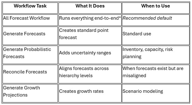
*Uses the Generate Forecasts task and not the Generate Probabilistic Forecasts task.

If unsure, use the All Forecast Workflow.

Where This Fits in Your Workflow

Run this utility after:

  • Data ingestion (orders, shipments, history)
  • Hierarchy setup (product and location structures)
  • Optional enrichment (pricing, promotions, external drivers)

Outputs feed into:

  • Network design models
  • Inventory optimization
  • Transportation planning
  • Capacity planning
  • Scenario analysis

This makes Pulsar a core upstream step in supply chain decision-making.

What the Engine Does Automatically

The Pulsar engine handles complex forecasting tasks for you:

Keeps forecasts consistent across all levels

  • Forecasts at category, SKU, region, and store levels
  • Ensures totals match across the entire hierarchy

Adapts to each demand pattern

  • Detects intermittent demand
  • Identifies seasonality
  • Handles sparse or irregular data

Provides multiple models so users can choose the best one(s) for their needs

Uses statistical and machine/deep learning models such as:

  • ARIMA, ETS, Prophet
  • LightGBM, XGBoost, N-BEATS

Learns across products when useful

  • Local models (per series)
  • Global models (across multiple series)

Quantifies uncertainty

  • Generates P10 / P50 / P90 forecasts
  • Supports risk-based planning

Generates scenario-ready growth rates

  • Converts forecasts into usable growth projections

What Happens Behind the Scenes (Advanced)

When you run the full workflow, the Pulsar engine executes a structured pipeline:

  1. Hierarchy Strategy
    Determines optimal levels for forecasting
  2. Data Aggregation & Alignment
    Standardizes time frequency and hierarchy
  3. Series Characterization
    Detects patterns like seasonality strength, intermittency, data sufficiency
  4. Feature Engineering
    Creates inputs like lags, calendar effects, external causals, rolling means
  5. Model Training & Forecasting
    Applies models at each hierarchy level
  6. Reconciliation
    Aligns forecasts across hierarchy levels
  7. Growth Projection Generation (optional)
    Converts forecasts into growth rates

This process is fully automated within the engine.

Inputs and Outputs Overview

The following diagram shows the required and optional inputs into the Pulsar engine on the left, while the outputs are listed on the right-hand side:
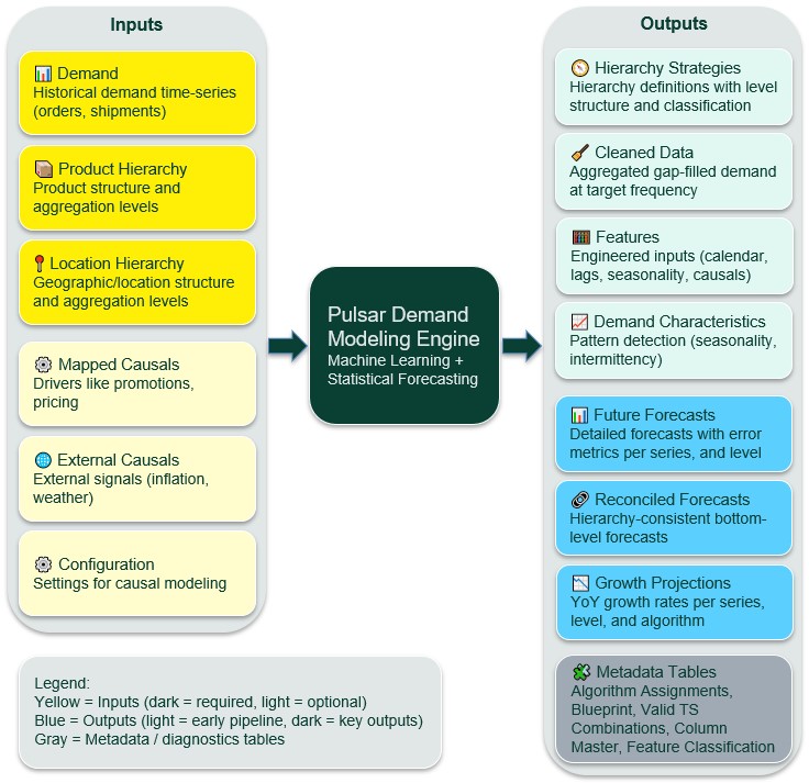
Note that optionally, an HTML Growth Report can be generated too when growth projections are turned on.

Full details on table and column names and their descriptions can be found in the appendix.

Two Ways to Run the Pulsar Engine

The Pulsar engine can be accessed and run from 2 locations:

  1. From within the DataStar application on the Optilogic platform – users use a Run Utility task to configure Pulsar engine runs
  2. Through the stand-alone Demand Modeling App

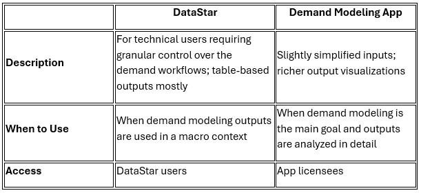
This table compares using the Pulsar engine through DataStar versus using it in the App:
Heads up

While DataStar and the Demand Modeling App can both be used to create projects and load the required demand modeling inputs, for a demand modeling project created in DataStar to be accessible without problems in the App, it needs to contain both inputs and outputs of a Pulsar run.

Heads up

When working in a Team account (see  Getting Started with Optilogic Teams ), either in DataStar or the Demand Modeling App, if two users under the same project run the Pulsar demand modelling engine at the same time, this will lead to one set of results 'winning' and overriding the other run's data.

Next, we walk through using the Pulsar engine through the Run Utility task in DataStar. After, we will cover the steps when using the Demand Modeling App.

Step-by-Step: DataStar

Note that this workflow assumes users use the Project Sandbox of a DataStar project to contain the inputs to be used by the Pulsar engine.

Should you want to use the same data as used in this walk-through while following along, then please download this PulsarDemandModelingDemoData zip-file and unzip it after download. Use the 6 csv-files as your input tables.

Step 1: Prepare and Import Input Data

The following data is used as input for the demand modelling engine and needs to be imported into a DataStar project before running the Pulsar engine.

Required

  1. Demand – historical demand data at the SKU-location level by time; ideally at least 2-3 years’ worth of data.
  2. Product Hierarchy – defines the hierarchical structure of products for aggregation and forecasting at different product levels (e.g., family → category → line → type → SKU).
  3. Location Hierarchy – defines the hierarchical structure of locations for aggregation and forecasting at multiple geographic levels (e.g., country → state / province → city → store).

Optional

  1. Mapped Causals – maps external variables (e.g., price, promotions) to specific product and location dimensions, enabling localized causal impact modeling.
  2. External Causals – provides time-series values of external variables (e.g., GDP, inflation, weather) that influence demand.
  3. Configuration - if using mapped causals and/or external causals, then this configuration table, which defines how each causal variable should be processed, aggregated, and used in forecasting scenarios, needs to be included.

The appendix contains complete details on the table and column names – your input data needs to match this schema exactly, including being all lower case and not containing any spaces.

Once the data is prepared, for example in CSV or Excel format, users can create Data Connections in DataStar to make the data visible inside any DataStar project. See the How to Create a New Data Connection section in the DataStar Overview help center article for more details.
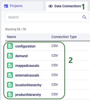
  1. We are on the DataStar start page, showing the Data Connections list.
  2. In this example we have set up CSV data connections to CSV files which contain our data to be used by the Pulsar Engine. We are using both the optional causals tables.

This data from the connections then needs to be imported into the project sandbox of the project. Users can use an Import task for each table they are importing, see this Quick Start Guide for a walk-through on how to import data from a CSV data connection.

  1. The CSV file data connections are shown here on the Data Connections tab in the list of Active and Bookmarked Connections.
  2. This macro contains 6 Import tasks to import the data contained in the active CSV File data connections (previous bullet) into the project sandbox of the DataStar project.
  3. After the macro is run, we see the 6 tables created in the project sandbox.

Step 2: Add a Run Utility Task

  • In the DataStar macro that imports all needed data, add a Run Utility task
  • In the Select Utility section on the task’s Configuration tab choose Run Demand Model

Step 3: Choose Workflow Task

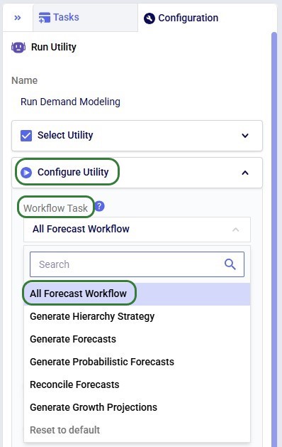
From the Workflow Task dropdown in the Configure Utility section, choose the desired workflow. As discussed above in the Workflow Tasks You Can Run section, the All Forecast Workflow is recommended in most cases.
Step 4: Select Data Source (Adapter)

Choose how data is provided from the IO Adapter Type dropdown:

  • DataStar → Use tables already in your project (most common)
    • This was done in steps 1 and 2 above.
    • Select the name of the project containing the data from the DataStar Project dropdown, which will typically be the project you have open currently.
  • CSV or Parquet → External files: specify the folder containing the input files in the Input and Output Directory field. These files need to be in the same specified format as detailed in the appendix.

Step 5: Configure Forecast and Growth Projection Controls

Several forecasting and growth projection related settings can be configured next. The settings shown in the screenshot are the defaults (except where noted) and it is recommended to use these as a starting point.
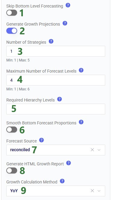
5.1 Skip Bottom Level Forecasting

  • ON → does not forecast at the base product × location level. Use when:
    • Your data contains too many time series at the base level
    • You only need aggregated forecasts
  • OFF → does forecast at the base product × location level

5.2 Generate Growth Projections

  • ON → outputs year-over-year (YoY) growth rates in the growthprojections table
  • OFF → only forecasts; this is the default

5.3 Number of Strategies

The number of hierarchical strategies that will be generated. Outputs can be found in the hierarchystrategies table.

  • Recommended: start with 1
    • Note that 1 strategy can have multiple levels (see next setting): a top level, up to 4 middle levels, and a bottom level forecasting strategy, so forecasting can occur at multiple levels already when setting number of strategies = 1.
  • Higher values:
    • Generate multiple hierarchy strategies
    • A generated strategy can be selected as a next step when using the Generate Forecasts workflow (advanced use)

Good to know

Independent of the number of strategies generated, only 1 (automatically selected) will be used in the subsequent forecasting steps of the demand workflow. Others can be used in different demand workflows.

5.4 Maximum Number of Forecast Levels

  • Limits how many hierarchy levels are forecasted per strategy
  • Prevents excessive computation
  • Unless “Skip Bottom Level Forecasting” (5.1. above) is on, a bottom level forecast at the base product x location is always included. Next (when number forecast levels >1), a top-level forecast is added (always at the most aggregated level for both product and location), and after that any middle level forecasts.

Pro tip

More levels ≠ better results as the engine selects levels with strongest signal automatically.

5.5 Required Hierarchy Levels

If a forecast at a specific combination of product and location levels is required, for example for a certain supply chain function, this can be added in this setting. The format is comma-separated tuples. For example, if you require forecasts at the product - location_l3 and product_l4 - location_l2 levels, you enter: (product,location_l3),(product_l4,location_l2).

5.6 Smooth Bottom Forecast Proportions

  • ON → bottom level forecast proportions are smoothed by averaging across time to create stable proportions for disaggregation. Top-level seasonality is preserved.
  • OFF → bottom level forecast proportions are not replaced with their time-based average.

5.7 Forecast Source (if Generate Growth Projections = ON)

  • Raw → the forecast that was generated before reconciliation has been applied is used as the source for growth projections.
  • Reconciled (recommended) → the forecast resulting after it has been reconciled is used as the source for growth projections.

5.8 Generate HTML Growth Report (if Generate Growth Projections = ON)

  • ON → a report in HTML format is generated summarizing the growth projections. The report, named growth_report.html, can be found in the Explorer application in the My Files/DataStar/<DataStar project name>/demand_modeling subfolder.
  • OFF → no growth report is generated; this is the default.

5.9 Growth Calculation Method (if Generate Growth Projections = ON)

Currently only year-over-year (YoY) is available as the method for calculating growth. More to come.

Step 6: Configure Forecast Timeframe and Interval

These options configure what data is used for forecasting, plus the interval and length required for the forecasted demand.

6.1 Data End Date

Controls how much historical data is used.

  • Important auto-detect behavior when left blank: prevents partial-period bias, e.g., if current month is incomplete → exclude it.
  • You can override auto-detection manually by entering the date after which data in the inputs should not be used.

6.2 Forecast Horizon

  • Defines how far into the future to predict
  • Example: 26 (weeks)
  • Default: 12

6.3 Frequency

  • The interval between dates to forecast for: day, week, month, etc.
  • Default: month

6.4 Test Length (Model Validation)

  • Defines holdout period for validation
  • Example: last 6 months
  • Default: 4

What happens:

  • Model is trained on earlier data
  • Predicts test period
  • Accuracy is measured by comparing test period results with historical data not used for the forecast – these are found in the blueprint output table

This is how users gain confidence in the engine’s performance.

Step 7: Algorithm Selection

Here, users can overwrite the automatic selection of algorithms.
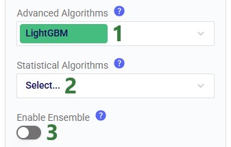
7.1 Advanced Algorithms

  • Left blank: the default algorithm of LightGBM will be used for all series.
  • When 1 or more algorithms are selected, each will be used for all series. The outputs indicate which algorithm was used for which forecast / growth projection.
  • Default: LightGBM.

7.2 Statistical Algorithms

  • Left blank: no statistical algorithms will be used, only advanced algorithms.
  • When 1 or more algorithms are selected, each will be used for all series. The outputs indicate which algorithm was used for which forecast / growth projection.
  • Default: blank.

7.3 Enable Ensemble

  • ON → when multiple algorithms have been used to forecast individual series (i.e., more than 1 algorithm was selected under 7.1 and 7.2 combined), they will be combined into one overall forecast, named ensemble.
    • When ON, an additional option Ensemble Method will be shown, options are:
      • Weighted Average (default) → uses inverse-error weights derived from the chosen error metric’s validation results (see 8.1 below; rmse is the default).
      • Average → uses the straight average (equal weights) across the algorithms used.
  • OFF → algorithm-based ensembles are not created; this is the default.

Step 8: Advanced Options

Options for more advanced users and applications can optionally be configured. If not configured, their defaults will be used under the hood.

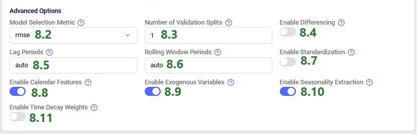
8.1 Show Advanced Options

  • ON → options 8.2 – 8.10 are shown and can be configured.
  • OFF → options 8.2 – 8.10 stay hidden and defaults are used under the hood.

8.2 Model Selection Metric

The error metric used for selecting the best model for a series. Options are:

  • rmse – root mean squared error; this is the default
  • mae – mean absolute error
  • me – mean error
  • mape – mean absolute percentage error
  • wmape – weighted mape

8.3 Number of Validation Splits

The number of times the model is tested on different unseen slices of historical data during cross-validation. An example with 3 folds:

  • Fold 1: The model trains on data from 2023 and validates on Q1 2024.
  • Fold 2: The model trains on data from 2023 + Q1 2024 and validates on Q2 2024.
  • Fold 3: The model trains on data up to Q2 2024 and validates on Q3 2024.

8.4 Enable Differencing

  • ON → differencing is applied to the time series which makes them stationary by removing trends and seasonality, stabilizing the means of the data over time.
  • OFF → no differencing is applied; this is the default.

8.5 Lag Periods

Defines how the data needs to be shifted backwards in time to predict future demand. Options are:

  • auto – intelligent selection by the Pulsar engine
  • default – same as the forecasting frequency (e.g. day, week, month, etc.)
  • comma-separated values – if forecasting frequency = day and the user enters ‘7,14,28’ as the lag period, this means demand from 7 days ago, 14 days ago, and 28 days ago is used to predict demand
  • a single integer – if forecasting frequency = week and the user enters ‘52’ as the lag period, this means a lag period of 52 weeks
  • blank – disables lag periods

8.6 Rolling Window Periods

Defines the period used to calculate an aggregated average over; this acts as a moving block of time. Options are:

  • auto – intelligent selection by the Pulsar engine
  • default – same as the forecasting frequency (e.g. day, week, month, etc.)
  • comma-separated values – if forecasting frequency = week and the user enters ‘4,13’ as the rolling window period, this means rolling periods of 4 weeks (about a month), and 13 weeks (about 3 months) are used
  • a single integer – if forecasting frequency = week and the user enters ‘26’ as the rolling window period, this means a lag period of 26 weeks
  • blank – disables rolling window periods

8.7 Enable Standardization

  • ON → normalizes each series independently before training so that high-volume series do not dominate low-volume ones.
  • OFF → series are not normalized independently before training.

8.8 Enable Calendar Features

  • ON → for each data point, features based on the time period are extracted, e.g., month number, week of the year number, week of the month number, quarter number. This enables pattern recognition and cross-learning across all time series data.
  • OFF → no additional time period-based features are extracted

8.9 Enable Exogenous Variables

  • ON → uses external causals table (if provided)
  • OFF → ignores external causals tables, even if present (useful for benchmarking)

8.10 Enable Seasonality Extraction

  • ON → extract seasonality for the time-series data
  • OFF → seasonality is not extracted

8.11 Enable Time Decay Weights

  • ON → recent data is weighted more heavily than older data. This improves responsiveness to demand shifts.
  • OFF → all data is weighted equally.

8.12 Demand Job Config

  • ON → when turned on, additional settings to configure parallel running of multiple jobs will be shown:
    • Enable Multiple Jobs:
      • ON → allows running jobs in parallel
      • OFF → jobs will not be run in parallel
    • Job Grouping Strategy - determines how rows from the blueprint table are grouped into jobs for parallel running. Options are:
      • AlgorithmAndSplit - maximum parallelism by grouping each algorithm-split combination into 1 job
      • Algorithm - one job per algorithm; all splits are run sequentially within each job
      • Split - one job per split; all algorithms run sequentially within each job
  • OFF → jobs will not be run in parallel.

Step 9: Set Resource Size

Optionally, users can adjust Run Configuration settings, located underneath the Configure Utility section:

  1. Add any Tags in this text box to facilitate searching for the job in the Run Manager application when this task is run.
  2. The Timeout option sets the maximum amount of time a task is allowed to run before it will automatically be cancelled. It is set in seconds, and the default is 86,400 (24hrs).
  3. Resource Size: select the CPU/RAM size for the run. Larger resources have higher billing factors - see the Resource Size Selection Guide for more information.
  4. You can also click on this link to open the Resource Size Selection Guide immediately from within DataStar.

Heads up

For most demand modeling runs, you will need to use a bigger resource size than the default of 3XS since the runs typically require more RAM; it is recommended to use M to start.

Step 10: Run the Run Utility task

Click on the play button on the task that is shown when hovering over the task to start running the Pulsar engine:

You can monitor the progress of the run in the Macro & Task Logs below the macro canvas:

Step 11: Review Outputs

Example outputs found in the most used output tables are shown here with a short explanation.

Hierarchy Strategies

This table shows at which levels forecasts will be generated. The Pulsar engine has determined at which combination of product-location levels the demand signal the richest is.

We see that one strategy is generated (per the Number of Strategies input) and it contains 4 levels to forecast at (per the Maximum Number of Forecast Levels input):

  1. Top level: this is at the most aggregated level, which in this case is at product level 4 (Consumer Goods) and location level 5 (USA)
  2. There can be up to 4 middle levels, here 2 are used (the other 2 have value = ‘None’): product at the bottom level (7 categories) combined with location at the L2 level (US state), and product at the bottom level combined with location at the L1 level (region within a US state)
  3. Bottom level: this will always be at the most granular product and location level. Note that if Skip Bottom Level Forecasting is turned on, no forecast will be created for this bottom level.

Reconciled Forecasts

This table contains the demand forecasts after reconciliation has been performed. It contains the forecast at all 4 levels from Strategy_1.

  1. To show records from multiple forecast levels in this screenshot, the table has been filtered on the timestamp column to show forecasts where the date is before June 1, 2026. This means that we will see 2 forecasts (May 24 and May 31) for each product – location combination. However, the table contains weekly forecasts through November 15, 2016 (26 weeks total).
  2. Shown are records from 2 of the forecasted levels:
    1. The first 2 records are for the top-level forecast at the product L4 and Location L5 levels.
    2. The other records shown are at the bottom level for products and at the location L2 level.
  3. The product and location columns show the actual product and location names at the levels shown in the 2 columns to the left.
  4. We see that at the top level, over all included products and locations, the lightgbm algorithm forecasts the demand to be 282,770 on May 31, 2026, and 312,386 on May 31, 2026.

Growth Projections

The forecasts are turned into growth projections which can be found in this output table; this is again done for all 4 levels of Strategy_1:

  1. We see that at the highest level, the growth rate is projected to be 0.1022 or 10.22%.
  2. The other records shown here are for the bottom product and location L2 level where we can see that at this level the growth rate varies quite a bit from 14.2% to 35.3% for the records shown .

Please note there are 2 more columns in this table which are not shown in the screenshot:

  • Skip reason – in case a growth rate was not calculated for the product-location combination, the reason will be listed here
  • Confidence – the level of trust we have in the projected growth

HTML Growth Report

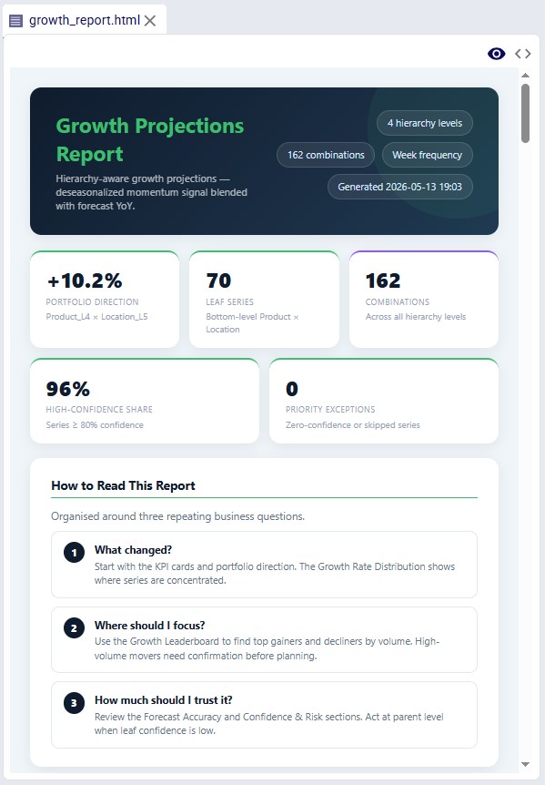
When growth projections are being generated and the Generate HTML Report option is turned on, a growth_report.html file is created. It contains an overview of what the growth projections tell us and users can drill into details.

Location of the growth report for a DataStar project named “Demand Modeling”.
The first part of an example growth report that is generated by the Pulsar engine.

Step-by-Step: Demand Modeling App

Should you want to use the same data as used in this walk-through while following along, then please download this PulsarDemandModelingDemoData zip-file and unzip it after download. Use the 6 csv-files as your input tables.

Step 1: Select Account & Project

After logging into the Demand Modeling App at https://demand-modeling.apps.optilogic.app, users will see a screen similar to the following:
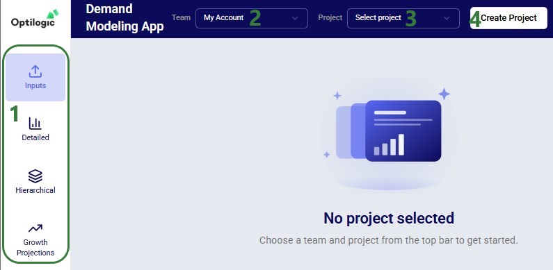
  1. There are 4 parts to the app, and currently we are in the Inputs section.
  2. Select the account you want to work with. See the Getting Started with Optilogic Teams documentation to understand more about working within your own account or within a team account.
  3. Here, you can choose a project to work in from the drop-down. It contains the databases present in the selected account.
  4. Instead of using an already existing project, you can also opt to create a new one by clicking on the Create Project button.

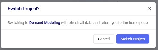
When you switch between accounts or projects, a Switch Team? / Switch Project? confirmation message will come up:
Create a new project as follows:
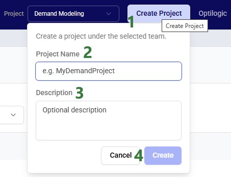
  1. Click on the Create Project button
  2. Give the project a unique name
  3. Optionally, add a description of the project
  4. Click on Cancel to abort creating a new project or on Create to finalize the creation of the project

After creating a new project, first a toast message comes up at the right top of the app saying that you will be notified when the new project is ready:

While the project is being created, we see the status of “1 job running” in the toolbar of the App, to the left of the Team selector:

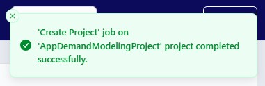
A short while later the following toast message lets us know that the project has been created successfully. You can then select it from the Project drop-down list to start working with it.
Heads up

Until the “’Create Project’ job … completed successfully” message appears, any work done is not applied to the newly created project.

Step 2: View and/or Upload Data

If input data is already present in the project, it can be viewed and otherwise it can be directly added by uploading CSV or Excel (.xlsx) files.
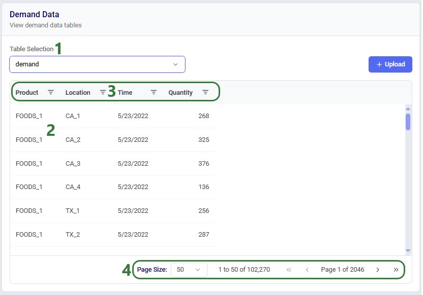
  1. Select the input table you want to view the data of from the drop-down list. As discussed before in the Step 1: Prepare and Import Input Data section, to run the demand modeling engine, 3 tables are required (demand, location hierarchy, and product hierarchy) and the mapped causals and external causals tables are optional. When using either or both causals tables, the configuration table needs to be populated too.
  2. If there is data in the selected table, it will be shown down here. In this example we see data in the demand table.
  3. The columns can be:
    1. Dragged and dropped to re-order them – click on the column heading, hold down the mouse, and drag to the new location
    2. Resized – move the mouse in between 2 column headers until the mouse cursor changes into 2 arrows pointing away from each other, hold down the mouse and drag to the desired new size
    3. Sorted on – click on a column heading to sort in ascending order, click again to sort in descending order, and click once more to remove the sort. Hold Ctrl + Shift down to sort by multiple columns.
    4. Filtered – click on the filter icon on the right side of the column and enter the condition the filtered records need to match
  4. At the bottom of the grid, you can configure how many records you see on a page and click through the pages.

To upload files to populate the input tables, click on the ‘+ Upload’ button at the right top which brings up the following Upload Demand Files form:
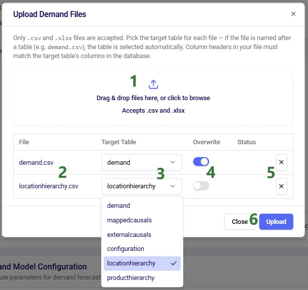
  1. Drop or browse to your .xlsx and/or .csv files which have column headers matching those of the tables you are targeting here. See the appendix for full details on column names. You can upload multiple files simultaneously.
  2. The file(s) that are going to be uploaded are listed here.
  3. The Target Table is automatically selected if the name of the file matches a table name. Otherwise, you need to choose the target table from the drop-down list.
  4. Choose if the file should overwrite any already existing data in the target table or if the data should be appended.
  5. If you decide not to go ahead with uploading a certain file, you can click on the button with the cross to remove it from the upload form.
  6. If you decide not to upload any files, click on the Close button. If you are ready to upload the selected files, click on the Upload button.

Good to know

When choosing to not overwrite existing data, currently the data is simply appended without updating existing data or checking for duplicates.

After clicking on the Upload button, the Status of both files will show a spinner indicating the upload is in progress.

  1. The Status of both files is a green checkmark now, indicating the upload has completed successfully.
  2. You can click on the Close button to close the upload form.

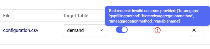
Should an upload fail, an error status icon appears, and users can hover over the icon to show a tooltip which displays the error message. The following screenshot shows an example where the column names are incorrect:
Good to know

You may need to switch to another table and back to see updated data after uploading files.

Step 3: Configure Demand Model Run – Basics

Once your project contains demand data, you can configure the inputs for running the demand modeling engine. The configuration options are mostly the same as what we have seen for the DataStar workflow as covered in the previous section, but somewhat simplified. The Demand Model Configuration section is found on the Inputs page, below the grid showing the selected table:
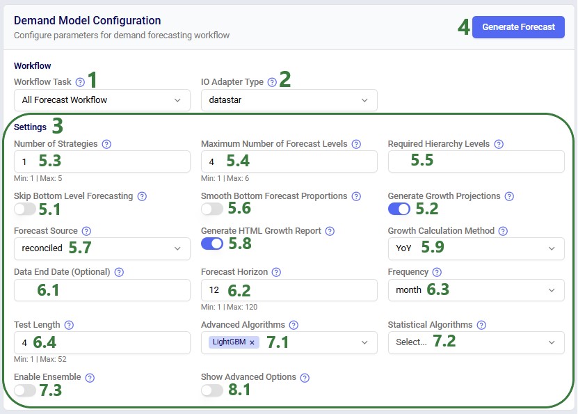
  1. The Workflow Task is always set to All Forecast Workflow, the recommended default for most users. Refer to the Workflow Tasks You Can Run section for an explanation of the All Forecast Workflow.
  2. IO Adapter Type is always set to datastar. This means that when you create a project in the App, you can also open it in DataStar later on. Vice versa, you can select a DataStar project from the projects drop-down list and if it has inputs and outputs of a demand model run you can review those in the App.
  3. These are the other basic settings users can update. The numbers refer to the sections where they are explained above:
    1. Options starting with 5. are explained here
    2. Options starting with 6. are explained here
    3. Options starting with 7. are explained here
    4. Options starting with 8. are explained here
  4. Once you have configured the settings, and optionally the advanced options (next section), you can click on the Generate Forecast button to start the Pulsar engine.

Step 4: Configure Demand Model Run – Advanced (Optional)

Following advanced options can be configured if desired. The numbers on the options refer to the part of section Step 8: Advanced Options where they are explained:
Step 5: Run Demand Model

Click on the Generate Forecast button at the right top of the Demand Model Configuration area once ready to run the Pulsar engine. First, a toast message saying that the job was submitted comes up at the right-top of the App:

While the Pulsar engine is running, we see the status of “1 job running” in the toolbar of the App, to the left of the Team selector:

Once a run completes, another toast message stating so comes up in the right-top corner of the App:
Pro tip

Progress of a run can also be monitored in the Run Manager application on the Optilogic platform.

Step 5: Review Detailed Outputs

Once the job has finished, outputs can be reviewed in the Detailed, Hierarchical, and Growth Projections (if generated) parts of the App. Switch to them using the navigation on the left hand-side.

In the Detailed outputs section, you can look at the historical and forecasted demand, at the bottom product-location level. Features from the causals tables can be overlayed as well.


  1. Select the strategy you want to see the bottom level forecasts for, typically there will be just 1 strategy for which forecasts have been generated, Strategy_1. Also choose the product and location from their drop-down lists.
  2. If multiple algorithms have been used for forecasting, you can switch between them here. If an ensemble was generated, it can also be chosen in the drop-down menu.
  3. The features (causals) that have been included in the modeling can be chosen from this drop-down to overlay their values on the graph. You can select one at a time.
  4. At the top of the graph the values for the various error metrics for the displayed series are summarized, together with the forecast accuracy (100% - wmape).
  5. In the graph, the historical demand is shown in blue, the forecasted demand in red, and if a feature is enabled, its color is green.
  6. When hovering over the graph, a tooltip with the date and values for historical demand, forecast and the selected feature is shown.
  7. The slider beneath the chart can be used to zoom in and out of the chart: hover over the thick blue edges of the slider on the left or right until the cursor changes to 2 arrows pointing away from each other, hold down the mouse and drag the edge to the desired start / end date of the chart:

Step 6: Review Hierarchical Outputs

In the Hierarchical part of the App, outputs can be viewed at the different levels that were forecast at:
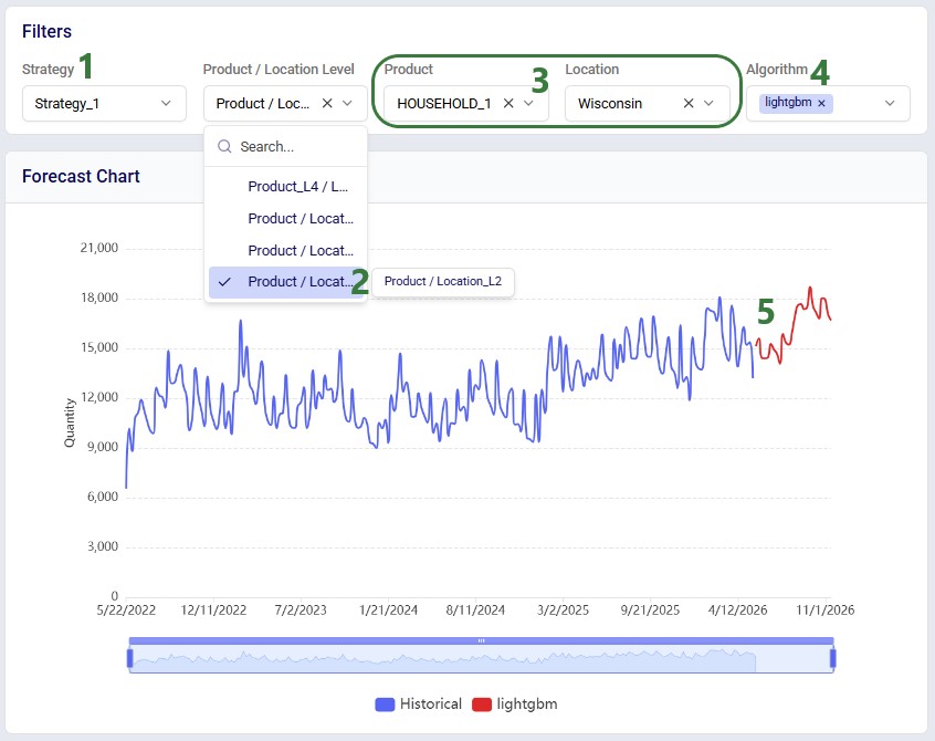
  1. Select the strategy you want to see the forecasts for, again there will typically be just 1 strategy for which forecasts were generated, Strategy_1.
  2. Select the forecast level you want to review. In our example there are 4 levels, a top one, a bottom one, and 2 middle levels. Hovering over them in the drop-down will show the full level name to the right. We have selected the product – location L2 level, which means the lowest level for products and the State level for locations.
  3. Choose the product and location from these drop-downs.
  4. Choose the algorithm(s) to show the forecast(s) of. When multiple are enabled, they will all be shown simultaneously in the chart. If an ensemble was generated, it can also be chosen in the drop-down menu.
  5. In the forecast chart, the historical demand is shown in blue, the first selected algorithm in red, the next selected algorithm in green, etc.

Note that similar to the Detailed outputs chart, you can also hover over the graphs here to show a tooltip with date and values of the historical demand / forecast(s) and use the slider beneath to zoom in/out of the chart.

Step 7: Review Growth Projection Outputs

If Growth Projections generation was turned on for the Pulsar engine run, results at the table level and summarized into a risk quadrant and growth distribution bar chart can be found in the Growth Projections part of the App.
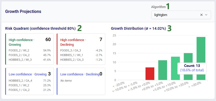
  1. Select the algorithm you want to see the growth projections for in the drop down at the top right.
  2. The risk quadrant shows, at the bottom level, the product-location combinations with the highest projected growth on the left and those with the lowest projected growth on the right. For growing segments, the top-left quadrant shows those with high confidence in the growth number; the bottom-left one those with low confidence. For declining segments, the top-right quadrant shows those with high confidence in the growth number and those with low confidence are shown in the bottom-right quadrant.
  3. The growth distribution bar-chart shows how many product-location combinations fall within certain shrinkage/growth percentage bands. Hovering over a bar in the chart brings up a tooltip of the count in that percentage band and the percentage of the total. For example, 13 product-location combinations are expected to grow between 5% and 10%.

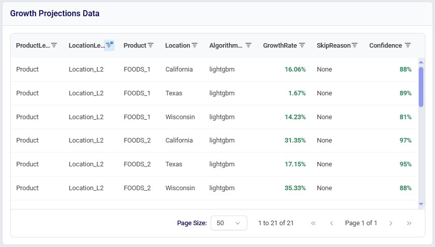
The grid further below shows all growth projections at all forecasted levels. Like the grids showing the input tables, in this one the columns can be re-ordered, resized, sorted on, and filtered too. At the bottom of the grid, the number of records per page can be set and if there are multiple pages they can be stepped through using the controls here. Positive growth rates are shown in green and negative ones in red. Where confidence is greater than 80%, it is shown in green:
Best Practices

  • Use 2–3 years of demand history when available
  • Include external drivers for better accuracy
  • Start with default hierarchy strategy before customizing
  • Enable probabilistic forecasts for uncertain environments
  • Validate outputs at both aggregate and granular level

Key Takeaways

  • Pulsar replaces static forecasting with dynamic, granular modeling
    • It produces demand forecasts at every level—from aggregate down to SKU × location.
  • Acts as a foundational upstream step for decision-making, not just forecasting
    • Pulsar feeds all major supply chain planning and optimization workflows.
  • All outputs are hierarchy-consistent
    • No more mismatched totals between regional and detailed plans.
  • Handles real-world demand complexity automatically
    • Seasonality, intermittency, sparse data, and shifting patterns are all managed by the engine.
  • Automatically chooses and combines statistical + machine learning models
    • Includes ARIMA, ETS, Prophet, LightGBM, XGBoost, N-BEATS, and more.
  • Enables scenario planning and risk-aware decisions
    • With growth projections and probabilistic forecasts (P10 / P50 / P90).
  • Minimal configuration required to get started
    • Default settings are designed to work well in most cases.
  • Two access paths suit different needs
    • The Demand Modeling App provides a streamlined interface with rich interactive visualizations; DataStar provides deeper configuration and integrates Pulsar into broader automated workflows.
  • Start simple, then refine
    • Start with the All Forecast Workflow with default settings and layer in external causal variables or probabilistic outputs once the baseline is established.

As always, please feel free to contact our Support team on support@optilogic.com in case of any questions or feedback. Happy demand modeling!
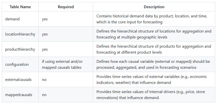
Appendix – Table and Column Details

Input Tables Overview

Output Tables Overview

Database Schema

The following zip-file contains an Excel file named DemandModeling_DatabaseSchema_August2026.xlsx in which the schema of all input and output tables of the Pulsar engine can be found: Demand Modeling Schema download (download this zip-file and then extract it). The tables are colored like they are in the diagram in the Inputs and Outputs Overview section:

  • Dark yellow: required input tables
  • Light yellow: optional input tables
  • Dark blue: key output tables
  • Light blue: early pipeline output tables
  • Gray: metadata/diagnostics output tables

The column master output table is one of the metadata output tables. It is the first table in the file as it shows the schema: it contains a list of all the columns and their descriptions used across the input and output tables. Some columns are used in multiple tables and their values need to be internally consistent.

Supply chain design is meant to answer future-looking questions — but too often, those decisions are driven by historical averages or coarse forecasts that hide the real structure of demand. We have built Pulsar: a repeatable, scalable Demand Engine that delivers unified demand signals for supply chain decisioning, and scenario modeling.

Quick Start

Follow these steps to get up and running with the Pulsar demand engine quickly.

  1. Prepare your input data. You need at minimum three tables: Demand (historical SKU-location data, ideally 2–3 years), Product Hierarchy, and Location Hierarchy. Column names must match the schema exactly (all lowercase, no spaces). See the appendix for full details on the schema.
  2. Choose how you want to run Pulsar. Use the Demand Modeling App for a streamlined experience with rich visualizations, or DataStar when demand modeling is part of a larger workflow.
  3. Import your data. In DataStar, create Data Connections and import tables into the project sandbox. In the App, upload CSV or Excel files directly from the Inputs screen.
  4. Configure the run. Select All Forecast Workflow (recommended default). Set the forecast frequency (e.g., month) and horizon (e.g., 12 months). Leave all other settings at their defaults for a first run.
  5. Run and review outputs. Click Run and monitor progress in the task logs (DataStar) or the job status indicator (App). When complete, review the Reconciled Forecasts table and, if growth projections were enabled, the Growth Projections table and HTML Growth Report.

Once you are comfortable with default results, explore the advanced options (algorithm selection, probabilistic forecasts, causal variables) to refine accuracy further.

What Pulsar Does and Why It Matters

The Pulsar demand engine generates granular, hierarchy-consistent forecasts.

Traditional approaches rely on historical averages or fixed proportions. These often break when demand shifts, new products launch, or channels grow unevenly.

Pulsar improves this by:

  • Forecasting demand at every level (aggregate → SKU × Store)
  • Ensuring all forecasts align across the hierarchy
  • Supporting scenario modeling and uncertainty analysis

Result:
A single, reliable demand signal used across different teams and functions: network design & facility investment, inventory & replenishment planning, transportation & logistics, capacity planning, and strategic planning.

1. Network Design & Facility Investment

The engine enables scenario-based network planning using granular growth forecasts (product × location), rather than blanket assumptions.

  • Supports base, upside, and downside scenarios with targeted adjustments
  • Hierarchical modeling ensures consistency from regional down to SKU/site level
  • Outputs can be directly used in network optimization

2. Inventory & Replenishment Planning

It shifts planning from reactive to forward-looking:

  • Uses projected growth to recalculate safety stock and reorder points
  • Enables targeted inventory investment, increasing stock where demand grows and reducing it where demand declines

3. Transportation & Logistics

The engine improves logistics planning with predictive insights:

  • Provides lane-level volume forecasts for contract negotiation, mode selection, and fleet sizing
  • Identifies geographic demand shifts early, allowing proactive network adjustments

4. Capacity Planning

It strengthens long-term infrastructure decisions:

  • Bases expansion or consolidation on granular, forward-looking demand trends
  • Supports multi-year capital planning with statistically grounded site- and DC-level forecasts

5. Strategic Planning

The outputs align decision-making across the business:

  • Enables data-driven investment and budgeting by category and geography
  • Highlights declining segments early, supporting proactive action (e.g., turnaround or divestment)
  • Creates a single, consistent growth view across commercial, finance, and supply chain teams

Bottom line

The engine replaces broad, assumption-driven planning with granular, statistically grounded, and aligned forecasts, improving decision quality across operational and strategic levels.

Problems Solved

The following table provides an overview of problems commonly encountered when modeling demand and how Pulsar addresses these.

Outputs You Will Get

After running the Pulsar engine, the outputs include:

  • Forecasts
    Future demand at SKU × Location and appropriate aggregated levels
  • Reconciled forecasts
    Consistent across all hierarchy levels
  • Probabilistic forecast outputs (optional)
    Forecasted demand includes confidence intervals and quantile outputs (P10 - low estimate, P50 - median estimate, P90 - high estimate)
  • Growth projections (optional)
    Year-over-year growth at all forecasted levels including at SKU × Location
  • HTML growth preport (optional)
    Hierarchy-aware view of forecasted demand growth across products which highlight forecast accuracy, confidence levels, growth leaders, and risk areas

The table-based outputs can be used directly in downstream models.

Workflow Tasks You Can Run

These are the workflow tasks available in the Pulsar Engine:

*Uses the Generate Forecasts task and not the Generate Probabilistic Forecasts task.

If unsure, use the All Forecast Workflow.

Where This Fits in Your Workflow

Run this utility after:

  • Data ingestion (orders, shipments, history)
  • Hierarchy setup (product and location structures)
  • Optional enrichment (pricing, promotions, external drivers)

Outputs feed into:

  • Network design models
  • Inventory optimization
  • Transportation planning
  • Capacity planning
  • Scenario analysis

This makes Pulsar a core upstream step in supply chain decision-making.

What the Engine Does Automatically

The Pulsar engine handles complex forecasting tasks for you:

Keeps forecasts consistent across all levels

  • Forecasts at category, SKU, region, and store levels
  • Ensures totals match across the entire hierarchy

Adapts to each demand pattern

  • Detects intermittent demand
  • Identifies seasonality
  • Handles sparse or irregular data

Provides multiple models so users can choose the best one(s) for their needs

Uses statistical and machine/deep learning models such as:

  • ARIMA, ETS, Prophet
  • LightGBM, XGBoost, N-BEATS

Learns across products when useful

  • Local models (per series)
  • Global models (across multiple series)

Quantifies uncertainty

  • Generates P10 / P50 / P90 forecasts
  • Supports risk-based planning

Generates scenario-ready growth rates

  • Converts forecasts into usable growth projections

What Happens Behind the Scenes (Advanced)

When you run the full workflow, the Pulsar engine executes a structured pipeline:

  1. Hierarchy Strategy
    Determines optimal levels for forecasting
  2. Data Aggregation & Alignment
    Standardizes time frequency and hierarchy
  3. Series Characterization
    Detects patterns like seasonality strength, intermittency, data sufficiency
  4. Feature Engineering
    Creates inputs like lags, calendar effects, external causals, rolling means
  5. Model Training & Forecasting
    Applies models at each hierarchy level
  6. Reconciliation
    Aligns forecasts across hierarchy levels
  7. Growth Projection Generation (optional)
    Converts forecasts into growth rates

This process is fully automated within the engine.

Inputs and Outputs Overview

The following diagram shows the required and optional inputs into the Pulsar engine on the left, while the outputs are listed on the right-hand side:

Note that optionally, an HTML Growth Report can be generated too when growth projections are turned on.

Full details on table and column names and their descriptions can be found in the appendix.

Two Ways to Run the Pulsar Engine

The Pulsar engine can be accessed and run from 2 locations:

  1. From within the DataStar application on the Optilogic platform – users use a Run Utility task to configure Pulsar engine runs
  2. Through the stand-alone Demand Modeling App

This table compares using the Pulsar engine through DataStar versus using it in the App:

Heads up

While DataStar and the Demand Modeling App can both be used to create projects and load the required demand modeling inputs, for a demand modeling project created in DataStar to be accessible without problems in the App, it needs to contain both inputs and outputs of a Pulsar run.

Heads up

When working in a Team account (see  Getting Started with Optilogic Teams ), either in DataStar or the Demand Modeling App, if two users under the same project run the Pulsar demand modelling engine at the same time, this will lead to one set of results 'winning' and overriding the other run's data.

Next, we walk through using the Pulsar engine through the Run Utility task in DataStar. After, we will cover the steps when using the Demand Modeling App.

Step-by-Step: DataStar

Note that this workflow assumes users use the Project Sandbox of a DataStar project to contain the inputs to be used by the Pulsar engine.

Should you want to use the same data as used in this walk-through while following along, then please download this PulsarDemandModelingDemoData zip-file and unzip it after download. Use the 6 csv-files as your input tables.

Step 1: Prepare and Import Input Data

The following data is used as input for the demand modelling engine and needs to be imported into a DataStar project before running the Pulsar engine.

Required

  1. Demand – historical demand data at the SKU-location level by time; ideally at least 2-3 years’ worth of data.
  2. Product Hierarchy – defines the hierarchical structure of products for aggregation and forecasting at different product levels (e.g., family → category → line → type → SKU).
  3. Location Hierarchy – defines the hierarchical structure of locations for aggregation and forecasting at multiple geographic levels (e.g., country → state / province → city → store).

Optional

  1. Mapped Causals – maps external variables (e.g., price, promotions) to specific product and location dimensions, enabling localized causal impact modeling.
  2. External Causals – provides time-series values of external variables (e.g., GDP, inflation, weather) that influence demand.
  3. Configuration - if using mapped causals and/or external causals, then this configuration table, which defines how each causal variable should be processed, aggregated, and used in forecasting scenarios, needs to be included.

The appendix contains complete details on the table and column names – your input data needs to match this schema exactly, including being all lower case and not containing any spaces.

Once the data is prepared, for example in CSV or Excel format, users can create Data Connections in DataStar to make the data visible inside any DataStar project. See the How to Create a New Data Connection section in the DataStar Overview help center article for more details.

  1. We are on the DataStar start page, showing the Data Connections list.
  2. In this example we have set up CSV data connections to CSV files which contain our data to be used by the Pulsar Engine. We are using both the optional causals tables.

This data from the connections then needs to be imported into the project sandbox of the project. Users can use an Import task for each table they are importing, see this Quick Start Guide for a walk-through on how to import data from a CSV data connection.

  1. The CSV file data connections are shown here on the Data Connections tab in the list of Active and Bookmarked Connections.
  2. This macro contains 6 Import tasks to import the data contained in the active CSV File data connections (previous bullet) into the project sandbox of the DataStar project.
  3. After the macro is run, we see the 6 tables created in the project sandbox.

Step 2: Add a Run Utility Task

  • In the DataStar macro that imports all needed data, add a Run Utility task
  • In the Select Utility section on the task’s Configuration tab choose Run Demand Model

Step 3: Choose Workflow Task

From the Workflow Task dropdown in the Configure Utility section, choose the desired workflow. As discussed above in the Workflow Tasks You Can Run section, the All Forecast Workflow is recommended in most cases.

Step 4: Select Data Source (Adapter)

Choose how data is provided from the IO Adapter Type dropdown:

  • DataStar → Use tables already in your project (most common)
    • This was done in steps 1 and 2 above.
    • Select the name of the project containing the data from the DataStar Project dropdown, which will typically be the project you have open currently.
  • CSV or Parquet → External files: specify the folder containing the input files in the Input and Output Directory field. These files need to be in the same specified format as detailed in the appendix.

Step 5: Configure Forecast and Growth Projection Controls

Several forecasting and growth projection related settings can be configured next. The settings shown in the screenshot are the defaults (except where noted) and it is recommended to use these as a starting point.

5.1 Skip Bottom Level Forecasting

  • ON → does not forecast at the base product × location level. Use when:
    • Your data contains too many time series at the base level
    • You only need aggregated forecasts
  • OFF → does forecast at the base product × location level

5.2 Generate Growth Projections

  • ON → outputs year-over-year (YoY) growth rates in the growthprojections table
  • OFF → only forecasts; this is the default

5.3 Number of Strategies

The number of hierarchical strategies that will be generated. Outputs can be found in the hierarchystrategies table.

  • Recommended: start with 1
    • Note that 1 strategy can have multiple levels (see next setting): a top level, up to 4 middle levels, and a bottom level forecasting strategy, so forecasting can occur at multiple levels already when setting number of strategies = 1.
  • Higher values:
    • Generate multiple hierarchy strategies
    • A generated strategy can be selected as a next step when using the Generate Forecasts workflow (advanced use)

Good to know

Independent of the number of strategies generated, only 1 (automatically selected) will be used in the subsequent forecasting steps of the demand workflow. Others can be used in different demand workflows.

5.4 Maximum Number of Forecast Levels

  • Limits how many hierarchy levels are forecasted per strategy
  • Prevents excessive computation
  • Unless “Skip Bottom Level Forecasting” (5.1. above) is on, a bottom level forecast at the base product x location is always included. Next (when number forecast levels >1), a top-level forecast is added (always at the most aggregated level for both product and location), and after that any middle level forecasts.

Pro tip

More levels ≠ better results as the engine selects levels with strongest signal automatically.

5.5 Required Hierarchy Levels

If a forecast at a specific combination of product and location levels is required, for example for a certain supply chain function, this can be added in this setting. The format is comma-separated tuples. For example, if you require forecasts at the product - location_l3 and product_l4 - location_l2 levels, you enter: (product,location_l3),(product_l4,location_l2).

5.6 Smooth Bottom Forecast Proportions

  • ON → bottom level forecast proportions are smoothed by averaging across time to create stable proportions for disaggregation. Top-level seasonality is preserved.
  • OFF → bottom level forecast proportions are not replaced with their time-based average.

5.7 Forecast Source (if Generate Growth Projections = ON)

  • Raw → the forecast that was generated before reconciliation has been applied is used as the source for growth projections.
  • Reconciled (recommended) → the forecast resulting after it has been reconciled is used as the source for growth projections.

5.8 Generate HTML Growth Report (if Generate Growth Projections = ON)

  • ON → a report in HTML format is generated summarizing the growth projections. The report, named growth_report.html, can be found in the Explorer application in the My Files/DataStar/<DataStar project name>/demand_modeling subfolder.
  • OFF → no growth report is generated; this is the default.

5.9 Growth Calculation Method (if Generate Growth Projections = ON)

Currently only year-over-year (YoY) is available as the method for calculating growth. More to come.

Step 6: Configure Forecast Timeframe and Interval

These options configure what data is used for forecasting, plus the interval and length required for the forecasted demand.

6.1 Data End Date

Controls how much historical data is used.

  • Important auto-detect behavior when left blank: prevents partial-period bias, e.g., if current month is incomplete → exclude it.
  • You can override auto-detection manually by entering the date after which data in the inputs should not be used.

6.2 Forecast Horizon

  • Defines how far into the future to predict
  • Example: 26 (weeks)
  • Default: 12

6.3 Frequency

  • The interval between dates to forecast for: day, week, month, etc.
  • Default: month

6.4 Test Length (Model Validation)

  • Defines holdout period for validation
  • Example: last 6 months
  • Default: 4

What happens:

  • Model is trained on earlier data
  • Predicts test period
  • Accuracy is measured by comparing test period results with historical data not used for the forecast – these are found in the blueprint output table

This is how users gain confidence in the engine’s performance.

Step 7: Algorithm Selection

Here, users can overwrite the automatic selection of algorithms.

7.1 Advanced Algorithms

  • Left blank: the default algorithm of LightGBM will be used for all series.
  • When 1 or more algorithms are selected, each will be used for all series. The outputs indicate which algorithm was used for which forecast / growth projection.
  • Default: LightGBM.

7.2 Statistical Algorithms

  • Left blank: no statistical algorithms will be used, only advanced algorithms.
  • When 1 or more algorithms are selected, each will be used for all series. The outputs indicate which algorithm was used for which forecast / growth projection.
  • Default: blank.

7.3 Enable Ensemble

  • ON → when multiple algorithms have been used to forecast individual series (i.e., more than 1 algorithm was selected under 7.1 and 7.2 combined), they will be combined into one overall forecast, named ensemble.
    • When ON, an additional option Ensemble Method will be shown, options are:
      • Weighted Average (default) → uses inverse-error weights derived from the chosen error metric’s validation results (see 8.1 below; rmse is the default).
      • Average → uses the straight average (equal weights) across the algorithms used.
  • OFF → algorithm-based ensembles are not created; this is the default.

Step 8: Advanced Options

Options for more advanced users and applications can optionally be configured. If not configured, their defaults will be used under the hood.

8.1 Show Advanced Options

  • ON → options 8.2 – 8.10 are shown and can be configured.
  • OFF → options 8.2 – 8.10 stay hidden and defaults are used under the hood.

8.2 Model Selection Metric

The error metric used for selecting the best model for a series. Options are:

  • rmse – root mean squared error; this is the default
  • mae – mean absolute error
  • me – mean error
  • mape – mean absolute percentage error
  • wmape – weighted mape

8.3 Number of Validation Splits

The number of times the model is tested on different unseen slices of historical data during cross-validation. An example with 3 folds:

  • Fold 1: The model trains on data from 2023 and validates on Q1 2024.
  • Fold 2: The model trains on data from 2023 + Q1 2024 and validates on Q2 2024.
  • Fold 3: The model trains on data up to Q2 2024 and validates on Q3 2024.

8.4 Enable Differencing

  • ON → differencing is applied to the time series which makes them stationary by removing trends and seasonality, stabilizing the means of the data over time.
  • OFF → no differencing is applied; this is the default.

8.5 Lag Periods

Defines how the data needs to be shifted backwards in time to predict future demand. Options are:

  • auto – intelligent selection by the Pulsar engine
  • default – same as the forecasting frequency (e.g. day, week, month, etc.)
  • comma-separated values – if forecasting frequency = day and the user enters ‘7,14,28’ as the lag period, this means demand from 7 days ago, 14 days ago, and 28 days ago is used to predict demand
  • a single integer – if forecasting frequency = week and the user enters ‘52’ as the lag period, this means a lag period of 52 weeks
  • blank – disables lag periods

8.6 Rolling Window Periods

Defines the period used to calculate an aggregated average over; this acts as a moving block of time. Options are:

  • auto – intelligent selection by the Pulsar engine
  • default – same as the forecasting frequency (e.g. day, week, month, etc.)
  • comma-separated values – if forecasting frequency = week and the user enters ‘4,13’ as the rolling window period, this means rolling periods of 4 weeks (about a month), and 13 weeks (about 3 months) are used
  • a single integer – if forecasting frequency = week and the user enters ‘26’ as the rolling window period, this means a lag period of 26 weeks
  • blank – disables rolling window periods

8.7 Enable Standardization

  • ON → normalizes each series independently before training so that high-volume series do not dominate low-volume ones.
  • OFF → series are not normalized independently before training.

8.8 Enable Calendar Features

  • ON → for each data point, features based on the time period are extracted, e.g., month number, week of the year number, week of the month number, quarter number. This enables pattern recognition and cross-learning across all time series data.
  • OFF → no additional time period-based features are extracted

8.9 Enable Exogenous Variables

  • ON → uses external causals table (if provided)
  • OFF → ignores external causals tables, even if present (useful for benchmarking)

8.10 Enable Seasonality Extraction

  • ON → extract seasonality for the time-series data
  • OFF → seasonality is not extracted

8.11 Enable Time Decay Weights

  • ON → recent data is weighted more heavily than older data. This improves responsiveness to demand shifts.
  • OFF → all data is weighted equally.

8.12 Demand Job Config

  • ON → when turned on, additional settings to configure parallel running of multiple jobs will be shown:
    • Enable Multiple Jobs:
      • ON → allows running jobs in parallel
      • OFF → jobs will not be run in parallel
    • Job Grouping Strategy - determines how rows from the blueprint table are grouped into jobs for parallel running. Options are:
      • AlgorithmAndSplit - maximum parallelism by grouping each algorithm-split combination into 1 job
      • Algorithm - one job per algorithm; all splits are run sequentially within each job
      • Split - one job per split; all algorithms run sequentially within each job
  • OFF → jobs will not be run in parallel.

Step 9: Set Resource Size

Optionally, users can adjust Run Configuration settings, located underneath the Configure Utility section:

  1. Add any Tags in this text box to facilitate searching for the job in the Run Manager application when this task is run.
  2. The Timeout option sets the maximum amount of time a task is allowed to run before it will automatically be cancelled. It is set in seconds, and the default is 86,400 (24hrs).
  3. Resource Size: select the CPU/RAM size for the run. Larger resources have higher billing factors - see the Resource Size Selection Guide for more information.
  4. You can also click on this link to open the Resource Size Selection Guide immediately from within DataStar.

Heads up

For most demand modeling runs, you will need to use a bigger resource size than the default of 3XS since the runs typically require more RAM; it is recommended to use M to start.

Step 10: Run the Run Utility task

Click on the play button on the task that is shown when hovering over the task to start running the Pulsar engine:

You can monitor the progress of the run in the Macro & Task Logs below the macro canvas:

Step 11: Review Outputs

Example outputs found in the most used output tables are shown here with a short explanation.

Hierarchy Strategies

This table shows at which levels forecasts will be generated. The Pulsar engine has determined at which combination of product-location levels the demand signal the richest is.

We see that one strategy is generated (per the Number of Strategies input) and it contains 4 levels to forecast at (per the Maximum Number of Forecast Levels input):

  1. Top level: this is at the most aggregated level, which in this case is at product level 4 (Consumer Goods) and location level 5 (USA)
  2. There can be up to 4 middle levels, here 2 are used (the other 2 have value = ‘None’): product at the bottom level (7 categories) combined with location at the L2 level (US state), and product at the bottom level combined with location at the L1 level (region within a US state)
  3. Bottom level: this will always be at the most granular product and location level. Note that if Skip Bottom Level Forecasting is turned on, no forecast will be created for this bottom level.

Reconciled Forecasts

This table contains the demand forecasts after reconciliation has been performed. It contains the forecast at all 4 levels from Strategy_1.

  1. To show records from multiple forecast levels in this screenshot, the table has been filtered on the timestamp column to show forecasts where the date is before June 1, 2026. This means that we will see 2 forecasts (May 24 and May 31) for each product – location combination. However, the table contains weekly forecasts through November 15, 2016 (26 weeks total).
  2. Shown are records from 2 of the forecasted levels:
    1. The first 2 records are for the top-level forecast at the product L4 and Location L5 levels.
    2. The other records shown are at the bottom level for products and at the location L2 level.
  3. The product and location columns show the actual product and location names at the levels shown in the 2 columns to the left.
  4. We see that at the top level, over all included products and locations, the lightgbm algorithm forecasts the demand to be 282,770 on May 31, 2026, and 312,386 on May 31, 2026.

Growth Projections

The forecasts are turned into growth projections which can be found in this output table; this is again done for all 4 levels of Strategy_1:

  1. We see that at the highest level, the growth rate is projected to be 0.1022 or 10.22%.
  2. The other records shown here are for the bottom product and location L2 level where we can see that at this level the growth rate varies quite a bit from 14.2% to 35.3% for the records shown .

Please note there are 2 more columns in this table which are not shown in the screenshot:

  • Skip reason – in case a growth rate was not calculated for the product-location combination, the reason will be listed here
  • Confidence – the level of trust we have in the projected growth

HTML Growth Report

When growth projections are being generated and the Generate HTML Report option is turned on, a growth_report.html file is created. It contains an overview of what the growth projections tell us and users can drill into details.

Location of the growth report for a DataStar project named “Demand Modeling”.
The first part of an example growth report that is generated by the Pulsar engine.

Step-by-Step: Demand Modeling App

Should you want to use the same data as used in this walk-through while following along, then please download this PulsarDemandModelingDemoData zip-file and unzip it after download. Use the 6 csv-files as your input tables.

Step 1: Select Account & Project

After logging into the Demand Modeling App at https://demand-modeling.apps.optilogic.app, users will see a screen similar to the following:

  1. There are 4 parts to the app, and currently we are in the Inputs section.
  2. Select the account you want to work with. See the Getting Started with Optilogic Teams documentation to understand more about working within your own account or within a team account.
  3. Here, you can choose a project to work in from the drop-down. It contains the databases present in the selected account.
  4. Instead of using an already existing project, you can also opt to create a new one by clicking on the Create Project button.

When you switch between accounts or projects, a Switch Team? / Switch Project? confirmation message will come up:

Create a new project as follows:

  1. Click on the Create Project button
  2. Give the project a unique name
  3. Optionally, add a description of the project
  4. Click on Cancel to abort creating a new project or on Create to finalize the creation of the project

After creating a new project, first a toast message comes up at the right top of the app saying that you will be notified when the new project is ready:

While the project is being created, we see the status of “1 job running” in the toolbar of the App, to the left of the Team selector:

A short while later the following toast message lets us know that the project has been created successfully. You can then select it from the Project drop-down list to start working with it.

Heads up

Until the “’Create Project’ job … completed successfully” message appears, any work done is not applied to the newly created project.

Step 2: View and/or Upload Data

If input data is already present in the project, it can be viewed and otherwise it can be directly added by uploading CSV or Excel (.xlsx) files.

  1. Select the input table you want to view the data of from the drop-down list. As discussed before in the Step 1: Prepare and Import Input Data section, to run the demand modeling engine, 3 tables are required (demand, location hierarchy, and product hierarchy) and the mapped causals and external causals tables are optional. When using either or both causals tables, the configuration table needs to be populated too.
  2. If there is data in the selected table, it will be shown down here. In this example we see data in the demand table.
  3. The columns can be:
    1. Dragged and dropped to re-order them – click on the column heading, hold down the mouse, and drag to the new location
    2. Resized – move the mouse in between 2 column headers until the mouse cursor changes into 2 arrows pointing away from each other, hold down the mouse and drag to the desired new size
    3. Sorted on – click on a column heading to sort in ascending order, click again to sort in descending order, and click once more to remove the sort. Hold Ctrl + Shift down to sort by multiple columns.
    4. Filtered – click on the filter icon on the right side of the column and enter the condition the filtered records need to match
  4. At the bottom of the grid, you can configure how many records you see on a page and click through the pages.

To upload files to populate the input tables, click on the ‘+ Upload’ button at the right top which brings up the following Upload Demand Files form:

  1. Drop or browse to your .xlsx and/or .csv files which have column headers matching those of the tables you are targeting here. See the appendix for full details on column names. You can upload multiple files simultaneously.
  2. The file(s) that are going to be uploaded are listed here.
  3. The Target Table is automatically selected if the name of the file matches a table name. Otherwise, you need to choose the target table from the drop-down list.
  4. Choose if the file should overwrite any already existing data in the target table or if the data should be appended.
  5. If you decide not to go ahead with uploading a certain file, you can click on the button with the cross to remove it from the upload form.
  6. If you decide not to upload any files, click on the Close button. If you are ready to upload the selected files, click on the Upload button.

Good to know

When choosing to not overwrite existing data, currently the data is simply appended without updating existing data or checking for duplicates.

After clicking on the Upload button, the Status of both files will show a spinner indicating the upload is in progress.

  1. The Status of both files is a green checkmark now, indicating the upload has completed successfully.
  2. You can click on the Close button to close the upload form.

Should an upload fail, an error status icon appears, and users can hover over the icon to show a tooltip which displays the error message. The following screenshot shows an example where the column names are incorrect:

Good to know

You may need to switch to another table and back to see updated data after uploading files.

Step 3: Configure Demand Model Run – Basics

Once your project contains demand data, you can configure the inputs for running the demand modeling engine. The configuration options are mostly the same as what we have seen for the DataStar workflow as covered in the previous section, but somewhat simplified. The Demand Model Configuration section is found on the Inputs page, below the grid showing the selected table:

  1. The Workflow Task is always set to All Forecast Workflow, the recommended default for most users. Refer to the Workflow Tasks You Can Run section for an explanation of the All Forecast Workflow.
  2. IO Adapter Type is always set to datastar. This means that when you create a project in the App, you can also open it in DataStar later on. Vice versa, you can select a DataStar project from the projects drop-down list and if it has inputs and outputs of a demand model run you can review those in the App.
  3. These are the other basic settings users can update. The numbers refer to the sections where they are explained above:
    1. Options starting with 5. are explained here
    2. Options starting with 6. are explained here
    3. Options starting with 7. are explained here
    4. Options starting with 8. are explained here
  4. Once you have configured the settings, and optionally the advanced options (next section), you can click on the Generate Forecast button to start the Pulsar engine.

Step 4: Configure Demand Model Run – Advanced (Optional)

Following advanced options can be configured if desired. The numbers on the options refer to the part of section Step 8: Advanced Options where they are explained:

Step 5: Run Demand Model

Click on the Generate Forecast button at the right top of the Demand Model Configuration area once ready to run the Pulsar engine. First, a toast message saying that the job was submitted comes up at the right-top of the App:

While the Pulsar engine is running, we see the status of “1 job running” in the toolbar of the App, to the left of the Team selector:

Once a run completes, another toast message stating so comes up in the right-top corner of the App:

Pro tip

Progress of a run can also be monitored in the Run Manager application on the Optilogic platform.

Step 5: Review Detailed Outputs

Once the job has finished, outputs can be reviewed in the Detailed, Hierarchical, and Growth Projections (if generated) parts of the App. Switch to them using the navigation on the left hand-side.

In the Detailed outputs section, you can look at the historical and forecasted demand, at the bottom product-location level. Features from the causals tables can be overlayed as well.

  1. Select the strategy you want to see the bottom level forecasts for, typically there will be just 1 strategy for which forecasts have been generated, Strategy_1. Also choose the product and location from their drop-down lists.
  2. If multiple algorithms have been used for forecasting, you can switch between them here. If an ensemble was generated, it can also be chosen in the drop-down menu.
  3. The features (causals) that have been included in the modeling can be chosen from this drop-down to overlay their values on the graph. You can select one at a time.
  4. At the top of the graph the values for the various error metrics for the displayed series are summarized, together with the forecast accuracy (100% - wmape).
  5. In the graph, the historical demand is shown in blue, the forecasted demand in red, and if a feature is enabled, its color is green.
  6. When hovering over the graph, a tooltip with the date and values for historical demand, forecast and the selected feature is shown.
  7. The slider beneath the chart can be used to zoom in and out of the chart: hover over the thick blue edges of the slider on the left or right until the cursor changes to 2 arrows pointing away from each other, hold down the mouse and drag the edge to the desired start / end date of the chart:

Step 6: Review Hierarchical Outputs

In the Hierarchical part of the App, outputs can be viewed at the different levels that were forecast at:

  1. Select the strategy you want to see the forecasts for, again there will typically be just 1 strategy for which forecasts were generated, Strategy_1.
  2. Select the forecast level you want to review. In our example there are 4 levels, a top one, a bottom one, and 2 middle levels. Hovering over them in the drop-down will show the full level name to the right. We have selected the product – location L2 level, which means the lowest level for products and the State level for locations.
  3. Choose the product and location from these drop-downs.
  4. Choose the algorithm(s) to show the forecast(s) of. When multiple are enabled, they will all be shown simultaneously in the chart. If an ensemble was generated, it can also be chosen in the drop-down menu.
  5. In the forecast chart, the historical demand is shown in blue, the first selected algorithm in red, the next selected algorithm in green, etc.

Note that similar to the Detailed outputs chart, you can also hover over the graphs here to show a tooltip with date and values of the historical demand / forecast(s) and use the slider beneath to zoom in/out of the chart.

Step 7: Review Growth Projection Outputs

If Growth Projections generation was turned on for the Pulsar engine run, results at the table level and summarized into a risk quadrant and growth distribution bar chart can be found in the Growth Projections part of the App.

  1. Select the algorithm you want to see the growth projections for in the drop down at the top right.
  2. The risk quadrant shows, at the bottom level, the product-location combinations with the highest projected growth on the left and those with the lowest projected growth on the right. For growing segments, the top-left quadrant shows those with high confidence in the growth number; the bottom-left one those with low confidence. For declining segments, the top-right quadrant shows those with high confidence in the growth number and those with low confidence are shown in the bottom-right quadrant.
  3. The growth distribution bar-chart shows how many product-location combinations fall within certain shrinkage/growth percentage bands. Hovering over a bar in the chart brings up a tooltip of the count in that percentage band and the percentage of the total. For example, 13 product-location combinations are expected to grow between 5% and 10%.

The grid further below shows all growth projections at all forecasted levels. Like the grids showing the input tables, in this one the columns can be re-ordered, resized, sorted on, and filtered too. At the bottom of the grid, the number of records per page can be set and if there are multiple pages they can be stepped through using the controls here. Positive growth rates are shown in green and negative ones in red. Where confidence is greater than 80%, it is shown in green:

Best Practices

  • Use 2–3 years of demand history when available
  • Include external drivers for better accuracy
  • Start with default hierarchy strategy before customizing
  • Enable probabilistic forecasts for uncertain environments
  • Validate outputs at both aggregate and granular level

Key Takeaways

  • Pulsar replaces static forecasting with dynamic, granular modeling
    • It produces demand forecasts at every level—from aggregate down to SKU × location.
  • Acts as a foundational upstream step for decision-making, not just forecasting
    • Pulsar feeds all major supply chain planning and optimization workflows.
  • All outputs are hierarchy-consistent
    • No more mismatched totals between regional and detailed plans.
  • Handles real-world demand complexity automatically
    • Seasonality, intermittency, sparse data, and shifting patterns are all managed by the engine.
  • Automatically chooses and combines statistical + machine learning models
    • Includes ARIMA, ETS, Prophet, LightGBM, XGBoost, N-BEATS, and more.
  • Enables scenario planning and risk-aware decisions
    • With growth projections and probabilistic forecasts (P10 / P50 / P90).
  • Minimal configuration required to get started
    • Default settings are designed to work well in most cases.
  • Two access paths suit different needs
    • The Demand Modeling App provides a streamlined interface with rich interactive visualizations; DataStar provides deeper configuration and integrates Pulsar into broader automated workflows.
  • Start simple, then refine
    • Start with the All Forecast Workflow with default settings and layer in external causal variables or probabilistic outputs once the baseline is established.

As always, please feel free to contact our Support team on support@optilogic.com in case of any questions or feedback. Happy demand modeling!

Appendix – Table and Column Details

Input Tables Overview

Output Tables Overview

Database Schema

The following zip-file contains an Excel file named DemandModeling_DatabaseSchema_August2026.xlsx in which the schema of all input and output tables of the Pulsar engine can be found: Demand Modeling Schema download (download this zip-file and then extract it). The tables are colored like they are in the diagram in the Inputs and Outputs Overview section:

  • Dark yellow: required input tables
  • Light yellow: optional input tables
  • Dark blue: key output tables
  • Light blue: early pipeline output tables
  • Gray: metadata/diagnostics output tables

The column master output table is one of the metadata output tables. It is the first table in the file as it shows the schema: it contains a list of all the columns and their descriptions used across the input and output tables. Some columns are used in multiple tables and their values need to be internally consistent.

Have More Questions?

Contact Support

Get in touch

Contact Sales

Get in touch

Visit Frogger Pond Community

Visit our Community