Showing supply chains on maps is a great way to visualize them, to understand differences between scenarios, and to show how they evolve over time. Cosmic Frog offers users many configuration options to customize maps to their exact needs and compare them side-by-side. In this documentation we will cover how to create and configure maps in Cosmic Frog.
Maps Basics
In Cosmic Frog, a map represents a single geographic visualization composed of different layers. A layer is an individual supply chain element such as a customer, product flow, or facility. To show locations on a map, these need to exist in the master tables (e.g. Customers, Facilities, and Suppliers) and they need to have been geocoded (see also the How to Geocode Locations section in this help center article). Flow based layers are based on output tables, such as the OptimizationFlowSummary or SimulationFlowSummary and to draw these, the model needs to have been run so outputs are present in these output tables.
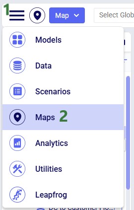
Maps can be accessed through the Maps module in Cosmic Frog:
Click on the Module menu at the top left in Cosmic Frog.
Choose Maps from the drop-down menu.
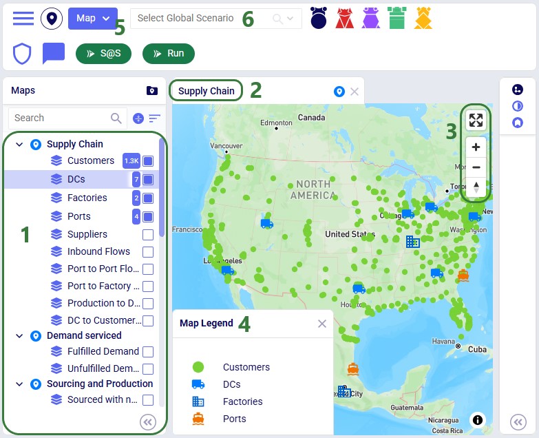
The Maps module opens and shows the first map in the Maps list; this will be the default pre-configured “Supply Chain” map for maps the user created and most models copied from the Resource Library:
The list of pre-configured maps and their layers is located on the left-hand side of the map, the next screenshot will cover this list in more detail.
The pre-configured Supply Chain map is showing by default when first opening the Maps module. Here, Customers are shown as small green circles (there are around 1.3k customers in this model), 7 Distribution Centers (DCs) are shown using a blue truck icon, 2 Factories are depicted with a blue building icon, and 2 Ports with an orange ship icon.
At the right top of a map, user will find following 4 map controls, from top to bottom:
Enter fullscreen: clicking on this icon will maximize the map on the whole computer screen. Clicking on this icon again, which at that point will have the arrows pointing inwards, will exit fullscreen mode.
Zoom in: clicking on this icon will zoom the map in. The map area will be used to show a smaller part of the world, and the features will become more detailed (e.g. smaller roads and smaller localities will become visible) as user zooms in more. Note that users can also zoom in using the scroll button on a mouse or putting two fingers on a mouse trackpad and moving them away from each other.
Zoom out: clicking on this icon will zoom the map out. The map area will be used to show a larger part of the world and features will become less detailed. Note that users can also zoom out using the scroll button on a mouse or putting two fingers on a mouse trackpad and moving them closer to each other.
Reset bearing to north: when working with a map, they may get moved so that the orientation is not the standard of top being north, right being east, etc. Click on this icon to reset the map so that the middle top part of the map faces north again.
Optionally, a Map Legend which can be configured by the user can be shown on the map. This will be covered in the Map Legend section further below.
Basic map and layer operations are available from the Map drop-down menu. See the Basic Map & Layer Operations section for more details.
The user can either set which scenario a map should use for each map individually (see the Map Filters section on how to do this) or they can use this Global Scenario Filter to set one scenario to be used by all Maps contained in the model. This filter is discussed in the Global Scenario Filter section further below.
Mouse Actions on Maps
In addition to what is mentioned under bullet 4 of the screenshot just above, users can also perform following actions on maps:
Users can drag the map to move it around to see a different part of the world: when hovering above the map with the mouse, the cursor becomes a hand. Click the mouse down and hold it down while you move in any direction to move the map.
Shift and use left mouse / mouse trackpad to draw a marquee to zoom.
To show a more 3-dimensional view where you can look down a street instead of looking at it from above: zoom in quite far, then hold CTRL down whilst using your left mouse button / track pad to tilt the projection:
Following shortcuts for zooming, panning, and rotating are also available:
= or +: increase the zoom level by 1
- or _: decrease the zoom level by 1
Shift and = or +: increase the zoom level by 2
Shift and – or _: decrease the zoom level by 2
Arrow keys: pan by 100 pixels
Shift and right arrow: increase the rotation by 15 degrees
Shift and left arrow: decrease the rotation by 15 degrees
Shift and up arrow: increase the pitch by 10 degrees
Shift and down arrow: decrease the pitch by 10 degrees
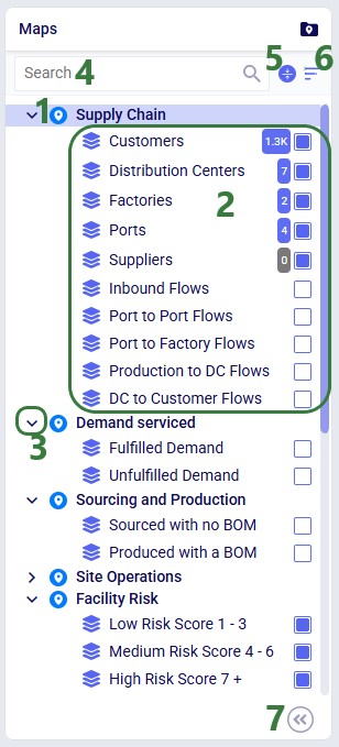
Maps List
As we have seen in the screenshot above, the Maps module opens with a list of pre-configured maps and layers on the left-hand side:
The map named “Supply Chain” is selected in the list. When clicking on a map, it will be opened, and it becomes the active map.
This map has 10 layers. Five of the layers are enabled and will be showing on the map: Customers, Distribution Centers (renamed from Facilities), Factories, Ports, and Suppliers. Please note that:
By default, only 3 layers (Customers, Facilities, and Suppliers) are enabled; the user has in addition enabled the Factories and Ports layers in this case.
The number of records from the input or output table that is used to draw the layer is listed in a blue square to the left of its checkbox. If there are no records in the table used to draw the layer, then the square’s color is grey so users can easily identify these. This number of records reflects filtering the table based on the scenario, product(s), and period(s) the user has selected to show on the map (for more details, see the Map Filters and Maps of Multi-period Models sections further below). In addition, the number also reflects if user has filtered the table based on applying any filtering condition(s) or named filter(s) to the map layer (for more details, see the Condition Builder section further below).
Map layers can be dragged to change the order of how they are drawn on the map:
Layers that show locations (layer Type = Point) are always drawn on top of layers that show flows (layer Type = Line).
Multiple layers of the same type are drawn on the map in the order they are listed (top to bottom), so drag any layer that should not be obscured by another layer below the layers it should be on top of.
Users can click on the chevron icon to collapse a map so that its layers are not visible in the list anymore. When collapsed, clicking on the chevron icon again will expand the map again and the layers become visible in the list. In the screenshot, all maps are expanded, except for the Site Operations map, which is collapsed.
At the top of the list users can free type text in a search box. This will filter the list of maps down to the maps where the map name or any of its layer names contain the text.
Clicking on this icon will collapse all maps, so that no layers are visible in the list, only the map names. Clicking on the icon again will expand all maps and all map layers become visible again.
Users can sort the maps in 2 ways that will be available when clicking on this icon:
Default: the pre-configured maps are listed first and any maps added by the user are listed below in the order they were added.
A-Z Name: this sorts the list in alphabetical order of map names. Clicking on the A-Z Name sort order icon again will sort them in reverse alphabetical order.
Click on this icon with 2 less than signs to hide the pane with the Maps list. The icon then turns into 2 greater than signs, which when clicked on will open the Maps list pane up again.
Basic Map & Layer Operations
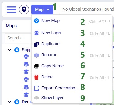
The Map menu in the toolbar at the top of the Maps module allows users to perform basic map and layer operations:
The Map drop-down menu is located in the toolbar at the top of the Maps module.
New Map: this will create a new map. Users can also use the Ctrl + Alt + O shortcut.
New Layer: this will create a new layer within the currently selected map. Users can also use the Ctrl + Alt + L shortcut.
Duplicate: this makes a copy of the currently selected Map (and all its layers) or currently selected Layer (which will be copied as a new layer within the same Map).
Rename: this will rename the currently selected Map or Layer. Users can also use the Ctrl + Alt + E shortcut.
Copy Name: this will copy the name of the currently selected Map or Layer to the clipboard.
Delete: this will delete the currently selected Map (and all its layers) or the currently selected Layer. Before the delete is performed, the user will be asked to confirm that they indeed want to delete the Map/Layer. Users can also use the Ctrl + Alt + T shortcut.
Export Screenshot: this will create a map.png image of the currently active map, which will be placed in the folder where user’s downloads are saved.
Hide Layer: this option is only available when a Layer is selected, and it will uncheck its checkbox, so that it will not be shown on the Map. If the checkbox of the layer is already unchecked, then instead of this Hide Layer option, there will be a Show Layer option in the Maps drop-down menu. When selected this will check the checkbox of the layer, so it will then be showing on the Map.
These options from the Map menu are also available in the context menu that comes up when right-clicking on a map or layer in the Maps list.
Global Scenario Filter
The Map Filters panel can be used to set scenarios for each map individually. If users want to use the same scenario for all maps present in the model, they can use the Global Scenario Filter located in the toolbar at the top of the Maps module:
The Global Scenario Filter will contain the text "Select Global Scenario" if no scenario has been selected. Click on the chevron icon on the right to open the drop-down list.
Users can use the free type text search box to quickly find the desired scenario in the drop-down list. Scenarios which contain the search text will be shown in the drop-down list.
The scenarios drop-down list can be sorted in 2 ways when clicking on this icon:
Default: the scenarios are listed in the order they were added.
A-Z Name: this sorts the scenario list in alphabetical order of scenarios names. Clicking on the A-Z Name sort order icon again will sort them in reverse alphabetical order.
The list of scenarios present in the model, select the desired one for all maps to use.
Now all maps in the model will use the selected scenario, and the option to set the scenario at the map-level is disabled.
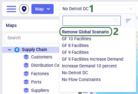
When a global scenario has been set, it can be removed using the Global Scenario Filter again:
The "No Detroit DC" scenario has been selected as the global scenario to be used by all maps.
At the top of the scenarios list, there is now the option available to "Remove Global Scenario". Select this option to set the scenario by map instead of at the global level.
Persistence of Map Settings
The zoom level, how the map is centered, and the configuration of maps and their layers persist. After moving between other modules within Cosmic Frog or switching between models, when user comes back to the map(s) in a specific model, the map settings are the same as when last configured.
Adding and Configuring a Map
Now let us look at how users can add new maps, and the map configuration options available to them.
User has collapsed all pre-configured maps and chosen “New Map” from the Map drop-down menu. User can now type the name the new map should have into the text box. They have decided to call the new map “My New Map”.
On the right-hand side of the map, the New Map panel has come up, and user could have also typed the name here in the Map Name textbox.
Map Filters
Once done typing the name of the new map, the panel on the right-hand side of the map changes to the Map Filters panel which can be used to select the scenario and products the map will be showing. If the user wants to see a side-by-side map comparison of 2 scenarios in the model, this can be configured here too:
The Map Filters is the first of 3 panels users can use to configure maps. They can be selected by clicking on the 3 icons on the right. The first one is for Map Filters, the second one for Map Information, and the third one for Map Legend. Whichever one is active is colored darker blue than the other 2 icons. We will cover the Map Information and Map Legend panes with screenshots further below.
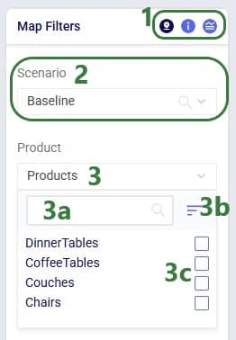
If there are multiple scenarios present in the model, user can select the one to show on the map from the drop-down list. Since this is a map-level setting it applies to all layers that are added to the map, and user can change between scenarios in this one place.
User can also choose to show the map for all products present in the model (the default) or a subset of them. When wanting to show a subset, user can click on the drop-down and select the product(s) to show:
A search box to quickly filter the products list to those that contain certain text in their names is available to quickly find products of interest in case there are many products in the model.
User also has the option to sort the product names either in the Default order, which is the order in which they were added to and appear in the Products table, or in (reverse) alphabetical order (the A-Z Name option).
The checkbox(es) of the product(s) that should be shown on the map can be checked individually.
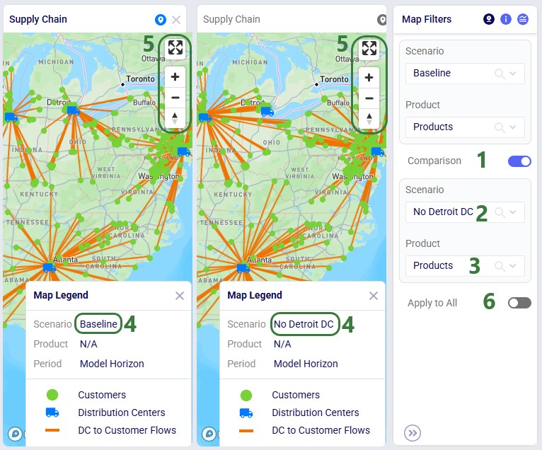
In the screenshot above, the Comparison toggle is hidden by the Product drop-down. In the next screenshot it is shown. By default, this toggle is off; when sliding it right to be on, we can configure which scenario we want to compare the previously selected scenario to:
The Comparison toggle has been turned on. A new empty map appears on the right-hand side of the map that is already showing the Baseline scenario.
In the Scenario drop-down, the user chooses the “No Detroit DC” scenario as the scenario to compare to the Baseline scenario.
If desired, the user can filter this second map for a subset of the Products available in the model using the Product drop-down list. Note that in order to have an apples-to-apples comparison between the 2 selected scenarios, the user should select the same product(s) for both scenarios using the 2 Product filters.
In the Map Legend of each map, we see that the left map now shows the Baseline scenario and the right map the No Detroit DC scenario. On the map itself, we see that the customers served by the DC in Detroit in the Baseline scenario are now served by the Chicago, Philadelphia and Atlanta DC’s in the No Detroit DC scenario.
Users can adjust both maps (e.g. panning, zooming, maximizing/minimizing) using either map. A change made to map on the left, will also be made to the map on the right, and vice versa.
The Apply to All toggle can be used to apply the same comparison filter settings for all maps within the model. By default, it is turned off: slide it to the right to turn it on. It will then be applied to any map that is already open or any map that will be opened while the toggle is on.
Please note:
Combining the Global Scenario Filter with the Apply to All toggle for map comparisons, lets users configure comparisons between the same 2 scenarios for all maps in their model in 2 easy steps.
The Apply to All toggle for scenario comparisons appears in the Map Filters panel of each map. If it is turned on in any of the maps, it will be shown as on for all maps.
While the Apply to All toggle is on then if the scenario and/or product filters in the Comparison section are changed in any of the open maps, they are changed for all maps.
If the Apply to All toggle is turned off in any of the maps, either the one it was first turned on for or in any other map, it will be turned off for all maps. The comparisons in all open maps are reverted to the settings they had when the toggle was first turned on.
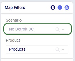
Instead of setting which scenario to use for each map individually on the Map Filters panel, users can instead choose to set a global scenario for all maps to use, as discussed above in the Global Scenario Filter section. If a global scenario is set, the Scenario drop-down on the Map Filters panel will be disabled and the user cannot open it:
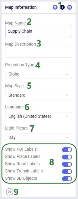
Map Information
On the Map Information panel, users have a lot of options to configure what the map looks like and what entities (outside of the supply chain ones configured in the layers) are shown on it:
The second icon has been clicked to show the Map Information panel.
The Map Name is shown here and can be changed if desired.
A description of the map can be typed here. This is for example useful for a user when coming back to a map at a later stage to quickly be reminded of how and why the map is set up the way it is and for models shared between multiple users.
Projection Type: a map projection is a way to flatten the earth’s surface onto a screen. There are different methods to project the earth, and multiple options are available for Cosmic Frog maps. An explanation of the available projections together with some advantages and disadvantages of each can be found in this Map Projections documentation from Mapbox.
Map Style: multiple map styles are available to the user to choose from to show the map. The styles available are listed in the Mapbox Styles documentation from Mapbox, where user can see an example of each style.
Language: many languages are available to choose from in the drop-down list. The written names of features shown on the map are then displayed in the chosen language when available.
When the Standard Map Style is used (bullet 5), a Light Preset drop-down is available with 4 available options: Dusk, Dawn, Day, and Night. This will then show the map with the lighting as expected during that time of day/night.
Depending on the Map Style (bullet 5), some or all of the following features can be turned on or off on the map. Note that to see some of these labels, users may need to zoom in quite far:
POI Labels: when turned on shows points of interests like restaurants, hotels, etc.
Place Labels: when turned on shows names of countries, provinces/states, cities, etc.
Road Labels: when turned on shows road names and numbers.
Show Transit Labels: when turned on shows airport codes, names of sea routes, ports, etc.
Show 3D Objects: when turned on objects like buildings will be shown with 3 dimensions while in the street view mode shown in the screenshot in the Keyboard & Mouse Actions on Maps section further above.
Click on this icon with 2 greater than signs to hide the Map Information pane. The icon then turns into 2 less than signs, which when clicked on will open the Map Information pane up again.
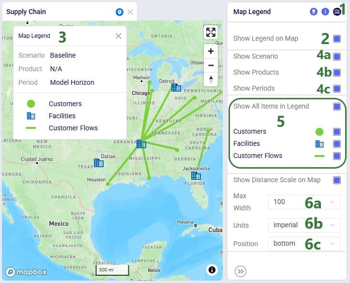
Map Legend
Users can choose to show a legend on the map and configure it on the Map Legend pane:
The third icon has been clicked to show the Map Legend panel.
Enabling this “Show Legend on Map” checkbox will put a legend on the map. If this checkbox is disabled, the map is shown without the legend.
This is the legend showing on the map. Note that users can click on the legend and drag it to a different location on the map. Hovering over Scenario, Product, or Period will also show the full text in a tooltip, which is helpful in case the text is too wide for it to be shown in the legend entirely.
In this section user can choose which of the following map settings should be included in the legend:
Scenario – show in the legend for which scenario each layer is being drawn on the map.
Product – show in the legend for which product(s) each layer is being drawn on the map. Will say “N/A” in case all products are being shown.
Period – show in the legend for which period each layer is being drawn on the map. Will say “Model Horizon” for single-period models.
In this section user can choose which of the layers present in the map should be shown in the legend. Note that only layers that are currently enabled are listed here. Enabling the “Show All Items in Legend” checkbox will ensure all layers that are showing on the map (e.g. enabled in the Maps list) will be listed in the legend, this will automatically update the legend when user enables/disables layers in the Maps list. Disabling this checkbox will disable the checkboxes of all layers listed beneath it and no layers will be listed in the legend.
User can choose to show the distance scale on the map. If showing, following can be configured for the scale:
Max Width – how wide the scale drawn on the map can be at the most. This number represents the number of pixels.
Units – the unit of measure used for the scale. Options are imperial (distance in miles), metric (distance in kilometres), and nautical (distance in nautical miles).
Position – the location on the map where the scale should be showing. Options are: top-left, top, top-right, right, bottom-right, bottom, bottom-left, and left.
Adding and Configuring Layers
To start visualizing the supply chain that is being modelled on a map, user needs to add at least 1 layer to a map, which can be done by choosing “New Layer” from the Map-menu:
User can now type the name the new layer should have into the text box. They have decided to call the new layer “My new Layer”.
On the right-hand side of the map, the Add Layer panel has come up, and user could have also typed the name here in the Layer Name textbox.
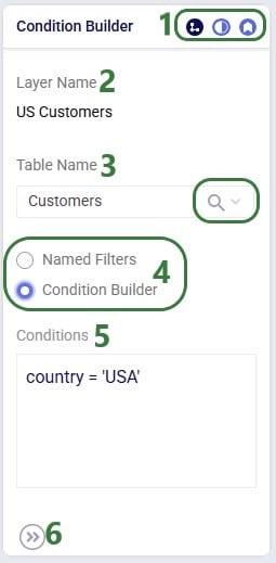
Condition Builder
Once a layer has been added or is selected in the Maps list, the panel on the right-hand side of the map changes to the Condition Builder panel which can be used to select the input or output table and any filters on it to be used to draw the layer:
The Condition Builder is the first of 3 panels users can use to configure map layers. They can be selected by clicking on the 3 icons on the right. The first one is for Condition Builder, the second one for Layer Style, and the third one for Layer Labels. Whichever one is active is colored darker blue than the other 2 icons.
The name of the layer is shown at the top of this panel. It cannot be changed here; should a user want to change the name of a layer, the “Rename” option in the Maps-menu can be used (also accessible from the right-click context menu when clicking on the layer in the Maps list).
The table to be used to draw the map layer can be chosen from the Table Name drop-down list. When clicking on the drop-down (caret down icon), a search box in which user can type text to find tables containing that text in their name becomes available. User can also sort the tables, either in the Default order (input tables first, then output tables, both in the order they appear in Cosmic Frog when sorting them by the Default in the Data module) or in (reverse) alphabetical order when choosing the A-Z Name sort order option.
Three input tables are available in this list: Customers, Facilities, and Suppliers, which will draw these locations on the map (if geocoded). In addition to these 3 input tables, many output tables for the different engines are available too. An additional transportation optimization (Hopper) specific table called “TransportationRoutesMapLayer” is also available. This is not an input or output table, but one available specifically for the purpose of drawing multi-stop routes on the map. Here, the Customers input table is selected.
If all data in the selected table should be used to draw the map layer, then user does not need to do anything in addition and the layer will be drawn according to the map-level scenario and product filters (see above section on Map Filters). If the table should be filtered before drawing the map layer, user has 2 options: either use the Named Filters option or the Condition Builder one. The latter has been selected here; Named Filters will be covered further below.
When “Condition Builder” is chosen as the method to filter the table, then user needs to specify the filter that needs to be applied in the Condition text box. Here user has typed country = ‘USA’, this means that only those records from the Customers table where the Country field value equals USA will be drawn. To learn more about the syntax for writing conditions, please see this Help Center article. Note that the number of records used to draw the layer (the blue number next to the checkbox) will update based on the condition(s) applied to the layer.
Click on this icon with 2 greater than signs to hide the Condition Builder pane. The icon then turns into 2 less than signs, which when clicked on will open the Condition Builder pane up again.
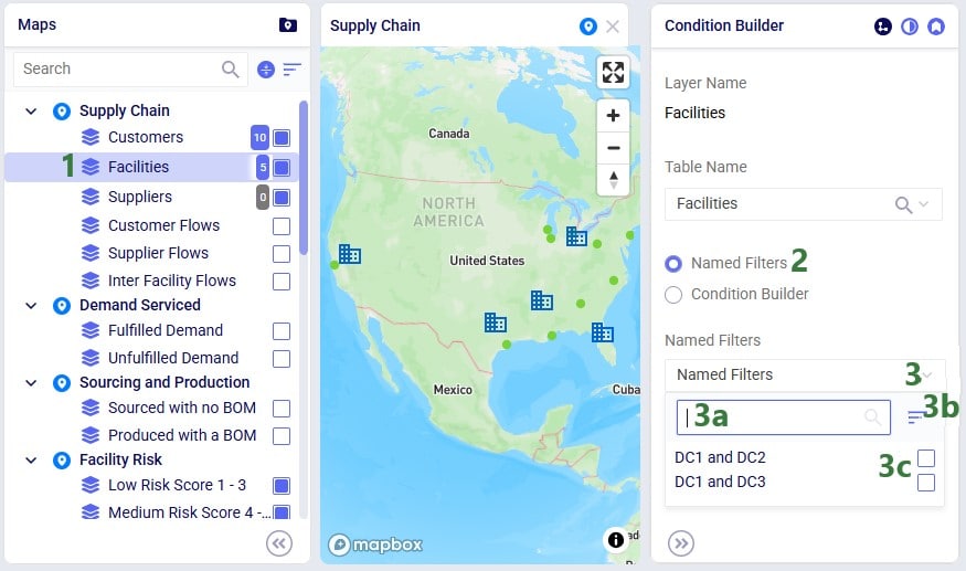
We will now also look at using the Named Filters option to filter the table used to draw the map layer:
Here we are looking at a facilities layer where originally 5 facilities are showing on the map (the blue building icons on the map).
In the Condition Builder pane of this layer, user has chosen to use Named Filters. See also the “Named Filters in Cosmic Frog” Help Center article to learn all the ins and outs of Named Filters.
When clicking on the Named Filters drop-down, following become available to the user:
A search box to quickly filter the named filter list to those that contain certain text in their names to quickly find filters of interest.
User also has the option to sort the named filters either in the Default order, which is the order in which they were added in the table, or in (reverse) alphabetical order (the A-Z Name option).
The checkbox(es) of the named filter(s) that should be shown on the map can be checked individually. Note that enabling multiple named filters works in an additive way (i.e. like an OR statement): the records that are filtered out by each filter will be shown on the map.
In this walk-through example, user chooses to enable the “DC1 and DC2” named filter:
The “DC1 and DC2” named filter has been enabled and is now shown beneath the Named Filters drop-down list. To remove this filter user can click on the x-icon on the right. If the whole name is not visible, user can hover over the name of the filter to show the tooltip, which will show the full name of the named filter.
We see that the number representing the number of records used to draw the map layer has now changed from 5 to 2. Looking at the map, we also notice that there are now only 2 blue building icons showing.
Lastly on the Named Filters option, users have the option to view a grid preview to ensure the correct filtered records are being drawn on the map:
The Show Grid Preview option beneath the Named Filters drop-down has been turned on (toggle to the right, blue color).
Instead of the map, now the Filter Grid Preview is showing in the center of the screen. It shows the records of the Facilities table that have been filtered out and will be used to draw the map layer.
The name of the Named Filter is showing at the right top of the Grid Preview. It can be removed by clicking on the x-icon on the right.
We see that the “DC1 and DC2” Named Filter is working as expected: it filters out the facilities that are named DC1 and DC2.
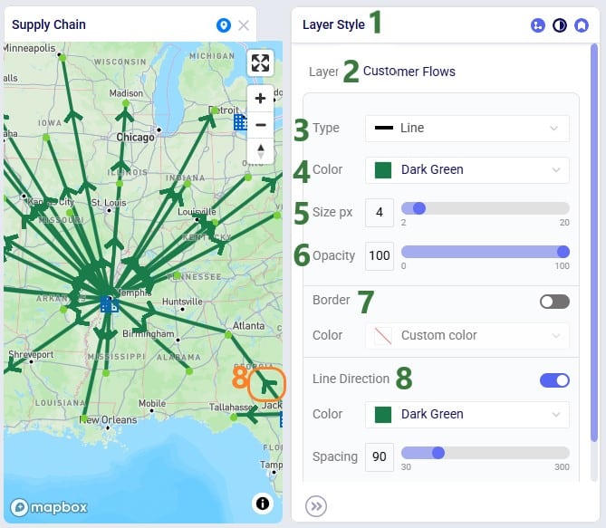
Layer Style
In the next layer configuration panel, Layer Style, users can choose what the supply chain entities that the layer shows will look like on the map. This panel looks somewhat different for layers that show locations (Type = Point) than for those that show flows (Type = Line). First, we will look at a point type layer (Customers):
The Layer Style is the second of 3 panels users can use to configure map layers. It is opened by clicking on the middle icon of the 3 on the right, which is then colored in a darker blue than the other 2.
The name of the layer is shown at the top of this panel. It cannot be changed here; should a user want to change the name of a layer, the “Rename” option in the Maps-menu can be used (also accessible from the right-click context menu when clicking on the layer in the Maps list).
The Type of layer is listed, since this layer shows locations (the customers), the type is a Point layer, which cannot be changed.
In the Shape drop-down, user can choose the icon to show for this entity on the map. Circle has been chosen here.
The color with which the entity will be drawn on the map can be chosen from the Color drop-down.
The size in pixels of the shape drawn on the map can be configured here by dragging the slider to the right to increase the size and to the left to decrease the size.
When collision detection is turned on by moving the toggle to the right (it will then become blue), it is automatically determined if entities overlap with each other, and if so, mitigating actions are taken to show them not overlapping on the map.
The opacity level determines if the entities drawn by the layer are entirely solid (100% opacity) and obscuring the rest of the map beneath the entity or if the entity is somewhat transparent and the features of the map beneath it can be made out to some extent. The opacity level can be configured by dragging the slider to the right to increase the opacity and to the left to decrease the opacity.
Next, we will look at a line type layer, Customer Flows:
The Layer Style is the second of 3 panels users can use to configure map layers. It is opened by clicking on the middle icon of the 3 on the right, which is then colored in a darker blue than the other 2.
The name of the layer is shown at the top of this panel. It cannot be changed here; should a user want to change the name of a layer, the “Rename” option in the Maps-menu can be used (also accessible from the right-click context menu when clicking on the layer in the Maps list).
The Type of layer is listed, since this layer shows flows (the Customer Flows), the type is by default set to Line, which will draw solid lines on the map. User can change this by choosing one of following options from the Type drop-down: Line, Dashed (Long Dashes), Dotted, or Dashed Dotted.
The color with which the lines will be drawn on the map can be chosen from the Color drop-down.
The thickness of the lines drawn on the map can be configured here by dragging the slider to the right to increase the thickness and to the left to decrease the thickness.
The opacity level determines if the entities drawn by the layer are entirely solid (100% opacity) and obscuring the rest of the map beneath the entity or if the entity is somewhat transparent and the features of the map beneath it can be made out to some extent. The opacity level can be configured by dragging the slider to the right to increase the opacity and to the left to decrease the opacity.
Lines can optionally have a border, which can be turned on by moving the toggle to the right (it then becomes blue). If a line border is being used, its color can be chosen in the Color drop-down.
Also optionally, arrows indicating the direction of the flow the lines represent can be drawn on the lines. This can be turned on by moving the toggle to the right (it then becomes blue). If Line Direction is turned on, user can choose the color of the arrowheads in the Color drop-down and how far apart the arrowheads need to be by dragging the Spacing slider left (closer together) or right (farther apart). The orange box with the number 8 on the map shows one of these arrowheads indicating the direction of the customer flow.
At the bottom of the Layer Style pane a Breakpoints toggle is available too (not shown in the screenshots above). To learn more about how these can be used and configured, please see the "Maps - Styling Points & Flows based on Breakpoints" Help Center article.
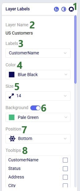
Layer Labels
Labels and tooltips can be added to each layer, so users can more easily see properties of the entities shown in the layer. The Layer Labels configuration panel allows users to choose what to show as labels and tooltips, and configure the style of the labels:
The third icon has been clicked to show the Layer Labels panel.
The name of the layer is shown at the top of this panel. It cannot be changed here; should a user want to change the name of a layer, the “Rename” option in the Maps-menu can be used (also accessible from the right-click context menu when clicking on the layer in the Maps list).
In the Labels drop-down list, user can choose which field from the input/output table will be used as the label. Here the Customer Name field is chosen.
The font color of the label can be set in the Color drop-down list. Blue Black is the choice here.
The font size of the label can be set in the Size drop-down list. Size 14 is chosen here.
A background box for the label can be turned on (toggle to the right, color blue). If it is turned on, the color of it can be chosen from the drop-down list. Here the background is turned on and Pale Green is chosen as the background color.
Where the labels are shown on the map in relation to the entity they belong to can be chosen here from the Position drop-down list. Options are: Top, Bottom, Left, and Right.
In addition to a label that is always shown on the map, user can also enable tooltips which will show the value of 1 or multiple fields from the table the layer is drawn from when hovering over the entity on the map. User needs to enable the checkbox(es) of the field(s) of interest in the Tooltips list. These fields appear in the tooltip in the order they were checked in the Tooltips list.
Maps of Multi-period Models
When modelling multiple periods in network optimization (Neo) models, users can see how these evolve over time using the map:
On the maps of multi-time period models, a toolbar controlling the periods shown on the map will be shown. This toolbar can be moved by clicking on the navigation icon on the left and dragging the toolbar to its desired location.
In the Period drop-down list, users can choose the period(s) for which they want to show the currently selected map. They also have the option to select multiple periods or all of them.
Instead of choosing a period from the drop-down mentioned in the previous bullet, users can also drag the dot on the timeline to the period they want to show the map for.
Use the icon with 2 less than signs to collapse the periods toolbar. When collapsed, clicking on the icon with 2 greater than icons will expand the periods toolbar again.
Adding a Location using the Map
Users can now add Customers, Facilities and Suppliers via the map:
Zoom in and move the cursor to the location on the map where the Customer, Facility or Supplier should be added.
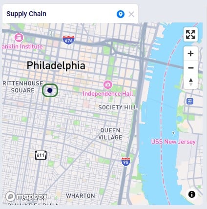
Right-click on the map and the Add Entity form comes up:
From the drop-down list choose the table the location needs to be added to, either Customers, Facilities or Suppliers. Here a new Customer location is being added.
Type the name of the new location, here the new customer will be called CZ_Philadelphia.
Click on the Add button to add the entity to the input table. In case user does not want to add the entity at this time, they can click on the x at the right top of the Add Entity form.
After adding the entity, we see it showing on the map, here as a dark blue circle, which is how the Customers layer is configured on this map:
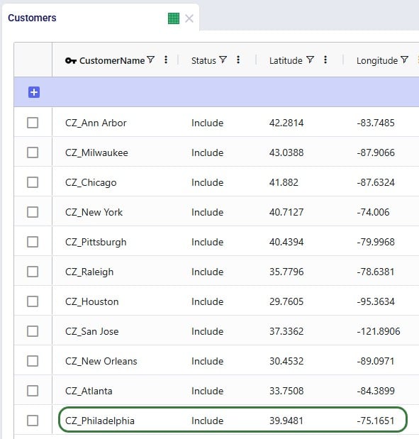
Looking in the Customers table, we notice that CZ_Philadelphia has been added. Note that while its latitude and longitude fields are set, other fields such as City, Country and Region are not automatically filled out for entities added via the map:
Example Maps
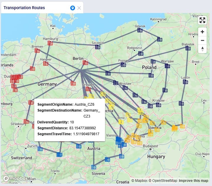
In this final section, we will show a few example maps to give users some ideas of what maps can look like. In this first screenshot, a map for a Transportation Optimization (Hopper engine) model, Transportation Optimization UserDefinedVariables available from Optilogic’s Resource Library (here), is shown:
Some notable features of this map are:
The customers have been color-coded based on the country they are in (e.g. red customers are in Germany, light blue in Austria, etc.). This is done by adding a layer for each country, choosing Customers as the table for each of these layers, filtering each for a different country using either the Condition Builder (Country = ‘Poland’, etc.) or Named Filters, and setting the color of the shape differently for each of these layers.
The Transportation Routes Map Layer is used as the table to show the lines of the routes on the map.
The opacity of this Routes layer is set to 50%, so the features of the map are still somewhat visible through the lines.
The Tooltip is configured on the Routes layer to show the value of 5 fields when hovering over a segment of the route:
Segment Origin Name
Segment Destination Name
Delivered Quantity
Segment Distance
Segment Travel Time
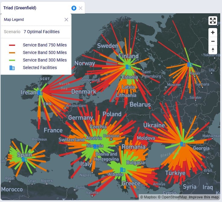
The next screenshot shows a map of a Greenfield (Triad engine) model:
Some notable features of this map are:
It shows the standard Triad (Greenfield) map for the “7 Optimal Facilities” scenario in the European Greenfield Facility Selection model, available from Optilogic’s Resource Library (here).
The Projection Type is the default of Globe, but the Map Style has been changed to Navigation Night V1 (on the Map Information pane when selecting the map in the maps list).
This model has 3 service bands set up in the Greenfield Service Bands input table: 50% of the demand quantity needs to be served from within 300 Miles, 70% from within 500 Miles, and 100% from within 750 Miles.
Three layers that use the Optimization Greenfield Flow Summary output table as the table have been added, each filtered for 1 of the 3 service bands: servicebandname = ‘750 Miles’, etc., and each with a different color set up for the flow lines (green for 300 miles, orange for 500 miles, and red for 750 miles).
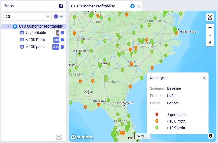
This following screenshot shows a subset of the customers in a Network Optimization (Neo engine) model, the Global Sourcing – Cost to Serve model available from Optilogic’s Resource Library (here). These customers are color-coded based on how profitable they are:
Some notable features of this map are:
Three layers have been added, Unprofitable, <10k Profit, >10k Profit, all from the Optimization Cost To Serve Summary output table:
The condition used on the Unprofitable layer is as follows: (revenue - cost) < 0. The color used for the shapes of this layer is red, and since we do not see any red shapes on the map and there is a grey 0 as the record count for the layer, we can conclude there are no unprofitable customers in this scenario (Baseline) of this model.
The condition used on the <10k Profit layer is as follows: (revenue - cost) >= 0 and (revenue - cost) <= 10000. The color used for the shapes of this layer is orange. The record count for the layer indicates there are 568 such customers (not all shown in the screenshot), that are profitable, but with a profit less than $10k.
The condition used on the >10k Profit layer is as follows: (revenue - cost) > 10000. The color used for the shapes of this layer is green. The record count for the layer indicates there are 3.4k such customers (not all shown in the screenshot), that are profitable and have a profit greater than $10k.
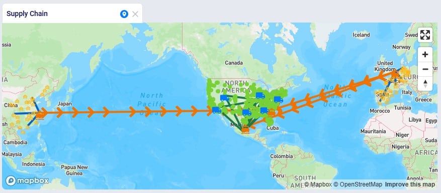
Lastly, the following screenshot shows a map of the Tariffs example model, a network optimization (Neo engine) model available from Optilogic’s Resource Library (here), where suppliers located in Europe and China supply raw materials to the US and Mexico:
Some notable features of this map are:
The Mercator projection is used, so the flows from China and Europe to the US and Mexico (the orange lines) can be shown in one view.
The Line Direction option is used; the arrow heads on the orange lines indicate that the raw materials are coming from China/Europe and are being moved to Mexico/the US.
Multiple layers that are using the Optimization Flow Summary output table as the table have been added so that the colors of the lines are indicative of the type of flow: blue lines for movements from suppliers to local ports (condition: FlowType = 'Procurement'), orange lines for movements between ports (condition: OriginName LIKE '%Port%' AND DestinationName LIKE '%Port%'), and green for movements from manufacturing locations to distribution centers (condition: OriginName LIKE '%Factory%').
We hope users feel empowered to create their own insightful maps. For any questions, please do not hesitate to contact Optilogic support at support@optilogic.com.
Showing supply chains on maps is a great way to visualize them, to understand differences between scenarios, and to show how they evolve over time. Cosmic Frog offers users many configuration options to customize maps to their exact needs and compare them side-by-side. In this documentation we will cover how to create and configure maps in Cosmic Frog.
Maps Basics
In Cosmic Frog, a map represents a single geographic visualization composed of different layers. A layer is an individual supply chain element such as a customer, product flow, or facility. To show locations on a map, these need to exist in the master tables (e.g. Customers, Facilities, and Suppliers) and they need to have been geocoded (see also the How to Geocode Locations section in this help center article). Flow based layers are based on output tables, such as the OptimizationFlowSummary or SimulationFlowSummary and to draw these, the model needs to have been run so outputs are present in these output tables.
Maps can be accessed through the Maps module in Cosmic Frog:
Click on the Module menu at the top left in Cosmic Frog.
Choose Maps from the drop-down menu.
The Maps module opens and shows the first map in the Maps list; this will be the default pre-configured “Supply Chain” map for maps the user created and most models copied from the Resource Library:
The list of pre-configured maps and their layers is located on the left-hand side of the map, the next screenshot will cover this list in more detail.
The pre-configured Supply Chain map is showing by default when first opening the Maps module. Here, Customers are shown as small green circles (there are around 1.3k customers in this model), 7 Distribution Centers (DCs) are shown using a blue truck icon, 2 Factories are depicted with a blue building icon, and 2 Ports with an orange ship icon.
At the right top of a map, user will find following 4 map controls, from top to bottom:
Enter fullscreen: clicking on this icon will maximize the map on the whole computer screen. Clicking on this icon again, which at that point will have the arrows pointing inwards, will exit fullscreen mode.
Zoom in: clicking on this icon will zoom the map in. The map area will be used to show a smaller part of the world, and the features will become more detailed (e.g. smaller roads and smaller localities will become visible) as user zooms in more. Note that users can also zoom in using the scroll button on a mouse or putting two fingers on a mouse trackpad and moving them away from each other.
Zoom out: clicking on this icon will zoom the map out. The map area will be used to show a larger part of the world and features will become less detailed. Note that users can also zoom out using the scroll button on a mouse or putting two fingers on a mouse trackpad and moving them closer to each other.
Reset bearing to north: when working with a map, they may get moved so that the orientation is not the standard of top being north, right being east, etc. Click on this icon to reset the map so that the middle top part of the map faces north again.
Optionally, a Map Legend which can be configured by the user can be shown on the map. This will be covered in the Map Legend section further below.
Basic map and layer operations are available from the Map drop-down menu. See the Basic Map & Layer Operations section for more details.
The user can either set which scenario a map should use for each map individually (see the Map Filters section on how to do this) or they can use this Global Scenario Filter to set one scenario to be used by all Maps contained in the model. This filter is discussed in the Global Scenario Filter section further below.
Mouse Actions on Maps
In addition to what is mentioned under bullet 4 of the screenshot just above, users can also perform following actions on maps:
Users can drag the map to move it around to see a different part of the world: when hovering above the map with the mouse, the cursor becomes a hand. Click the mouse down and hold it down while you move in any direction to move the map.
Shift and use left mouse / mouse trackpad to draw a marquee to zoom.
To show a more 3-dimensional view where you can look down a street instead of looking at it from above: zoom in quite far, then hold CTRL down whilst using your left mouse button / track pad to tilt the projection:
Following shortcuts for zooming, panning, and rotating are also available:
= or +: increase the zoom level by 1
- or _: decrease the zoom level by 1
Shift and = or +: increase the zoom level by 2
Shift and – or _: decrease the zoom level by 2
Arrow keys: pan by 100 pixels
Shift and right arrow: increase the rotation by 15 degrees
Shift and left arrow: decrease the rotation by 15 degrees
Shift and up arrow: increase the pitch by 10 degrees
Shift and down arrow: decrease the pitch by 10 degrees
Maps List
As we have seen in the screenshot above, the Maps module opens with a list of pre-configured maps and layers on the left-hand side:
The map named “Supply Chain” is selected in the list. When clicking on a map, it will be opened, and it becomes the active map.
This map has 10 layers. Five of the layers are enabled and will be showing on the map: Customers, Distribution Centers (renamed from Facilities), Factories, Ports, and Suppliers. Please note that:
By default, only 3 layers (Customers, Facilities, and Suppliers) are enabled; the user has in addition enabled the Factories and Ports layers in this case.
The number of records from the input or output table that is used to draw the layer is listed in a blue square to the left of its checkbox. If there are no records in the table used to draw the layer, then the square’s color is grey so users can easily identify these. This number of records reflects filtering the table based on the scenario, product(s), and period(s) the user has selected to show on the map (for more details, see the Map Filters and Maps of Multi-period Models sections further below). In addition, the number also reflects if user has filtered the table based on applying any filtering condition(s) or named filter(s) to the map layer (for more details, see the Condition Builder section further below).
Map layers can be dragged to change the order of how they are drawn on the map:
Layers that show locations (layer Type = Point) are always drawn on top of layers that show flows (layer Type = Line).
Multiple layers of the same type are drawn on the map in the order they are listed (top to bottom), so drag any layer that should not be obscured by another layer below the layers it should be on top of.
Users can click on the chevron icon to collapse a map so that its layers are not visible in the list anymore. When collapsed, clicking on the chevron icon again will expand the map again and the layers become visible in the list. In the screenshot, all maps are expanded, except for the Site Operations map, which is collapsed.
At the top of the list users can free type text in a search box. This will filter the list of maps down to the maps where the map name or any of its layer names contain the text.
Clicking on this icon will collapse all maps, so that no layers are visible in the list, only the map names. Clicking on the icon again will expand all maps and all map layers become visible again.
Users can sort the maps in 2 ways that will be available when clicking on this icon:
Default: the pre-configured maps are listed first and any maps added by the user are listed below in the order they were added.
A-Z Name: this sorts the list in alphabetical order of map names. Clicking on the A-Z Name sort order icon again will sort them in reverse alphabetical order.
Click on this icon with 2 less than signs to hide the pane with the Maps list. The icon then turns into 2 greater than signs, which when clicked on will open the Maps list pane up again.
Basic Map & Layer Operations
The Map menu in the toolbar at the top of the Maps module allows users to perform basic map and layer operations:
The Map drop-down menu is located in the toolbar at the top of the Maps module.
New Map: this will create a new map. Users can also use the Ctrl + Alt + O shortcut.
New Layer: this will create a new layer within the currently selected map. Users can also use the Ctrl + Alt + L shortcut.
Duplicate: this makes a copy of the currently selected Map (and all its layers) or currently selected Layer (which will be copied as a new layer within the same Map).
Rename: this will rename the currently selected Map or Layer. Users can also use the Ctrl + Alt + E shortcut.
Copy Name: this will copy the name of the currently selected Map or Layer to the clipboard.
Delete: this will delete the currently selected Map (and all its layers) or the currently selected Layer. Before the delete is performed, the user will be asked to confirm that they indeed want to delete the Map/Layer. Users can also use the Ctrl + Alt + T shortcut.
Export Screenshot: this will create a map.png image of the currently active map, which will be placed in the folder where user’s downloads are saved.
Hide Layer: this option is only available when a Layer is selected, and it will uncheck its checkbox, so that it will not be shown on the Map. If the checkbox of the layer is already unchecked, then instead of this Hide Layer option, there will be a Show Layer option in the Maps drop-down menu. When selected this will check the checkbox of the layer, so it will then be showing on the Map.
These options from the Map menu are also available in the context menu that comes up when right-clicking on a map or layer in the Maps list.
Global Scenario Filter
The Map Filters panel can be used to set scenarios for each map individually. If users want to use the same scenario for all maps present in the model, they can use the Global Scenario Filter located in the toolbar at the top of the Maps module:
The Global Scenario Filter will contain the text "Select Global Scenario" if no scenario has been selected. Click on the chevron icon on the right to open the drop-down list.
Users can use the free type text search box to quickly find the desired scenario in the drop-down list. Scenarios which contain the search text will be shown in the drop-down list.
The scenarios drop-down list can be sorted in 2 ways when clicking on this icon:
Default: the scenarios are listed in the order they were added.
A-Z Name: this sorts the scenario list in alphabetical order of scenarios names. Clicking on the A-Z Name sort order icon again will sort them in reverse alphabetical order.
The list of scenarios present in the model, select the desired one for all maps to use.
Now all maps in the model will use the selected scenario, and the option to set the scenario at the map-level is disabled.
When a global scenario has been set, it can be removed using the Global Scenario Filter again:
The "No Detroit DC" scenario has been selected as the global scenario to be used by all maps.
At the top of the scenarios list, there is now the option available to "Remove Global Scenario". Select this option to set the scenario by map instead of at the global level.
Persistence of Map Settings
The zoom level, how the map is centered, and the configuration of maps and their layers persist. After moving between other modules within Cosmic Frog or switching between models, when user comes back to the map(s) in a specific model, the map settings are the same as when last configured.
Adding and Configuring a Map
Now let us look at how users can add new maps, and the map configuration options available to them.
User has collapsed all pre-configured maps and chosen “New Map” from the Map drop-down menu. User can now type the name the new map should have into the text box. They have decided to call the new map “My New Map”.
On the right-hand side of the map, the New Map panel has come up, and user could have also typed the name here in the Map Name textbox.
Map Filters
Once done typing the name of the new map, the panel on the right-hand side of the map changes to the Map Filters panel which can be used to select the scenario and products the map will be showing. If the user wants to see a side-by-side map comparison of 2 scenarios in the model, this can be configured here too:
The Map Filters is the first of 3 panels users can use to configure maps. They can be selected by clicking on the 3 icons on the right. The first one is for Map Filters, the second one for Map Information, and the third one for Map Legend. Whichever one is active is colored darker blue than the other 2 icons. We will cover the Map Information and Map Legend panes with screenshots further below.
If there are multiple scenarios present in the model, user can select the one to show on the map from the drop-down list. Since this is a map-level setting it applies to all layers that are added to the map, and user can change between scenarios in this one place.
User can also choose to show the map for all products present in the model (the default) or a subset of them. When wanting to show a subset, user can click on the drop-down and select the product(s) to show:
A search box to quickly filter the products list to those that contain certain text in their names is available to quickly find products of interest in case there are many products in the model.
User also has the option to sort the product names either in the Default order, which is the order in which they were added to and appear in the Products table, or in (reverse) alphabetical order (the A-Z Name option).
The checkbox(es) of the product(s) that should be shown on the map can be checked individually.
In the screenshot above, the Comparison toggle is hidden by the Product drop-down. In the next screenshot it is shown. By default, this toggle is off; when sliding it right to be on, we can configure which scenario we want to compare the previously selected scenario to:
The Comparison toggle has been turned on. A new empty map appears on the right-hand side of the map that is already showing the Baseline scenario.
In the Scenario drop-down, the user chooses the “No Detroit DC” scenario as the scenario to compare to the Baseline scenario.
If desired, the user can filter this second map for a subset of the Products available in the model using the Product drop-down list. Note that in order to have an apples-to-apples comparison between the 2 selected scenarios, the user should select the same product(s) for both scenarios using the 2 Product filters.
In the Map Legend of each map, we see that the left map now shows the Baseline scenario and the right map the No Detroit DC scenario. On the map itself, we see that the customers served by the DC in Detroit in the Baseline scenario are now served by the Chicago, Philadelphia and Atlanta DC’s in the No Detroit DC scenario.
Users can adjust both maps (e.g. panning, zooming, maximizing/minimizing) using either map. A change made to map on the left, will also be made to the map on the right, and vice versa.
The Apply to All toggle can be used to apply the same comparison filter settings for all maps within the model. By default, it is turned off: slide it to the right to turn it on. It will then be applied to any map that is already open or any map that will be opened while the toggle is on.
Please note:
Combining the Global Scenario Filter with the Apply to All toggle for map comparisons, lets users configure comparisons between the same 2 scenarios for all maps in their model in 2 easy steps.
The Apply to All toggle for scenario comparisons appears in the Map Filters panel of each map. If it is turned on in any of the maps, it will be shown as on for all maps.
While the Apply to All toggle is on then if the scenario and/or product filters in the Comparison section are changed in any of the open maps, they are changed for all maps.
If the Apply to All toggle is turned off in any of the maps, either the one it was first turned on for or in any other map, it will be turned off for all maps. The comparisons in all open maps are reverted to the settings they had when the toggle was first turned on.
Instead of setting which scenario to use for each map individually on the Map Filters panel, users can instead choose to set a global scenario for all maps to use, as discussed above in the Global Scenario Filter section. If a global scenario is set, the Scenario drop-down on the Map Filters panel will be disabled and the user cannot open it:
Map Information
On the Map Information panel, users have a lot of options to configure what the map looks like and what entities (outside of the supply chain ones configured in the layers) are shown on it:
The second icon has been clicked to show the Map Information panel.
The Map Name is shown here and can be changed if desired.
A description of the map can be typed here. This is for example useful for a user when coming back to a map at a later stage to quickly be reminded of how and why the map is set up the way it is and for models shared between multiple users.
Projection Type: a map projection is a way to flatten the earth’s surface onto a screen. There are different methods to project the earth, and multiple options are available for Cosmic Frog maps. An explanation of the available projections together with some advantages and disadvantages of each can be found in this Map Projections documentation from Mapbox.
Map Style: multiple map styles are available to the user to choose from to show the map. The styles available are listed in the Mapbox Styles documentation from Mapbox, where user can see an example of each style.
Language: many languages are available to choose from in the drop-down list. The written names of features shown on the map are then displayed in the chosen language when available.
When the Standard Map Style is used (bullet 5), a Light Preset drop-down is available with 4 available options: Dusk, Dawn, Day, and Night. This will then show the map with the lighting as expected during that time of day/night.
Depending on the Map Style (bullet 5), some or all of the following features can be turned on or off on the map. Note that to see some of these labels, users may need to zoom in quite far:
POI Labels: when turned on shows points of interests like restaurants, hotels, etc.
Place Labels: when turned on shows names of countries, provinces/states, cities, etc.
Road Labels: when turned on shows road names and numbers.
Show Transit Labels: when turned on shows airport codes, names of sea routes, ports, etc.
Show 3D Objects: when turned on objects like buildings will be shown with 3 dimensions while in the street view mode shown in the screenshot in the Keyboard & Mouse Actions on Maps section further above.
Click on this icon with 2 greater than signs to hide the Map Information pane. The icon then turns into 2 less than signs, which when clicked on will open the Map Information pane up again.
Map Legend
Users can choose to show a legend on the map and configure it on the Map Legend pane:
The third icon has been clicked to show the Map Legend panel.
Enabling this “Show Legend on Map” checkbox will put a legend on the map. If this checkbox is disabled, the map is shown without the legend.
This is the legend showing on the map. Note that users can click on the legend and drag it to a different location on the map. Hovering over Scenario, Product, or Period will also show the full text in a tooltip, which is helpful in case the text is too wide for it to be shown in the legend entirely.
In this section user can choose which of the following map settings should be included in the legend:
Scenario – show in the legend for which scenario each layer is being drawn on the map.
Product – show in the legend for which product(s) each layer is being drawn on the map. Will say “N/A” in case all products are being shown.
Period – show in the legend for which period each layer is being drawn on the map. Will say “Model Horizon” for single-period models.
In this section user can choose which of the layers present in the map should be shown in the legend. Note that only layers that are currently enabled are listed here. Enabling the “Show All Items in Legend” checkbox will ensure all layers that are showing on the map (e.g. enabled in the Maps list) will be listed in the legend, this will automatically update the legend when user enables/disables layers in the Maps list. Disabling this checkbox will disable the checkboxes of all layers listed beneath it and no layers will be listed in the legend.
User can choose to show the distance scale on the map. If showing, following can be configured for the scale:
Max Width – how wide the scale drawn on the map can be at the most. This number represents the number of pixels.
Units – the unit of measure used for the scale. Options are imperial (distance in miles), metric (distance in kilometres), and nautical (distance in nautical miles).
Position – the location on the map where the scale should be showing. Options are: top-left, top, top-right, right, bottom-right, bottom, bottom-left, and left.
Adding and Configuring Layers
To start visualizing the supply chain that is being modelled on a map, user needs to add at least 1 layer to a map, which can be done by choosing “New Layer” from the Map-menu:
User can now type the name the new layer should have into the text box. They have decided to call the new layer “My new Layer”.
On the right-hand side of the map, the Add Layer panel has come up, and user could have also typed the name here in the Layer Name textbox.
Condition Builder
Once a layer has been added or is selected in the Maps list, the panel on the right-hand side of the map changes to the Condition Builder panel which can be used to select the input or output table and any filters on it to be used to draw the layer:
The Condition Builder is the first of 3 panels users can use to configure map layers. They can be selected by clicking on the 3 icons on the right. The first one is for Condition Builder, the second one for Layer Style, and the third one for Layer Labels. Whichever one is active is colored darker blue than the other 2 icons.
The name of the layer is shown at the top of this panel. It cannot be changed here; should a user want to change the name of a layer, the “Rename” option in the Maps-menu can be used (also accessible from the right-click context menu when clicking on the layer in the Maps list).
The table to be used to draw the map layer can be chosen from the Table Name drop-down list. When clicking on the drop-down (caret down icon), a search box in which user can type text to find tables containing that text in their name becomes available. User can also sort the tables, either in the Default order (input tables first, then output tables, both in the order they appear in Cosmic Frog when sorting them by the Default in the Data module) or in (reverse) alphabetical order when choosing the A-Z Name sort order option.
Three input tables are available in this list: Customers, Facilities, and Suppliers, which will draw these locations on the map (if geocoded). In addition to these 3 input tables, many output tables for the different engines are available too. An additional transportation optimization (Hopper) specific table called “TransportationRoutesMapLayer” is also available. This is not an input or output table, but one available specifically for the purpose of drawing multi-stop routes on the map. Here, the Customers input table is selected.
If all data in the selected table should be used to draw the map layer, then user does not need to do anything in addition and the layer will be drawn according to the map-level scenario and product filters (see above section on Map Filters). If the table should be filtered before drawing the map layer, user has 2 options: either use the Named Filters option or the Condition Builder one. The latter has been selected here; Named Filters will be covered further below.
When “Condition Builder” is chosen as the method to filter the table, then user needs to specify the filter that needs to be applied in the Condition text box. Here user has typed country = ‘USA’, this means that only those records from the Customers table where the Country field value equals USA will be drawn. To learn more about the syntax for writing conditions, please see this Help Center article. Note that the number of records used to draw the layer (the blue number next to the checkbox) will update based on the condition(s) applied to the layer.
Click on this icon with 2 greater than signs to hide the Condition Builder pane. The icon then turns into 2 less than signs, which when clicked on will open the Condition Builder pane up again.
We will now also look at using the Named Filters option to filter the table used to draw the map layer:
Here we are looking at a facilities layer where originally 5 facilities are showing on the map (the blue building icons on the map).
In the Condition Builder pane of this layer, user has chosen to use Named Filters. See also the “Named Filters in Cosmic Frog” Help Center article to learn all the ins and outs of Named Filters.
When clicking on the Named Filters drop-down, following become available to the user:
A search box to quickly filter the named filter list to those that contain certain text in their names to quickly find filters of interest.
User also has the option to sort the named filters either in the Default order, which is the order in which they were added in the table, or in (reverse) alphabetical order (the A-Z Name option).
The checkbox(es) of the named filter(s) that should be shown on the map can be checked individually. Note that enabling multiple named filters works in an additive way (i.e. like an OR statement): the records that are filtered out by each filter will be shown on the map.
In this walk-through example, user chooses to enable the “DC1 and DC2” named filter:
The “DC1 and DC2” named filter has been enabled and is now shown beneath the Named Filters drop-down list. To remove this filter user can click on the x-icon on the right. If the whole name is not visible, user can hover over the name of the filter to show the tooltip, which will show the full name of the named filter.
We see that the number representing the number of records used to draw the map layer has now changed from 5 to 2. Looking at the map, we also notice that there are now only 2 blue building icons showing.
Lastly on the Named Filters option, users have the option to view a grid preview to ensure the correct filtered records are being drawn on the map:
The Show Grid Preview option beneath the Named Filters drop-down has been turned on (toggle to the right, blue color).
Instead of the map, now the Filter Grid Preview is showing in the center of the screen. It shows the records of the Facilities table that have been filtered out and will be used to draw the map layer.
The name of the Named Filter is showing at the right top of the Grid Preview. It can be removed by clicking on the x-icon on the right.
We see that the “DC1 and DC2” Named Filter is working as expected: it filters out the facilities that are named DC1 and DC2.
Layer Style
In the next layer configuration panel, Layer Style, users can choose what the supply chain entities that the layer shows will look like on the map. This panel looks somewhat different for layers that show locations (Type = Point) than for those that show flows (Type = Line). First, we will look at a point type layer (Customers):
The Layer Style is the second of 3 panels users can use to configure map layers. It is opened by clicking on the middle icon of the 3 on the right, which is then colored in a darker blue than the other 2.
The name of the layer is shown at the top of this panel. It cannot be changed here; should a user want to change the name of a layer, the “Rename” option in the Maps-menu can be used (also accessible from the right-click context menu when clicking on the layer in the Maps list).
The Type of layer is listed, since this layer shows locations (the customers), the type is a Point layer, which cannot be changed.
In the Shape drop-down, user can choose the icon to show for this entity on the map. Circle has been chosen here.
The color with which the entity will be drawn on the map can be chosen from the Color drop-down.
The size in pixels of the shape drawn on the map can be configured here by dragging the slider to the right to increase the size and to the left to decrease the size.
When collision detection is turned on by moving the toggle to the right (it will then become blue), it is automatically determined if entities overlap with each other, and if so, mitigating actions are taken to show them not overlapping on the map.
The opacity level determines if the entities drawn by the layer are entirely solid (100% opacity) and obscuring the rest of the map beneath the entity or if the entity is somewhat transparent and the features of the map beneath it can be made out to some extent. The opacity level can be configured by dragging the slider to the right to increase the opacity and to the left to decrease the opacity.
Next, we will look at a line type layer, Customer Flows:
The Layer Style is the second of 3 panels users can use to configure map layers. It is opened by clicking on the middle icon of the 3 on the right, which is then colored in a darker blue than the other 2.
The name of the layer is shown at the top of this panel. It cannot be changed here; should a user want to change the name of a layer, the “Rename” option in the Maps-menu can be used (also accessible from the right-click context menu when clicking on the layer in the Maps list).
The Type of layer is listed, since this layer shows flows (the Customer Flows), the type is by default set to Line, which will draw solid lines on the map. User can change this by choosing one of following options from the Type drop-down: Line, Dashed (Long Dashes), Dotted, or Dashed Dotted.
The color with which the lines will be drawn on the map can be chosen from the Color drop-down.
The thickness of the lines drawn on the map can be configured here by dragging the slider to the right to increase the thickness and to the left to decrease the thickness.
The opacity level determines if the entities drawn by the layer are entirely solid (100% opacity) and obscuring the rest of the map beneath the entity or if the entity is somewhat transparent and the features of the map beneath it can be made out to some extent. The opacity level can be configured by dragging the slider to the right to increase the opacity and to the left to decrease the opacity.
Lines can optionally have a border, which can be turned on by moving the toggle to the right (it then becomes blue). If a line border is being used, its color can be chosen in the Color drop-down.
Also optionally, arrows indicating the direction of the flow the lines represent can be drawn on the lines. This can be turned on by moving the toggle to the right (it then becomes blue). If Line Direction is turned on, user can choose the color of the arrowheads in the Color drop-down and how far apart the arrowheads need to be by dragging the Spacing slider left (closer together) or right (farther apart). The orange box with the number 8 on the map shows one of these arrowheads indicating the direction of the customer flow.
At the bottom of the Layer Style pane a Breakpoints toggle is available too (not shown in the screenshots above). To learn more about how these can be used and configured, please see the "Maps - Styling Points & Flows based on Breakpoints" Help Center article.
Layer Labels
Labels and tooltips can be added to each layer, so users can more easily see properties of the entities shown in the layer. The Layer Labels configuration panel allows users to choose what to show as labels and tooltips, and configure the style of the labels:
The third icon has been clicked to show the Layer Labels panel.
The name of the layer is shown at the top of this panel. It cannot be changed here; should a user want to change the name of a layer, the “Rename” option in the Maps-menu can be used (also accessible from the right-click context menu when clicking on the layer in the Maps list).
In the Labels drop-down list, user can choose which field from the input/output table will be used as the label. Here the Customer Name field is chosen.
The font color of the label can be set in the Color drop-down list. Blue Black is the choice here.
The font size of the label can be set in the Size drop-down list. Size 14 is chosen here.
A background box for the label can be turned on (toggle to the right, color blue). If it is turned on, the color of it can be chosen from the drop-down list. Here the background is turned on and Pale Green is chosen as the background color.
Where the labels are shown on the map in relation to the entity they belong to can be chosen here from the Position drop-down list. Options are: Top, Bottom, Left, and Right.
In addition to a label that is always shown on the map, user can also enable tooltips which will show the value of 1 or multiple fields from the table the layer is drawn from when hovering over the entity on the map. User needs to enable the checkbox(es) of the field(s) of interest in the Tooltips list. These fields appear in the tooltip in the order they were checked in the Tooltips list.
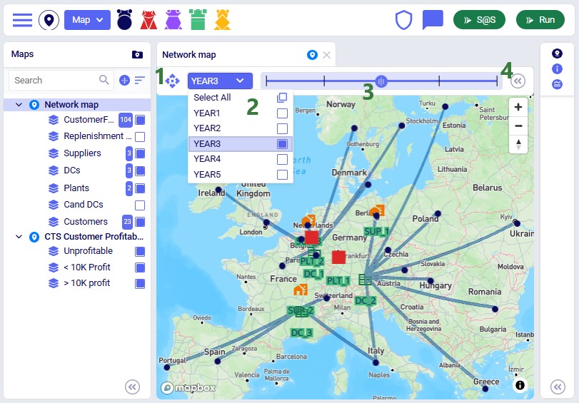
Maps of Multi-period Models
When modelling multiple periods in network optimization (Neo) models, users can see how these evolve over time using the map:
On the maps of multi-time period models, a toolbar controlling the periods shown on the map will be shown. This toolbar can be moved by clicking on the navigation icon on the left and dragging the toolbar to its desired location.
In the Period drop-down list, users can choose the period(s) for which they want to show the currently selected map. They also have the option to select multiple periods or all of them.
Instead of choosing a period from the drop-down mentioned in the previous bullet, users can also drag the dot on the timeline to the period they want to show the map for.
Use the icon with 2 less than signs to collapse the periods toolbar. When collapsed, clicking on the icon with 2 greater than icons will expand the periods toolbar again.
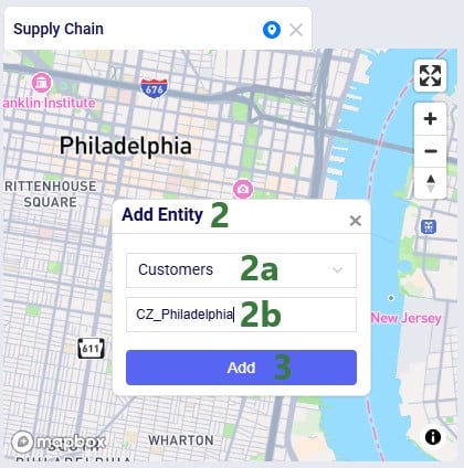
Adding a Location using the Map
Users can now add Customers, Facilities and Suppliers via the map:
Zoom in and move the cursor to the location on the map where the Customer, Facility or Supplier should be added.
Right-click on the map and the Add Entity form comes up:
From the drop-down list choose the table the location needs to be added to, either Customers, Facilities or Suppliers. Here a new Customer location is being added.
Type the name of the new location, here the new customer will be called CZ_Philadelphia.
Click on the Add button to add the entity to the input table. In case user does not want to add the entity at this time, they can click on the x at the right top of the Add Entity form.
After adding the entity, we see it showing on the map, here as a dark blue circle, which is how the Customers layer is configured on this map:
Looking in the Customers table, we notice that CZ_Philadelphia has been added. Note that while its latitude and longitude fields are set, other fields such as City, Country and Region are not automatically filled out for entities added via the map:
Example Maps
In this final section, we will show a few example maps to give users some ideas of what maps can look like. In this first screenshot, a map for a Transportation Optimization (Hopper engine) model, Transportation Optimization UserDefinedVariables available from Optilogic’s Resource Library (here), is shown:
Some notable features of this map are:
The customers have been color-coded based on the country they are in (e.g. red customers are in Germany, light blue in Austria, etc.). This is done by adding a layer for each country, choosing Customers as the table for each of these layers, filtering each for a different country using either the Condition Builder (Country = ‘Poland’, etc.) or Named Filters, and setting the color of the shape differently for each of these layers.
The Transportation Routes Map Layer is used as the table to show the lines of the routes on the map.
The opacity of this Routes layer is set to 50%, so the features of the map are still somewhat visible through the lines.
The Tooltip is configured on the Routes layer to show the value of 5 fields when hovering over a segment of the route:
Segment Origin Name
Segment Destination Name
Delivered Quantity
Segment Distance
Segment Travel Time
The next screenshot shows a map of a Greenfield (Triad engine) model:
Some notable features of this map are:
It shows the standard Triad (Greenfield) map for the “7 Optimal Facilities” scenario in the European Greenfield Facility Selection model, available from Optilogic’s Resource Library (here).
The Projection Type is the default of Globe, but the Map Style has been changed to Navigation Night V1 (on the Map Information pane when selecting the map in the maps list).
This model has 3 service bands set up in the Greenfield Service Bands input table: 50% of the demand quantity needs to be served from within 300 Miles, 70% from within 500 Miles, and 100% from within 750 Miles.
Three layers that use the Optimization Greenfield Flow Summary output table as the table have been added, each filtered for 1 of the 3 service bands: servicebandname = ‘750 Miles’, etc., and each with a different color set up for the flow lines (green for 300 miles, orange for 500 miles, and red for 750 miles).
This following screenshot shows a subset of the customers in a Network Optimization (Neo engine) model, the Global Sourcing – Cost to Serve model available from Optilogic’s Resource Library (here). These customers are color-coded based on how profitable they are:
Some notable features of this map are:
Three layers have been added, Unprofitable, <10k Profit, >10k Profit, all from the Optimization Cost To Serve Summary output table:
The condition used on the Unprofitable layer is as follows: (revenue - cost) < 0. The color used for the shapes of this layer is red, and since we do not see any red shapes on the map and there is a grey 0 as the record count for the layer, we can conclude there are no unprofitable customers in this scenario (Baseline) of this model.
The condition used on the <10k Profit layer is as follows: (revenue - cost) >= 0 and (revenue - cost) <= 10000. The color used for the shapes of this layer is orange. The record count for the layer indicates there are 568 such customers (not all shown in the screenshot), that are profitable, but with a profit less than $10k.
The condition used on the >10k Profit layer is as follows: (revenue - cost) > 10000. The color used for the shapes of this layer is green. The record count for the layer indicates there are 3.4k such customers (not all shown in the screenshot), that are profitable and have a profit greater than $10k.
Lastly, the following screenshot shows a map of the Tariffs example model, a network optimization (Neo engine) model available from Optilogic’s Resource Library (here), where suppliers located in Europe and China supply raw materials to the US and Mexico:
Some notable features of this map are:
The Mercator projection is used, so the flows from China and Europe to the US and Mexico (the orange lines) can be shown in one view.
The Line Direction option is used; the arrow heads on the orange lines indicate that the raw materials are coming from China/Europe and are being moved to Mexico/the US.
Multiple layers that are using the Optimization Flow Summary output table as the table have been added so that the colors of the lines are indicative of the type of flow: blue lines for movements from suppliers to local ports (condition: FlowType = 'Procurement'), orange lines for movements between ports (condition: OriginName LIKE '%Port%' AND DestinationName LIKE '%Port%'), and green for movements from manufacturing locations to distribution centers (condition: OriginName LIKE '%Factory%').
We hope users feel empowered to create their own insightful maps. For any questions, please do not hesitate to contact Optilogic support at support@optilogic.com.