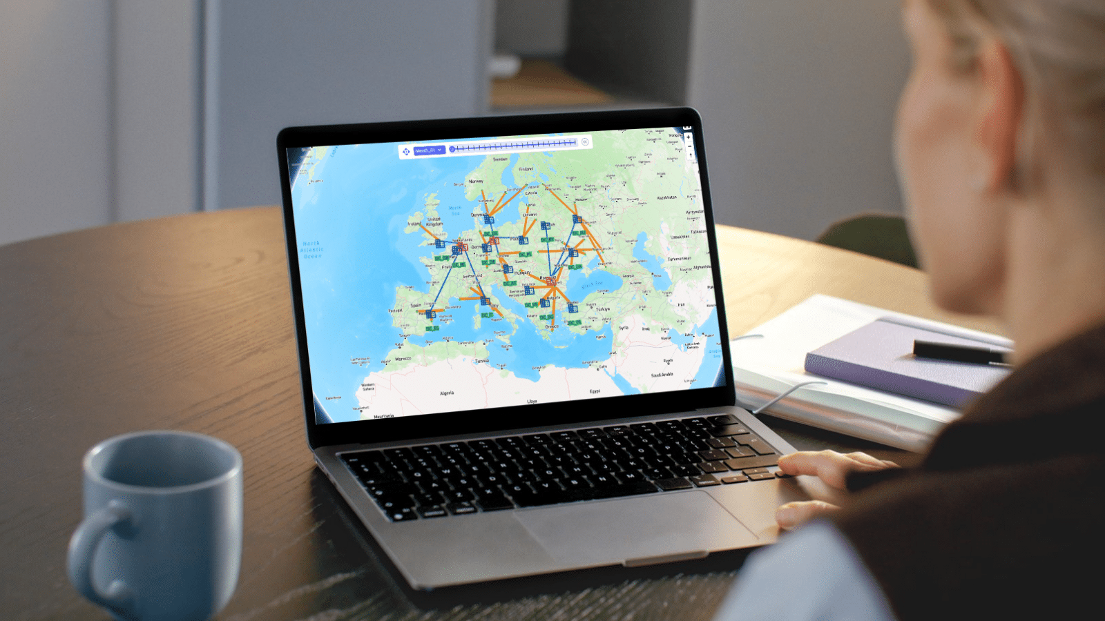
Skip links

Editing Dashboards and Visualizations

You can customize existing dashboards to fit your needs.

edit_dashboard_screenshot.png

Inside of a dashboard, add a new visualization:

add_new_visualization_screenshot.png

or edit an existing visualization:

edit_visualization_screenshot.png

Visualization elements

The most common elements of visualizations are values and labels.​

Values represent the data you want to be presented in the visualization. Typically, values are aggregated representations of your data (e.g. sum, average, etc.).​​

Labels refer to the labels on the visualization axes and consequently the groups by which you want to aggregate your values.

To build a visualization, we drag fields (i.e. database columns) into these elements.​

analytics_fields_screenshot.png

Other elements include categories which allow for additional grouping and filters which allow users to adjust inclusion and exclusion criteria while viewing the dashboard.

Creating a new dashboard

You can use the Analytics dropdown button to create a new dashboard.

 13499496694043 2

You can use the “+” button to add your first visualization to the dashboard.

 13499498185499 2

Have More Questions?

Contact Support Contact Sales Visit Frogger Pond Community