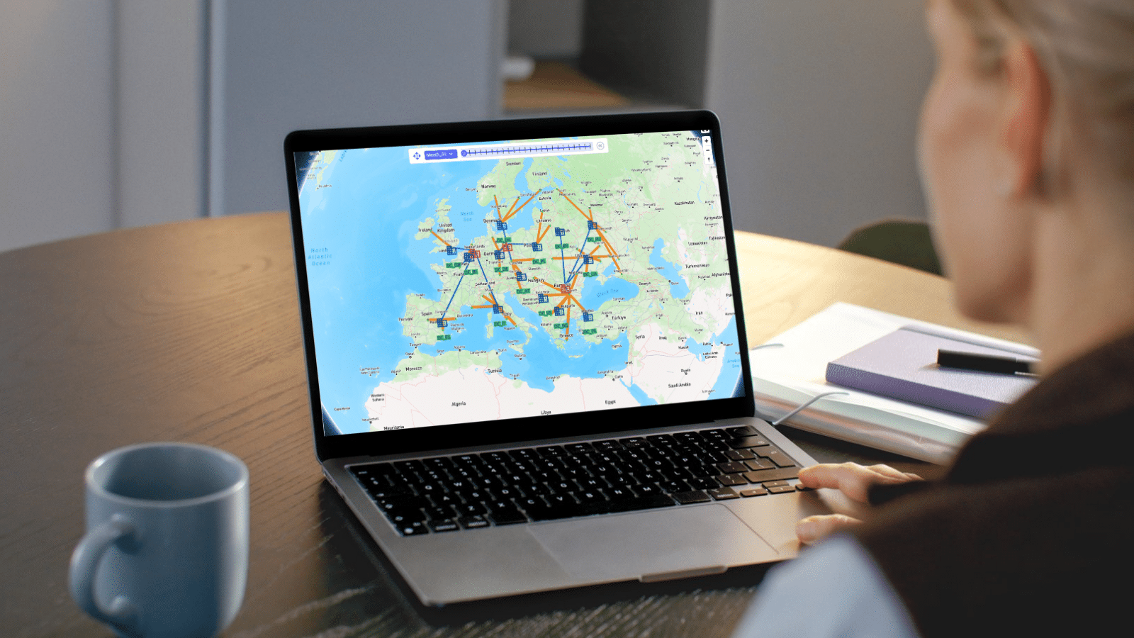

Once you have run a model, you can visualize your results using the Analytics module. A dashboard in the Analytics module is a collection of visualizations. Visualizations can take on many forms, such as charts, tables or maps.
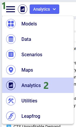
To access the Analytics module:
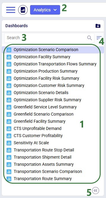
Once in the Analytics module, the left-hand side panel looks as follows:
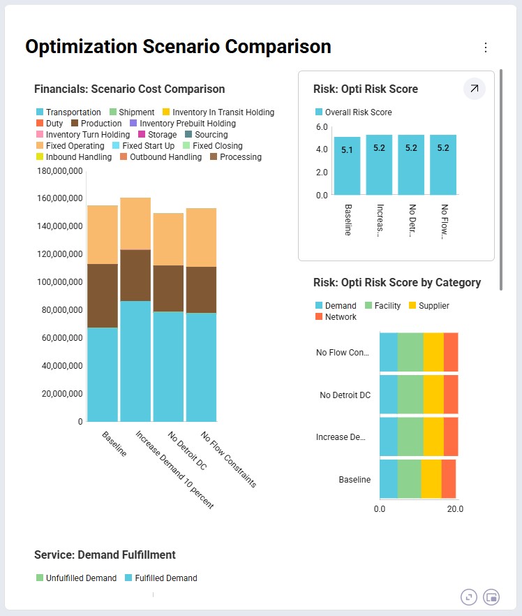
When opening a dashboard it is shown in the central part of Cosmic Frog. This is the default Optimization Scenario Comparison dashboard shown for the Global Supply Chain Strategy model, which highlights some common analytics and metrics:
Many dashboards are designed to be interacted with through a set of filters, like for example the Optimization Transportation Flows one (also shown for the Global Supply Chain Strategy model):
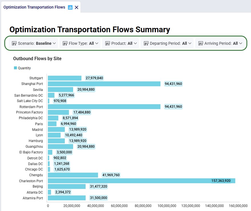
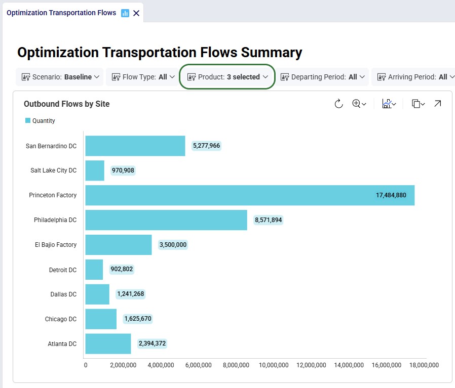
In the screenshot directly above, the dashboard is shown for all products in the model, which includes raw materials and finished goods. Filtering for just the finished goods changes the shown chart on this dashboard as follows:
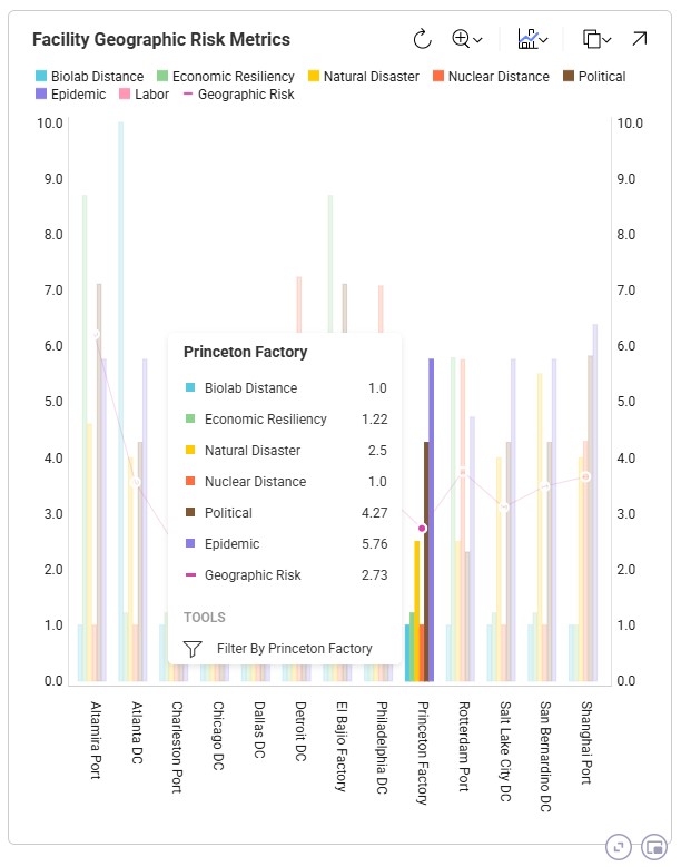
We can hover over visualization elements to get more information, which will be shown in a tooltip. Here, we show the information for one of the facilities, Princeton Factory, in a chart named Facility Geographic Risk Metrics, which is part of the Optimization Facility Risk Summary dashboard. This is again in the Global Supply Chain Strategy model:
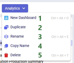
The Analytics drop-down menu at the top of the module contains the following options:
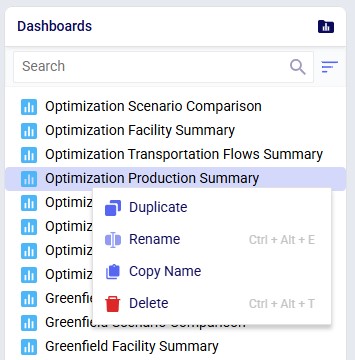
The context menu that comes up when right-clicking on a dashboard in the list has all the same options, except for the New Dashboard one:
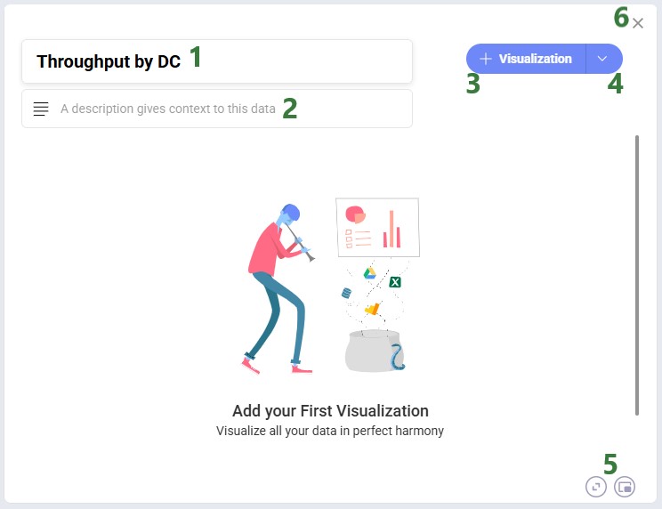
After you click on New Dashboard in the Analytics menu, the central part of Cosmic Frog will look as follows:
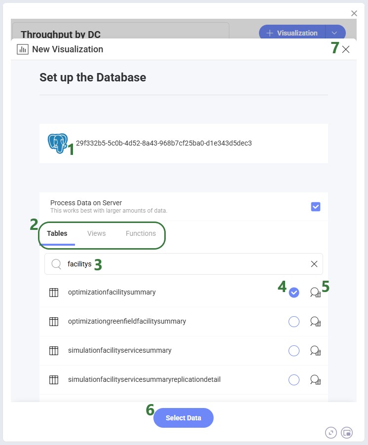
After clicking on the + Visualization button, first we need to choose the source data we will use for the visualization:
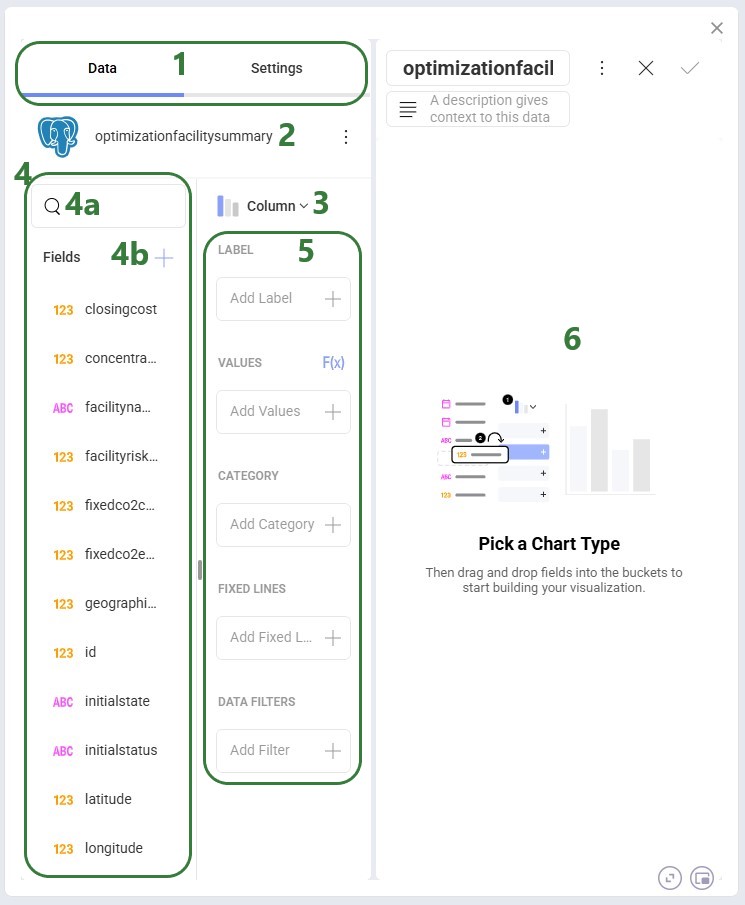
The form now looks similar to the following screenshot, where on the left-hand side the visualization can be configured and on the right-hand side the chart will be shown as it is being built:
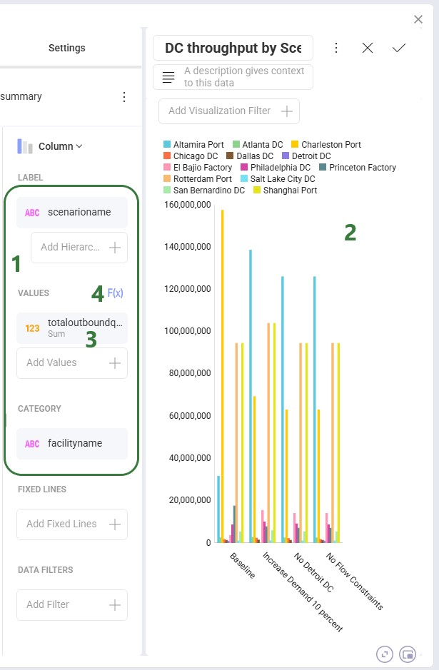
After dragging the fields we want on top of the Label, Values, and Category areas, our visualization configuration area looks as follows:
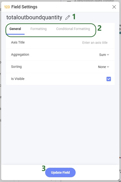
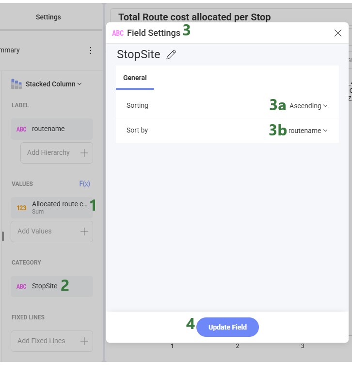
Clicking on a field in any of the configuration areas (bullet 3 above) brings up the Field Settings form:
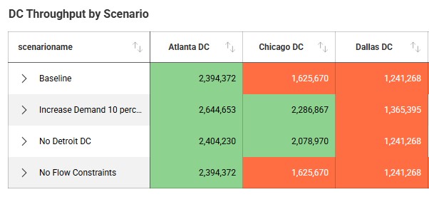
The following screenshot shows an example of using conditional formatting in a grid visualization, where the background color for values less than 2M is orange and over 2M green:
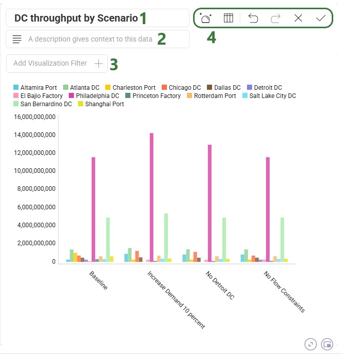
While the chart is being configured, its current state is shown on the right-hand side where several additional settings and options are available to the user:
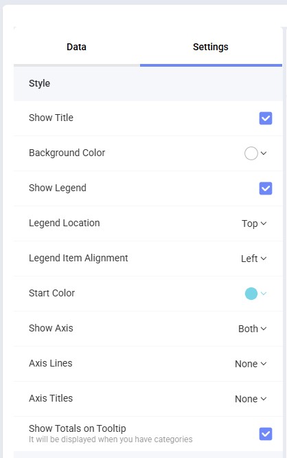
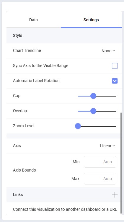
The chart configuration options available to the user under the Settings tab are shown in the next 2 screenshots; these specify what is shown on the chart and the formatting of the different chart items:
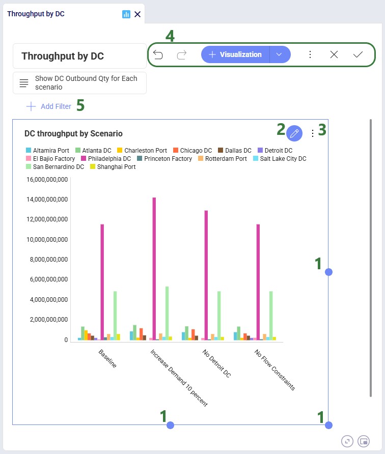
Once you are happy with the visualization, click on the Save checkmark icon to save it and close the editor for this visualization. This will bring you back to the dashboard:
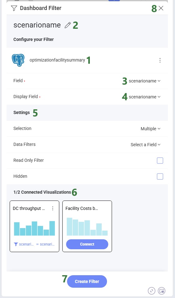
When you choose a Dashboard Filter, you are first prompted to choose your data source (a table, view or function) in the same way as selecting the source data for a visualization. After selecting your source, the Dashboard Filter form is shown:
Creating a Date Filter works as follows:
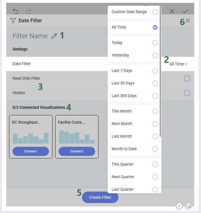
Note that after a Date Filter has been added to the dashboard, users can still switch between different timeframes when using the filter; this is not fixed at the time of Date Filter configuration.
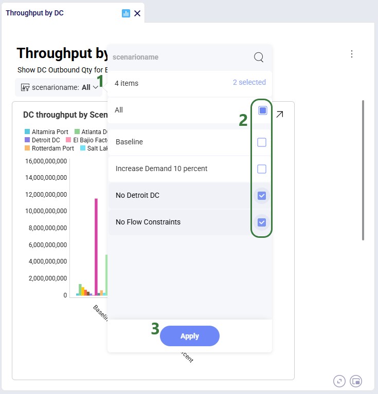
After a filter has been created, it is accessible in the top part of the dashboard, underneath the dashboard's description. Here we have added a filter for scenario name:
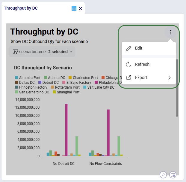
We can customize existing dashboards to fit our needs. Click on the icon with 3 vertical dots to bring up the options to Edit, Refresh, and Export (Image, PowerPoint, PDF, or Excel) the current dashboard. If previously a visualization was copied to the Clipboard, a Paste option will be available here too:
Please see the sections above on adding and configuring visualizations and dashboards which apply here in the same way.
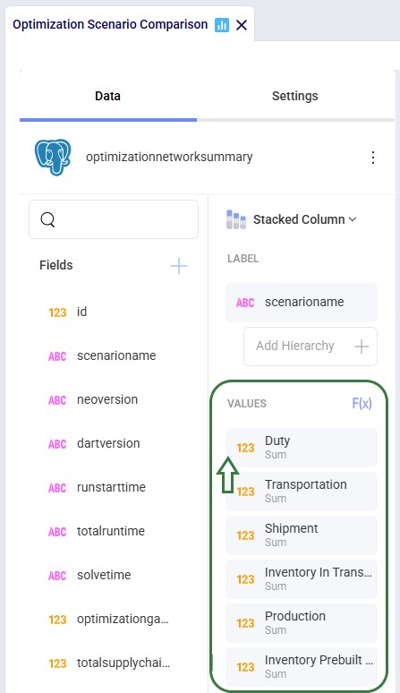
If bars are not showing in a chart this is likely due to the first column having no value or its value being 0. To resolve:
As always, please reach out to our Support team at support@optilogic.com in case of any questions or feedback.

Once you have run a model, you can visualize your results using the Analytics module. A dashboard in the Analytics module is a collection of visualizations. Visualizations can take on many forms, such as charts, tables or maps.
To access the Analytics module:
Once in the Analytics module, the left-hand side panel looks as follows:
When opening a dashboard it is shown in the central part of Cosmic Frog. This is the default Optimization Scenario Comparison dashboard shown for the Global Supply Chain Strategy model, which highlights some common analytics and metrics:
Many dashboards are designed to be interacted with through a set of filters, like for example the Optimization Transportation Flows one (also shown for the Global Supply Chain Strategy model):
In the screenshot directly above, the dashboard is shown for all products in the model, which includes raw materials and finished goods. Filtering for just the finished goods changes the shown chart on this dashboard as follows:
We can hover over visualization elements to get more information, which will be shown in a tooltip. Here, we show the information for one of the facilities, Princeton Factory, in a chart named Facility Geographic Risk Metrics, which is part of the Optimization Facility Risk Summary dashboard. This is again in the Global Supply Chain Strategy model:
The Analytics drop-down menu at the top of the module contains the following options:
The context menu that comes up when right-clicking on a dashboard in the list has all the same options, except for the New Dashboard one:
After you click on New Dashboard in the Analytics menu, the central part of Cosmic Frog will look as follows:
After clicking on the + Visualization button, first we need to choose the source data we will use for the visualization:
The form now looks similar to the following screenshot, where on the left-hand side the visualization can be configured and on the right-hand side the chart will be shown as it is being built:
After dragging the fields we want on top of the Label, Values, and Category areas, our visualization configuration area looks as follows:
Clicking on a field in any of the configuration areas (bullet 3 above) brings up the Field Settings form:
The following screenshot shows an example of using conditional formatting in a grid visualization, where the background color for values less than 2M is orange and over 2M green:
While the chart is being configured, its current state is shown on the right-hand side where several additional settings and options are available to the user:
The chart configuration options available to the user under the Settings tab are shown in the next 2 screenshots; these specify what is shown on the chart and the formatting of the different chart items:
Once you are happy with the visualization, click on the Save checkmark icon to save it and close the editor for this visualization. This will bring you back to the dashboard:
When you choose a Dashboard Filter, you are first prompted to choose your data source (a table, view or function) in the same way as selecting the source data for a visualization. After selecting your source, the Dashboard Filter form is shown:
Creating a Date Filter works as follows:
Note that after a Date Filter has been added to the dashboard, users can still switch between different timeframes when using the filter; this is not fixed at the time of Date Filter configuration.
After a filter has been created, it is accessible in the top part of the dashboard, underneath the dashboard's description. Here we have added a filter for scenario name:
We can customize existing dashboards to fit our needs. Click on the icon with 3 vertical dots to bring up the options to Edit, Refresh, and Export (Image, PowerPoint, PDF, or Excel) the current dashboard. If previously a visualization was copied to the Clipboard, a Paste option will be available here too:
Please see the sections above on adding and configuring visualizations and dashboards which apply here in the same way.
If bars are not showing in a chart this is likely due to the first column having no value or its value being 0. To resolve:
As always, please reach out to our Support team at support@optilogic.com in case of any questions or feedback.