Output factors define what Dendro tries to optimize - they are your business objectives translated into measurable metrics. While input factors control what can change, output factors determine what "better" means.
Key concepts:
This guide explains how to configure output factors to align Dendro's optimization with your business goals. These can be specified in the Output Factors input table in Cosmic Frog models.
Recommended reading prior to diving into this guide: Getting Started with Dendro, a high-level overview of how Dendro works, and Dendro: Genetic Algorithm Guide which explains the inner workings of Dendro in more detail.
An output factor tells Dendro's genetic algorithm:
Imagine you are evaluating employee performance:
Dendro uses the same approach to evaluate inventory policy combinations across your supply chain.
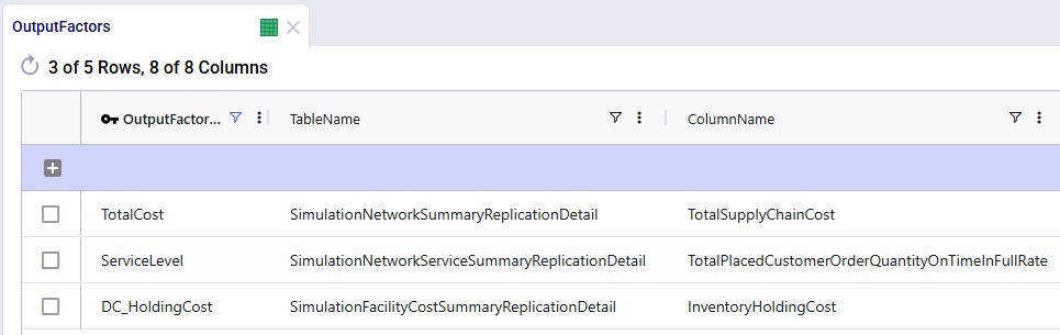
Output factors are configured in the Output Factors input table with the following columns:
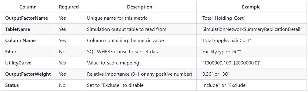
Minimize overall supply chain costs:
OutputFactorName: TotalCost TableName: SimulationNetworkSummaryReplicationDetail ColumnName: TotalSupplyChainCost Filter: (leave empty for all data)UtilityCurve: [1500000,100],[2000000,0]OutputFactorWeight: 0.40 Status: Include Interpretation:
Maximize service level performance:
OutputFactorName: ServiceLevel TableName: SimulationNetworkServiceSummaryReplicationDetailColumnName: TotalPlacedCustomerOrderQuantityOnTimeInFullRate Filter: (leave empty) UtilityCurve: [0,0],[85,10],[95,99],[100,100]OutputFactorWeight: 0.35 Status: Include Interpretation:
Focus on inventory costs at distribution centers only:
OutputFactorName: DC_HoldingCost TableName: SimulationFacilityCostSummaryReplicationDetail ColumnName: InventoryHoldingCost Filter: FacilityType='DC' UtilityCurve: [50000,100],[150000,0]OutputFactorWeight: 0.25 Status: Include Interpretation:
The following 2 screenshots show the Output Factors input table in Cosmic Frog; it contains 3 rows which represent the 3 examples above:
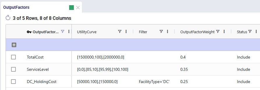
A utility curve translates raw metric values (like dollars or percentages) into standardized quality scores (0-100 points). It answers the question: "How good is this value?".
Format:[value1,score1],[value2,score2],[value3,score3],...
Each [value,score] pair defines a point on the curve:
Dendro connects these points with straight lines to create a piecewise linear curve.
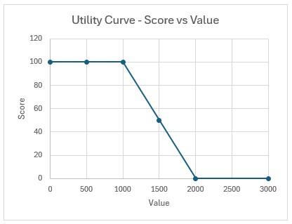
[1000,100],[2000,0]
Meaning:
Visualization:
Best for:
[50,0],[100,50],[150,100]
Meaning:
Visualization:
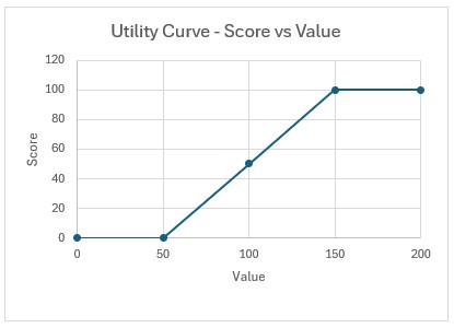
Best for:
[0,0],[85,10],[95,99],[100,100]
Meaning:
Characteristics:
Visualization:
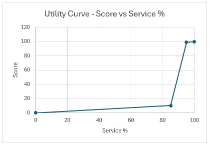
Best for:
The challenge: Early in optimization, Dendro does not know what the best and worst possible values are.
The solution: Utility curves automatically expand when new extremes are discovered.
Example scenario:
Generation 1:
[1800000,100],[2200000,0]Generation 5:
[1600000,100],[2200000,0]Why it matters:
When rescaling occurs:
Weights determine how much each output factor contributes to the overall fitness score.
Common approaches:
Total Cost: Weight = 0.40 (40%) Service Level: Weight = 0.35 (35%) Inventory Value: Weight = 0.25 (25%) Total = 1.00 (100%) Advantage: Easy to understand - directly represents percentage contribution.
Total Cost: Weight = 40 Service Level: Weight = 35 Inventory Value: Weight = 25 Total = 100 (but could be any sum) Advantage: Can use any convenient scale; Dendro handles normalization.
Critical Factor: Weight = 10 Important Factor: Weight = 5 Secondary Factor: Weight = 2 Minor Factor: Weight = 1 Advantage: Emphasizes relative priorities clearly.
Example calculation:
Output Factors:
Holding Cost: Raw value = $80,000 → Utility score = 60 → Weight = 0.40 Service Level: Raw value = 94% → Utility score = 85 → Weight = 0.35 Transport Cost: Raw value = $45,000 → Utility score = 70 → Weight = 0.25 Weighted Contributions:
Holding Cost: 60 × 0.40 = 24.0 pointsService Level: 85 × 0.35 = 29.75 points Transport Cost: 70 × 0.25 = 17.5 points Overall Fitness Score: 24.0 + 29.75 + 17.5 = 71.25 points
Higher fitness scores are better in Dendro
The fitness calculation adds these weighted scores, so the formula is:
Fitness = 24.0 + 29.75 + 17.5 = 71.25
Balanced approach:
Cost factors (total): 50% Service factors (total): 50% Equal priority to cost reduction and service achievement.
Cost-focused approach:
Cost factors (total): 70% Service factors (total): 30% Emphasizes cost minimization; willing to accept moderate service levels.
Service-focused approach:
Cost factors (total): 30% Service factors (total): 70% Prioritizes customer service; cost is secondary.
Multi-objective balanced:
Holding cost: 25% Transport cost: 25% Service level: 25% Inventory turns: 25% Equal consideration to multiple objectives.
For each output factor, Dendro reads the metric value from the simulation results:
Factor 1 (Total Cost): Reads TotalSupplyChainCost → $1,750,000 Factor 2 (Service Level): Reads OnTimeInFullRate → 92% Factor 3 (Holding Cost): Reads InventoryHoldingCost → $320,000 Each value is mapped to a raw score using its utility curve:
Factor 1: $1,750,000 → Utility curve [1500000,100],[2000000,0]Interpolation: (1,750,000 - 1,500,000) / (2,000,000 - 1,500,000) = 0.5 Raw score: 100 - (0.5 × 100) = 50 Factor 2: 92% → Utility curve [0,0],[85,10],[95,99],[100,100]Falls between 85 and 95: Interpolate Raw score: 10 + ((92-85)/(95-85)) × (99-10) = 10 + 62.3 = 72.3Factor 3: $320,000 → Utility curve [200000,100],[400000,0]Interpolation: (320,000 - 200,000) / (400,000 - 200,000) = 0.6Raw score: 100 - (0.6 × 100) = 40 Utility scores are scaled to a 0-100 range based on the min/max scores in the curve:
If all curves use 0-100 range → No additional scaling neededScores are already normalized: 50, 72.3, 40 Multiply each normalized score by its weight:
Factor 1: 50 × 0.40 = 20.0 Factor 2: 72.3 × 0.35 = 25.3 Factor 3: 40 × 0.25 = 10.0 Combine all weighted scores:
Overall score = 20.0 + 25.3 + 10.0 = 55.3
Chromosome A:
Total Cost: $1,600,000 → Score 80 → Weighted 32.0 Service: 96% → Score 100 → Weighted 35.0 Holding: $280,000 → Score 60 → Weighted 15.0 Total: 82.0 Chromosome B:
Total Cost: $1,750,000 → Score 50 → Weighted 20.0 Service: 92% → Score 72 → Weighted 25.2 Holding: $320,000 → Score 40 → Weighted 10.0 Total: 55.2 Result: Chromosome A (fitness score of 82.0) is better than Chromosome B (fitness score of 55.2).
Chromosome A achieves better performance across all metrics, resulting in a higher fitness score.
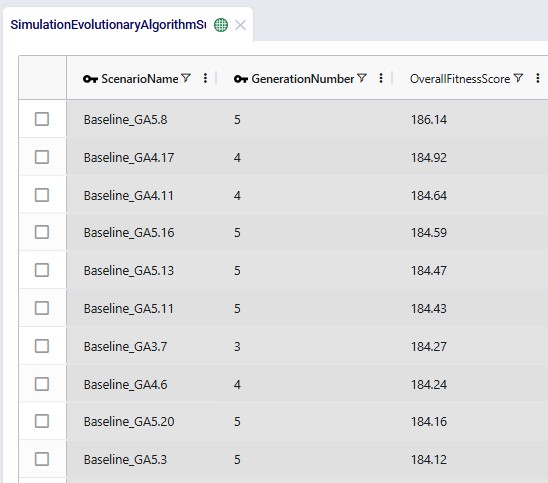
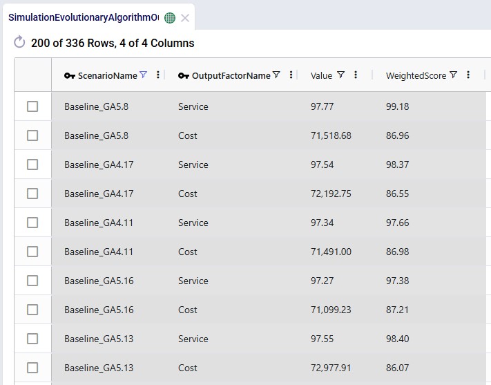
In Cosmic Frog, the Overall Fitness Scores of all scenarios (=chromosomes) run can be assessed in the Simulation Evolutionary Algorithm Summary output table after a Dendro run has completed. Scores of individual output factors can be reviewed in the Simulation Evolutionary Algorithm Output Factor Report output table:
The Automatically Generate Output Factors option automatically creates standard output factor configurations based on your target service levels and baseline simulation results. This option can be set in the Dendro section of the Technology Parameters.
When to use:
What it creates:
Step 1: Run baseline simulation Execute your current inventory policies to measure actual cost.
Step 2: Establish boundaries
Baseline Cost: $1,800,000 Left Boundary (best): 75% of baseline = $1,350,000 Right Boundary (worst): 110% of baseline = $1,980,000 Step 3: Create utility curve
UtilityCurve: [1350000,100],[1980000,0]
Interpretation:
Step 4: Set weight
OutputFactorWeight: 1 (50% when combined with service factor)
Step 1: Use configured service targets
DefaultTargetService: 95% LowService: 85% Step 2: Create multi-point utility curve
UtilityCurve: [0,0],[85,10],[95,99],[100,100]
Interpretation:
Design rationale:
Step 3: Set weight
OutputFactorWeight: 1 (50% when combined with cost factor)
OutputFactors Table:
Row 1: OutputFactorName: Cost TableName: SimulationNetworkSummaryReplicationDetailColumnName: TotalSupplyChainCost Filter: NULL UtilityCurve: [1350000,100],[1980000,0]OutputFactorWeight: 1 Status: Include Row 2: OutputFactorName: Service TableName: SimulationNetworkServiceSummaryReplicationDetailColumnName: TotalPlacedCustomerOrderQuantityOnTimeInFullRateFilter: NULL UtilityCurve: [0,0],[85,10],[95,99],[100,100]OutputFactorWeight: 1 Status: Include Optimization behavior: Dendro will seek policies that:
Goal: Find the lowest-cost inventory policies without service constraints.
Setup:
OutputFactorName: TotalCost TableName: SimulationNetworkSummaryReplicationDetailColumnName: TotalSupplyChainCost UtilityCurve: [1000000,100],[3000000,0]OutputFactorWeight: 1.0 Result: Dendro minimizes cost aggressively; service may suffer.
When to use:
Goal: Maximize service while preventing excessive cost increases.
Setup:
Factor 1 - Service (Primary): OutputFactorName: Service TableName: SimulationNetworkSummaryReplicationDetailColumnName: OnTimeInFullRate UtilityCurve: [90,0],[95,50],[98,99],[100,100]OutputFactorWeight: 0.70 Factor 2 - Cost (Constraint):OutputFactorName: CostLimit TableName: SimulationNetworkSummaryReplicationDetailColumnName: TotalSupplyChainCost UtilityCurve: [1500000,100],[2000000,50],[2500000,0]OutputFactorWeight: 0.30 Result: Dendro prioritizes service but penalizes solutions exceeding cost thresholds.
When to use:
Goal: Optimize multiple objectives with balanced priorities.
Setup:
Factor 1 - Holding Cost: OutputFactorName: HoldingCost TableName: SimulationNetworkSummaryReplicationDetailColumnName: InventoryHoldingCost UtilityCurve: [200000,100],[500000,0]OutputFactorWeight: 0.25 Factor 2 - Transport Cost: OutputFactorName: TransportCostTableName: SimulationNetworkSummaryReplicationDetailColumnName: TransportationCost UtilityCurve: [300000,100],[600000,0]OutputFactorWeight: 0.25 Factor 3 - Service Level: OutputFactorName: Service TableName: SimulationNetworkSummaryReplicationDetailColumnName: FillRate UtilityCurve: [85,0],[95,99],[100,100]OutputFactorWeight: 0.30 Factor 4 - Inventory Turns: OutputFactorName: InventoryTurnsTableName: SimulationNetworkSummaryReplicationDetailColumnName: InventoryTurns UtilityCurve: [2,0],[6,50],[12,100]OutputFactorWeight: 0.20 Result: Dendro finds well-rounded solutions balancing cost, service, and efficiency.
When to use:
Goal: Different service targets for different regions.
Setup:
Factor 1 - Premium Region Service: OutputFactorName: Premium_Service TableName: SimulationNetworkSummaryReplicationDetailColumnName: FillRate Filter: Region='Premium' UtilityCurve: [92,0],[98,99],[100,100]OutputFactorWeight: 0.40 Factor 2 - Standard Region Service: OutputFactorName: Standard_Service TableName: SimulationNetworkSummaryReplicationDetailColumnName: FillRate Filter: Region='Standard' UtilityCurve: [85,0],[92,99],[100,100]OutputFactorWeight: 0.30 Factor 3 - Overall Cost: OutputFactorName: TotalCost TableName: SimulationNetworkSummaryReplicationDetailColumnName: TotalSupplyChainCost UtilityCurve: [2000000,100],[3000000,0]OutputFactorWeight: 0.30 Result: Premium regions get higher service targets; standard regions have lower thresholds.
When to use:
Some output tables contain multiple rows per scenario (e.g., one row per facility or product). Dendro combines these into a single metric value by using a straight average calculation. More options will be added in future releases.
How it works: Calculates the arithmetic mean of all matching rows.
SQL equivalent:
SELECT AVG(ColumnName)
FROM TableName
WHERE ScenarioName = 'Gen3_Chr5' AND [Filter]
Example:
Facility A holding cost: $80,000 Facility B holding cost: $120,000 Facility C holding cost: $100,000 SimpleAverage: ($80,000 + $120,000 + $100,000) / 3 = $100,000 Best for:
Do not use:
[0,0],[10,5],[20,15],[30,28],[40,45],[50,65],[60,82],[70,95],[80,98],[90,99],[100,100]
Over-complicated curves are hard to understand and maintain.
Do use:
[0,0],[85,10],[95,99],[100,100]
Simple curves with clear inflection points at meaningful thresholds.
Principle: Use the minimum number of points to capture your business logic.
Cost factors (minimize):
[best_cost, 100], [worst_acceptable_cost, 0]
Lower values → higher scores.
Service factors (maximize):
[minimum_acceptable, 0], [target, 99], [perfect, 100]
Higher values → higher scores.
Efficiency metrics (target range):
[too_low, 0], [optimal, 100], [too_high, 0]
Sweet spot in the middle.
Too narrow:
[1900000,100],[2000000,0]
Only a 5% range - most solutions will score 0 or 100, providing little differentiation.
Too wide:
[500000,100],[5000000,0]
Unrealistic extremes - actual values may all cluster in a small region, reducing curve sensitivity.
Just right:
[1500000,100],[2500000,0]
Reasonable range around baseline (±25%) allows meaningful differentiation.
Avoid extreme imbalances:
Cost: Weight = 0.95 Service: Weight = 0.05 Service becomes nearly irrelevant - Dendro will slash costs with little regard for service.
Prefer balanced or clearly justified ratios:
Cost: Weight = 0.60 Service: Weight = 0.40 Both factors matter; cost slightly more important.
Or equal weighting for exploration:
Cost: Weight = 0.50 Service: Weight = 0.50 Neutral stance - let Dendro find the natural trade-off.
Workflow:
Benefits:
Before running full optimization:
SELECT * FROM SimulationFacilityCostSummaryReplicationDetail
WHERE ScenarioName = 'Baseline' AND FacilityType = 'DC'[100,0],[200,100] ✓ Valid [100,0] [200,100] ✗ Invalid (missing comma between pairs)Simulate scoring: Manually calculate expected fitness for baseline After the Dendro runs have all completed, review the Overall Fitness Score values in the Simulation Evolutionary Algorithm Summary output table and the scores of the individiual otuput factors Simulation Evolutionary Algorithm Output Factor Report output tables.
Healthy optimization shows:
Warning signs:
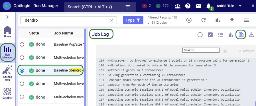
The symptoms of the problems desribed in this section can generally be seen either in the Cosmic Frog output tables, typically the Simulation Evolutionary Algorithm Summary and/or the Simulation Evolutionary Algorithm Output Factor Report output tables, or in the logs of the base scenario that Dendro was run on. These logs can be reviewed using the Run Manager application. The following screenshot shows part of a Job Log of a Dendro run, which is the most detailed log available:
Besides the Job Log, the Job Records log (second icon in the row of icons at the top rightof the logs) can also be helpful; it contains status messages of a run at a more aggregated level. If a run ends in an error, the Job Error Log may provide useful troubleshooting information. This log is accessed by clicking on the last icon in the row of icons at the top right of the logs.
Symptom: Fitness scores are nearly identical across different policy combinations.
Possible causes:
Cause 1: Utility curves too flat
UtilityCurve: [0,100],[10000000,0]
Range is so wide that actual values ($1.5M-$2.5M) all map to ~80-90 points.
Solution: Narrow the utility curve to the realistic range of values.
Cause 2: Weights too imbalanced
Dominant factor: Weight = 0.99 Other factors: Weight = 0.01 (total) One factor overwhelms all others, hiding differentiation.
Solution: Balance weights more evenly (unless extreme prioritization is truly intended).
Cause 3: Input factors do not affect output metrics - optimizing parameters that do not impact measured outcomes.
Solution: Verify that input factor changes influence output metrics via simulation.
Symptom: Cost decreases but service stays low or drops.
Possible causes:
Cause 1: Service weight too low
Cost: Weight = 0.90 Service: Weight = 0.10 Dendro focuses almost entirely on cost reduction.
Solution: Increase service weight to at least 0.30-0.50.
Cause 2: Service utility curve rewards poor performance
UtilityCurve: [80,50],[100,100]
80% service still gets 50 points - not enough penalty.
Solution: Use a steeper curve with lower minimum:
UtilityCurve: [80,0],[95,99],[100,100]
Cause 3: Conflicting objectives Impossible to improve service without exceeding cost limits defined in utility curves.
Solution: Relax cost constraints or adjust service targets to achievable levels.
Symptom: Frequent rescaling events throughout optimization.
Possible cause: Utility curve bounds are too narrow; Dendro keeps finding values outside the range.
Solution:
Symptom: Error loading output factors or calculating fitness.
Possible causes:
Cause 1: Wrong table name
TableName: NetworkSummary
Actual table is SimulationNetworkSummaryReplicationDetail.
Solution: Use exact table name from database schema.
Cause 2: Wrong column name
ColumnName: TotalCost
Actual column is TotalSupplyChainCost.
Solution: Verify column names match simulation output schema exactly.
Cause 3: Filter returns no rows
Filter: Region='West Coast'
No rows in output table have Region='West Coast'.
Solution: Test filter with SQL query against actual simulation output.
Symptom: "UtilityCurve is None" or parsing failures.
Common syntax errors:
❌ Missing commas between pairs:
[100,0][200,100]
✓ Correct:
[100,0],[200,100]
❌ Spaces inside brackets:
[ 100 , 0 ],[ 200 , 100 ]
✓ Correct (spaces are removed automatically but avoid for clarity):
[100,0],[200,100]
❌ Invalid numbers:
[1,000,0],[2,000,100]
Commas in numbers are invalid.
✓ Correct:
[1000,0],[2000,100]
❌ Single point:
[100,0]
Need at least two points for a curve.
✓ Correct:
[100,0],[200,100]
Optimize performance across different time periods:
Factor 1 - Peak Season Service: Filter: Month IN (11,12) Weight: 0.40 Factor 2 - Off-Season Service: Filter: Month NOT IN (11,12) Weight: 0.20 Factor 3 - Annual Cost: Filter: (empty - all months) Weight: 0.40 Result: Higher service standards during peak season, relaxed otherwise.
Different objectives for different product categories:
Factor 1 - A-Item Service (High priority): Filter: ProductCategory='A' UtilityCurve: [95,0],[98,99],[100,100] Weight: 0.35 Factor 2 - B-Item Service (Medium priority): Filter: ProductCategory='B' UtilityCurve: [90,0],[95,99],[100,100] Weight: 0.25 Factor 3 - C-Item Service (Low priority): Filter: ProductCategory='C' UtilityCurve: [85,0],[90,99],[100,100] Weight: 0.15 Factor 4 - Total Cost (All categories): Filter: (empty) Weight: 0.25 Result: ABC-based service differentiation with balanced cost control.
Output factors define success in Dendro optimization:
✓ What to measure: Metrics from simulation output tables
✓ How good is good: Utility curves mapping values to quality scores
✓ How important: Weights defining relative priorities
Key takeaways:
Well-configured output factors ensure Dendro optimizes for what truly matters to your business - whether that is cost minimization, service maximization, or balanced multi-objective optimization.
You may find these links helpful, some of which have already been mentioned above:
Please do not hesitate to contact the Optilogic Support team on support@optilogic.com for any questions or feedback.

Output factors define what Dendro tries to optimize - they are your business objectives translated into measurable metrics. While input factors control what can change, output factors determine what "better" means.
Key concepts:
This guide explains how to configure output factors to align Dendro's optimization with your business goals. These can be specified in the Output Factors input table in Cosmic Frog models.
Recommended reading prior to diving into this guide: Getting Started with Dendro, a high-level overview of how Dendro works, and Dendro: Genetic Algorithm Guide which explains the inner workings of Dendro in more detail.
An output factor tells Dendro's genetic algorithm:
Imagine you are evaluating employee performance:
Dendro uses the same approach to evaluate inventory policy combinations across your supply chain.
Output factors are configured in the Output Factors input table with the following columns:
Minimize overall supply chain costs:
OutputFactorName: TotalCost TableName: SimulationNetworkSummaryReplicationDetail ColumnName: TotalSupplyChainCost Filter: (leave empty for all data)UtilityCurve: [1500000,100],[2000000,0]OutputFactorWeight: 0.40 Status: Include Interpretation:
Maximize service level performance:
OutputFactorName: ServiceLevel TableName: SimulationNetworkServiceSummaryReplicationDetailColumnName: TotalPlacedCustomerOrderQuantityOnTimeInFullRate Filter: (leave empty) UtilityCurve: [0,0],[85,10],[95,99],[100,100]OutputFactorWeight: 0.35 Status: Include Interpretation:
Focus on inventory costs at distribution centers only:
OutputFactorName: DC_HoldingCost TableName: SimulationFacilityCostSummaryReplicationDetail ColumnName: InventoryHoldingCost Filter: FacilityType='DC' UtilityCurve: [50000,100],[150000,0]OutputFactorWeight: 0.25 Status: Include Interpretation:
The following 2 screenshots show the Output Factors input table in Cosmic Frog; it contains 3 rows which represent the 3 examples above:
A utility curve translates raw metric values (like dollars or percentages) into standardized quality scores (0-100 points). It answers the question: "How good is this value?".
Format:[value1,score1],[value2,score2],[value3,score3],...
Each [value,score] pair defines a point on the curve:
Dendro connects these points with straight lines to create a piecewise linear curve.
[1000,100],[2000,0]
Meaning:
Visualization:
Best for:
[50,0],[100,50],[150,100]
Meaning:
Visualization:
Best for:
[0,0],[85,10],[95,99],[100,100]
Meaning:
Characteristics:
Visualization:
Best for:
The challenge: Early in optimization, Dendro does not know what the best and worst possible values are.
The solution: Utility curves automatically expand when new extremes are discovered.
Example scenario:
Generation 1:
[1800000,100],[2200000,0]Generation 5:
[1600000,100],[2200000,0]Why it matters:
When rescaling occurs:
Weights determine how much each output factor contributes to the overall fitness score.
Common approaches:
Total Cost: Weight = 0.40 (40%) Service Level: Weight = 0.35 (35%) Inventory Value: Weight = 0.25 (25%) Total = 1.00 (100%) Advantage: Easy to understand - directly represents percentage contribution.
Total Cost: Weight = 40 Service Level: Weight = 35 Inventory Value: Weight = 25 Total = 100 (but could be any sum) Advantage: Can use any convenient scale; Dendro handles normalization.
Critical Factor: Weight = 10 Important Factor: Weight = 5 Secondary Factor: Weight = 2 Minor Factor: Weight = 1 Advantage: Emphasizes relative priorities clearly.
Example calculation:
Output Factors:
Holding Cost: Raw value = $80,000 → Utility score = 60 → Weight = 0.40 Service Level: Raw value = 94% → Utility score = 85 → Weight = 0.35 Transport Cost: Raw value = $45,000 → Utility score = 70 → Weight = 0.25 Weighted Contributions:
Holding Cost: 60 × 0.40 = 24.0 pointsService Level: 85 × 0.35 = 29.75 points Transport Cost: 70 × 0.25 = 17.5 points Overall Fitness Score: 24.0 + 29.75 + 17.5 = 71.25 points
Higher fitness scores are better in Dendro
The fitness calculation adds these weighted scores, so the formula is:
Fitness = 24.0 + 29.75 + 17.5 = 71.25
Balanced approach:
Cost factors (total): 50% Service factors (total): 50% Equal priority to cost reduction and service achievement.
Cost-focused approach:
Cost factors (total): 70% Service factors (total): 30% Emphasizes cost minimization; willing to accept moderate service levels.
Service-focused approach:
Cost factors (total): 30% Service factors (total): 70% Prioritizes customer service; cost is secondary.
Multi-objective balanced:
Holding cost: 25% Transport cost: 25% Service level: 25% Inventory turns: 25% Equal consideration to multiple objectives.
For each output factor, Dendro reads the metric value from the simulation results:
Factor 1 (Total Cost): Reads TotalSupplyChainCost → $1,750,000 Factor 2 (Service Level): Reads OnTimeInFullRate → 92% Factor 3 (Holding Cost): Reads InventoryHoldingCost → $320,000 Each value is mapped to a raw score using its utility curve:
Factor 1: $1,750,000 → Utility curve [1500000,100],[2000000,0]Interpolation: (1,750,000 - 1,500,000) / (2,000,000 - 1,500,000) = 0.5 Raw score: 100 - (0.5 × 100) = 50 Factor 2: 92% → Utility curve [0,0],[85,10],[95,99],[100,100]Falls between 85 and 95: Interpolate Raw score: 10 + ((92-85)/(95-85)) × (99-10) = 10 + 62.3 = 72.3Factor 3: $320,000 → Utility curve [200000,100],[400000,0]Interpolation: (320,000 - 200,000) / (400,000 - 200,000) = 0.6Raw score: 100 - (0.6 × 100) = 40 Utility scores are scaled to a 0-100 range based on the min/max scores in the curve:
If all curves use 0-100 range → No additional scaling neededScores are already normalized: 50, 72.3, 40 Multiply each normalized score by its weight:
Factor 1: 50 × 0.40 = 20.0 Factor 2: 72.3 × 0.35 = 25.3 Factor 3: 40 × 0.25 = 10.0 Combine all weighted scores:
Overall score = 20.0 + 25.3 + 10.0 = 55.3
Chromosome A:
Total Cost: $1,600,000 → Score 80 → Weighted 32.0 Service: 96% → Score 100 → Weighted 35.0 Holding: $280,000 → Score 60 → Weighted 15.0 Total: 82.0 Chromosome B:
Total Cost: $1,750,000 → Score 50 → Weighted 20.0 Service: 92% → Score 72 → Weighted 25.2 Holding: $320,000 → Score 40 → Weighted 10.0 Total: 55.2 Result: Chromosome A (fitness score of 82.0) is better than Chromosome B (fitness score of 55.2).
Chromosome A achieves better performance across all metrics, resulting in a higher fitness score.
In Cosmic Frog, the Overall Fitness Scores of all scenarios (=chromosomes) run can be assessed in the Simulation Evolutionary Algorithm Summary output table after a Dendro run has completed. Scores of individual output factors can be reviewed in the Simulation Evolutionary Algorithm Output Factor Report output table:
The Automatically Generate Output Factors option automatically creates standard output factor configurations based on your target service levels and baseline simulation results. This option can be set in the Dendro section of the Technology Parameters.
When to use:
What it creates:
Step 1: Run baseline simulation Execute your current inventory policies to measure actual cost.
Step 2: Establish boundaries
Baseline Cost: $1,800,000 Left Boundary (best): 75% of baseline = $1,350,000 Right Boundary (worst): 110% of baseline = $1,980,000 Step 3: Create utility curve
UtilityCurve: [1350000,100],[1980000,0]
Interpretation:
Step 4: Set weight
OutputFactorWeight: 1 (50% when combined with service factor)
Step 1: Use configured service targets
DefaultTargetService: 95% LowService: 85% Step 2: Create multi-point utility curve
UtilityCurve: [0,0],[85,10],[95,99],[100,100]
Interpretation:
Design rationale:
Step 3: Set weight
OutputFactorWeight: 1 (50% when combined with cost factor)
OutputFactors Table:
Row 1: OutputFactorName: Cost TableName: SimulationNetworkSummaryReplicationDetailColumnName: TotalSupplyChainCost Filter: NULL UtilityCurve: [1350000,100],[1980000,0]OutputFactorWeight: 1 Status: Include Row 2: OutputFactorName: Service TableName: SimulationNetworkServiceSummaryReplicationDetailColumnName: TotalPlacedCustomerOrderQuantityOnTimeInFullRateFilter: NULL UtilityCurve: [0,0],[85,10],[95,99],[100,100]OutputFactorWeight: 1 Status: Include Optimization behavior: Dendro will seek policies that:
Goal: Find the lowest-cost inventory policies without service constraints.
Setup:
OutputFactorName: TotalCost TableName: SimulationNetworkSummaryReplicationDetailColumnName: TotalSupplyChainCost UtilityCurve: [1000000,100],[3000000,0]OutputFactorWeight: 1.0 Result: Dendro minimizes cost aggressively; service may suffer.
When to use:
Goal: Maximize service while preventing excessive cost increases.
Setup:
Factor 1 - Service (Primary): OutputFactorName: Service TableName: SimulationNetworkSummaryReplicationDetailColumnName: OnTimeInFullRate UtilityCurve: [90,0],[95,50],[98,99],[100,100]OutputFactorWeight: 0.70 Factor 2 - Cost (Constraint):OutputFactorName: CostLimit TableName: SimulationNetworkSummaryReplicationDetailColumnName: TotalSupplyChainCost UtilityCurve: [1500000,100],[2000000,50],[2500000,0]OutputFactorWeight: 0.30 Result: Dendro prioritizes service but penalizes solutions exceeding cost thresholds.
When to use:
Goal: Optimize multiple objectives with balanced priorities.
Setup:
Factor 1 - Holding Cost: OutputFactorName: HoldingCost TableName: SimulationNetworkSummaryReplicationDetailColumnName: InventoryHoldingCost UtilityCurve: [200000,100],[500000,0]OutputFactorWeight: 0.25 Factor 2 - Transport Cost: OutputFactorName: TransportCostTableName: SimulationNetworkSummaryReplicationDetailColumnName: TransportationCost UtilityCurve: [300000,100],[600000,0]OutputFactorWeight: 0.25 Factor 3 - Service Level: OutputFactorName: Service TableName: SimulationNetworkSummaryReplicationDetailColumnName: FillRate UtilityCurve: [85,0],[95,99],[100,100]OutputFactorWeight: 0.30 Factor 4 - Inventory Turns: OutputFactorName: InventoryTurnsTableName: SimulationNetworkSummaryReplicationDetailColumnName: InventoryTurns UtilityCurve: [2,0],[6,50],[12,100]OutputFactorWeight: 0.20 Result: Dendro finds well-rounded solutions balancing cost, service, and efficiency.
When to use:
Goal: Different service targets for different regions.
Setup:
Factor 1 - Premium Region Service: OutputFactorName: Premium_Service TableName: SimulationNetworkSummaryReplicationDetailColumnName: FillRate Filter: Region='Premium' UtilityCurve: [92,0],[98,99],[100,100]OutputFactorWeight: 0.40 Factor 2 - Standard Region Service: OutputFactorName: Standard_Service TableName: SimulationNetworkSummaryReplicationDetailColumnName: FillRate Filter: Region='Standard' UtilityCurve: [85,0],[92,99],[100,100]OutputFactorWeight: 0.30 Factor 3 - Overall Cost: OutputFactorName: TotalCost TableName: SimulationNetworkSummaryReplicationDetailColumnName: TotalSupplyChainCost UtilityCurve: [2000000,100],[3000000,0]OutputFactorWeight: 0.30 Result: Premium regions get higher service targets; standard regions have lower thresholds.
When to use:
Some output tables contain multiple rows per scenario (e.g., one row per facility or product). Dendro combines these into a single metric value by using a straight average calculation. More options will be added in future releases.
How it works: Calculates the arithmetic mean of all matching rows.
SQL equivalent:
SELECT AVG(ColumnName)
FROM TableName
WHERE ScenarioName = 'Gen3_Chr5' AND [Filter]
Example:
Facility A holding cost: $80,000 Facility B holding cost: $120,000 Facility C holding cost: $100,000 SimpleAverage: ($80,000 + $120,000 + $100,000) / 3 = $100,000 Best for:
Do not use:
[0,0],[10,5],[20,15],[30,28],[40,45],[50,65],[60,82],[70,95],[80,98],[90,99],[100,100]
Over-complicated curves are hard to understand and maintain.
Do use:
[0,0],[85,10],[95,99],[100,100]
Simple curves with clear inflection points at meaningful thresholds.
Principle: Use the minimum number of points to capture your business logic.
Cost factors (minimize):
[best_cost, 100], [worst_acceptable_cost, 0]
Lower values → higher scores.
Service factors (maximize):
[minimum_acceptable, 0], [target, 99], [perfect, 100]
Higher values → higher scores.
Efficiency metrics (target range):
[too_low, 0], [optimal, 100], [too_high, 0]
Sweet spot in the middle.
Too narrow:
[1900000,100],[2000000,0]
Only a 5% range - most solutions will score 0 or 100, providing little differentiation.
Too wide:
[500000,100],[5000000,0]
Unrealistic extremes - actual values may all cluster in a small region, reducing curve sensitivity.
Just right:
[1500000,100],[2500000,0]
Reasonable range around baseline (±25%) allows meaningful differentiation.
Avoid extreme imbalances:
Cost: Weight = 0.95 Service: Weight = 0.05 Service becomes nearly irrelevant - Dendro will slash costs with little regard for service.
Prefer balanced or clearly justified ratios:
Cost: Weight = 0.60 Service: Weight = 0.40 Both factors matter; cost slightly more important.
Or equal weighting for exploration:
Cost: Weight = 0.50 Service: Weight = 0.50 Neutral stance - let Dendro find the natural trade-off.
Workflow:
Benefits:
Before running full optimization:
SELECT * FROM SimulationFacilityCostSummaryReplicationDetail
WHERE ScenarioName = 'Baseline' AND FacilityType = 'DC'[100,0],[200,100] ✓ Valid [100,0] [200,100] ✗ Invalid (missing comma between pairs)Simulate scoring: Manually calculate expected fitness for baseline After the Dendro runs have all completed, review the Overall Fitness Score values in the Simulation Evolutionary Algorithm Summary output table and the scores of the individiual otuput factors Simulation Evolutionary Algorithm Output Factor Report output tables.
Healthy optimization shows:
Warning signs:
The symptoms of the problems desribed in this section can generally be seen either in the Cosmic Frog output tables, typically the Simulation Evolutionary Algorithm Summary and/or the Simulation Evolutionary Algorithm Output Factor Report output tables, or in the logs of the base scenario that Dendro was run on. These logs can be reviewed using the Run Manager application. The following screenshot shows part of a Job Log of a Dendro run, which is the most detailed log available:
Besides the Job Log, the Job Records log (second icon in the row of icons at the top rightof the logs) can also be helpful; it contains status messages of a run at a more aggregated level. If a run ends in an error, the Job Error Log may provide useful troubleshooting information. This log is accessed by clicking on the last icon in the row of icons at the top right of the logs.
Symptom: Fitness scores are nearly identical across different policy combinations.
Possible causes:
Cause 1: Utility curves too flat
UtilityCurve: [0,100],[10000000,0]
Range is so wide that actual values ($1.5M-$2.5M) all map to ~80-90 points.
Solution: Narrow the utility curve to the realistic range of values.
Cause 2: Weights too imbalanced
Dominant factor: Weight = 0.99 Other factors: Weight = 0.01 (total) One factor overwhelms all others, hiding differentiation.
Solution: Balance weights more evenly (unless extreme prioritization is truly intended).
Cause 3: Input factors do not affect output metrics - optimizing parameters that do not impact measured outcomes.
Solution: Verify that input factor changes influence output metrics via simulation.
Symptom: Cost decreases but service stays low or drops.
Possible causes:
Cause 1: Service weight too low
Cost: Weight = 0.90 Service: Weight = 0.10 Dendro focuses almost entirely on cost reduction.
Solution: Increase service weight to at least 0.30-0.50.
Cause 2: Service utility curve rewards poor performance
UtilityCurve: [80,50],[100,100]
80% service still gets 50 points - not enough penalty.
Solution: Use a steeper curve with lower minimum:
UtilityCurve: [80,0],[95,99],[100,100]
Cause 3: Conflicting objectives Impossible to improve service without exceeding cost limits defined in utility curves.
Solution: Relax cost constraints or adjust service targets to achievable levels.
Symptom: Frequent rescaling events throughout optimization.
Possible cause: Utility curve bounds are too narrow; Dendro keeps finding values outside the range.
Solution:
Symptom: Error loading output factors or calculating fitness.
Possible causes:
Cause 1: Wrong table name
TableName: NetworkSummary
Actual table is SimulationNetworkSummaryReplicationDetail.
Solution: Use exact table name from database schema.
Cause 2: Wrong column name
ColumnName: TotalCost
Actual column is TotalSupplyChainCost.
Solution: Verify column names match simulation output schema exactly.
Cause 3: Filter returns no rows
Filter: Region='West Coast'
No rows in output table have Region='West Coast'.
Solution: Test filter with SQL query against actual simulation output.
Symptom: "UtilityCurve is None" or parsing failures.
Common syntax errors:
❌ Missing commas between pairs:
[100,0][200,100]
✓ Correct:
[100,0],[200,100]
❌ Spaces inside brackets:
[ 100 , 0 ],[ 200 , 100 ]
✓ Correct (spaces are removed automatically but avoid for clarity):
[100,0],[200,100]
❌ Invalid numbers:
[1,000,0],[2,000,100]
Commas in numbers are invalid.
✓ Correct:
[1000,0],[2000,100]
❌ Single point:
[100,0]
Need at least two points for a curve.
✓ Correct:
[100,0],[200,100]
Optimize performance across different time periods:
Factor 1 - Peak Season Service: Filter: Month IN (11,12) Weight: 0.40 Factor 2 - Off-Season Service: Filter: Month NOT IN (11,12) Weight: 0.20 Factor 3 - Annual Cost: Filter: (empty - all months) Weight: 0.40 Result: Higher service standards during peak season, relaxed otherwise.
Different objectives for different product categories:
Factor 1 - A-Item Service (High priority): Filter: ProductCategory='A' UtilityCurve: [95,0],[98,99],[100,100] Weight: 0.35 Factor 2 - B-Item Service (Medium priority): Filter: ProductCategory='B' UtilityCurve: [90,0],[95,99],[100,100] Weight: 0.25 Factor 3 - C-Item Service (Low priority): Filter: ProductCategory='C' UtilityCurve: [85,0],[90,99],[100,100] Weight: 0.15 Factor 4 - Total Cost (All categories): Filter: (empty) Weight: 0.25 Result: ABC-based service differentiation with balanced cost control.
Output factors define success in Dendro optimization:
✓ What to measure: Metrics from simulation output tables
✓ How good is good: Utility curves mapping values to quality scores
✓ How important: Weights defining relative priorities
Key takeaways:
Well-configured output factors ensure Dendro optimizes for what truly matters to your business - whether that is cost minimization, service maximization, or balanced multi-objective optimization.
You may find these links helpful, some of which have already been mentioned above:
Please do not hesitate to contact the Optilogic Support team on support@optilogic.com for any questions or feedback.