Incremental Change is a powerful new capability in Cosmic Frog’s NEO engine (Network Optimization) that helps you manage the transition between two network states – such as moving from your current baseline network to an optimized future state. Rather than implementing all changes at once, Incremental Change allows you to control the pace and sequence of changes over time, making network transformations more practical and manageable.
This feature bridges the gap between theoretical optimization results and realistic implementation plans by generating a sequenced roadmap of network changes.
In this documentation, we will discuss the impact of Incremental Change, explain how to use it, and then walk through 2 demo models showing examples of the new capabilities. These models can be copied to your own Optilogic account from the Resource Library:
Please also see the following brief video for an introduction to Incremental Change and an overview of the second demo model, Incremental Change - Supplier Base Transition:
Supply chain networks rarely change overnight. Whether you are opening new distribution centers, shifting supplier bases, or adapting to seasonal demand fluctuations, real-world constraints limit how quickly you can implement changes. Organizations face practical limitations including:
Incremental Change addresses these realities by helping you answer critical questions: What is the best order of changes? What is the optimal rate of change? What tolerance levels are appropriate for different types of modifications?
Understand which network modifications deliver the greatest value earliest in your transition. Incremental Change provides clear visibility into expected savings versus the number of changes required, along with detailed change checklists for each scenario.
Create realistic, step-by-step roadmaps for moving from your current network to your target network. You will receive:
Manage network evolution in response to changing business conditions while respecting operational constraints. Balance total cost optimization against your tolerance for change, with detailed monthly implementation plans.
Cosmic Frog's Incremental Change currently supports the following network changes:
Progressive Facility Expansion: When opening a new distribution center, specify that you want to reassign up to 10 customers per month, and the system determines which customers to transition each month to maximize savings.
Seasonal Production Smoothing: For products with seasonal demand patterns, set constraints to ensure facility production never varies by more than 10% month-over-month, maintaining operational stability.
Multi-Year Facility Rollouts: Plan the optimal sequence for opening 10 facilities over five years including a detailed 2-year implementation roadmap.
Strategic Supplier Transitions: Systematically shift your supplier base. For example, progressively move sourcing out of or into a particular region – with Incremental Change determining the optimal sequence of supplier changes.
Incremental Change uses a new input table and generates 2 new output tables with different levels of detail:
Input: Use the Incremental Change Constraints table to set the change type(s) being included and your change budget for each period.
Outputs:
By leveraging Incremental Change, you can transform theoretical network optimization results into actionable, phased implementation plans that respect real-world operational constraints while maximizing value delivery.
Some additional pointers that may prove helpful are as follows:
In this example model, "Incremental Change - Production Smoothing", we will see how we can ensure that increases in production from one month to the next are limited to a certain percentage using the Incremental Change feature. This model can be copied from the Resource Library to your own account in case you want to follow along.
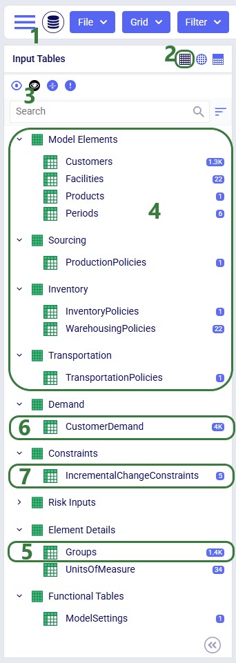
The following screenshot shows which input tables are populated in this example model:
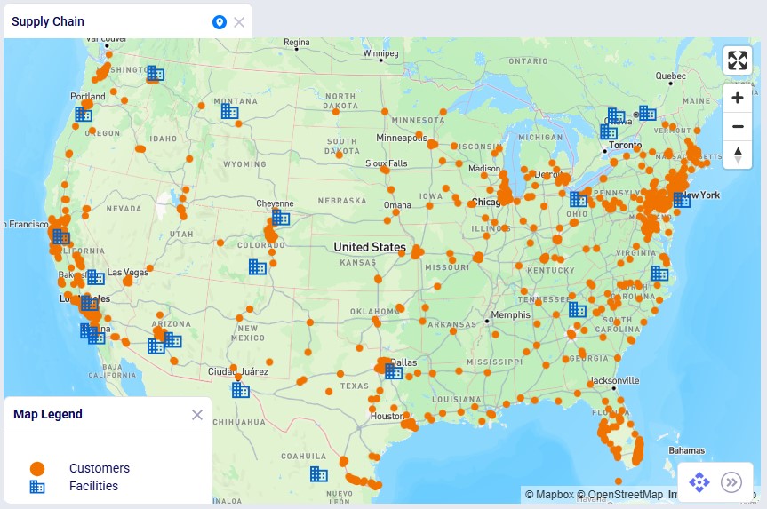
This next screenshot shows the customer and facility locations on a map:
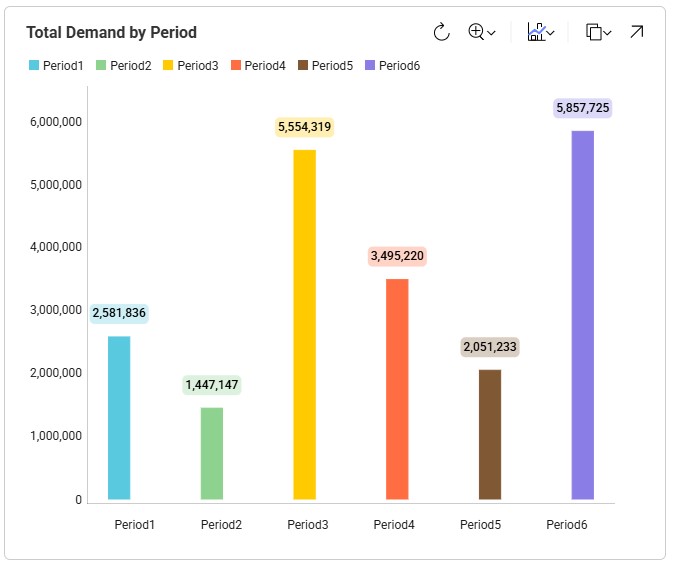
As mentioned, the demand varies quite a lot by period; the following bar chart shows the total demand by period:
Now, we will take a closer look at the new Incremental Change Constraints input table:
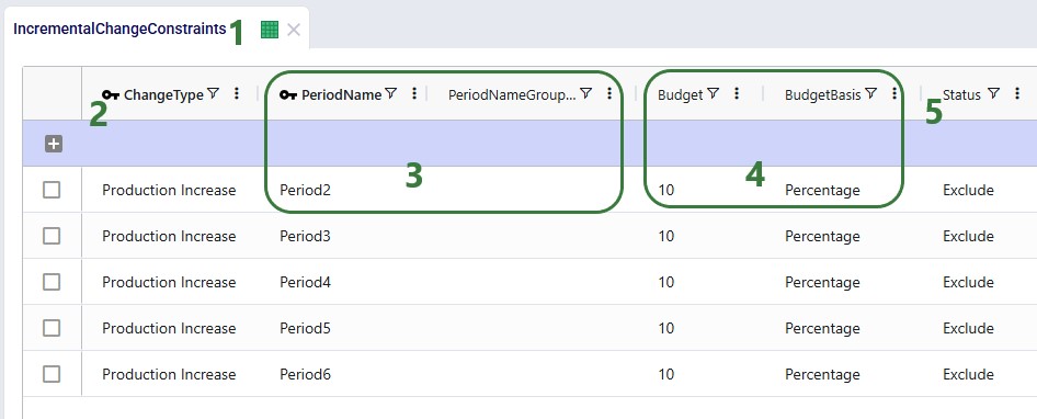
Please note that this table also has a Notes field, which is not shown in the screenshot. Notes fields are also often used by scenarios, for example to filter out a subset of records for which the Status needs to be switched based on the text contained in the Notes field.
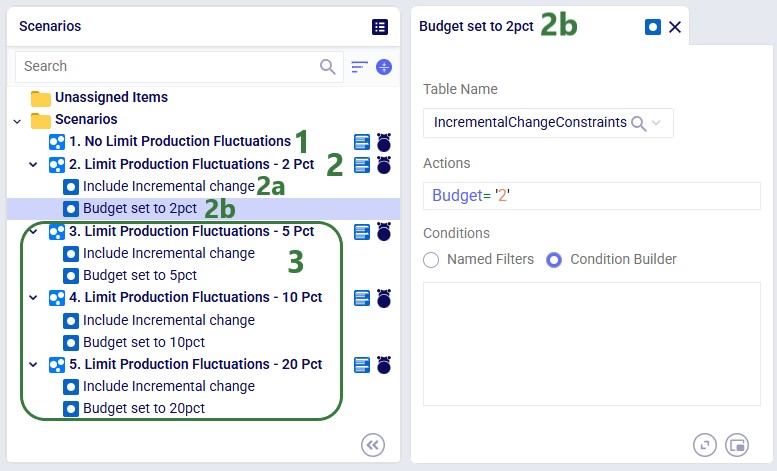
The following 5 scenarios are included in this example model:
After running all 5 scenarios, we will first look at the 2 new output tables, and then at several graphs set up in the Analytics module specifically for this model.
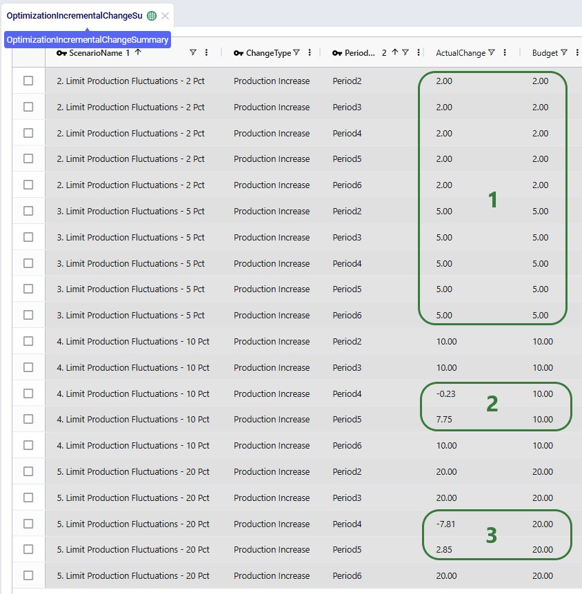
The following screenshot shows the Optimization Incremental Change Summary output table:
The other new output table, the Optimization Incremental Change Report, contains the changes at a more detailed level. For production increase incremental change types, it indicates the change in production at the individual facilities for the periods the constraint(s) are applied. In the next screenshot, we look at the report which is filtered for the fourth scenario and only the records for Facility_01 are shown:
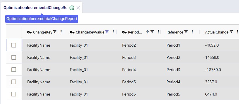
The Actual Change column here reflects the difference in the quantity produced between the period and the referenced (previous) period. The first record tells us that in Period2 Facility_01 produced 4,092 units less than it produced in Period1, etc.
Now, we will look at several graphs set up in the Analytics module. The names of the dashboards containing the graphs start with “Incremental Change - …”. The first one we will look at is the Production by Period graph found on the “Incremental Change – Production by Period” dashboard. Here we compare the first scenario (No Limit) with the most constrained scenario which is the second one (only 2% increase in production allowed in each subsequent month):
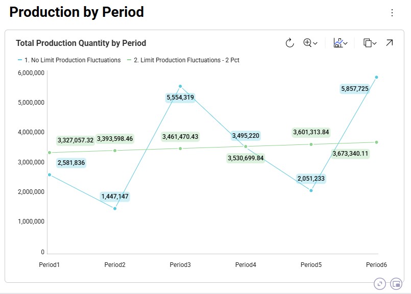
The blue line and numbers represent the production quantities of the first scenario (no limit). Since there are no limits set on how much production can fluctuate, the production is equal to the demand in that period to avoid any pre-build inventory and its holding costs. Since the demand varies greatly between each period, so does the production. For example, in Period2 the quantity produced is 1.45M units and in Period3 this is 5.55M units, which is a 280% increase.
The green line and numbers represent the production quantities of the second scenario (max 2% production increase). To even out the production and stay within the 2% increase restriction, we see that production in periods 1 and 2 is higher in this scenario as compared to the first one. We can deduce that inventory is being pre-built here in order to be able to fulfill the high demand in Period3. We will show the pre-build inventory levels by period in another upcoming dashboard.
The next graph, from the "Incremental Change - Demand and Production" dashboard, compares the production by period for all 5 scenarios using a bar-chart:
We see the same for scenarios 1 and 2 as we discussed for the previous graph: high fluctuations in scenario 1 and only slight increases period-over-period in scenario 2. Scenarios 3, 4, and 5 gradually allow higher increases in production (5%, 10%, and 20%), and we can see from the production outputs that in order to reduce cost of holding pre-build inventory in stock, the scenarios do show more fluctuations in the production quantity so that product is produced as close as possible in time to when the product is demanded, while adhering to the % increase limitations.
We can also illustrate this by looking at the amount of pre-build inventory across the periods for each scenario, which is shown on the “Incremental Change – Pre-build Inventory” dashboard:
We notice that the first scenario is not shown here as it does not have any pre-build inventory in any of the periods: the production in each period matches the demand in each period to avoid any pre-build holding costs. For the other scenarios, we see, as expected, that the more stringent the limitation on the fluctuation in production quantity is, the more pre-build inventory is being held. In scenarios 4 and 5 (10% and 20% increases allowed), there is no need to have pre-build inventory in Period4 for example, whereas this is needed in scenarios 2 and 3 (2% and 5% increases allowed).
We can of course also look at the costs associated with each of the 5 scenarios, using the Optimization Network Summary output table:
The costs are made up of transportation costs ($41.2M for all scenarios), in transit holding costs ($51k for all scenarios), production costs ($4.2M for all scenarios), outbound handling costs ($19.5M for all scenarios), and pre-build holding costs. Only the pre-build holding costs differ between the scenarios due to the timing of production being different because of the production increase incremental change constraints. As we saw above, no pre-build inventory was held in scenario 1, so the pre-build holding cost for this scenario is 0. Most pre-build inventory was held in the most stringent scenario, scenario #2, and therefore the pre-build holding costs are highest for this scenario, decreasing as the production increase change constraint is gradually loosened from 2 to 20%.
Finally, we will have a look at a map to see the flows from the facilities to the customers:
In this map we see all flows for all periods for scenario 3. We notice that customers source from their closest facility. Since this is a multi-period model, we can also configure the map to see the flows for just a single period or a subset of the periods, by using the fold-out periods toolbar located at the bottom-right in the screenshot.
This example demonstrates how Incremental Change can be used to determine the optimal sequence of supplier changes when transitioning from a mixed supplier base to a single-region sourcing strategy.
The model evaluates two potential transitions:
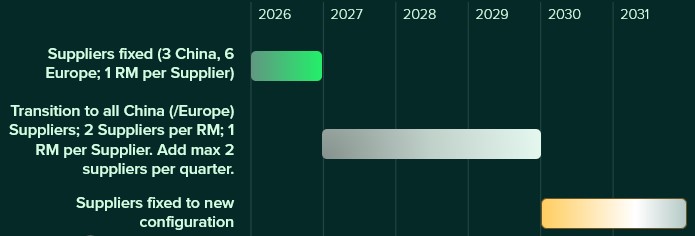
Supplier onboarding is limited to two suppliers per quarter, reflecting operational onboarding limits.
In addition, the model evaluates whether adding a new West Coast port and factory improves the network. These locations could realistically only become operational starting in 2028, which is modeled using incremental change constraints.
This example model, "Incremental Change - Supplier Base Transition", can be copied from the Resource Library if you want to follow along.
This example is based on the Global Supply Chain Strategy model from the Resource Library (here) and has been modified to demonstrate Incremental Change functionality.
This model includes two supplier regions:
Europe
China
The current supplier base consists of:
The additional suppliers are included in the model but initially inactive.
This screenshot shows the existing and potential suppliers in Europe:
The next screenshot shows the existing and potential suppliers in China:
Materials flow through the network as follows:
The model also includes potential West Coast expansion locations:
These facilities are evaluated in selected scenarios.
The following screenshot shows the port, factory, DC, and customer locations in North America, with the port to factory and factory to DC flows showing too:
First, we will cover the basic inputs in this model that were added / modified from the original Global Supply Chain Strategy model. After that we will explain the inputs that have been added to model the supplier base transition and those that enable consideration of using the new port and factory on the US west coast.
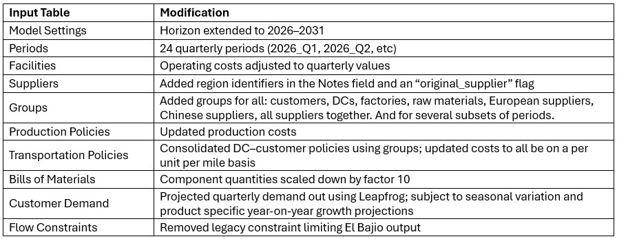
Several changes were made to the base model to support the incremental change example:
The model evaluates transitions to either an all-Europe or all-China supplier base under the following rules:
This supplier base transition is visualized on the following timeline:
After running scenarios with the above transition settings, we will also run 2 accelerated transition scenarios:
This looks as follows on a timeline:
Supplier availability is controlled using two input tables:
Supplier Capabilities
Supplier Capabilities Multi-Time Period
Three configuration sets are included:
Scenarios activate the appropriate configuration by switching the Status field to Include for the relevant records.
In the following screenshot of the Supplier Capabilities table, we see 12 (of the 21) suppliers that can supply RM4. Since the Paris supplier is the one which currently supplies this raw material, we see that the Status for that record is set to Include, whereas it is set to Exclude for all others. This is similarly set up for the other 8 raw materials. In scenarios where the supplier base is being shifted, the Status of the other records is set to Include.
The next screenshot shows the Supplier Capabilities Multi-Time Period table which is filtered for Supplier Name = Chengdu or Mainz and Product Name = RM3. Chengdu (China) is the original supplier for RM3, while Mainz (Europe) is not currently used at all and will be considered for supplying RM3 in scenarios that transition the supplier base to Europe:
To ensure meaningful dual sourcing, each raw material must be supplied by two suppliers.
To prevent trivial allocations (e.g., one supplier providing only a few units), conditional minimum flow constraints require that each active supplier provides approximately 35% of total supply. This ensures both suppliers meaningfully contribute to supply.
The 2 screenshots below show the setup for RM6 on the Flow Constraints input table:
Additional flow count constraints enforce the supplier structure:
These 2 screenshots show the flow count constraints which are used (Status switched from Exclude to Include) in the scenarios where the supplier base is shifted; they are explained underneath the second screenshot:
Incremental Change controls the rate of supplier onboarding.
Two configurations are included:
Additional constraints prevent supplier changes after the transition period.
The first 2 constraints shown in the screenshot below are for the standard transition type (Budget = 2 during transition, 0 after) and are included (Status switched to Include) in the scenarios where the supplier base is shifted. The bottom 2 constraints are used together with the one in the second record for scenarios modeling the accelerated transition (Budget =3 during transition, 0 after):
The model evaluates adding:
These facilities:
Facilities table:
Records were added for Los Angeles Port and Reno Factory. As these are currently not existing locations and will be considered for inclusion, their Facility Status = Consider and Initial State = Potential:
Facilities Multi-Time Period table:
Since we only want to consider including the west coast locations from 2028 onwards, we need to make sure that at the beginning of the model horizon they are closed. This is done by adding 2 records for 2026_Q1 to the Facilities Multi-Time Period table setting the Status for both the Reno Factory and the Los Angeles Port to Closed, see screenshot below. For the remaining periods in the model the Incremental Change Constraints (see further below in this section) take care of when the factory and port are considered for opening.
Production Policies table:
Records are added for the Reno Factory so it can manufacture all 3 finished goods, using the existing BOMs:
Transportation Policies table:
Records are added so that Los Angeles Port can receive raw materials from the ports in Rotterdam and Shanghai, the Los Angeles Port can ship these to the factory in Reno, and Reno Factory can serve the finished goods to all 7 DCs:
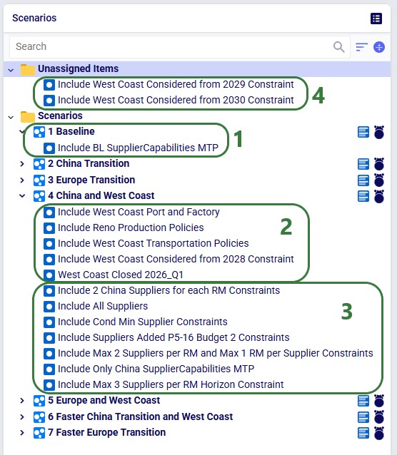
Incremental Change Constraints table:
Here, 2 records are added to set up the desired behavior of allowing the Reno Factory and Los Angeles Port to be added to the network from 2028_Q1 onwards.
The other 4 "Facilities Opened" records in this table are not used in this model. They were added in case users want to set up and run some scenarios themselves where the west coast port and factory are allowed to be added from 2029 (records 3 and 4) or from 2030 (records 5 and 6) onwards.
The following table shows the scenarios that were run in this example model. Initially the first 5 were run and based on the results, number 6 and 7 were added and run too:
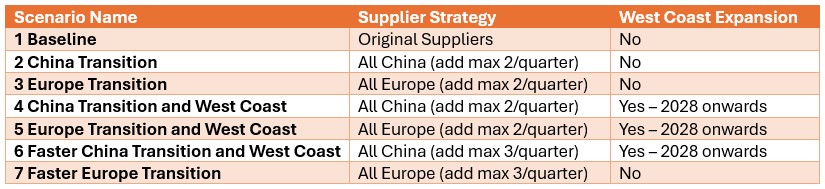
The Scenarios module of this example model looks as follows:
For running the scenarios, 2 of the technology parameters were changed from their defaults:
After running all scenarios, it is time to examine the outputs. We will start by looking at the new Optimization Incremental Change Summary and Optimization Incremental Change Report output tables and then visualize the supplier base changes on maps and a timeline grid. For these, we will mostly focus on scenarios 4 and 5 which show all incremental change constructs we have used in the model. Finally, we will also have a look at the financial impact and compare all scenarios.
The Optimization Incremental Change Summary table shows how much of each change budget is used in each period. Two screenshots of this output table are shown next; in both, the table is filtered for scenario number 5 (field not shown) where the supplier base is moved to Europe and adding the west coast locations to the network is considered:
During each of the first 3 quarters of the transition period 2 suppliers were added, then there is a pause in adding suppliers, and towards the end of the transition period, another 9 suppliers are added, essentially as late as possible. We can interpret this as:
The next screenshot shows the same table, still filtered for scenario 5, but now the records for the Facilities Opened change type constraints are shown:
We see that the budget was 2 for each of the periods in the 2028 – 2031 timeframe, but the Actual Change column indicates that no change (0) happened in any of those periods. In this scenario, it is not beneficial to start using the west coast port and factory anytime from Q1 2028 onwards.
Next, we will cover the Optimization Incremental Change Report output table. This table has a record for each incremental change that was made, including details on what the change was. This table is filtered for scenario 4 (field not shown) where the supplier base is moved to China and the west coast locations are considered (note that records beyond Q1 2029 are not shown here):

From the first 4 records for Q1 of 2027, we can tell that suppliers in Hefei and Taiyuan were added to the supplier base, while suppliers in Lyon and Madrid were removed. Similarly, 2 suppliers are added and removed in each of the next 2 quarters. Then in Q1 of 2028, the Reno Factory and Los Angeles Port are opened, which is apparently beneficial to do as early as possible when moving the supplier base to China. This is due to the lower transportation costs because of the shorter distance from Shanghai to Los Angeles as compared to going to the Charleston or Altamira ports.
In summary:
The next map shows the final configuration of the supplier base for scenario 4 where it is moved entirely to China. Notice that we have used the Period selector bar (at the top of the map) to show the map for Q1 of 2030 when the transition is complete. You can use this period selector to step through the periods to see the gradual changes over time.
The next map is also for scenario 4 but now showing the North American locations and flows (except for the DC – Customer flows) for the same period of Q1 2030. We see that the Los Angeles Port and Reno Factory are being used in this scenario.
Similar to the first map shown above, the next map shows the final supplier configuration in Q1 2030 for scenario 5, where the whole base is moved to Europe:
The next 2 timeline grids on the Supplier Transition Timeline dashboard (Analytics module) are generated from a custom table “timeline_rm_bysupplier_byperiod”, which in turn was generated from the Optimization Supply Summary output table. The appendix describes the steps to create the custom table and how to re-create it in case (new) scenarios are added / adjusted and run.
The first screenshot is for scenario 4, the second for scenario 5. They show which supplier supplies which RM when. Note that Q1-Q3 of 2026 are not included as the supplier configuration is equal to the Q4 2026 configuration. Similarly, the timeframe of Q2 2030 through Q4 2031 is not included in this dashboard either, since the supplier configuration is equal to the Q1 2030 configuration. Not all suppliers and period columns are shown in the screenshots, users can scroll horizontally and vertically in the dashboard to examine the full timeline.
Some things we notice here for scenario 4 are:
Some things we notice examining the above grid for scenario 5 are:
Since we are interested in looking at the impact of requiring the supplier base to be transitioned over sooner, scenarios 6 and 7 were run too where the budget for adding suppliers is set to 3 per quarter. We know from scenarios 4 and 5 that the west coast locations are only used when moving the supplier base to China, therefore we run scenario 6 (where we speed up the transition to the China supplier base) with these locations still considered. We do not consider them in scenario 7 where we speed up the transition to the Europe supplier base.
We will now have a look at how the costs compare for all 7 scenarios that were run with the next 2 screenshots of the Optimization Network Summary output table and the screenshot of the “Financials: Scenario Cost Comparison” chart. The latter can be found on the Scenario Comparison dashboard in the Analytics module:
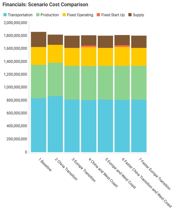
Comparing all scenarios reveals:
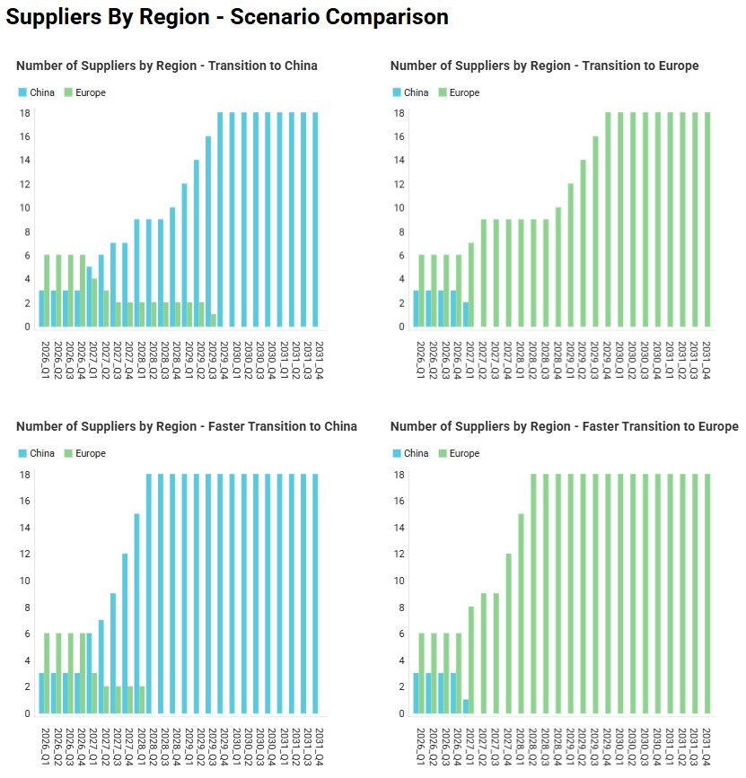
Finally, the following 4 charts for scenarios 4-7 which show the number of suppliers by region over time can be found in the “Suppliers by Region – Scenario Comparison” dashboard in the Analytics module:
Please do not hesitate to contact Optilogic support at support@optilogic.com in case of questions or feedback.
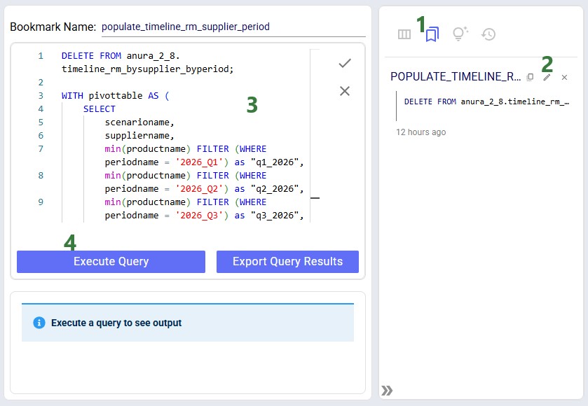
To create the timeline grid on the Supplier Transition Timeline dashboard, we first created a custom table named timeline_rm_bysupplier_byperiod, where we added columns for scenarioname, supplier, and 1 column for each period in the model. The latter we named q1_2026, q2_2026, etc. rather than 2026_Q1, 2026_Q2, etc. (which is how the periods in the model are named) as column names in custom tables cannot start with a digit.
Next, this table was populated from the outputs in the Optimization Supply Summary output table, using a SQL Query, which is saved in the model and can be used to refresh the custom table if scenarios are modified/added and (re-)run. For this we use the SQL Editor application on the Optilogic platform:
The following screenshot shows the central part and right-hand side panel of the SQL Editor application:
Please note that this custom table, the Supplier Transition Timeline dashboard, and SQL Query to populate it are specific to how this model is set up. All three will need to be updated if the model is changed in certain ways. For example, when adding/removing/renaming periods or if it becomes possible for 1 supplier to supply more than 1 raw material within a period.

Incremental Change is a powerful new capability in Cosmic Frog’s NEO engine (Network Optimization) that helps you manage the transition between two network states – such as moving from your current baseline network to an optimized future state. Rather than implementing all changes at once, Incremental Change allows you to control the pace and sequence of changes over time, making network transformations more practical and manageable.
This feature bridges the gap between theoretical optimization results and realistic implementation plans by generating a sequenced roadmap of network changes.
In this documentation, we will discuss the impact of Incremental Change, explain how to use it, and then walk through 2 demo models showing examples of the new capabilities. These models can be copied to your own Optilogic account from the Resource Library:
Please also see the following brief video for an introduction to Incremental Change and an overview of the second demo model, Incremental Change - Supplier Base Transition:
Supply chain networks rarely change overnight. Whether you are opening new distribution centers, shifting supplier bases, or adapting to seasonal demand fluctuations, real-world constraints limit how quickly you can implement changes. Organizations face practical limitations including:
Incremental Change addresses these realities by helping you answer critical questions: What is the best order of changes? What is the optimal rate of change? What tolerance levels are appropriate for different types of modifications?
Understand which network modifications deliver the greatest value earliest in your transition. Incremental Change provides clear visibility into expected savings versus the number of changes required, along with detailed change checklists for each scenario.
Create realistic, step-by-step roadmaps for moving from your current network to your target network. You will receive:
Manage network evolution in response to changing business conditions while respecting operational constraints. Balance total cost optimization against your tolerance for change, with detailed monthly implementation plans.
Cosmic Frog's Incremental Change currently supports the following network changes:
Progressive Facility Expansion: When opening a new distribution center, specify that you want to reassign up to 10 customers per month, and the system determines which customers to transition each month to maximize savings.
Seasonal Production Smoothing: For products with seasonal demand patterns, set constraints to ensure facility production never varies by more than 10% month-over-month, maintaining operational stability.
Multi-Year Facility Rollouts: Plan the optimal sequence for opening 10 facilities over five years including a detailed 2-year implementation roadmap.
Strategic Supplier Transitions: Systematically shift your supplier base. For example, progressively move sourcing out of or into a particular region – with Incremental Change determining the optimal sequence of supplier changes.
Incremental Change uses a new input table and generates 2 new output tables with different levels of detail:
Input: Use the Incremental Change Constraints table to set the change type(s) being included and your change budget for each period.
Outputs:
By leveraging Incremental Change, you can transform theoretical network optimization results into actionable, phased implementation plans that respect real-world operational constraints while maximizing value delivery.
Some additional pointers that may prove helpful are as follows:
In this example model, "Incremental Change - Production Smoothing", we will see how we can ensure that increases in production from one month to the next are limited to a certain percentage using the Incremental Change feature. This model can be copied from the Resource Library to your own account in case you want to follow along.
The following screenshot shows which input tables are populated in this example model:
This next screenshot shows the customer and facility locations on a map:
As mentioned, the demand varies quite a lot by period; the following bar chart shows the total demand by period:
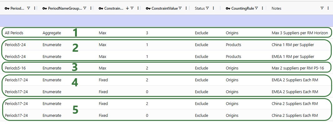
Now, we will take a closer look at the new Incremental Change Constraints input table:
Please note that this table also has a Notes field, which is not shown in the screenshot. Notes fields are also often used by scenarios, for example to filter out a subset of records for which the Status needs to be switched based on the text contained in the Notes field.
The following 5 scenarios are included in this example model:
After running all 5 scenarios, we will first look at the 2 new output tables, and then at several graphs set up in the Analytics module specifically for this model.
The following screenshot shows the Optimization Incremental Change Summary output table:
The other new output table, the Optimization Incremental Change Report, contains the changes at a more detailed level. For production increase incremental change types, it indicates the change in production at the individual facilities for the periods the constraint(s) are applied. In the next screenshot, we look at the report which is filtered for the fourth scenario and only the records for Facility_01 are shown:
The Actual Change column here reflects the difference in the quantity produced between the period and the referenced (previous) period. The first record tells us that in Period2 Facility_01 produced 4,092 units less than it produced in Period1, etc.
Now, we will look at several graphs set up in the Analytics module. The names of the dashboards containing the graphs start with “Incremental Change - …”. The first one we will look at is the Production by Period graph found on the “Incremental Change – Production by Period” dashboard. Here we compare the first scenario (No Limit) with the most constrained scenario which is the second one (only 2% increase in production allowed in each subsequent month):
The blue line and numbers represent the production quantities of the first scenario (no limit). Since there are no limits set on how much production can fluctuate, the production is equal to the demand in that period to avoid any pre-build inventory and its holding costs. Since the demand varies greatly between each period, so does the production. For example, in Period2 the quantity produced is 1.45M units and in Period3 this is 5.55M units, which is a 280% increase.
The green line and numbers represent the production quantities of the second scenario (max 2% production increase). To even out the production and stay within the 2% increase restriction, we see that production in periods 1 and 2 is higher in this scenario as compared to the first one. We can deduce that inventory is being pre-built here in order to be able to fulfill the high demand in Period3. We will show the pre-build inventory levels by period in another upcoming dashboard.
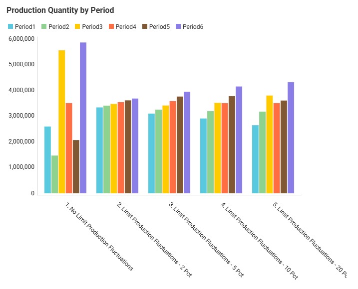
The next graph, from the "Incremental Change - Demand and Production" dashboard, compares the production by period for all 5 scenarios using a bar-chart:
We see the same for scenarios 1 and 2 as we discussed for the previous graph: high fluctuations in scenario 1 and only slight increases period-over-period in scenario 2. Scenarios 3, 4, and 5 gradually allow higher increases in production (5%, 10%, and 20%), and we can see from the production outputs that in order to reduce cost of holding pre-build inventory in stock, the scenarios do show more fluctuations in the production quantity so that product is produced as close as possible in time to when the product is demanded, while adhering to the % increase limitations.
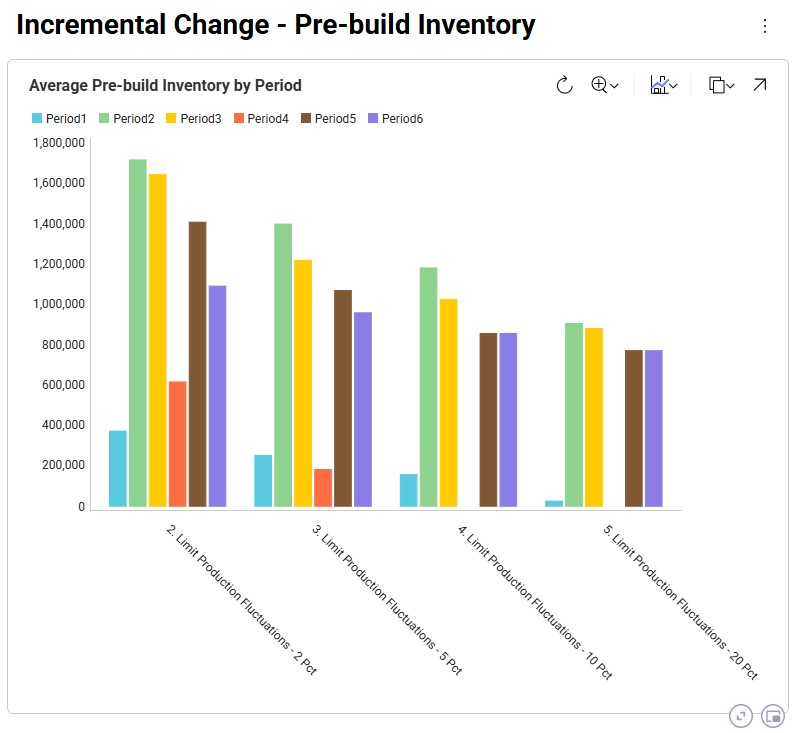
We can also illustrate this by looking at the amount of pre-build inventory across the periods for each scenario, which is shown on the “Incremental Change – Pre-build Inventory” dashboard:
We notice that the first scenario is not shown here as it does not have any pre-build inventory in any of the periods: the production in each period matches the demand in each period to avoid any pre-build holding costs. For the other scenarios, we see, as expected, that the more stringent the limitation on the fluctuation in production quantity is, the more pre-build inventory is being held. In scenarios 4 and 5 (10% and 20% increases allowed), there is no need to have pre-build inventory in Period4 for example, whereas this is needed in scenarios 2 and 3 (2% and 5% increases allowed).
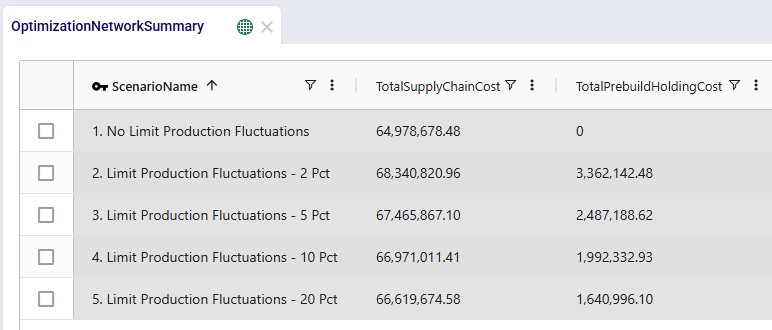
We can of course also look at the costs associated with each of the 5 scenarios, using the Optimization Network Summary output table:
The costs are made up of transportation costs ($41.2M for all scenarios), in transit holding costs ($51k for all scenarios), production costs ($4.2M for all scenarios), outbound handling costs ($19.5M for all scenarios), and pre-build holding costs. Only the pre-build holding costs differ between the scenarios due to the timing of production being different because of the production increase incremental change constraints. As we saw above, no pre-build inventory was held in scenario 1, so the pre-build holding cost for this scenario is 0. Most pre-build inventory was held in the most stringent scenario, scenario #2, and therefore the pre-build holding costs are highest for this scenario, decreasing as the production increase change constraint is gradually loosened from 2 to 20%.
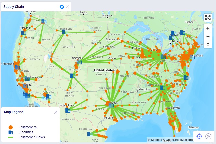
Finally, we will have a look at a map to see the flows from the facilities to the customers:
In this map we see all flows for all periods for scenario 3. We notice that customers source from their closest facility. Since this is a multi-period model, we can also configure the map to see the flows for just a single period or a subset of the periods, by using the fold-out periods toolbar located at the bottom-right in the screenshot.
This example demonstrates how Incremental Change can be used to determine the optimal sequence of supplier changes when transitioning from a mixed supplier base to a single-region sourcing strategy.
The model evaluates two potential transitions:
Supplier onboarding is limited to two suppliers per quarter, reflecting operational onboarding limits.
In addition, the model evaluates whether adding a new West Coast port and factory improves the network. These locations could realistically only become operational starting in 2028, which is modeled using incremental change constraints.
This example model, "Incremental Change - Supplier Base Transition", can be copied from the Resource Library if you want to follow along.
This example is based on the Global Supply Chain Strategy model from the Resource Library (here) and has been modified to demonstrate Incremental Change functionality.
This model includes two supplier regions:
Europe
China
The current supplier base consists of:
The additional suppliers are included in the model but initially inactive.
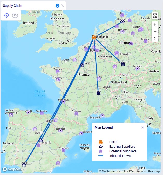
This screenshot shows the existing and potential suppliers in Europe:
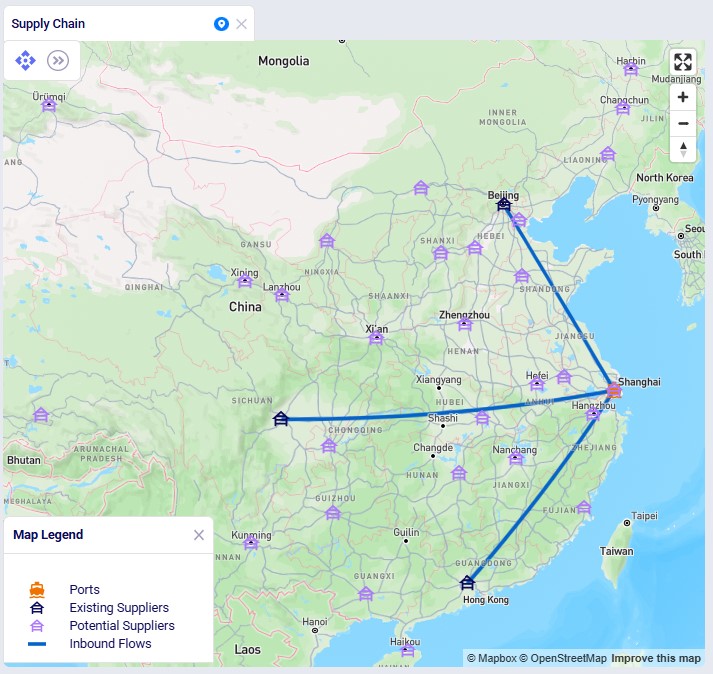
The next screenshot shows the existing and potential suppliers in China:
Materials flow through the network as follows:
The model also includes potential West Coast expansion locations:
These facilities are evaluated in selected scenarios.
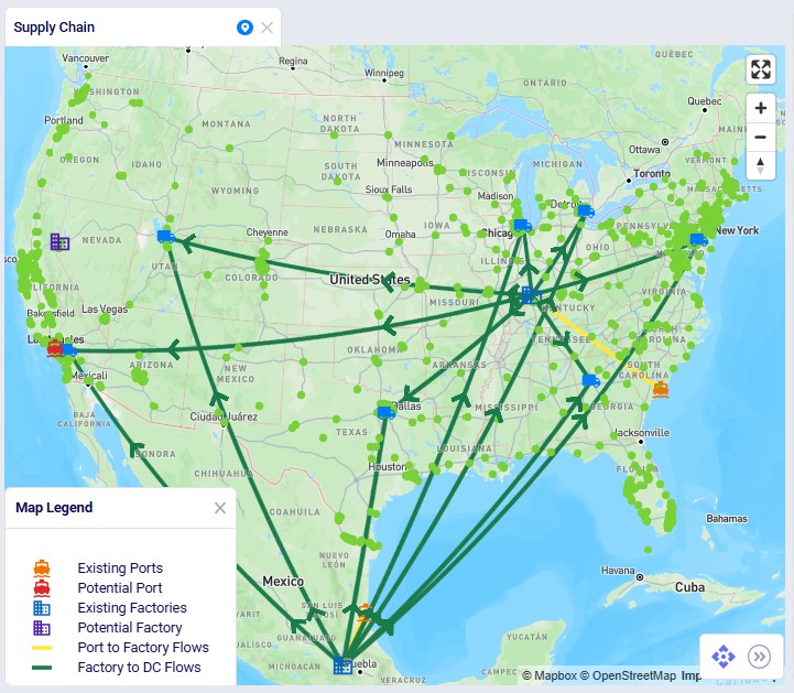
The following screenshot shows the port, factory, DC, and customer locations in North America, with the port to factory and factory to DC flows showing too:
First, we will cover the basic inputs in this model that were added / modified from the original Global Supply Chain Strategy model. After that we will explain the inputs that have been added to model the supplier base transition and those that enable consideration of using the new port and factory on the US west coast.
Several changes were made to the base model to support the incremental change example:
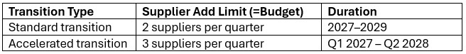
The model evaluates transitions to either an all-Europe or all-China supplier base under the following rules:
This supplier base transition is visualized on the following timeline:
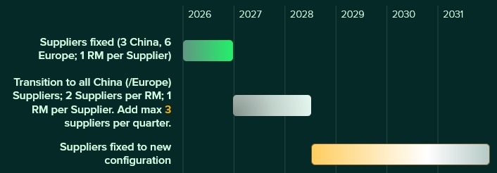
After running scenarios with the above transition settings, we will also run 2 accelerated transition scenarios:
This looks as follows on a timeline:
Supplier availability is controlled using two input tables:
Supplier Capabilities
Supplier Capabilities Multi-Time Period
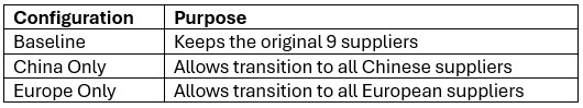
Three configuration sets are included:
Scenarios activate the appropriate configuration by switching the Status field to Include for the relevant records.
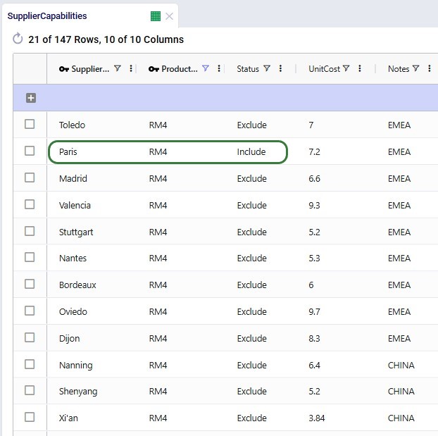
In the following screenshot of the Supplier Capabilities table, we see 12 (of the 21) suppliers that can supply RM4. Since the Paris supplier is the one which currently supplies this raw material, we see that the Status for that record is set to Include, whereas it is set to Exclude for all others. This is similarly set up for the other 8 raw materials. In scenarios where the supplier base is being shifted, the Status of the other records is set to Include.
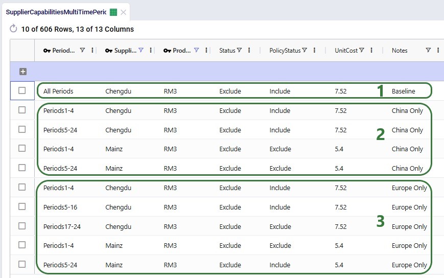
The next screenshot shows the Supplier Capabilities Multi-Time Period table which is filtered for Supplier Name = Chengdu or Mainz and Product Name = RM3. Chengdu (China) is the original supplier for RM3, while Mainz (Europe) is not currently used at all and will be considered for supplying RM3 in scenarios that transition the supplier base to Europe:
To ensure meaningful dual sourcing, each raw material must be supplied by two suppliers.
To prevent trivial allocations (e.g., one supplier providing only a few units), conditional minimum flow constraints require that each active supplier provides approximately 35% of total supply. This ensures both suppliers meaningfully contribute to supply.
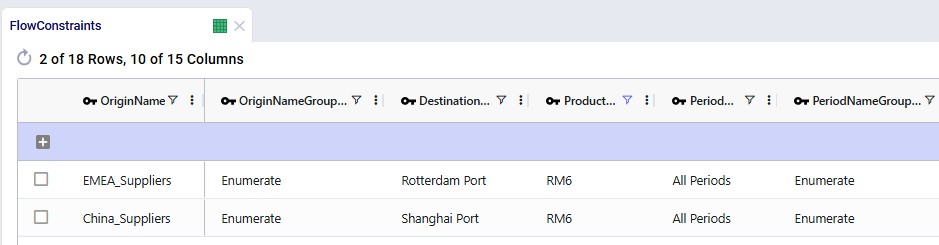
The 2 screenshots below show the setup for RM6 on the Flow Constraints input table:
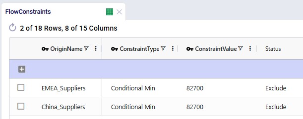
Additional flow count constraints enforce the supplier structure:
These 2 screenshots show the flow count constraints which are used (Status switched from Exclude to Include) in the scenarios where the supplier base is shifted; they are explained underneath the second screenshot:
Incremental Change controls the rate of supplier onboarding.
Two configurations are included:
Additional constraints prevent supplier changes after the transition period.
The first 2 constraints shown in the screenshot below are for the standard transition type (Budget = 2 during transition, 0 after) and are included (Status switched to Include) in the scenarios where the supplier base is shifted. The bottom 2 constraints are used together with the one in the second record for scenarios modeling the accelerated transition (Budget =3 during transition, 0 after):
The model evaluates adding:
These facilities:
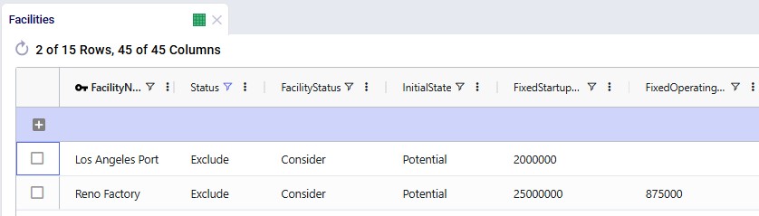
Facilities table:
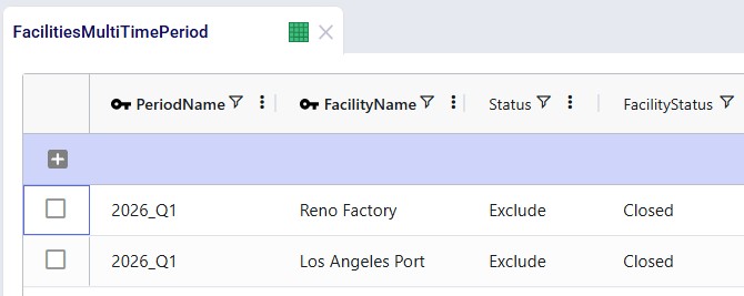
Records were added for Los Angeles Port and Reno Factory. As these are currently not existing locations and will be considered for inclusion, their Facility Status = Consider and Initial State = Potential:
Facilities Multi-Time Period table:
Since we only want to consider including the west coast locations from 2028 onwards, we need to make sure that at the beginning of the model horizon they are closed. This is done by adding 2 records for 2026_Q1 to the Facilities Multi-Time Period table setting the Status for both the Reno Factory and the Los Angeles Port to Closed, see screenshot below. For the remaining periods in the model the Incremental Change Constraints (see further below in this section) take care of when the factory and port are considered for opening.
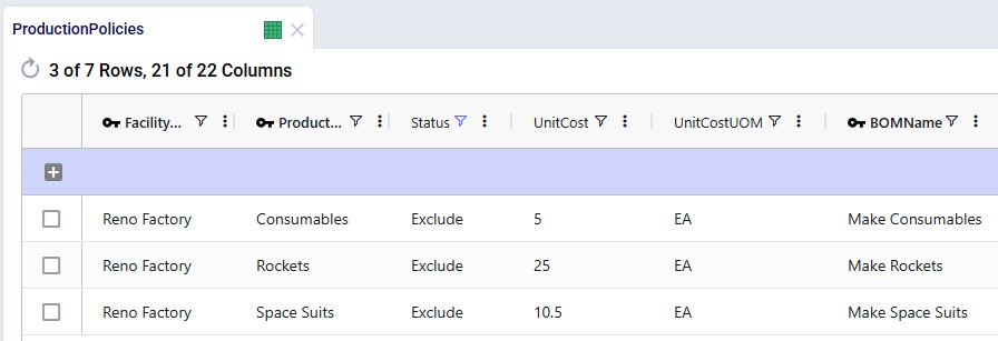
Production Policies table:
Records are added for the Reno Factory so it can manufacture all 3 finished goods, using the existing BOMs:
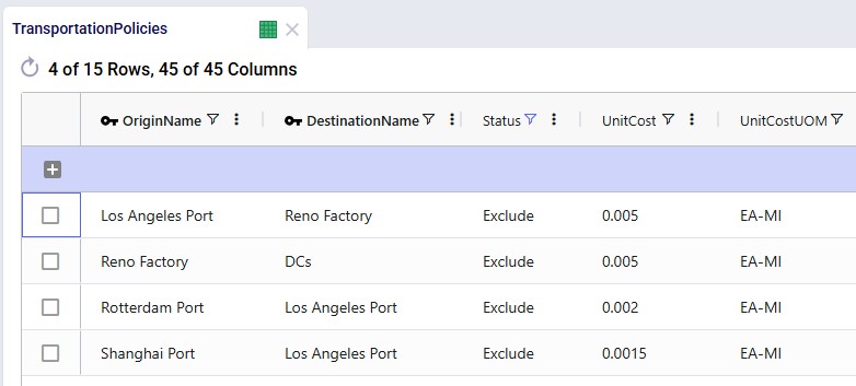
Transportation Policies table:
Records are added so that Los Angeles Port can receive raw materials from the ports in Rotterdam and Shanghai, the Los Angeles Port can ship these to the factory in Reno, and Reno Factory can serve the finished goods to all 7 DCs:
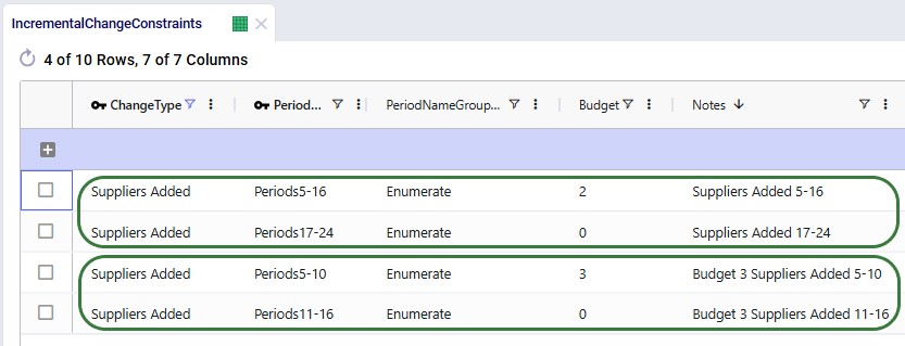
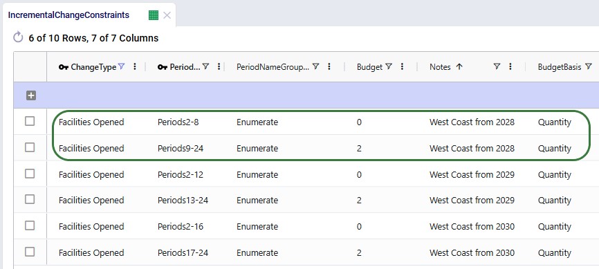
Incremental Change Constraints table:
Here, 2 records are added to set up the desired behavior of allowing the Reno Factory and Los Angeles Port to be added to the network from 2028_Q1 onwards.
The other 4 "Facilities Opened" records in this table are not used in this model. They were added in case users want to set up and run some scenarios themselves where the west coast port and factory are allowed to be added from 2029 (records 3 and 4) or from 2030 (records 5 and 6) onwards.
The following table shows the scenarios that were run in this example model. Initially the first 5 were run and based on the results, number 6 and 7 were added and run too:
The Scenarios module of this example model looks as follows:
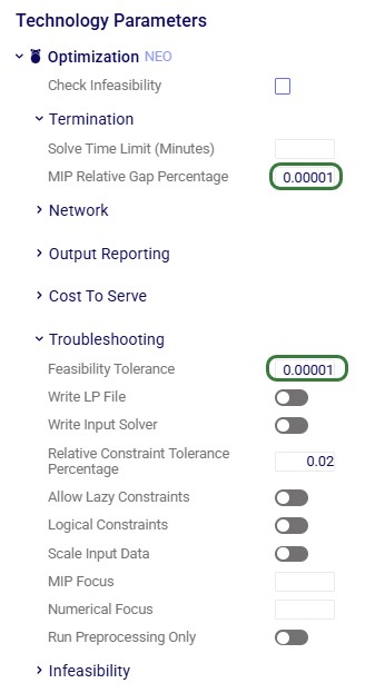
For running the scenarios, 2 of the technology parameters were changed from their defaults:
After running all scenarios, it is time to examine the outputs. We will start by looking at the new Optimization Incremental Change Summary and Optimization Incremental Change Report output tables and then visualize the supplier base changes on maps and a timeline grid. For these, we will mostly focus on scenarios 4 and 5 which show all incremental change constructs we have used in the model. Finally, we will also have a look at the financial impact and compare all scenarios.
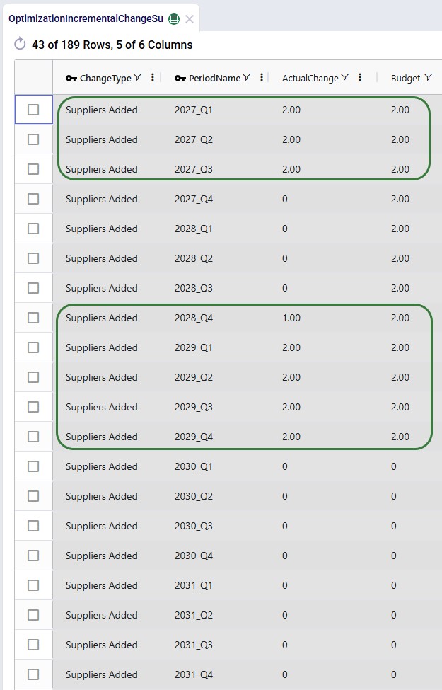
The Optimization Incremental Change Summary table shows how much of each change budget is used in each period. Two screenshots of this output table are shown next; in both, the table is filtered for scenario number 5 (field not shown) where the supplier base is moved to Europe and adding the west coast locations to the network is considered:
During each of the first 3 quarters of the transition period 2 suppliers were added, then there is a pause in adding suppliers, and towards the end of the transition period, another 9 suppliers are added, essentially as late as possible. We can interpret this as:
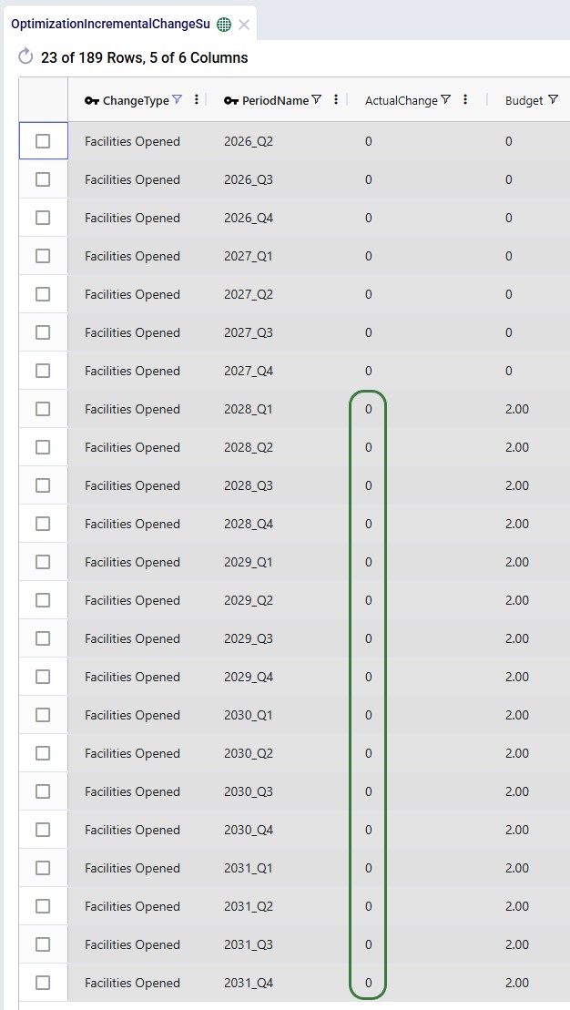
The next screenshot shows the same table, still filtered for scenario 5, but now the records for the Facilities Opened change type constraints are shown:
We see that the budget was 2 for each of the periods in the 2028 – 2031 timeframe, but the Actual Change column indicates that no change (0) happened in any of those periods. In this scenario, it is not beneficial to start using the west coast port and factory anytime from Q1 2028 onwards.
Next, we will cover the Optimization Incremental Change Report output table. This table has a record for each incremental change that was made, including details on what the change was. This table is filtered for scenario 4 (field not shown) where the supplier base is moved to China and the west coast locations are considered (note that records beyond Q1 2029 are not shown here):
From the first 4 records for Q1 of 2027, we can tell that suppliers in Hefei and Taiyuan were added to the supplier base, while suppliers in Lyon and Madrid were removed. Similarly, 2 suppliers are added and removed in each of the next 2 quarters. Then in Q1 of 2028, the Reno Factory and Los Angeles Port are opened, which is apparently beneficial to do as early as possible when moving the supplier base to China. This is due to the lower transportation costs because of the shorter distance from Shanghai to Los Angeles as compared to going to the Charleston or Altamira ports.
In summary:
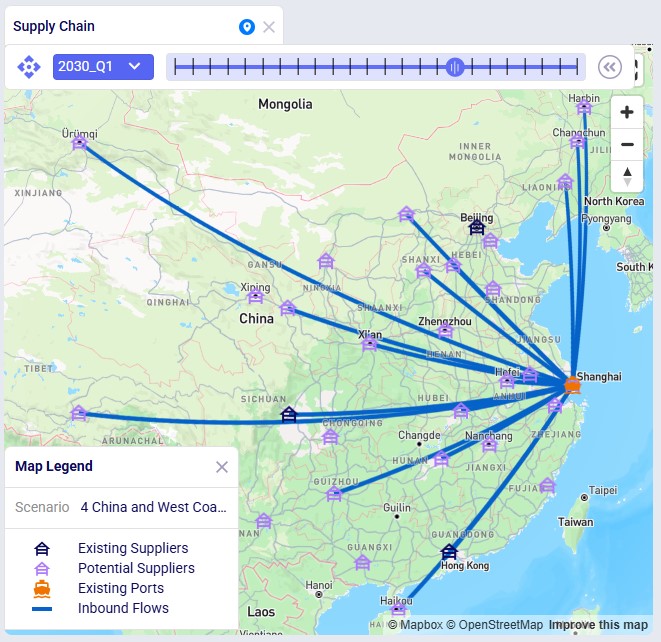
The next map shows the final configuration of the supplier base for scenario 4 where it is moved entirely to China. Notice that we have used the Period selector bar (at the top of the map) to show the map for Q1 of 2030 when the transition is complete. You can use this period selector to step through the periods to see the gradual changes over time.
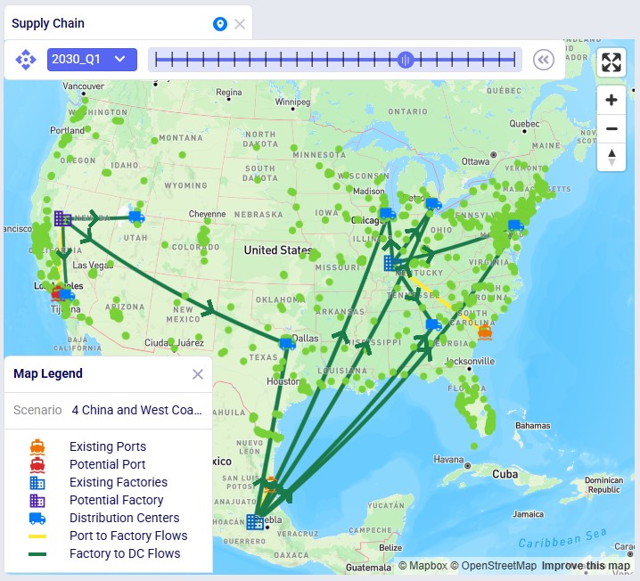
The next map is also for scenario 4 but now showing the North American locations and flows (except for the DC – Customer flows) for the same period of Q1 2030. We see that the Los Angeles Port and Reno Factory are being used in this scenario.
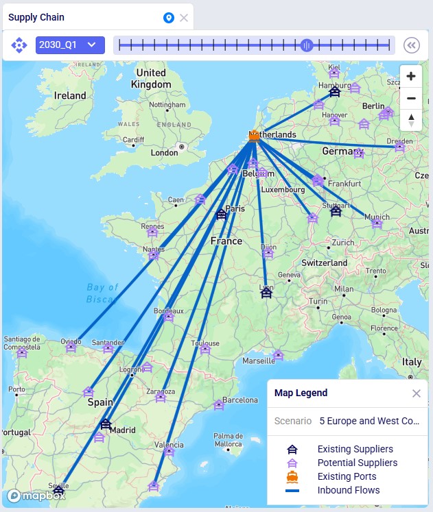
Similar to the first map shown above, the next map shows the final supplier configuration in Q1 2030 for scenario 5, where the whole base is moved to Europe:
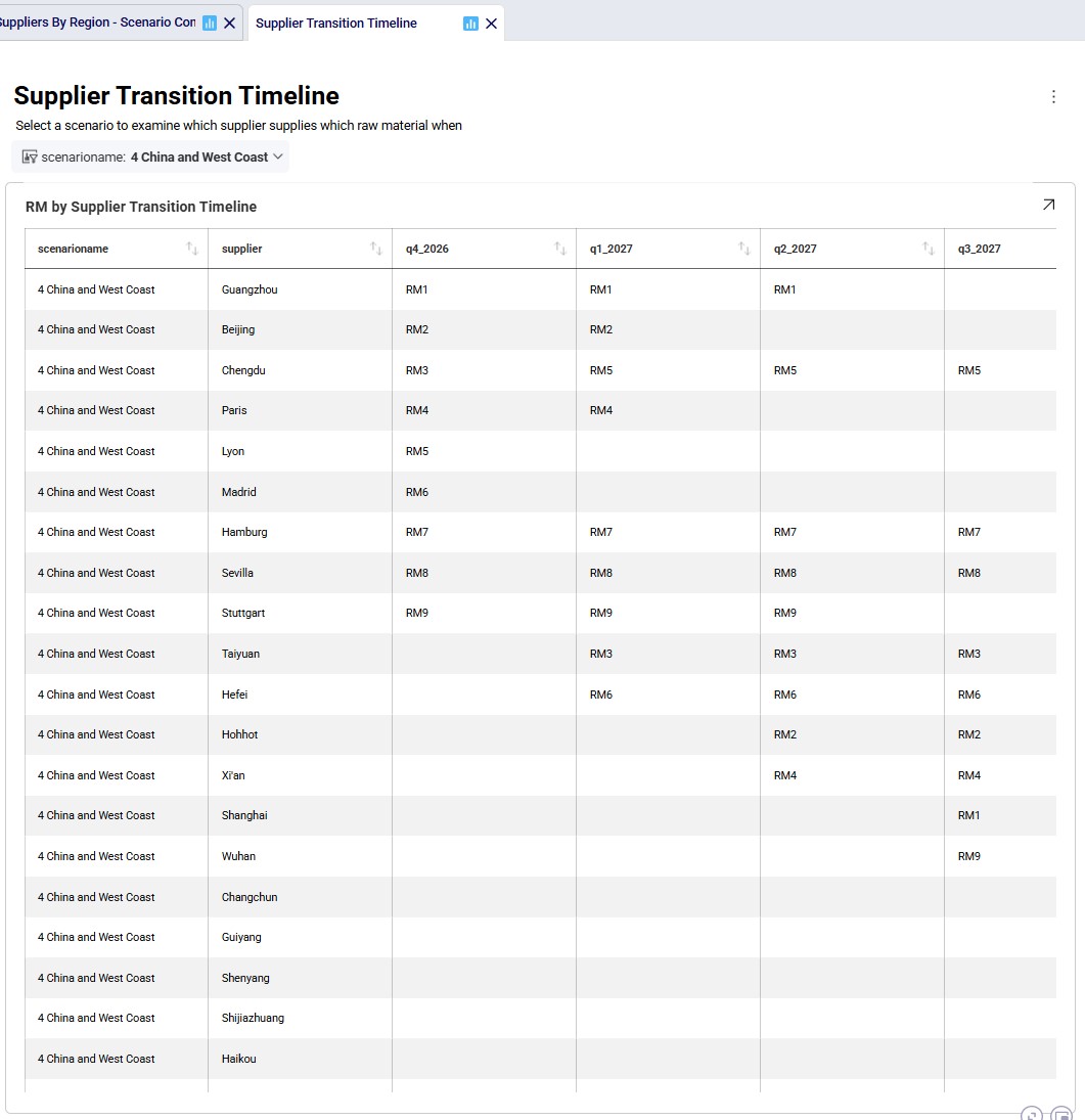
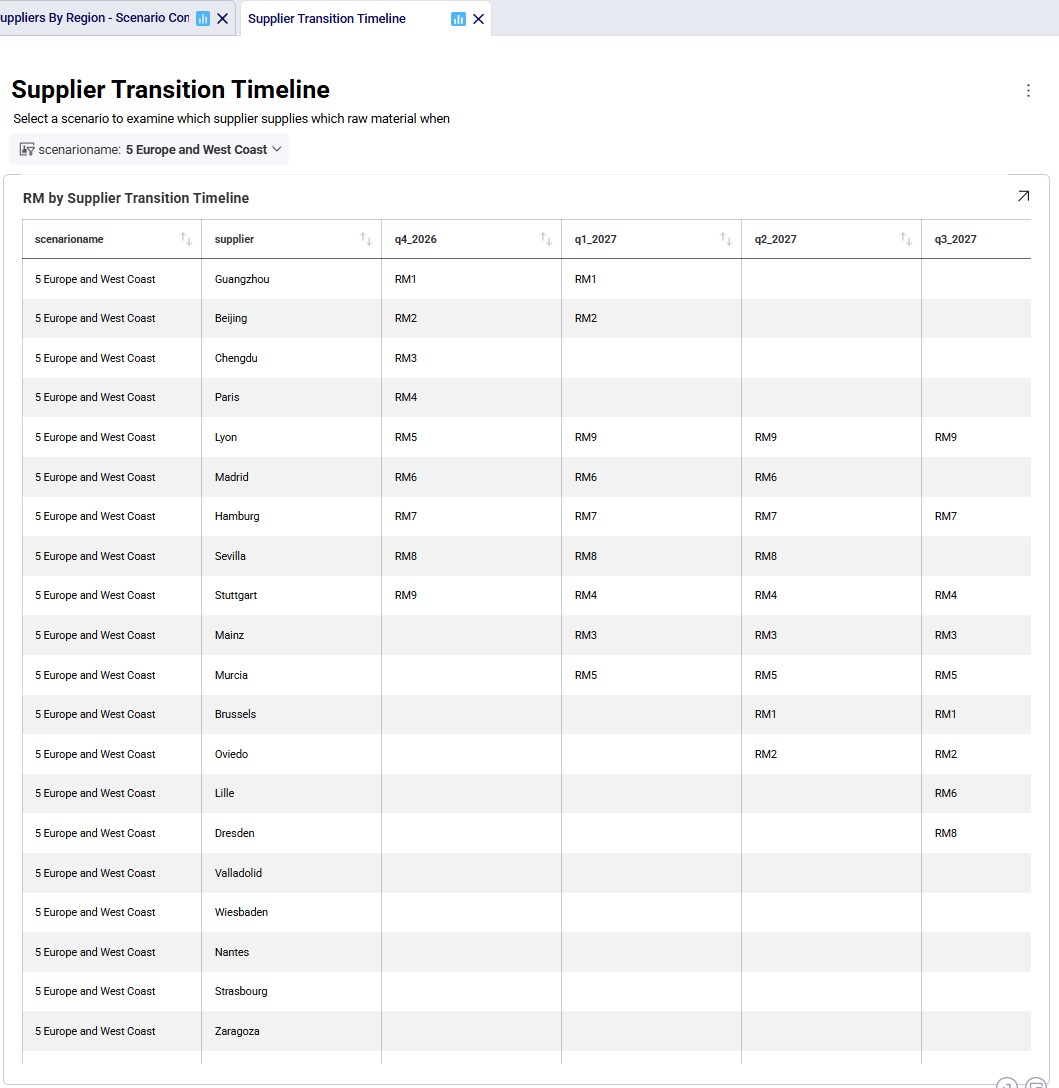
The next 2 timeline grids on the Supplier Transition Timeline dashboard (Analytics module) are generated from a custom table “timeline_rm_bysupplier_byperiod”, which in turn was generated from the Optimization Supply Summary output table. The appendix describes the steps to create the custom table and how to re-create it in case (new) scenarios are added / adjusted and run.
The first screenshot is for scenario 4, the second for scenario 5. They show which supplier supplies which RM when. Note that Q1-Q3 of 2026 are not included as the supplier configuration is equal to the Q4 2026 configuration. Similarly, the timeframe of Q2 2030 through Q4 2031 is not included in this dashboard either, since the supplier configuration is equal to the Q1 2030 configuration. Not all suppliers and period columns are shown in the screenshots, users can scroll horizontally and vertically in the dashboard to examine the full timeline.
Some things we notice here for scenario 4 are:
Some things we notice examining the above grid for scenario 5 are:
Since we are interested in looking at the impact of requiring the supplier base to be transitioned over sooner, scenarios 6 and 7 were run too where the budget for adding suppliers is set to 3 per quarter. We know from scenarios 4 and 5 that the west coast locations are only used when moving the supplier base to China, therefore we run scenario 6 (where we speed up the transition to the China supplier base) with these locations still considered. We do not consider them in scenario 7 where we speed up the transition to the Europe supplier base.
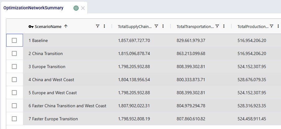
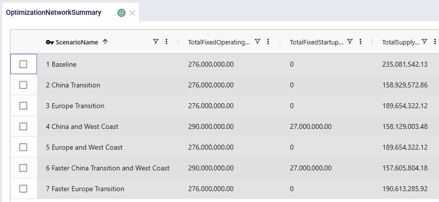
We will now have a look at how the costs compare for all 7 scenarios that were run with the next 2 screenshots of the Optimization Network Summary output table and the screenshot of the “Financials: Scenario Cost Comparison” chart. The latter can be found on the Scenario Comparison dashboard in the Analytics module:
Comparing all scenarios reveals:
Finally, the following 4 charts for scenarios 4-7 which show the number of suppliers by region over time can be found in the “Suppliers by Region – Scenario Comparison” dashboard in the Analytics module:
Please do not hesitate to contact Optilogic support at support@optilogic.com in case of questions or feedback.
To create the timeline grid on the Supplier Transition Timeline dashboard, we first created a custom table named timeline_rm_bysupplier_byperiod, where we added columns for scenarioname, supplier, and 1 column for each period in the model. The latter we named q1_2026, q2_2026, etc. rather than 2026_Q1, 2026_Q2, etc. (which is how the periods in the model are named) as column names in custom tables cannot start with a digit.
Next, this table was populated from the outputs in the Optimization Supply Summary output table, using a SQL Query, which is saved in the model and can be used to refresh the custom table if scenarios are modified/added and (re-)run. For this we use the SQL Editor application on the Optilogic platform:
The following screenshot shows the central part and right-hand side panel of the SQL Editor application:
Please note that this custom table, the Supplier Transition Timeline dashboard, and SQL Query to populate it are specific to how this model is set up. All three will need to be updated if the model is changed in certain ways. For example, when adding/removing/renaming periods or if it becomes possible for 1 supplier to supply more than 1 raw material within a period.