Cosmic Frog users can now perform additional quick analyses on their supply chain models’ input and output data through Cosmic Frog’s new grid features. This functionality enables users to easily apply different types of grouping and aggregation to their data, while also allowing users to view their data in a pivoted format. Think for example of the following use cases:
In this documentation we will cover how grids can be configured to use these new features, show several additional examples, and conclude with a few pointers for effective use of these features.
These new grid features can be accessed from the “Columns” section on the side bar on the right-hand side of input and output tables while in the Data module of Cosmic Frog:

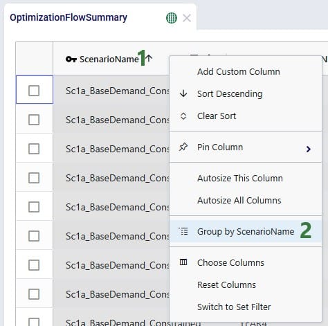
Alternatively, users can also start grouping and subsequently aggregating by right clicking on the column names in the table grid:
We will first cover Row Grouping, then Aggregated Table Mode, and finally Pivot Mode.
Using the row grouping functionality allows users to select 1 or multiple columns of an input or output table by which all records in the table will be grouped. These groups of records can be collapsed and expanded as desired to review the data. In the following screenshot the row grouping feature is used to compare the sources of a certain finished good in a particular period for 1 scenario:
When clicking on Columns on the right hand-side of the table to open the row grouping / aggregated table / pivot grid configuration pane shows the configuration for this row grouping:

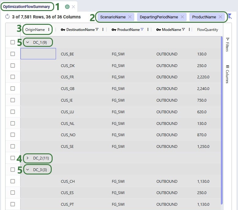
The above example showed grouping the rows by 1 column, this next example shows the same table, but now the rows are grouped by 3 columns. Note that you can change the order of the Row Groups by clicking on a column header and dragging it up or down.
The table then looks as follows:
The number in parenthesis indicates how many unique values there are for the next row group:
Once a table is grouped by one or more fields, a next step can be to aggregate one or multiple columns by this/these grouped field(s). When this is done, we call this aggregated table mode. Different types of aggregation are available to the user, which will be discussed in this section.
When configuring the grid through the configuration panel that comes up when clicking on Columns on the right-hand side of input & output tables, several options are available to help users find field names quickly and turn multiple on/off simultaneously:
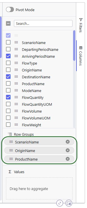
To configure the grid, fields can be dragged and dropped:

Alternatively, instead of dragging and dropping, users can also right-click on the field(s) of interest to add them to the configuration areas. This can be done both in the list with column names at the top of the configuration window as shown in the following screenshot, but also on the column names in the grid itself (which we have seen an example of in the “How to Access the New Grid Features” section above):

In the screenshot above (taken with Pivot Mode on which is why the Column Labels area is also visible), the user right-clicked on the Flow Volume field and now they can choose to add it to the Row Groups area (“Group by FlowVolume”), to the ∑ Values area (“Add FlowVolume to values”), or to the Column Labels area (“Add FlowVolume to labels”).
The next screenshot shows the result of a configured aggregated table grid:
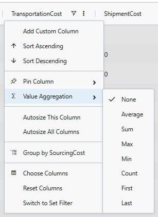
When adding numeric fields to the ∑ Values area, the following aggregation options are available to the user:
For non-numeric fields, only the last 3 options are available as aggregations:
When adding an aggregation field through right-clicking on a field name in the grid, it looks as follows. The user right-clicked on a numerical field, Transportation Cost, here:
When filters are applied to the table, these are still applied when the table is being grouped by rows, aggregated, or pivoted:

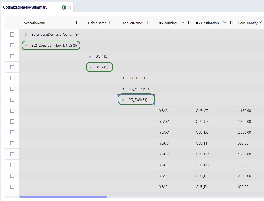
It was mentioned above that the number in parentheses after the scenario name represents the number of rows that the aggregation was applied to. We can expand this by clicking on the greater than (>) icon to view the individual rows that make up the aggregation:
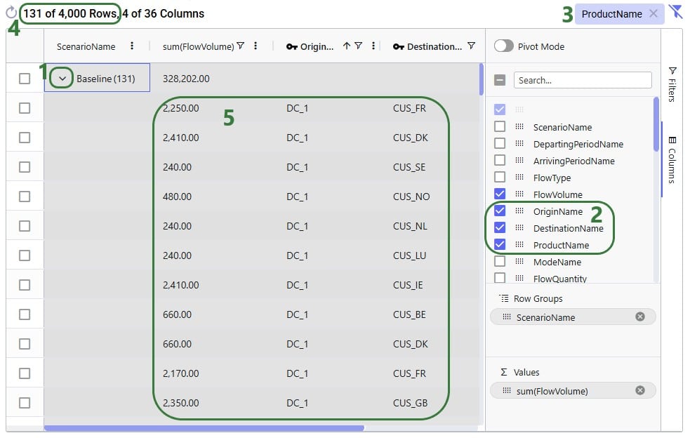
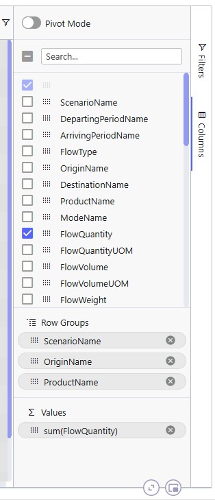
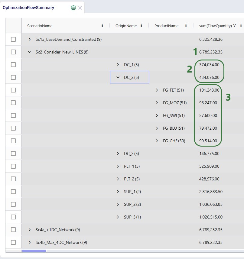
Next is an aggregated table mode example where more than 1 Row Group is used. Here, the Flow Quantity on the Optimization Flow Summary table is summed by scenario, origin, and product:
The resulting table:
When users turn on pivot mode, an extra configuration area named Column Labels becomes available in addition to the Row Groups and ∑ Values areas:
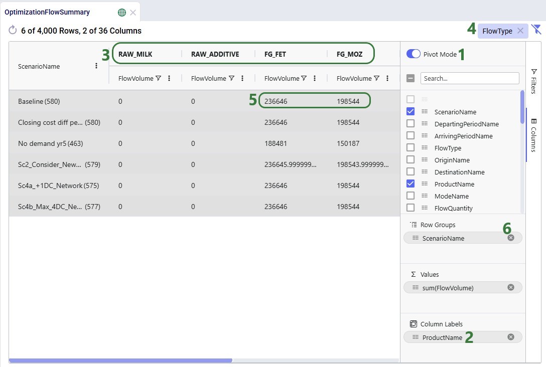
Another example to show the total volumes of different flow types, filtered for finished goods, by scenario is shown in the next screenshot:

So far, we have only looked at using the new grid features on the Optimization Flow Summary output table. Here, we will show some additional examples on different input and output tables.
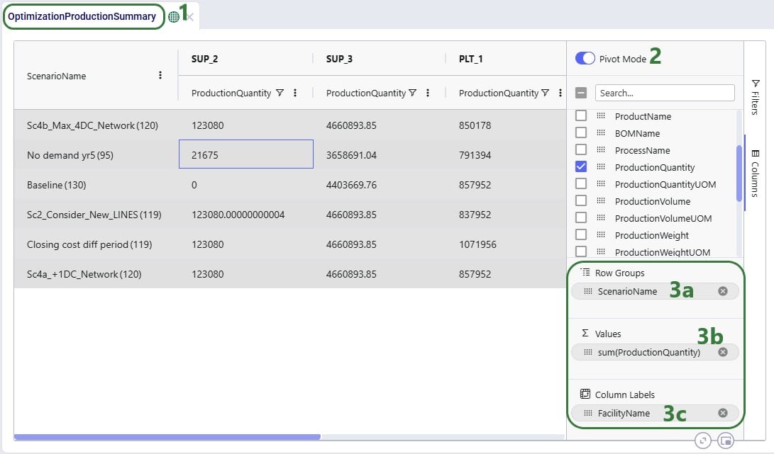
In this first additional example, a pivot grid is configured to show the total production quantity for each facility by scenario:
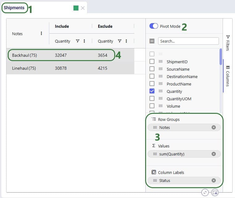
In the next example, we will show how to configure a pivot grid to do a quick check on the shipment quantities: how much the backhaul vs linehaul quantity is and how much of each is set to Include vs Exclude:
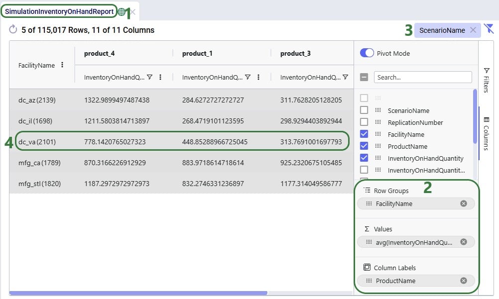
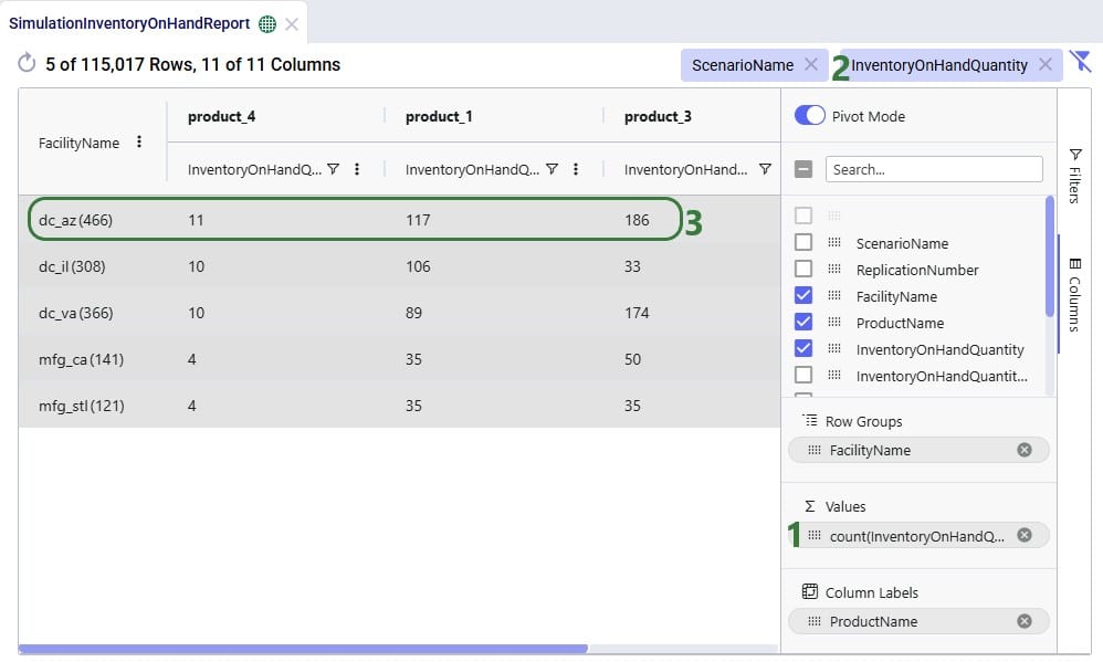
In the following 2 examples, we are doing some quick analysis on the Simulation Inventory On Hand Report, a simulation (Throg) output table containing granular details on the inventory levels by location and product over time. In the first of these 2 examples, we want to see the average inventory by location and product for a specific scenario:
In the next example, we want to see how often products stock out at the different facilities in the Baseline scenario:
The last 2 examples in this section show 2 different views of Greenfield (Triad) outputs. The first example shows the average transport distance and time by scenario:
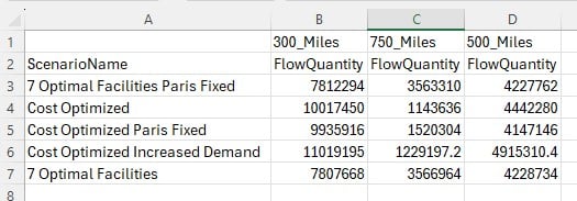
Lastly, we want to look, by scenario, how much of the quantity delivered to customers falls in the 300 miles, 500 miles, and 750 miles service bands:
Please take note of following to make working with Row Grouping, Aggregated Table Grids and Pivot Grids as effective as possible:

Cosmic Frog users can now perform additional quick analyses on their supply chain models’ input and output data through Cosmic Frog’s new grid features. This functionality enables users to easily apply different types of grouping and aggregation to their data, while also allowing users to view their data in a pivoted format. Think for example of the following use cases:
In this documentation we will cover how grids can be configured to use these new features, show several additional examples, and conclude with a few pointers for effective use of these features.
These new grid features can be accessed from the “Columns” section on the side bar on the right-hand side of input and output tables while in the Data module of Cosmic Frog:
Alternatively, users can also start grouping and subsequently aggregating by right clicking on the column names in the table grid:
We will first cover Row Grouping, then Aggregated Table Mode, and finally Pivot Mode.
Using the row grouping functionality allows users to select 1 or multiple columns of an input or output table by which all records in the table will be grouped. These groups of records can be collapsed and expanded as desired to review the data. In the following screenshot the row grouping feature is used to compare the sources of a certain finished good in a particular period for 1 scenario:
When clicking on Columns on the right hand-side of the table to open the row grouping / aggregated table / pivot grid configuration pane shows the configuration for this row grouping:
The above example showed grouping the rows by 1 column, this next example shows the same table, but now the rows are grouped by 3 columns. Note that you can change the order of the Row Groups by clicking on a column header and dragging it up or down.
The table then looks as follows:
The number in parenthesis indicates how many unique values there are for the next row group:
Once a table is grouped by one or more fields, a next step can be to aggregate one or multiple columns by this/these grouped field(s). When this is done, we call this aggregated table mode. Different types of aggregation are available to the user, which will be discussed in this section.
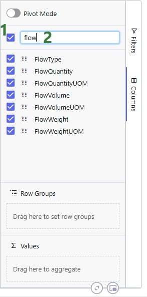
When configuring the grid through the configuration panel that comes up when clicking on Columns on the right-hand side of input & output tables, several options are available to help users find field names quickly and turn multiple on/off simultaneously:
To configure the grid, fields can be dragged and dropped:
Alternatively, instead of dragging and dropping, users can also right-click on the field(s) of interest to add them to the configuration areas. This can be done both in the list with column names at the top of the configuration window as shown in the following screenshot, but also on the column names in the grid itself (which we have seen an example of in the “How to Access the New Grid Features” section above):
In the screenshot above (taken with Pivot Mode on which is why the Column Labels area is also visible), the user right-clicked on the Flow Volume field and now they can choose to add it to the Row Groups area (“Group by FlowVolume”), to the ∑ Values area (“Add FlowVolume to values”), or to the Column Labels area (“Add FlowVolume to labels”).
The next screenshot shows the result of a configured aggregated table grid:
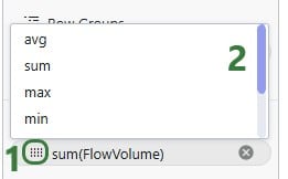
When adding numeric fields to the ∑ Values area, the following aggregation options are available to the user:
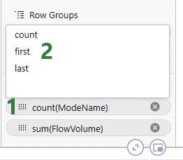
For non-numeric fields, only the last 3 options are available as aggregations:
When adding an aggregation field through right-clicking on a field name in the grid, it looks as follows. The user right-clicked on a numerical field, Transportation Cost, here:
When filters are applied to the table, these are still applied when the table is being grouped by rows, aggregated, or pivoted:
It was mentioned above that the number in parentheses after the scenario name represents the number of rows that the aggregation was applied to. We can expand this by clicking on the greater than (>) icon to view the individual rows that make up the aggregation:
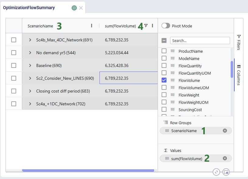
Next is an aggregated table mode example where more than 1 Row Group is used. Here, the Flow Quantity on the Optimization Flow Summary table is summed by scenario, origin, and product:
The resulting table:
When users turn on pivot mode, an extra configuration area named Column Labels becomes available in addition to the Row Groups and ∑ Values areas:
Another example to show the total volumes of different flow types, filtered for finished goods, by scenario is shown in the next screenshot:
So far, we have only looked at using the new grid features on the Optimization Flow Summary output table. Here, we will show some additional examples on different input and output tables.
In this first additional example, a pivot grid is configured to show the total production quantity for each facility by scenario:
In the next example, we will show how to configure a pivot grid to do a quick check on the shipment quantities: how much the backhaul vs linehaul quantity is and how much of each is set to Include vs Exclude:
In the following 2 examples, we are doing some quick analysis on the Simulation Inventory On Hand Report, a simulation (Throg) output table containing granular details on the inventory levels by location and product over time. In the first of these 2 examples, we want to see the average inventory by location and product for a specific scenario:
In the next example, we want to see how often products stock out at the different facilities in the Baseline scenario:
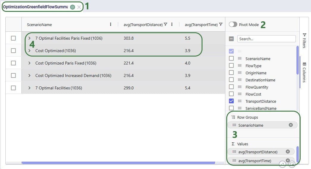
The last 2 examples in this section show 2 different views of Greenfield (Triad) outputs. The first example shows the average transport distance and time by scenario:
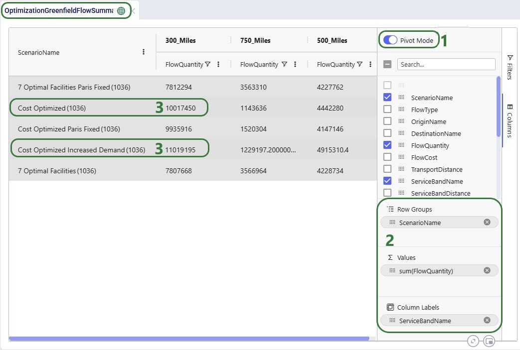
Lastly, we want to look, by scenario, how much of the quantity delivered to customers falls in the 300 miles, 500 miles, and 750 miles service bands:
Please take note of following to make working with Row Grouping, Aggregated Table Grids and Pivot Grids as effective as possible: